What is a relationship style?
Also known as a bivariate choropleth map, you can use a relationship style to explore the potential relationship between two numeric attributes. It overlays two sequential color schemes, each associated with a range of values to color features based on how each variable is classified in relation to the other.
Keep in mind that even if you observe a positive relationship between the two variables of interest, it doesn't mean they are statistically correlated. It also doesn't imply that the presence of one variable influences the other. Therefore, this renderer should be used judiciously with some prior knowledge that two variables may likely be related.
How relationship a style works
This renderer classifies each variable in either 2, 3, or 4 classes along separate color ramps. One of those ramps is rotated 90 degrees and overlaid on the other to create a 2x2, 3x3, or 4x4 square grid. The x-axis indicates the range of values for one variable, and the y-axis indicates the range for the second variable. The squares running diagonal from the lower left corner to the upper right corner indicate features where the two variables may be related or in agreement with one another.
The legend of a relationship renderer resembles a grid of two single-hue sequential color ramps overlaid on each other, forming a third hue along a diagonal line, which indicates where the two variables could potentially be related.
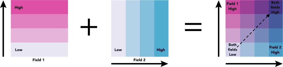
The lower right and upper left corners indicate features where one field has high values and the other field low values and vice versa.
Code examples
3x3 grid
The following example shows the geographic relationship between average household size and average home value using a 3x3 relationship color scheme.
- Blue corner - Areas where the average household size is large, but the average home size is small.
- Orange corner - Areas where the average household size is small, but the average home size is large.
- Brown corner - Areas where the average household size and the average home size are both large.
- Light brown corner - Areas where the average household size and the average home size are both small.
const params = {
layer: layer,
view: view,
field1: {
field: "AVGHHSZ_CY",
label: "Household size"
},
field2: {
field: "AVGVAL_CY",
label: "Home value"
},
focus: null,
numClasses: 3,
outlineOptimizationEnabled: true
};
return relationshipRendererCreator.createRenderer(params);
Tutorials
Style a feature layer
Use symbols and renderers to style feature layers.
Style layers in a web map
Use Map Viewer to style layers in a web map.
Services
Feature service
Add, update, delete, and query feature data.
API support
Different APIs have different levels of support for data-driven visualization.
| Unique types | Class breaks | Visual variables | Time | Multivariate | Predominance | Dot density | Relationship | |
|---|---|---|---|---|---|---|---|---|
| ArcGIS Maps SDK for JavaScript | ||||||||
| ArcGIS Maps SDK for Kotlin | ||||||||
| ArcGIS Maps SDK for Swift | ||||||||
| ArcGIS Maps SDK for Java | ||||||||
| ArcGIS Maps SDK for .NET | ||||||||
| ArcGIS Maps SDK for Qt | ||||||||
| ArcGIS API for Python |