- 🔬 Data Science
- 🥠 Deep Learning and Object classification
Introduction
We have already seen how we can extract coastlines using Landsat-8 multispectral imagery and band ratio technique, and next, we will classify these coastlines into multiple categories. To achieve this, we can train a model that can classify a coastline as one of the different categories shown in the screenshot below:
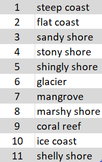
Figure 1. Coastline categories
In this sample notebook, we will see how we can classify these coastlines in the categories mentioned in figure 1, by training a Feature Classifier model.
Necessary imports
import os
import glob
import zipfile
from pathlib import Path

from arcgis.gis import GIS
from arcgis.learn import prepare_data, FeatureClassifier
Connect to your GIS
# Connect to GIS
gis = GIS("home")
Export training data
Using ArcGIS Maritime, we imported NOAA’s Electronic Navigational Charts. The maritime data in these charts contain the Coastline Feature class with the Category of Coastline details. The Sentinel 2 imagery was downloaded from the Copernicus Open Access Hub.
Before exporting the data, we will first create grids along the coastlines that can act as a feature class while exporting the data. For this, we will use the Generate Rectangles Along Lines tool. The parameters required to run the function are:
Input Line Features: Coastlines (belonging to each category)Output Feature Class: Output Feature class nameLength Along the Line: 1000Length Perpendicular to the Line: 1000Spatial Sort Method: Upper left
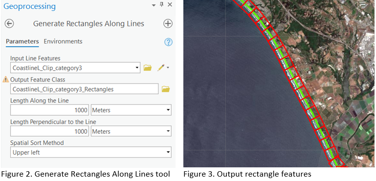
Figure 3 shows the output from the tool when run on a feature class belonging to category 3 (sandy shore).
Next, we add a category column to the feature class that can act as the class value field while exporting the data. We created a category column of the long data type named CATCOA. In this column, we set the value to be the same as the feature's coastline category using the Add and Calculate options respectively, as shown in figure 4.

Figure 4. Feature class after added category column
We then performed a similar process for each type of coastline category. Next, we exported this data in the "Labeled Tiles" metadata format for a small extent with multiple categories, using the Export Training Data For Deep Learning tool. This Export Training Data For Deep Learning tool is available in ArcGIS Pro, as well as ArcGIS Image Server.
Input Raster: Sentinel2 imageryInput Feature class Or Classified Raster: Feature class as shown in figure 4.Tile Size X & Tile Size Y: 256Stride X & Stride Y: 128Meta Data Format: 'Labeled Tiles' as we are training aFeature Classifiermodel.Environments: Set optimumCell Size,Processing Extent.

Figure 5. Export Training Data for Deep Learning tool
with arcpy.EnvManager(extent="MINOF", cellSize=10):
    arcpy.ia.ExportTrainingDataForDeepLearning("Multispectral_MTD_MSIL1C", r"D:\Coastline category\Data\Category_1", "CoastlineL_Clip_category1_Rectangles", "TIFF", 256, 256, 128, 128, "ONLY_TILES_WITH_FEATURES", "Labeled_Tiles", 0, "CATCOA", 0, None, 0, "MAP_SPACE", "PROCESS_AS_MOSAICKED_IMAGE", "NO_BLACKEN", "FIXED_SIZE")
We also created separate folders for each category to demonstrate the recently added multi-folder training support. Alternatively, you can choose the same folder each time you export the data, resulting in the newly exported images being amended in the existing folder.
We have also provided a subset of training data exported from each category. You can use this data directly to run these experiments.
training_data = gis.content.get('9251417cb9ab4a059eb538282f82883c')
training_data
filepath = training_data.download(file_name=training_data.name)with zipfile.ZipFile(filepath, 'r') as zip_ref:
zip_ref.extractall(Path(filepath).parent)output_path = os.path.join(os.path.splitext(filepath)[0], "*")output_path = glob.glob(output_path)Train the model
arcgis.learn provides the ability to determine the class of each feature in the form of a FeatureClassifier model. To learn more about it's workings and use cases, see this guide - "How feature classifier works?".
Prepare data
Here, we will specify the path to our training data and a few hyperparameters.
path: path of the folder/list of folders containing training data.batch_size: Number of images your model will train on each step inside an epoch, it directly depends on the memory of your graphic card. 128 worked for us on a 32GB GPU.
# output_path = [ r'D:\Coastline_category\Data_generate_rectangles\Category_1',
#            r'D:\Coastline_category\Data_generate_rectangles\Category_2',
#            r'D:\Coastline_category\Data_generate_rectangles\Category_3',
#            r'D:\Coastline_category\Data_generate_rectangles\Category_4',
#            r'D:\Coastline_category\Data_generate_rectangles\Category_6',
#            r'D:\Coastline_category\Data_generate_rectangles\Category_7',
#            r'D:\Coastline_category\Data_generate_rectangles\Category_8',
#            r'D:\Coastline_category\Data_generate_rectangles\Category_10']
data = prepare_data(
path=output_path,
batch_size=128,
val_split_pct=0.2
)Visualize training data
To get a sense of what the training data looks like, the arcgis.learn.show_batch() method randomly picks a few training chips and visualizes them.
rows: Number of rows to visualize
data.show_batch(rows=5)
Load model architecture
model = FeatureClassifier(data, oversample=True)Find an optimal learning rate
Learning rate is one of the most important hyperparameters in model training. ArcGIS API for Python provides a learning rate finder that automatically chooses the optimal learning rate for you.
lr = model.lr_find()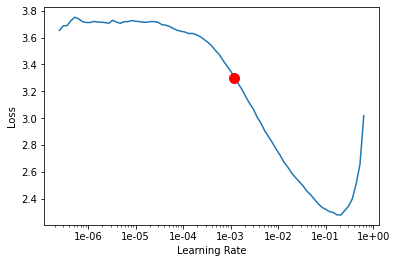
Fit the model
We will train the model for a few epochs with the learning rate we have found. For the sake of time, we can start with 20 epochs.
model.fit(20, lr=lr)| epoch | train_loss | valid_loss | accuracy | time |
|---|---|---|---|---|
| 0 | 1.566478 | 0.947836 | 0.688302 | 08:48 |
| 1 | 0.798208 | 0.607787 | 0.799047 | 08:53 |
| 2 | 0.491763 | 0.447151 | 0.852585 | 08:46 |
| 3 | 0.328522 | 0.360377 | 0.868720 | 08:50 |
| 4 | 0.240704 | 0.345637 | 0.881188 | 08:46 |
| 5 | 0.194254 | 0.285788 | 0.902090 | 08:44 |
| 6 | 0.159634 | 0.283150 | 0.914558 | 08:40 |
| 7 | 0.151040 | 0.257486 | 0.916025 | 08:43 |
| 8 | 0.124850 | 0.224945 | 0.921159 | 08:47 |
| 9 | 0.105106 | 0.268156 | 0.909791 | 08:39 |
| 10 | 0.105818 | 0.203183 | 0.931060 | 08:38 |
| 11 | 0.090749 | 0.216277 | 0.929226 | 08:42 |
| 12 | 0.080734 | 0.183624 | 0.935460 | 08:41 |
| 13 | 0.075979 | 0.212969 | 0.930326 | 08:39 |
| 14 | 0.071708 | 0.237691 | 0.922992 | 08:44 |
| 15 | 0.062223 | 0.232074 | 0.928126 | 08:46 |
| 16 | 0.052289 | 0.227401 | 0.929226 | 08:41 |
| 17 | 0.053027 | 0.222516 | 0.929593 | 08:39 |
| 18 | 0.054064 | 0.234973 | 0.928493 | 08:42 |
| 19 | 0.058555 | 0.233181 | 0.929226 | 08:41 |
Here, with only 20 epochs, we can see reasonable results — both training and validation losses have gone down considerably, indicating that the model is learning to classify coastlines.
Visualize results in validation set
It is a good practice to see the results of the model viz-a-viz ground truth. The code below picks random samples and shows us ground truth and model predictions, side by side. This enables us to preview the results of the model within the notebook.
model.show_results(rows=4)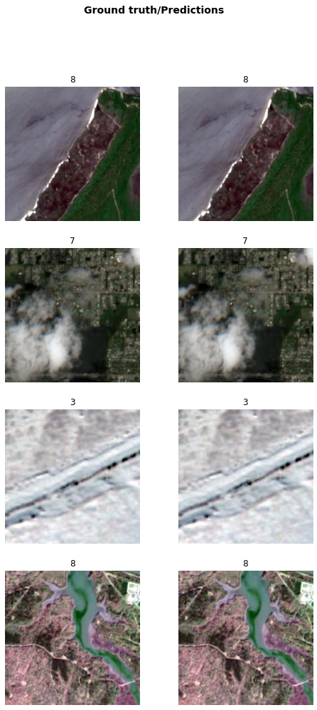
Accuracy assessment
arcgis.learn provides plot_confusion_matrix() that plots a confusion matrix of the model predictions to evaluate its accuracy.
model.plot_confusion_matrix()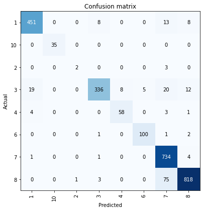
The confusion matrix validates that the trained model is learning to classify coastlines. The diagonal numbers show the number of chips correctly classified to the respective categories. The results are good for all but category 2. By looking at the row for category 2, we can see that there are very few chips in the validation set of our data (5 in total). As such, we can increase the number of chips either by increasing the value of the val_split_pct parameter in prepare_data() or by exporting more data for that particular category. We may need to re-train the model if we add more data to it.
Save the model
Now, we will save the model that we trained as a 'Deep Learning Package' ('.dlpk' format). A Deep Learning package is the standard format used to deploy deep learning models on the ArcGIS platform.
We will use the save() method to save the trained model. By default, it will be saved to the 'models' sub-folder within our training data folder.
model.save('model-20e_8classes')Computing model metrics...
WindowsPath('D:/Coastline_category/models/model-20e_8classes')Model inference
In order for us to perform inferencing in ArcGIS Pro, we need to create a feature class along the coastlines using the Generate Rectangles Along Lines tool, as shown in figure 2, for an area that is not already seen by the model.
Now, we will use the Classify Objects Using Deep Learning tool for inferencing the results. The parameters required to run the function are:
Input Raster: Sentinel2 imageryInput Features: Output from theGenerate Rectangles Along coastlinestool.Output CLassified Objects Feature Class: Output feature class.Model Definition: The model that we trained.Class Label Field: Feild name that will contain the detected class number.Environments: Set optimumCell Size,Processing ExtentandProcessor Type.

Figure 6. Classify Objects Using Deep Learning tool
Results
We selected an unseen (by the model) sandy shoreline (category 3) and generated the required rectangles along it using the Generate Rectangles Along Lines tool. We then used our model for classification. Below are the results that we got.

You can observe in figure 9 that two rectangles got misclassified into category 7 (mangrove), and that the rest were classified correctly as belonging to category 3. Further training of the model could produce even more accurate results.
Conclusion
In this notebook, we demonstrated how to use the FeatureClassifier model from the ArcGIS API for Python to classify coastlines into multiple categories.