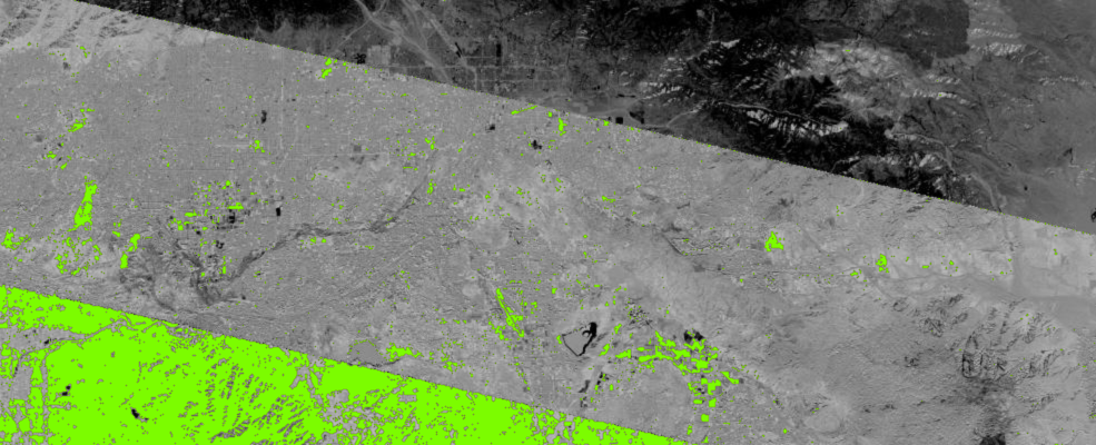
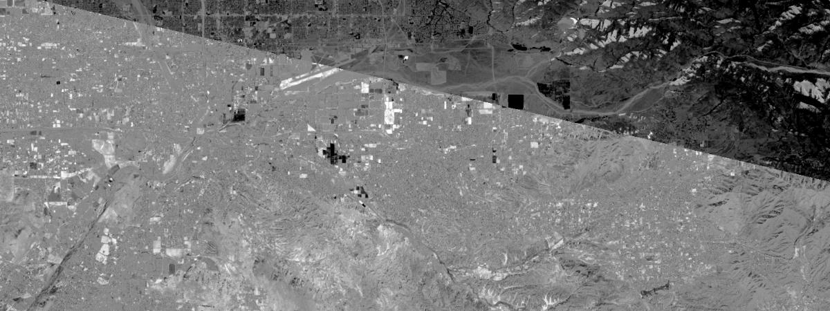
In this guide, we will first demonstrate how to chain multiple raster functions together, view the workflow as a graph, and persist the result. We will then show you how to make use of these capabilities in a change detection use case.
Getting Prepared
Let's first import the packages and make a connection to our GIS.
import arcgis
from arcgis.gis import GIS
from arcgis.raster.functions import *
from IPython.display import display

gis = GIS(url='https://pythonapi.playground.esri.com/portal', username='arcgis_python', password='amazing_arcgis_123')
items = gis.content.search("title: Multispectral Landsat", item_type="Imagery Layer", outside_org=True)
items[0]l8_lyr = items[0].layers[0]Chain raster functions
There are cases where one raster function is not enough and we need to chain multiple raster functions together.
For example, if we would like to highlight the difference between land and water, we can first extract Red, NIR, Green [4,5,3] bands using ExtractBand, and then use Stretch function to enhance the contrast further.
land_water_lr = stretch(extract_band(l8_lyr, [4, 5, 3]),
                        stretch_type='PercentClip',
                        min_percent=2,
                        max_percent=2,
                        dra=True,
                        gamma=[1, 1, 1])
landmap = gis.map('Redlands, CA')
landmap
landmap.content.add(land_water_lr)Visualize the workflow using draw_graph
We can take advantage of the draw_graph method to verify and present our workflow. This can be very useful when you perform complicated analysis.
land_water_lr.draw_graph()Use case - change detection
Now we are going demonstrate how to use raster function chaining to perform change detection, which is one of the most common tasks in remote sensing. The goal is to compare images of the same area from two different times.
Get images of two different times of the same area
from arcgis.geocoding import geocode

# get spatial extent of Redlands
area = geocode('Redlands, CA', out_sr=l8_lyr.properties.spatialReference)[0]
area['extent']
{'xmin': -13052832.571464855,
'ymin': 4026436.3359408537,
'xmax': -13036579.925809037,
'ymax': 4046053.3775858423}Now let's query all landsat layers between 2015 and 2019.
import pandas as pd
from datetime import datetime

selected = l8_lyr.filter_by(time=[datetime(2015, 1, 1), datetime(2019, 1, 1)],
                             geometry=arcgis.geometry.filters.intersects(area['extent']))

df = selected.query(out_fields="AcquisitionDate, GroupName, CloudCover",
                    order_by_fields="AcquisitionDate").sdf
df.head()| AcquisitionDate | CloudCover | GroupName | OBJECTID | SHAPE | Shape_Area | Shape_Length | |
|---|---|---|---|---|---|---|---|
| 0 | 2015-01-04 18:22:11.904000044 | 0.1037 | LC80400362015004LGN00_MTL | 84432 | {"rings": [[[-12860852.2438, 4198630.038500003... | 5.248638e+10 | 917052.740296 |
| 1 | 2015-01-04 18:22:35.790999889 | 0.0238 | LC80400372015004LGN00_MTL | 84496 | {"rings": [[[-12907879.6358, 4005216.699000001... | 5.074895e+10 | 901291.898351 |
| 2 | 2015-01-20 18:22:07.826999903 | 0.8998 | LC80400362015020LGN00_MTL | 84433 | {"rings": [[[-12861361.5129, 4198638.006399997... | 5.238693e+10 | 916794.241228 |
| 3 | 2015-01-20 18:22:31.719000101 | 0.5907 | LC80400372015020LGN00_MTL | 84497 | {"rings": [[[-12908240.5626, 4005219.975599996... | 5.078004e+10 | 901562.429520 |
| 4 | 2015-02-05 18:22:04.519000052 | 0.0202 | LC80400362015036LGN00_MTL | 84434 | {"rings": [[[-12862687.679200001, 4198655.3844... | 5.250613e+10 | 916748.873584 |
old = l8_lyr.filter_by('OBJECTID=84452')   # 2015-11-20
new = l8_lyr.filter_by('OBJECTID=1028427') # 2018-12-30
Obtain difference through map algebra
Now that we have the images, let's compute the NDVI and get their difference.
Instead of using the ndvi() method that applies a fixed raster algebra, let's do this through BandArithmetic() method that allows you to perform user-defined map algebra. All you need to do is to specify your own formula.
# ndvi_diff = ndvi(new, '5 4') - ndvi(old, '5 4')
ndvi_old = band_arithmetic(old, "(b5 - b4) / (b5 + b4)")
ndvi_new = band_arithmetic(new, "(b5 - b4) / (b5 + b4)")
ndvi_diff = ndvi_new - ndvi_old
Now we can add the difference image onto a map.
change_map = gis.map('Redlands, CA')
change_map
change_map.content.add(ndvi_diff)It's hard to tell which area has changed the most. So let's reclassify it using remap and display high increase with the color of green using colormap.
threshold_val = 0.2
masked = colormap(remap(ndvi_diff, # assign pixels whose value is greater than 0.2 with 1, and the rest with no_data
                        input_ranges=[threshold_val, 1],
                        output_values=[1],
                        no_data_ranges=[-1, threshold_val], astype='u8'),
colormap=[[1, 124, 252, 0]], astype='u8')change_map.content.add(masked)masked.draw_graph()Save your result
The save() method on ImageryLayer class persists this imagery layer to the GIS as an Imagery Layer item. If for_viz parameter is True, a new Item is created that uses the applied raster functions for visualization at display resolution using on-the-fly image processing. If for_viz is False, distributed raster analysis is used for generating a new raster information product by applying raster functions at source resolution across the extent of the output imagery layer.
In the example below, the threshold mask is being saved as item for visualization:
In addition to visualizing the imagery layers in the Jupyter Notebook, or using a map widget, they can be exported using the export_image method provided by ImageryLayers:
savedimg = ndvi_diff.export_image(bbox=area['extent'], size=[1200,450], f='image', save_folder='.', save_file='img.jpg')
savedimg
'./img.jpg'
from IPython.display import Image
Image(savedimg)
lyr = masked.save('Test_viz_layer3', for_viz=True)
lyr
