The Spatially Enabled Dataframe has a plot() method that uses a syntax and symbology similar to matplotlib for visualizing features on a map. With this functionality, you can easily visualize aspects of your data both on a map and on a matplotlib chart using the same symbology!
Some unique characteristics of working with the visualization capabalities on the SDF:
- Uses Pythonic syntax
- Uses the same syntax as visualizing charts on Pandas DataFrames
- Uses symbology familiar to users of matplotlib
- Works on features and attributes simultaneously, eliminating to a great extent the need to iterate over all features (rows)
- Handles reading and writing to multiple formats aiding data conversion
Checkout the Introduction to Spatially Enabled DataFrame guide to learn how to create a Spatially Enabled DataFrame.
Quickstart: Get Data
Let us read a census data on major cities and load that into a Spatially Enabled DataFrame
from arcgis import GIS

gis = GIS()
# create an anonymous connection to ArcGIS Online and get a public item for "USA Major Cities"
item = gis.content.get("9df5e769bfe8412b8de36a2e618c7672")
flayer = item.layers[0]

# Query the data as a Spatially Enabled DataFrame
df = flayer.query().sdf

# Visualize the top 5 records
df.head()| OBJECTID | NAME | CLASS | STATE_ABBR | STATE_FIPS | PLACE_FIPS | POPULATION | POP_CLASS | POP_SQMI | SQMI | CAPITAL | SHAPE | |
|---|---|---|---|---|---|---|---|---|---|---|---|---|
| 0 | 1 | Alabaster | city | AL | 01 | 0100820 | 33284 | 6 | 1300.7 | 25.59 | {"x": -86.81782028299995, "y": 33.244497706000... | |
| 1 | 2 | Albertville | city | AL | 01 | 0100988 | 22386 | 6 | 827.9 | 27.04 | {"x": -86.21204767999996, "y": 34.264208442000... | |
| 2 | 3 | Alexander City | city | AL | 01 | 0101132 | 14843 | 6 | 337.4 | 43.99 | {"x": -85.95631375099998, "y": 32.943094153000... | |
| 3 | 4 | Anniston | city | AL | 01 | 0101852 | 21564 | 6 | 469.9 | 45.89 | {"x": -85.81985578299998, "y": 33.656500677000... | |
| 4 | 5 | Athens | city | AL | 01 | 0102956 | 25406 | 6 | 625.8 | 40.6 | {"x": -86.95079502699997, "y": 34.784837689000... |
Note: If the above cell looks new to you, please checkout the Introduction to Spatially Enabled DataFrame guide.
Let us create a map of the United States
m1 = gis.map("United States")
m1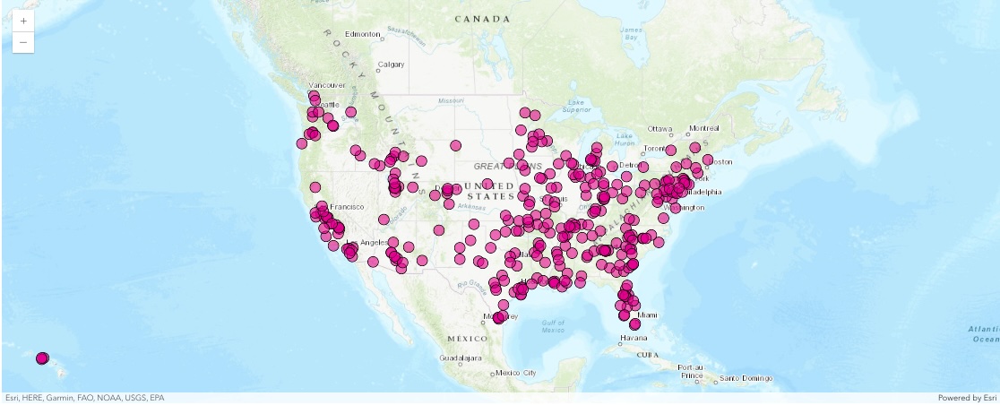
m1.zoom = 4
m1.center = [39, -98]
Plot the DataFrame - Using Defaults
You can quickly visualize the points by calling the plot() method off the DataFrame's spatial accessor and passing the map you created above.
df.spatial.plot(map_widget=m1)True
You can customize the symbols, their color, shape, border etc. like you would in a typical matplotlib plot. The rest of this guide talks about such customizations and suggestions to visualize your spatial and non-spatial data.
The code below plots the same set of points on a new map using a common structure used amongst many different Python packages for defining symbology. It is built off of the matplotlib libraries for simple, straightforward plotting. We'll explain some of the parameters below, and the plot() API Reference outlines more options.
m2 = GIS().map("United States")
m2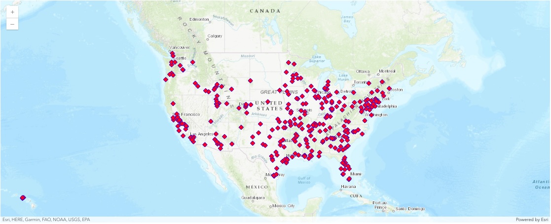
m2.center = [39, -98]
m2.zoom = 4
Plot the DataFrame - Setting Symbol Properties
from arcgis.map.renderers import SimpleRenderer
from arcgis.map.symbols import (
    SimpleMarkerSymbolEsriSMS,
    SimpleMarkerSymbolStyle,
    SimpleLineSymbolEsriSLS,
    SimpleLineSymbolStyle,
)

renderer = SimpleRenderer(
    symbol=SimpleMarkerSymbolEsriSMS(
        style=SimpleMarkerSymbolStyle.esri_sms_diamond.value,
        size=10,
        outline=SimpleLineSymbolEsriSLS(
            color=[0, 0, 255, 255],
            width=0.7,
            style=SimpleLineSymbolStyle.esri_sls_solid.value,
        ),
        color=[255, 0, 0, 255],
    ),
)

df.spatial.plot(
    map_widget=m2,
    renderer=renderer,
)
True
If this type of plotting is new to you, this is a good time to checkout matplotlib.pyplot documentation and Pandas dataframe plot documentation to get an idea.
gis = GIS()
m3 = gis.map("United States")
m3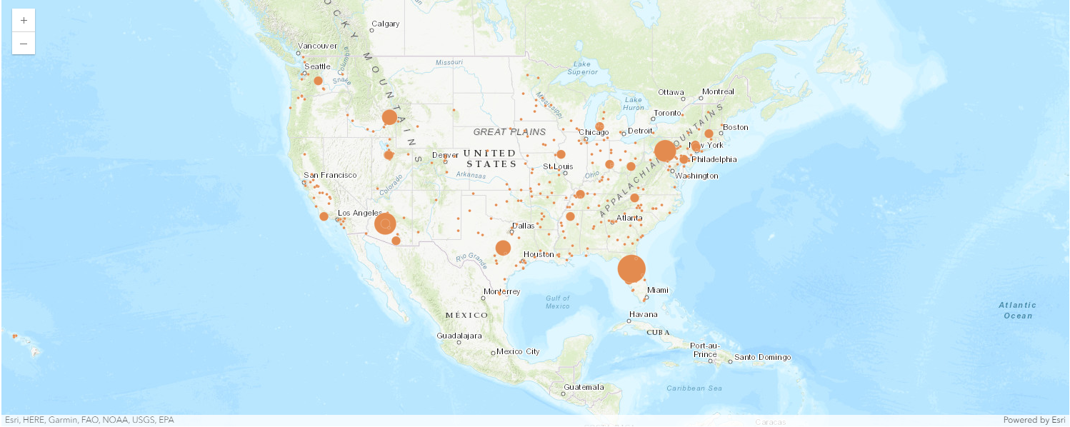
m3.center = [39, -98]
m3.zoom = 4
Plot the DataFrame - Using Class Break Symbology
df.spatial.plot(map_widget=m3)True
renderer_manager = m3.content.renderer(0)
smm = renderer_manager.smart_mapping()
smm.class_breaks_renderer(break_type="size", field="POPULATION")
Visualizing Unique Values with Arcade Expressions
Arcade is an expression language that can be used across the ArcGIS Platform. Whether writing simple scripts to control how features are rendered, or expressions to control label text, Arcade provides a simple scripting syntax to deliver these capabilities.
In the sense of visualization, Arcade expressions are used to create rich and dynamic symbology. This example will follow the JavaScript guide.
Obtain the Data
Access the enterprise to gain access to the FeatureLayer information and query it into a Spatially Enabled DataFrame.
item = gis.content.get("8444e275037549c1acab02d2626daaee")
flayer = item.layers[0]
df2 = flayer.query().sdf
fset = flayer.query()from arcgis.geometry import Geometry
g = Geometry(fset.features[0].geometry)
gWrite Arcade Expressions and Stops
Arcade expressions require the stops to be manually provided. In this case, we first create an opacity visual variable based on a percent of dominant parties in registered citizens.
from arcgis.map.renderers import TransparencyInfoVisualVariable

opacity_expression = (
    "var republican = $feature.MP06025a_B;var democrat = $feature.MP06024a_B;"
    "var independent = $feature.MP06026a_B;var parties = [republican, democrat, independent];"
    "var total = Sum(parties);var max = Max(parties);return (max / total) * 100;"
)
opacity_stops = [
    {"value": 33, "transparency": 0.05 * 255, "label": "< 33%"},
    {"value": 44, "transparency": 1.0 * 255, "label": "> 44%"},
]

vv = [
    TransparencyInfoVisualVariable(
        stops=opacity_stops, value_expression=opacity_expression
    )
]
Next we develop another Arcade expression to obtain the majority party in a given county.
from arcgis.map.renderers import UniqueValueRenderer, UniqueValueInfo
from arcgis.map.symbols import SimpleFillSymbolEsriSFS

arcade_expression = (
    "var republican = $feature.MP06025a_B;var democrat = $feature.MP06024a_B;"
    "var independent = $feature.MP06026a_B;var parties = [republican, democrat, independent];"
    "return Decode( Max(parties),republican, 'republican', democrat, 'democrat',independent, "
    "'independent','n/a' );"
)
uv = [
    UniqueValueInfo(
        label="Democrat",
        symbol=SimpleFillSymbolEsriSFS(
            **{
                "type": "esriSFS",
                "color": [0, 195, 255, 255],
                "outline": {
                    "type": "esriSLS",
                    "color": [0, 0, 0, 51],
                    "width": 0.5,
                    "style": "esriSLSSolid",
                },
                "style": "esriSFSSolid",
            }
        ),
        value="democrat",
    ),
    UniqueValueInfo(
        label="Republican",
        symbol=SimpleFillSymbolEsriSFS(
            **{
                "type": "esriSFS",
                "color": [255, 0, 46, 255],
                "outline": {
                    "type": "esriSLS",
                    "color": [0, 0, 0, 51],
                    "width": 0.5,
                    "style": "esriSLSSolid",
                },
                "style": "esriSFSSolid",
            }
        ),
        value="republican",
    ),
    UniqueValueInfo(
        label="Independent/other party",
        symbol=SimpleFillSymbolEsriSFS(
            **{
                "type": "esriSFS",
                "color": [250, 255, 0, 255],
                "outline": {
                    "type": "esriSLS",
                    "color": [0, 0, 0, 51],
                    "width": 0.5,
                    "style": "esriSLSSolid",
                },
                "style": "esriSFSSolid",
            }
        ),
        value="independent",
    ),
]


uv_rend = UniqueValueRenderer(
    unique_value_infos=uv, value_expression=arcade_expression, visual_variables=vv
)
gis = GIS()
m3_ua = gis.map("United States")
m3_ua
m3_ua.center = [39, -98]
m3_ua.zoom = 4
Visualize the Data
Provide the color scheme, and the arcade_expression to render the data in a dynamic/rich form.
df2.spatial.plot(map_widget=m3_ua, renderer=uv_rend)True
Visualizing classes with different colors
Often, you may want to classify the numerical values in your data into groups and visualize them on a map. You can accomplish this with a class break renderer which splits your data into specific number of groups and uses color to differentiate each group. You can choose the algorithm that performs the class splits or go with the defualt.
Let us visualize the same major cities point dataset using its POPULATION column.
df[["STATE_ABBR", "NAME", "POPULATION"]].head()| STATE_ABBR | NAME | POPULATION | |
|---|---|---|---|
| 0 | AL | Alabaster | 33284 |
| 1 | AL | Albertville | 22386 |
| 2 | AL | Alexander City | 14843 |
| 3 | AL | Anniston | 21564 |
| 4 | AL | Athens | 25406 |
m4 = gis.map("USA")
m4
df.spatial.plot(map_widget=m4)True
rend_manager = m4.content.renderer(0)
smm = rend_manager.smart_mapping()
smm.class_breaks_renderer(
    break_type="color",
    field="POPULATION",
    num_classes=20,
    classification_method="natural-breaks",
)
Visualizing line features using simple symbols
Let us search for USA freeway layer and visualize it by looping through the different line symbols
search_result = gis.content.search(
    "title:USA Freeway System AND owner:esri_dm", item_type="Feature Layer"
)
freeway_item = search_result[0]
freeway_item
freeway_sdf = freeway_item.layers[0].query().sdf
freeway_sdf.head()| OBJECTID | ROUTE_NUM | CLASS | NUMBER | SUFFIX | DIST_MILES | DIST_KM | SHAPE | |
|---|---|---|---|---|---|---|---|---|
| 0 | 1 | CG8 | C | G8 | 5.12996 | 8.25588 | {"paths": [[[-121.892261711658, 37.32391610061... | |
| 1 | 2 | I105 | I | 105 | 19.83041 | 31.91401 | {"paths": [[[-118.368428716304, 33.93055610296... | |
| 2 | 3 | I205 | I | 205 | 48.25566 | 77.66011 | {"paths": [[[-122.561879717577, 45.54969107336... | |
| 3 | 4 | I215 | I | 215 | 93.43523 | 150.36972 | {"paths": [[[-117.319118714291, 34.14458511089... | |
| 4 | 5 | I238 | I | 238 | 2.03548 | 3.27579 | {"paths": [[[-122.137358724846, 37.69015308551... |
m8 = gis.map("USA")
m8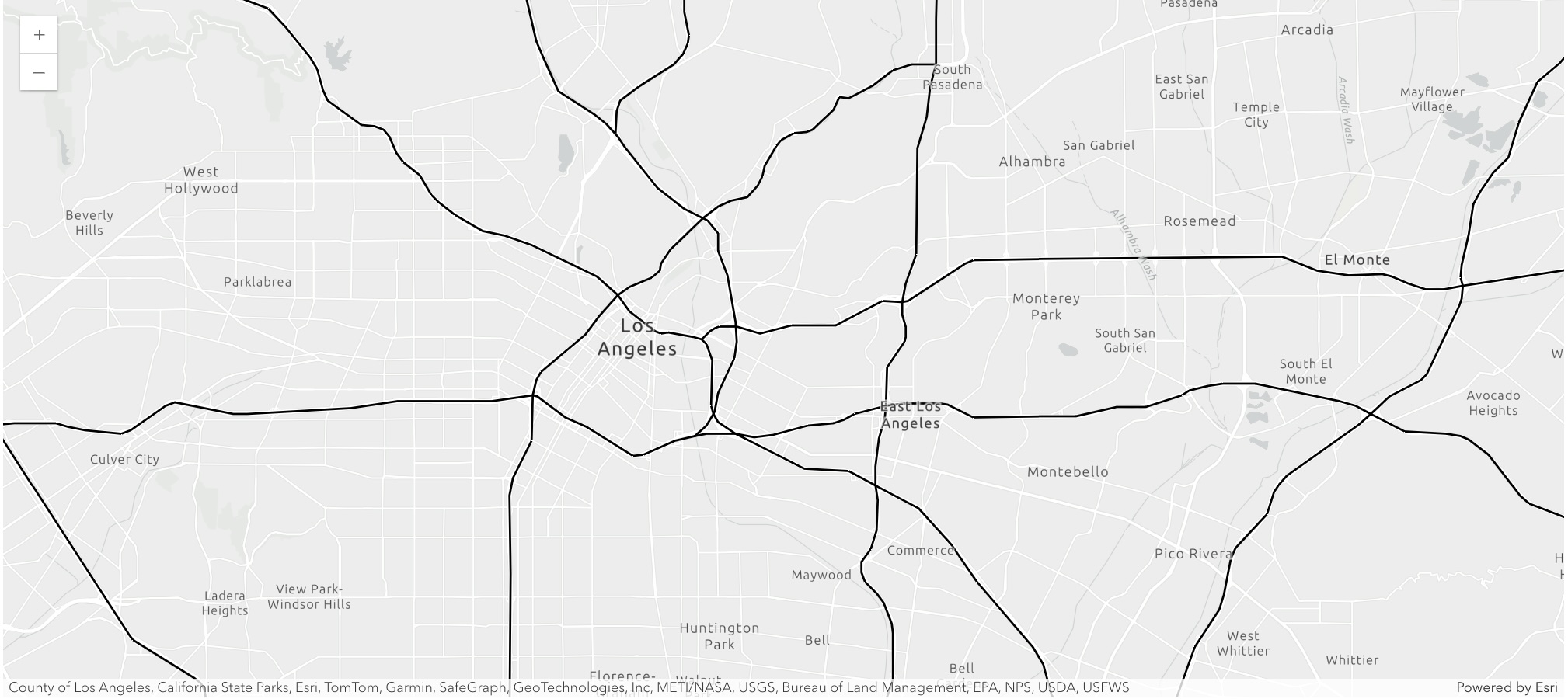
m8.center = [34.05, -118.2]
m8.zoom = 12
m8.basemap.basemap = "gray-vector"
freeway_sdf.spatial.plot(
map_widget=m8,
)True
Visualizing area features using different symbols
from arcgis.layers import Service

layer = Service(
    "https://sampleserver6.arcgisonline.com/arcgis/rest/services/Census/MapServer/2"
)
county_sdf = layer.query("STATE_NAME='Washington'", out_sr=4326).sdf
county_sdf.head()| Shape_Length | Shape_Area | OBJECTID | NAME | STATE_NAME | STATE_FIPS | CNTY_FIPS | FIPS | POP2000 | POP2007 | ... | HSE_UNITS | VACANT | OWNER_OCC | RENTER_OCC | NO_FARMS97 | AVG_SIZE97 | CROP_ACR97 | AVG_SALE97 | SQMI | SHAPE | |
|---|---|---|---|---|---|---|---|---|---|---|---|---|---|---|---|---|---|---|---|---|---|
| 0 | 3.879553 | 0.590994 | 2953 | Adams | Washington | 53 | 001 | 53001 | 16428 | 17555 | ... | 5773 | 544 | 3576 | 1653 | 628.0 | 1746.0 | 808651.0 | 321.45 | 1930.0 | {"rings": [[[-119.36961802215399, 46.737285024... |
| 1 | 2.127905 | 0.193369 | 2954 | Asotin | Washington | 53 | 003 | 53003 | 20551 | 21237 | ... | 9111 | 747 | 5612 | 2752 | 140.0 | 2175.0 | 87282.0 | 69.59 | 640.6 | {"rings": [[[-117.48006100031489, 46.085736986... |
| 2 | 3.259149 | 0.531696 | 2955 | Benton | Washington | 53 | 005 | 53005 | 142475 | 164259 | ... | 55963 | 3097 | 36344 | 16522 | 1078.0 | 568.0 | 440291.0 | 278.79 | 1760.0 | {"rings": [[[-119.87687899986594, 46.562399986... |
| 3 | 6.259164 | 0.932106 | 2956 | Chelan | Washington | 53 | 007 | 53007 | 66616 | 71939 | ... | 30407 | 5386 | 16178 | 8843 | 1113.0 | 111.0 | 41046.0 | 131.54 | 2993.7 | {"rings": [[[-121.17981297788657, 47.896832976... |
| 4 | 5.62703 | 0.551224 | 2957 | Clallam | Washington | 53 | 009 | 53009 | 64525 | 70908 | ... | 30683 | 3519 | 19757 | 7407 | 292.0 | 72.0 | 12116.0 | 20.58 | 1764.3 | {"rings": [[[-124.73315299891175, 48.163761012... |
5 rows × 53 columns
m9 = gis.map("Seattle, WA")
m9.basemap.basemap = "gray-vector"
m9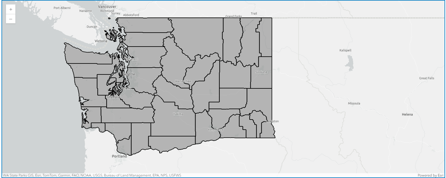
county_sdf.spatial.plot(map_widget=m9)True
Add Popup Field Info
Finally, we can add field information from the dataframe to the popup for it to display on the map when a user clicks on a specific county.
from arcgis.map.popups import PopupInfo, FieldInfo

popup1 = m9.content.popup(0)
popup1.disable_popup = False
fields = [FieldInfo(field_name=column_name) for column_name in county_sdf.columns]
popup1.edit("County Data", field_infos=fields)
True
Conclusion
The Spatially Enabled DataFrame gives you powerful visualization capabilities that allows you to plot your data on the interactive map widget. You specify colors and symbols using the same syntax that you would specify for a normal Pandas or a matplotlib plot.