Display and customize coordinate system grids including Latitude/Longitude, MGRS, UTM and USNG on a map view or scene view.
Use case
Grids are often used on printed maps, but can also be helpful on digital 2D maps or 3D scenes, to identify locations.
How to use the sample
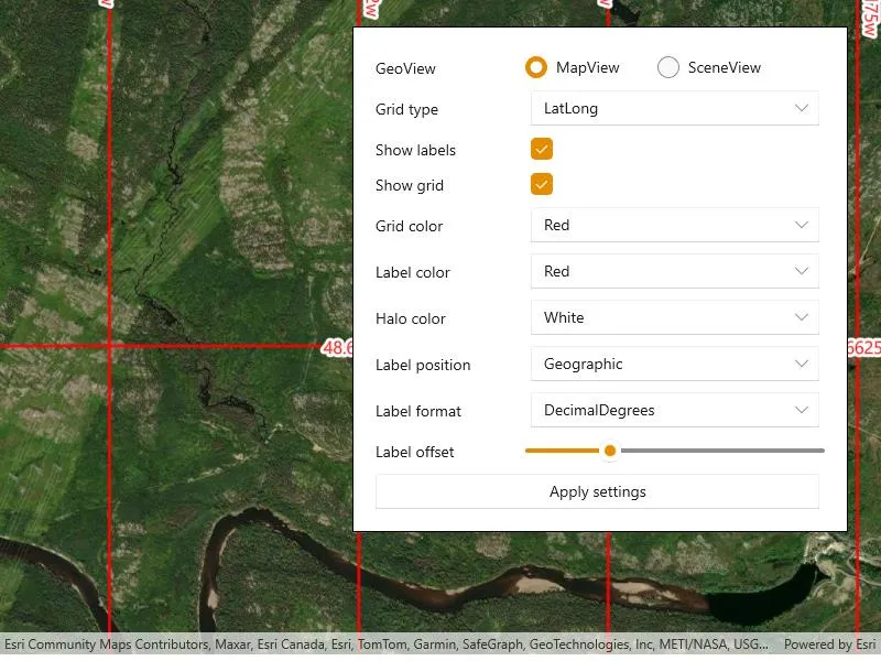
Use the controls to change the grid settings. You can change the view from 2D or 3D, select the type of grid from Grid Type (LatLong, MGRS, UTM, and USNG) and modify its properties like label visibility, grid line color, grid label color, label formatting, and label offset.
How it works
- Create an instance of one of the
Gridtypes. - Grid lines and labels can be styled per grid level with
setLineSymbol(gridLevel, lineSymbol)andsetTextSymbol(gridLevel, textSymbol)methods on the grid. - The label position can be set with
setLabelPosition(labelPosition)method on the grid.- Note that as of 200.6, MGRS, UTM, and USNG grids in a SceneView only support the
Geographiclabel position.
- Note that as of 200.6, MGRS, UTM, and USNG grids in a SceneView only support the
- For the
LatitudeLongitudeGridtype, you can specify a label format ofDECIMAL_DEGREESorDEGREES_MINUTES_SECONDS. - For all screen-aligned label placement strategies, you can set the labels’ offset in device-independent pixels (DIPs) from the screen edge with
setLabelOffset(offset). - To set the grid, use the
setGrid(grid)method on the map view or scene view.
Relevant API
- Grid
- LatitudeLongitudeGrid
- MapView
- MGRSGrid
- SceneView
- SimpleLineSymbol
- TextSymbol
- USNGGrid
- UTMGrid
Tags
coordinates, degrees, graticule, grid, latitude, longitude, MGRS, minutes, seconds, USNG, UTM
Sample code
// Copyright 2018 Esri.//// Licensed under the Apache License, Version 2.0 (the "License"); you may not use this file except in compliance with the License.// You may obtain a copy of the License at: http://www.apache.org/licenses/LICENSE-2.0//// Unless required by applicable law or agreed to in writing, software distributed under the License is distributed on an// "AS IS" BASIS, WITHOUT WARRANTIES OR CONDITIONS OF ANY KIND, either express or implied. See the License for the specific// language governing permissions and limitations under the License.
using Esri.ArcGISRuntime.Geometry;using Esri.ArcGISRuntime.Mapping;using Esri.ArcGISRuntime.Symbology;using Esri.ArcGISRuntime.UI;using Microsoft.UI.Xaml;using Microsoft.UI.Xaml.Controls;using System;using Colors = System.Drawing.Color;using Grid = Esri.ArcGISRuntime.UI.Grid;using Symbol = Esri.ArcGISRuntime.Symbology.Symbol;
namespace ArcGIS.WinUI.Samples.DisplayGrid{    [ArcGIS.Samples.Shared.Attributes.Sample(        name: "Display grid",        category: "MapView",        description: "Display and customize coordinate system grids including Latitude/Longitude, MGRS, UTM and USNG on a map view or scene view.",        instructions: "Use the controls to change the grid settings. You can change the view from 2D or 3D, select the type of grid from `Grid Type` (LatLong, MGRS, UTM, and USNG) and modify its properties like label visibility, grid line color, grid label color, label formatting, and label offset.",        tags: new[] { "MGRS", "USNG", "UTM", "coordinates", "degrees", "graticule", "grid", "latitude", "longitude", "minutes", "seconds" })]    public partial class DisplayGrid    {        public DisplayGrid()        {            InitializeComponent();
            Initialize();        }
        private void Initialize()        {            // Set up the map and scene with basemaps.            MyMapView.Map = new Map(BasemapStyle.ArcGISImagery);            MySceneView.Scene = new Scene(BasemapStyle.ArcGISImageryStandard);
            // Add an elevation source to the scene.            var elevationSource = new ArcGISTiledElevationSource(new Uri(                "https://elevation3d.arcgis.com/arcgis/rest/services/WorldElevation3D/Terrain3D/ImageServer"));            MySceneView.Scene.BaseSurface.ElevationSources.Add(elevationSource);
            // Configure the UI options.            gridTypeCombo.ItemsSource = new[] { "LatLong", "MGRS", "UTM", "USNG" };            string[] colorItemsSource = { "Red", "Green", "Blue", "White", "Purple" };            gridColorCombo.ItemsSource = colorItemsSource;            labelColorCombo.ItemsSource = colorItemsSource;            haloColorCombo.ItemsSource = colorItemsSource;            labelPositionCombo.ItemsSource = Enum.GetNames(typeof(GridLabelPosition));            labelFormatCombo.ItemsSource = Enum.GetNames(typeof(LatitudeLongitudeGridLabelFormat));            foreach (ComboBox combo in new[] { gridTypeCombo, gridColorCombo, labelColorCombo, labelPositionCombo, labelFormatCombo })            {                combo.SelectedIndex = 0;            }
            // Apply a good default halo color selection.            haloColorCombo.SelectedIndex = 3;
            // Subscribe to grid type change events in order to disable the format change option when it doesn't apply.            gridTypeCombo.SelectionChanged += (o, e) =>            {                labelFormatCombo.IsEnabled = gridTypeCombo.SelectedItem.ToString() == "LatLong";            };
            // Subscribe to the button click event.            applySettingsButton.Click += ApplySettingsButton_Click;
            // Enable the action button.            applySettingsButton.IsEnabled = true;
            // Zoom to a default scale that will show the grid labels if they are enabled.            MyMapView.SetViewpointCenterAsync(                new MapPoint(-7702852.905619, 6217972.345771, SpatialReferences.WebMercator), 23227);
            // Apply default settings.            ApplySettingsButton_Click(this, null);        }
        private void ApplySettingsButton_Click(object sender, Microsoft.UI.Xaml.RoutedEventArgs e)        {            Grid grid;
            // First, update the grid based on the type selected.            switch (gridTypeCombo.SelectedValue.ToString())            {                case "LatLong":                    grid = new LatitudeLongitudeGrid();                    // Apply the label format setting.                    string selectedFormatString = labelFormatCombo.SelectedValue.ToString();                    ((LatitudeLongitudeGrid)grid).LabelFormat =                        (LatitudeLongitudeGridLabelFormat)Enum.Parse(typeof(LatitudeLongitudeGridLabelFormat), selectedFormatString);                    break;
                case "MGRS":                    grid = new MgrsGrid();                    break;
                case "UTM":                    grid = new UtmGrid();                    break;
                case "USNG":                default:                    grid = new UsngGrid();                    break;            }
            // Next, apply the label visibility setting.            grid.IsLabelVisible = labelVisibilityCheckbox.IsChecked.Value;
            // Next, apply the grid visibility setting.            grid.IsVisible = gridVisibilityCheckbox.IsChecked.Value;
            // Next, apply the grid color and label color settings for each zoom level.            for (long level = 0; level < grid.LevelCount; level++)            {                // Set the line symbol.                Symbol lineSymbol = new SimpleLineSymbol(SimpleLineSymbolStyle.Solid, Colors.FromName(gridColorCombo.SelectedItem.ToString()), 2);                grid.SetLineSymbol(level, lineSymbol);
                // Set the text symbol.                Symbol textSymbol = new TextSymbol                {                    Color = Colors.FromName(labelColorCombo.SelectedItem.ToString()),                    OutlineColor = Colors.FromName(haloColorCombo.SelectedItem.ToString()),                    Size = 16,                    HaloColor = Colors.FromName(haloColorCombo.SelectedItem.ToString()),                    HaloWidth = 3                };                grid.SetTextSymbol(level, textSymbol);            }
            // Next, apply the label position setting.            grid.LabelPosition = (GridLabelPosition)Enum.Parse(typeof(GridLabelPosition), labelPositionCombo.SelectedValue.ToString());
            // Set the label offset.            grid.LabelOffset = labelOffsetSlider.Value;
// Apply the updated grid. // Show the correct GeoView. if (mapViewRadioButton.IsChecked == true) { MyMapView.Grid = grid; MyMapView.Visibility = Visibility.Visible; MySceneView.Visibility = Visibility.Collapsed; } else { MySceneView.Grid = grid; MySceneView.Visibility = Visibility.Visible; MyMapView.Visibility = Visibility.Collapsed; } } }}<UserControl x:Class="ArcGIS.WinUI.Samples.DisplayGrid.DisplayGrid" xmlns="http://schemas.microsoft.com/winfx/2006/xaml/presentation" xmlns:x="http://schemas.microsoft.com/winfx/2006/xaml" xmlns:esriUI="using:Esri.ArcGISRuntime.UI.Controls"> <UserControl.Resources> <Style TargetType="ComboBox"> <Setter Property="Margin" Value="5" /> <Setter Property="HorizontalAlignment" Value="Stretch" /> <Setter Property="VerticalAlignment" Value="Center" /> </Style> <Style TargetType="Button"> <Setter Property="Margin" Value="0,5,5,0" /> <Setter Property="HorizontalAlignment" Value="Stretch" /> </Style> <Style TargetType="TextBlock"> <Setter Property="VerticalAlignment" Value="Center" /> </Style> </UserControl.Resources> <Grid> <esriUI:MapView x:Name="MyMapView" /> <esriUI:SceneView x:Name="MySceneView" Visibility="Collapsed" /> <Border Width="450" Margin="30" Padding="20" HorizontalAlignment="Right" VerticalAlignment="Top" Background="White" BorderBrush="Black" BorderThickness="1"> <Grid> <Grid.RowDefinitions> <RowDefinition Height="Auto" /> <RowDefinition Height="Auto" /> <RowDefinition Height="Auto" /> <RowDefinition Height="Auto" /> <RowDefinition Height="Auto" /> <RowDefinition Height="Auto" /> <RowDefinition Height="Auto" /> <RowDefinition Height="Auto" /> <RowDefinition Height="Auto" /> <RowDefinition Height="Auto" /> <RowDefinition Height="Auto" /> </Grid.RowDefinitions> <Grid.ColumnDefinitions> <ColumnDefinition Width="*" /> <ColumnDefinition Width="2*" /> </Grid.ColumnDefinitions> <!-- TextBlocks --> <TextBlock Grid.Row="0" Text="GeoView" /> <TextBlock Grid.Row="1" Text="Grid type" /> <TextBlock Grid.Row="2" Text="Show labels" /> <TextBlock Grid.Row="3" Text="Show grid" /> <TextBlock Grid.Row="4" Text="Grid color" /> <TextBlock Grid.Row="5" Text="Label color" /> <TextBlock Grid.Row="6" Text="Halo color" /> <TextBlock Grid.Row="7" Text="Label position" /> <TextBlock Grid.Row="8" Text="Label format" /> <TextBlock Grid.Row="9" Text="Label offset" /> <!-- Inputs --> <StackPanel Grid.Row="0" Grid.Column="1" Orientation="Horizontal"> <RadioButton x:Name="mapViewRadioButton" Content="MapView" GroupName="GeoViewRadioButtons" IsChecked="True" /> <RadioButton Content="SceneView" GroupName="GeoViewRadioButtons" /> </StackPanel> <ComboBox x:Name="gridTypeCombo" Grid.Row="1" Grid.Column="1" /> <CheckBox x:Name="labelVisibilityCheckbox" Grid.Row="2" Grid.Column="1" Margin="5,0,0,0" IsChecked="True" /> <CheckBox x:Name="gridVisibilityCheckbox" Grid.Row="3" Grid.Column="1" Margin="5,0,0,0" IsChecked="True" /> <ComboBox x:Name="gridColorCombo" Grid.Row="4" Grid.Column="1" /> <ComboBox x:Name="labelColorCombo" Grid.Row="5" Grid.Column="1" /> <ComboBox x:Name="haloColorCombo" Grid.Row="6" Grid.Column="1" /> <ComboBox x:Name="labelPositionCombo" Grid.Row="7" Grid.Column="1" /> <ComboBox x:Name="labelFormatCombo" Grid.Row="8" Grid.Column="1" /> <Slider x:Name="labelOffsetSlider" Grid.Row="9" Grid.Column="1" Maximum="150" Minimum="0" Value="40" /> <!-- Apply --> <Button x:Name="applySettingsButton" Grid.Row="10" Grid.ColumnSpan="2" Content="Apply settings" IsEnabled="False" /> </Grid> </Border> </Grid></UserControl>