Use a symbol to display a geometry on a map.
Use case
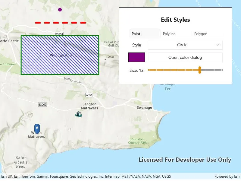
Customize the appearance of a geometry type with a symbol style suitable for the data. For example, a tourism office may use pictures of landmarks as symbols on an online map or app to help prospective visitors orient themselves more easily around a city. A point on the map styled with a circle could represent a drilled borehole location, whereas a cross could represent the location of an old coal mine shaft. A red line with a dashed style could represent a geological fault mapped on a geological map. A polygon with a brown ‘forward-diagonal’ fill style could represent an area of artificial ground mapped on a geological map.
How to use the sample
Tap “Edit Styles” and select a geometry to edit with the picker. Use the controls to change the symbol properties for the geometry.
How it works
- Create a
PictureMarkerSymbolorSimpleMarkerSymbolto style aPoint.- For the picture marker symbol, create it using a URL or image and set its height property.
- For the simple marker symbol, set the
Style,Color, andSizeproperties.
- Create a
SimpleLineSymbolto style aPolyline.- Set the
Style,Color, andSizeproperties.
- Set the
- Create a
SimpleFillSymbolto style aPolygon.- Set the
Style,Color, andOutlineproperties.
- Set the
- Create
Graphics using the geometries and symbols and add them to aGraphicsOverlay. - Add the graphics overlay to a
MapView.
Relevant API
- Geometry
- Graphic
- GraphicsOverlay
- PictureMarkerSymbol
- SimpleFillSymbol
- SimpleLineSymbol
- SimpleMarkerSymbol
Tags
display, fill, graphics, line, marker, overlay, picture, point, symbol, visualization
Sample code
// Copyright 2024 Esri.//// Licensed under the Apache License, Version 2.0 (the "License"); you may not use this file except in compliance with the License.// You may obtain a copy of the License at: http://www.apache.org/licenses/LICENSE-2.0//// Unless required by applicable law or agreed to in writing, software distributed under the License is distributed on an// "AS IS" BASIS, WITHOUT WARRANTIES OR CONDITIONS OF ANY KIND, either express or implied. See the License for the specific// language governing permissions and limitations under the License.
using Esri.ArcGISRuntime.Geometry;using Esri.ArcGISRuntime.Mapping;using Esri.ArcGISRuntime.Symbology;using Esri.ArcGISRuntime.UI;using Microsoft.UI.Xaml;using Microsoft.UI.Xaml.Controls;using Microsoft.UI.Xaml.Media;using System;using System.Collections.Generic;using System.IO;using System.Linq;using System.Reflection;using System.Threading.Tasks;using Color = System.Drawing.Color;
namespace ArcGIS.WinUI.Samples.StyleGeometryTypesWithSymbols{    [ArcGIS.Samples.Shared.Attributes.Sample(        name: "Style geometry types with symbols",        category: "Symbology",        description: "Use a symbol to display a geometry on a map.",        instructions: "Tap \"Edit Styles\" and select a geometry to edit with the picker. Use the controls to change the symbol properties for the geometry.",        tags: new[] { "display", "fill", "graphics", "line", "marker", "overlay", "picture", "point", "symbol", "visualization" })]    [ArcGIS.Samples.Shared.Attributes.OfflineData()]    public partial class StyleGeometryTypesWithSymbols    {        // Item sources for the combo boxes.        public List<SimpleMarkerSymbolStyle> SimpleMarkerSymbolStyles => Enum.GetValues(typeof(SimpleMarkerSymbolStyle)).Cast<SimpleMarkerSymbolStyle>().ToList();        public List<SimpleLineSymbolStyle> SimpleLineSymbolStyles => Enum.GetValues(typeof(SimpleLineSymbolStyle)).Cast<SimpleLineSymbolStyle>().ToList();        public List<SimpleFillSymbolStyle> SimpleFillSymbolStyles => Enum.GetValues(typeof(SimpleFillSymbolStyle)).Cast<SimpleFillSymbolStyle>().ToList();
        // Hold the selected graphic.        private Graphic _selectedGraphic;
        // Flag indicating if styling should be applied to a polygon's fill or outline.        private bool _stylingPolygonFill = true;
        public StyleGeometryTypesWithSymbols()        {            InitializeComponent();            _ = Initialize();        }
        private async Task Initialize()        {            // Set the data context for UI bindings.            DataContext = this;
            // Create a new map with a topographic basemap initially centered on Woolgarston, England.            MyMapView.Map = new Map(BasemapStyle.ArcGISTopographic)            {                InitialViewpoint = new Viewpoint(new MapPoint(-225e3, 6_553e3, SpatialReferences.WebMercator), 88e3)            };
            // A graphics overlay for displaying the geometry graphics on the map view.            var graphicsOverlay = new GraphicsOverlay();
            // Create the simple marker symbol for styling the point.            var pointSymbol = new SimpleMarkerSymbol(SimpleMarkerSymbolStyle.Circle, Color.Purple, 12);
            // Create simple line symbol for styling the polyline.            var polylineSymbol = new SimpleLineSymbol(SimpleLineSymbolStyle.Dash, Color.Red, 6);
            // Create the simple fill symbol for styling the polygon, including its outline.            var polygonSymbol = new SimpleFillSymbol(SimpleFillSymbolStyle.ForwardDiagonal, Color.Blue,                new SimpleLineSymbol(SimpleLineSymbolStyle.Solid, Color.Green, 3));
            // Create a point graphic and add it to the graphics overlay.            var point = new MapPoint(-225e3, 6_560e3, SpatialReferences.WebMercator);            var pointGraphic = new Graphic(point, pointSymbol);            graphicsOverlay.Graphics.Add(pointGraphic);
            // Create a polyline graphic and add it to the graphics overlay.            var points = new MapPoint[2]            {                new MapPoint(-223e3, 6_559e3, SpatialReferences.WebMercator),                new MapPoint(-227e3, 6_559e3, SpatialReferences.WebMercator)            };            var polyline = new Polyline(points, SpatialReferences.WebMercator);            var polylineGraphic = new Graphic(polyline, polylineSymbol);            graphicsOverlay.Graphics.Add(polylineGraphic);
            // Create a polygon graphic and add it to the graphics overlay.            points = new MapPoint[4]            {                new MapPoint(-222e3, 6_558e3, SpatialReferences.WebMercator),                new MapPoint(-228e3, 6_558e3, SpatialReferences.WebMercator),                new MapPoint(-228e3, 6_555e3, SpatialReferences.WebMercator),                new MapPoint(-222e3, 6_555e3, SpatialReferences.WebMercator)            };            var polygon = new Polygon(points, SpatialReferences.WebMercator);            var polygonGraphic = new Graphic(polygon, polygonSymbol);            graphicsOverlay.Graphics.Add(polygonGraphic);
            // Create a graphic with a picture marker symbol (image resource) and add it to the graphics overlay.            var pinGraphic = await MakePictureMarkerSymbolFromImage(new MapPoint(-226_770, 6_550_470, SpatialReferences.WebMercator));            graphicsOverlay.Graphics.Add(pinGraphic);
            // Create a graphic with a picture marker symbol (URL) and add it to the graphics overlay.            var imageUri = new Uri("https://static.arcgis.com/images/Symbols/OutdoorRecreation/Camping.png");            var campsiteSymbol = new PictureMarkerSymbol(imageUri)            {                Width = 25,                Height = 25            };            var campsitePoint = new MapPoint(-223_560, 6_552_020, SpatialReferences.WebMercator);            var campsiteGraphic = new Graphic(campsitePoint, campsiteSymbol);            graphicsOverlay.Graphics.Add(campsiteGraphic);
            // Add the graphics overlay to the map view.            MyMapView.GraphicsOverlays.Add(graphicsOverlay);        }
        private async Task<Graphic> MakePictureMarkerSymbolFromImage(MapPoint point)        {            // Hold a reference to the picture marker symbol.            PictureMarkerSymbol pinSymbol;
            // Get current assembly that contains the image.            Assembly currentAssembly = Assembly.GetExecutingAssembly();
            // Get the resource name of the blue pin star image            string resourceStreamName = this.GetType().Assembly.GetManifestResourceNames().Single(str => str.EndsWith("pin_star_blue.png"));
            // Load the resource stream            using (Stream resourceStream = this.GetType().Assembly.GetManifestResourceStream(resourceStreamName))            {                // Create new symbol using asynchronous factory method from stream.                pinSymbol = await PictureMarkerSymbol.CreateAsync(resourceStream);                pinSymbol.Width = 60;                pinSymbol.Height = 60;                // The image is a pin; offset the image so that the pinpoint is on the point rather than the image's true center.                pinSymbol.LeaderOffsetX = 30;                pinSymbol.OffsetY = 14;            }
            return new Graphic(point, pinSymbol);        }
        #region UI event handlers
        private void GeometryTypeTabControl_SelectionChanged(object sender, SelectionChangedEventArgs e)        {            // Get the tab control.            TabView tabView = sender as TabView;
            // Update the selected graphic based on the selected tab.            switch (tabView.SelectedIndex)            {                // Point                case 0:                    _selectedGraphic = MyMapView.GraphicsOverlays[0].Graphics[0];                    break;                // Polyline                case 1:                    _selectedGraphic = MyMapView.GraphicsOverlays[0].Graphics[1];                    break;                // Polygon                case 2:                    _selectedGraphic = MyMapView.GraphicsOverlays[0].Graphics[2];                    break;            }        }
        private void StyleComboBox_SelectionChanged(object sender, SelectionChangedEventArgs e)        {            // Selected graphic will be null when initializing the UI.            if (_selectedGraphic == null) return;
            // Get the selected combo box item.            var comboBox = sender as ComboBox;
            // Update the symbol style based on the selected combo box item.            switch (_selectedGraphic.Geometry.GeometryType)            {                case GeometryType.Point:                    ((SimpleMarkerSymbol)_selectedGraphic.Symbol).Style = (SimpleMarkerSymbolStyle)comboBox.SelectedItem;                    break;
                case GeometryType.Polyline:                    ((SimpleLineSymbol)_selectedGraphic.Symbol).Style = (SimpleLineSymbolStyle)comboBox.SelectedItem;                    break;
                case GeometryType.Polygon:                    var symbol = (SimpleFillSymbol)_selectedGraphic.Symbol;                    if (_stylingPolygonFill)                    {                        symbol.Style = (SimpleFillSymbolStyle)comboBox.SelectedItem;                    }                    else                    {                        symbol.Outline = new SimpleLineSymbol((SimpleLineSymbolStyle)comboBox.SelectedItem, symbol.Outline.Color, symbol.Outline.Width);                    }                    break;            }        }
        private async void ColorDialogButton_Click(object sender, RoutedEventArgs e)        {            // The content dialog's child is a color picker.            var colorPicker = ColorDialog.Content as ColorPicker;
            // Get the color preview border.            var border = (sender as Button).Tag as Border;
            // Set the color picker's color to the current symbol color.            colorPicker.Color = (border.Background as SolidColorBrush).Color;
            // Allow the user to select a color.            await ColorDialog.ShowAsync();
            // Update the color preview border.            border.Background = new SolidColorBrush(colorPicker.Color);
            // Convert the color to a System.Drawing.Color.            var color = Color.FromArgb(colorPicker.Color.A, colorPicker.Color.R, colorPicker.Color.G, colorPicker.Color.B);
            // Update the symbol color based on the selected geometry type.            switch (_selectedGraphic.Geometry.GeometryType)            {                case GeometryType.Point:                    ((SimpleMarkerSymbol)_selectedGraphic.Symbol).Color = color;                    break;
                case GeometryType.Polyline:                    ((SimpleLineSymbol)_selectedGraphic.Symbol).Color = color;                    break;
                case GeometryType.Polygon:                    var symbol = (SimpleFillSymbol)_selectedGraphic.Symbol;                    if (_stylingPolygonFill)                    {                        symbol.Color = color;                    }                    else                    {                        symbol.Outline.Color = color;                    }                    break;            }        }
        private void SizeSlider_ValueChanged(object sender, Microsoft.UI.Xaml.Controls.Primitives.RangeBaseValueChangedEventArgs e)        {            // Selected graphic will be null when initializing the UI.            if (_selectedGraphic == null) return;
            // Update the symbol size based on the selected geometry type.            switch (_selectedGraphic.Geometry.GeometryType)            {                case GeometryType.Point:                    ((SimpleMarkerSymbol)_selectedGraphic.Symbol).Size = e.NewValue;                    break;
                case GeometryType.Polyline:                    ((SimpleLineSymbol)_selectedGraphic.Symbol).Width = e.NewValue;                    break;
                case GeometryType.Polygon:                    ((SimpleFillSymbol)_selectedGraphic.Symbol).Outline.Width = e.NewValue;                    break;            }        }
        #region Polygon styling
        private void PolygonFillStyleComboBox_SelectionChanged(object sender, SelectionChangedEventArgs e)        {            _stylingPolygonFill = true;            StyleComboBox_SelectionChanged(sender, e);        }
        private void PolygonOutlineStyleComboBox_SelectionChanged(object sender, SelectionChangedEventArgs e)        {            _stylingPolygonFill = false;            StyleComboBox_SelectionChanged(sender, e);        }
        private void PolygonFillColorDialogButton_Click(object sender, RoutedEventArgs e)        {            _stylingPolygonFill = true;            ColorDialogButton_Click(sender, e);        }
        private void PolygonOutlineColorDialogButton_Click(object sender, RoutedEventArgs e)        {            _stylingPolygonFill = false;            ColorDialogButton_Click(sender, e);        }
        #endregion Polygon styling
#endregion UI event handlers }}<UserControl x:Class="ArcGIS.WinUI.Samples.StyleGeometryTypesWithSymbols.StyleGeometryTypesWithSymbols" xmlns="http://schemas.microsoft.com/winfx/2006/xaml/presentation" xmlns:x="http://schemas.microsoft.com/winfx/2006/xaml" xmlns:esri="using:Esri.ArcGISRuntime" xmlns:esriUI="using:Esri.ArcGISRuntime.UI.Controls"> <UserControl.Resources> <Style TargetType="Button"> <Setter Property="Margin" Value="5" /> <Setter Property="HorizontalAlignment" Value="Stretch" /> </Style> <Style TargetType="ComboBox"> <Setter Property="Margin" Value="5" /> <Setter Property="HorizontalAlignment" Value="Stretch" /> <Setter Property="HorizontalContentAlignment" Value="Center" /> </Style> <Style TargetType="Slider" BasedOn="{StaticResource DefaultSliderStyle}"> <Setter Property="Margin" Value="5" /> <Setter Property="VerticalAlignment" Value="Center" /> </Style> <Style TargetType="TabView"> <Setter Property="Margin" Value="5" /> </Style> <Style TargetType="TabViewItem"> <Setter Property="IsClosable" Value="False" /> </Style> <Style TargetType="TextBlock"> <Setter Property="Margin" Value="5" /> <Setter Property="VerticalAlignment" Value="Center" /> <Setter Property="HorizontalAlignment" Value="Center" /> </Style> <Style TargetType="Border"> <Setter Property="BorderThickness" Value="1" /> <Setter Property="BorderBrush" Value="Black" /> <Setter Property="Margin" Value="5" /> </Style> </UserControl.Resources> <Grid> <esriUI:MapView x:Name="MyMapView" /> <Border Style="{StaticResource BorderStyle}"> <StackPanel> <TextBlock HorizontalAlignment="Center" FontSize="20" FontWeight="Bold" Text="Edit Styles" /> <TabView CanDragTabs="False" CanReorderTabs="False" IsAddTabButtonVisible="False" SelectionChanged="GeometryTypeTabControl_SelectionChanged"> <TabViewItem Header="Point"> <Grid> <Grid.ColumnDefinitions> <ColumnDefinition Width="*" /> <ColumnDefinition Width="4*" /> </Grid.ColumnDefinitions> <Grid.RowDefinitions> <RowDefinition Height="*" /> <RowDefinition Height="*" /> <RowDefinition Height="*" /> </Grid.RowDefinitions> <TextBlock Text="Style" /> <ComboBox Grid.Column="1" ItemsSource="{Binding SimpleMarkerSymbolStyles}" SelectedIndex="0" SelectionChanged="StyleComboBox_SelectionChanged" /> <Border x:Name="PointColorPreview" Grid.Row="1" Background="Purple" /> <Button Grid.Row="1" Grid.Column="1" Click="ColorDialogButton_Click" Content="Open color dialog" Tag="{x:Bind PointColorPreview}" /> <TextBlock Grid.Row="2"> <Run Text="Size:" /> <Run Text="{Binding ElementName=PointSizeSlider, Path=Value}" /> </TextBlock> <Slider x:Name="PointSizeSlider" Grid.Row="2" Grid.Column="1" Maximum="15" Minimum="5" SmallChange="1" TickFrequency="1" ValueChanged="SizeSlider_ValueChanged" Value="12" /> </Grid> </TabViewItem> <TabViewItem Header="Polyline"> <Grid> <Grid.ColumnDefinitions> <ColumnDefinition Width="*" /> <ColumnDefinition Width="4*" /> </Grid.ColumnDefinitions> <Grid.RowDefinitions> <RowDefinition Height="*" /> <RowDefinition Height="*" /> <RowDefinition Height="*" /> </Grid.RowDefinitions> <TextBlock Text="Style" /> <ComboBox Grid.Column="1" ItemsSource="{Binding SimpleLineSymbolStyles}" SelectedIndex="2" SelectionChanged="StyleComboBox_SelectionChanged" /> <Border x:Name="PolylineColorPreview" Grid.Row="1" Background="Red" /> <Button Grid.Row="1" Grid.Column="1" Click="ColorDialogButton_Click" Content="Open color dialog" Tag="{x:Bind PolylineColorPreview}" /> <TextBlock Grid.Row="2"> <Run Text="Size:" /> <Run Text="{Binding ElementName=PolylineWidthSlider, Path=Value}" /> </TextBlock> <Slider x:Name="PolylineWidthSlider" Grid.Row="2" Grid.Column="1" Maximum="10" Minimum="1" SmallChange="1" TickFrequency="1" ValueChanged="SizeSlider_ValueChanged" Value="6" /> </Grid> </TabViewItem> <TabViewItem Header="Polygon"> <Grid> <Grid.ColumnDefinitions> <ColumnDefinition Width="*" /> <ColumnDefinition Width="4*" /> </Grid.ColumnDefinitions> <Grid.RowDefinitions> <RowDefinition Height="*" /> <RowDefinition Height="*" /> <RowDefinition Height="*" /> <RowDefinition Height="*" /> <RowDefinition Height="*" /> <RowDefinition Height="*" /> <RowDefinition Height="*" /> <RowDefinition Height="*" /> </Grid.RowDefinitions> <TextBlock Grid.ColumnSpan="2" HorizontalAlignment="Center" FontWeight="Bold" Text="Fill" /> <TextBlock Grid.Row="1" Text="Style" /> <ComboBox x:Name="PolygonFillStyles" Grid.Row="1" Grid.Column="1" ItemsSource="{Binding SimpleFillSymbolStyles}" SelectedIndex="3" SelectionChanged="PolygonFillStyleComboBox_SelectionChanged" /> <Border x:Name="PolygonFillColorPreview" Grid.Row="2" Background="Blue" /> <Button Grid.Row="2" Grid.Column="1" Click="PolygonFillColorDialogButton_Click" Content="Open color dialog" Tag="{x:Bind PolygonFillColorPreview}" /> <TextBlock Grid.Row="3" Grid.ColumnSpan="2" HorizontalAlignment="Center" FontWeight="Bold" Text="Outline" /> <TextBlock Grid.Row="4" Text="Style" /> <ComboBox Grid.Row="4" Grid.Column="2" ItemsSource="{Binding SimpleLineSymbolStyles}" SelectedIndex="5" SelectionChanged="PolygonOutlineStyleComboBox_SelectionChanged" /> <Border x:Name="PolygonOutlineColorPreview" Grid.Row="5" Background="Green" /> <Button Grid.Row="5" Grid.Column="1" Click="PolygonOutlineColorDialogButton_Click" Content="Open color dialog" Tag="{x:Bind PolygonOutlineColorPreview}" /> <TextBlock Grid.Row="6"> <Run Text="Size:" /> <Run Text="{Binding ElementName=PolygonOutlineWidthSlider, Path=Value}" /> </TextBlock> <Slider x:Name="PolygonOutlineWidthSlider" Grid.Row="6" Grid.Column="1" Maximum="10" Minimum="1" SmallChange="1" TickFrequency="1" ValueChanged="SizeSlider_ValueChanged" Value="3" /> </Grid> </TabViewItem> </TabView> </StackPanel> </Border> <ContentDialog x:Name="ColorDialog" CloseButtonText="Apply"> <ColorPicker HorizontalAlignment="Center" VerticalAlignment="Center" /> </ContentDialog> </Grid></UserControl>