Widgets can support multi-language configuration by implementing the Builder. This allows users to translate widget configuration properties, such as labels and tooltips, in the builder translation settings panel.
If your widget settings page does not include any configurable string input, you do not need to implement multi-language support.
How it works
To support multiple languages, define translatable configuration keys through an extension:
- Implement
Builderand return an array ofOperations Extension Translationobjects fromKey get.Translation Key - Each
Translationmaps a widget configuration field to a translation entry that appears in the builder translation settings panel.Key
How to use multi-language support
Here are the steps to work with multi-language support in your widgets:
1. Declare the extension
Add the builder extension point to your widget's manifest.json:
"extensions": [
{
"name": "builderOperations",
"point": "BUILDER_OPERATIONS",
"uri": "tools/builder-operations"
}
]2. Create the extension file
Once you have declared the extension in manifest.json, create a file named tools/builder-operations.ts in your widget folder. This file will contain the implementation of the Builder class.
3. Implement the extension class
Implement the Builder interface, specifically the get method. This method should return an array of Translation objects that define which configuration properties are translatable.
Example:
import type { extensionSpec, IMAppConfig } from 'jimu-core';
import { defaultMessages as jimuUIMessage } from 'jimu-ui';
import defaultMessage from '../setting/translations/default';
const messages = Object.assign({}, jimuUIMessage, defaultMessage);
export default class BuilderOperations implements extensionSpec.BuilderOperationsExtension {
id = 'button-builder-operation'
widgetId: string
getTranslationKey(appConfig: IMAppConfig): Promise<extensionSpec.TranslationKey[]> {
const functionConfig = appConfig.widgets[this.widgetId].config.functionConfig;
const keys: extensionSpec.TranslationKey[] = [];
if (functionConfig.toolTip) {
keys.push({
keyType: 'value',
key: `widgets.${this.widgetId}.config.functionConfig.toolTip`,
label: {
key: 'tooltip',
enLabel: messages.tooltip
},
valueType: 'text'
});
}
if (functionConfig.text) {
keys.push({
keyType: 'value',
key: `widgets.${this.widgetId}.config.functionConfig.text`,
label: {
key: 'text',
enLabel: messages.text
},
valueType: 'text'
});
}
return Promise.resolve(keys);
}
}4. Test your changes
In the the builder's translation setting panel:
- Add a widget to a page in Experience Builder.
- Set some values for the properties you defined in the widget configuration.
- Open the translation setting panel in the builder.
- Add languages other than the main locale.
- Expand the panel to see the translation keys you defined.
- Save the app.
Once the translation keys are defined in the builder, you can test them in runtime:
- Add a Language Switcher widget
- Preview the app to test. The Language Switcher widget does not work when the app is opened in the builder.
TranslationKey properties
The Translation object has the following properties:
| Property | Type | Description |
|---|---|---|
key | 'value' | 'group' | Required. Use 'value' for translatable fields and 'group' for structural grouping. |
key | string | Required. Unique identifier used to correlate with the config. |
label | string | I18n | Required. The display label. Can be a plain string or an I18n object. |
group | string | Optional. Set this to the key of the parent group entry if this key belongs to a group. This creates an explicit parent-child relationship used to render children inside the group's collapsible panel. The parent can be either a top-level group or another nested group. |
value | 'text' | 'textarea' | 'rich-text' | 'rich-text-with-plugins' | 'expression' | Optional. Input control type. 'text' for single line, 'textarea' for multi-line, 'rich-text' for rich text editor, 'rich-text-with-plugins' for rich text with additional plugins, 'expression' for expression builder. Defaults to 'text'. |
default | string | Optional. Default value if the value cannot be retrieved from the config by the key. |
I18nLabel interface
The I18n interface allows you to define a label that supports interpolation of dynamic values. This is useful when the label needs to include variable content, such as layer names or field names.
| Property | Type | Description |
|---|---|---|
key | string | Required. The i18n key in translation resources. |
en | string | Required. The English label, used as a fallback or reference. |
values | {[key | Optional. Values for interpolation in the i18n string. |
Code examples
The following examples cover common Translation scenarios. You can combine these examples as needed.
Refer to the flowchart below to determine the best structure for your widget.
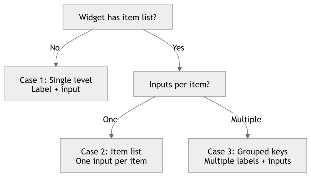
Single level with only a label and an input box
Use this when you need one translatable field with a direct label-to-input mapping.
Scenario
- Widget structure is simple
- No item list
- All labels are unique
Structure
- Label
- Input
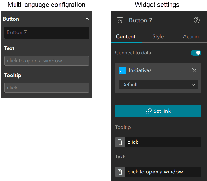
Example widgets: Button.
{
keyType: 'value',
key: `widgets.${this.widgetId}.config.functionConfig.toolTip`,
label: {
key: 'tooltip',
enLabel: messages.tooltip
},
valueType: 'text'
}
Single level with multiple items, each only containing a label and an input box
Use this when a widget contains an item list, each item has only one configurable input, and labels may repeat across items.
Scenario
- Widget contains an item list
- Each item contains only one configurable input box
- Labels may repeat
Structure
- Label / Hint for Item_num
- Input
Core rule: Differentiate labels by item content or index. If the item contains only one input, use the item name directly in the label, such as Name for Bookmark 1.
Example widgets: Basemap Gallery.
{
keyType: 'value',
key: `widgets.${this.widgetId}.config.items.${itemId}.label`,
label: {
key: 'labelForItem',
enLabel: 'Label for {item}',
values: { item: itemName }
},
valueType: 'text'
}Grouping translation keys
Widget with multiple items/maps/layers: each contains multiple labels and input boxes.
Scenario
- Widget contains an item list
- Each item contains two or more input boxes
Structure

Use key to create a collapsible grouping panel for related translation keys. Set the group property on each child key to the key of the parent group to establish the parent-child relationship. Children are rendered inside the collapsible panel indented under the group header. Groups can be nested by pointing a child group's group to another group.
Use this when multiple related fields should be organized under one collapsible section.
For widgets with nested items, include enough context in labels to avoid ambiguous translation entries. For example, a Filter clause label can use Hint for clause 1 or Label for predefined value "abc" in clause 2.
// Top-level group header
{
keyType: 'group',
key: `widgets.${this.widgetId}.config.group1`,
label: 'Group Label'
}
// Nested group header
{
keyType: 'group',
key: `widgets.${this.widgetId}.config.group1.layer1`,
groupKey: `widgets.${this.widgetId}.config.group1`,
label: 'Layer 1'
}
// Child value - linked to the group via groupKey
{
keyType: 'value',
key: `widgets.${this.widgetId}.config.group1.layer1.title`,
groupKey: `widgets.${this.widgetId}.config.group1.layer1`,
label: 'Title',
valueType: 'text'
}
Example widgets: Select, Filter.
Multi-line text with default value
Use value for multi-line input.
Use this when users need to edit paragraph-length content.
{
keyType: 'value',
key: `widgets.${this.widgetId}.config.description`,
label: 'Description', // Simple string label
valueType: 'textarea'
}Rich text content
Use value for rich text editor input.
Use this when you need formatted text without additional rich-text plugins.
{
keyType: 'value',
key: 'cookieBanner.displayRichText',
label: {
key: 'optionalBannerDefaultText',
enLabel: messages.cookieNotice
},
valueType: 'rich-text'
}Rich text with plugins
Use value for rich text editor with additional plugins. Such as inserting images and expressions.
Use this when you need rich-text content plus plugin-enabled authoring features.
{
keyType: 'value',
key: `widgets.${this.widgetId}.config.text`,
label: {
key: 'textContent',
enLabel: messages.textContent
},
valueType: 'rich-text-with-plugins'
}Expression builder
Use value for expression-based values.
Use this when field values are dynamic and should be defined with expressions.
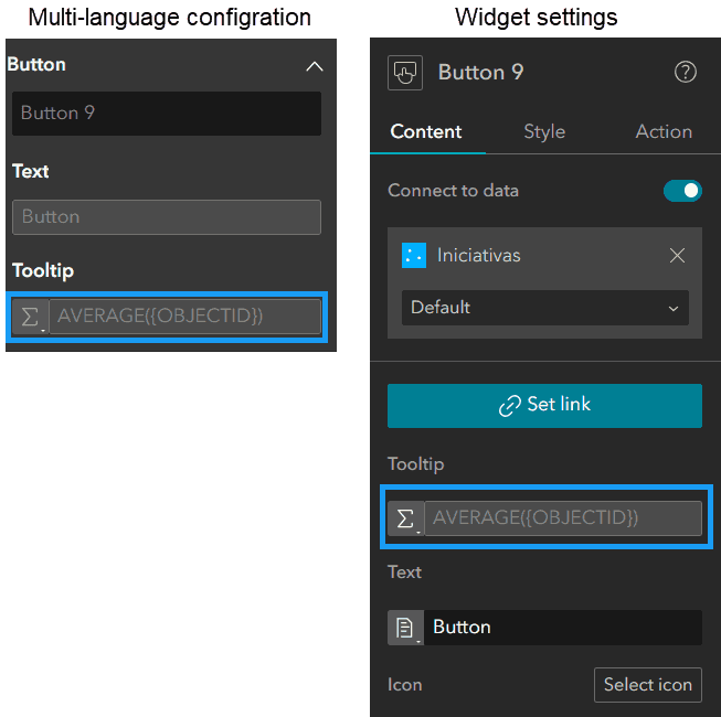
Example widgets: Button connected to a data source with tooltip configured using an expression.
{
keyType: 'value',
key: `widgets.${this.widgetId}.config.functionConfig.toolTipExpression`,
label: {
key: 'tooltip',
enLabel: messages.tooltip
},
valueType: 'expression'
}