May 2026
Initiatives
Component consistency
Input components clear button alignment
Input-based components like Autocomplete, Combobox and Input provide a consistent experience with their clear buttons. The newly added clear button implemented across the components leverage Actions to ensure consistent spacing, alignment, and a minimum hit target size across inputs.
Input components before clear button alignment (v5.0) | Input components after clear button alignment (v5.1) |
|---|---|

|

|
Add scale property to various components
The Card, Card Group, Navigation, Navigation Logo, Navigation User, and Tooltip components now support different sizes through the scale property. Sizing aligns closely with patterns used throughout Calcite components, where the "m" (medium) scale value preserves the same visual appearance as before the introduction of the scale property.

Add heading and description slots to various components
Dedicated heading and description slots have been added to Dialog, Flow Item, and Panel for supporting more highly customizable content. The existing heading and description properties are intended for plain text content, while the new slots allow custom HTML for elements such as styled text, icons, and links. The slots provide more flexibility for complex header content without requiring the entire header region to be replaced.

<calcite-flow>
<calcite-flow-item description="Can be used in conjuction with description property">
<div slot="heading">
Using the <b style="color:var(--calcite-color-brand)">heading slot</b> for custom content
</div>
...
</calcite-flow-item>
</calcite-flow>Dialog and Panel spacing styles
Dialog and Panel now support additional design tokens for customizing spacing within their top and bottom content regions via CSS variables. The new tokens provide improved flexibility when adapting component spacing to different application designs and workflows.
- Dialog
--calcite-dialog-content-top-space--calcite-dialog-content-bottom-space
- Panel
--calcite-panel-content-top-space--calcite-panel-content-bottom-space

Archived versions of documentation site
Starting with version 3.3, archived versions of Calcite Design System's documentation site are available for reference and historical purposes. Archived documentation is not updated and may not reflect the latest Calcite functionality or guidance. Links to archived versions are listed on the Archive page, which can be found in the side navigation of the Calcite documentation site.

Feature enhancements
- List's
empty-contentslot - List Item Group's sticky
headings - Autocomplete Item's
selectedproperty - Action's
overflowpropertyDisabled - Action Group's
overflowpropertyActions Disabled - Carousel's
paginationpropertyPosition - Combobox's
selectionpropertyAppearance - Dropdown's
placementandreferenceadditionsElement - Tooltip's
pointerpropertyDisabled
List's empty-content slot
List now supports an empty-content slot for displaying placeholder content when the component has no child List Items. The new slot lets developers customize the empty-state experience and provides clearer context for empty Lists. For example, in empty drag Lists the empty-content slot provides a better drag-and-drop experience by expanding the visible drop target area. The slotted content is dynamically displayed when the List is empty and hidden when items are added.
<calcite-list label="Completed tasks">
<calcite-notice slot="empty-content" open icon="plus-circle" aria-live="assertive">
<div slot="title">No completed tasks yet</div>
<div slot="message">Drag completed tasks here to add them.</div>
</calcite-notice>
</calcite-list>
empty-content slot.List Item Group's sticky headings
List Item Group helps organize Lists by displaying specified headings, such as layer types or categories. These headings are now sticky by default, keeping the current group visible while users scroll, helping them stay oriented in grouped Lists. When the next group reaches the top of the List, its heading replaces the previous one. For nested groups, only the lowest-level group heading stays visible.

Autocomplete Item's selected property
Autocomplete Item now supports a selected property to show the current selection while users view the list of options. The new property makes it easier for users to identify which option is currently selected, improving clarity and accessibility when interacting with Autocomplete's search results.

Action's overflow property
Action features a new overflow property that prevents it from being moved into an overflow menu when its parent Action Bar becomes too small to fit all of its child Actions. This is helpful for ensuring important or active Actions are always visible to users regardless of the Action Bar's size.
To comply with accessibility standards and ensure keyboard operability, Actions with overflow should be placed in the DOM matching the order that they appear visually.
<calcite-action-bar expand-disabled style="width: 50px">
<calcite-action-group>
<calcite-action icon="plus" text="Add" overflow-disabled></calcite-action>
<calcite-action icon="save" text="Save" overflow-disabled></calcite-action>
<calcite-action icon="trash" text="Delete"></calcite-action>
<calcite-action icon="undo" text="Undo"></calcite-action>
<calcite-action icon="redo" text="Redo"></calcite-action>
</calcite-action-group>
</calcite-action-bar>
overflowDisabled is not specified, the "Save" Action displayed would be moved into the component's overflow menu due to the Action Bar's limited width.Action Group's overflow property
Action Group offers an overflow property for more control on collapsing behavior in space constrained layouts. The property gives developers more flexibility to prioritize important actions and ensures users always have access to key controls, even when space is limited.

Carousel's pagination property
Carousel allows additional configuration of its pagination using the pagination property to place navigation above Carousel Item content. Navigation at the top of the component keeps controls visible when content extends beyond the viewport.
<calcite-carousel pagination-position="top">
...
</calcite-carousel>
Combobox's selection property
Combobox introduces the selection property to support an alternative appearance for selected Combobox Item children. By default, Combobox uses the existing "icon" styling. The "highlight" value communicates the selected state in an alternate manner by applying a background color and adjusting text formatting, matching the styling of Autocomplete. The "highlight" appearance provides more flexibility along with visual consistency when using Combobox alongside other components, such as Autocomplete.
<calcite-combobox selection-appearance="highlight">
<calcite-combobox-item value="personal" text="Personal"></calcite-combobox-item>
<calcite-combobox-item value="education" heading="Education"></calcite-combobox-item>
<calcite-combobox-item value="business" heading="Business"></calcite-combobox-item>
</calcite-combobox>
Dropdown's placement and reference additions
Dropdown has received two enhancements that provide more control over how and where the component is opened.
The placement property adds support for all values from the Logical type, most notably values that allow for placement on the sides of the reference element such as "left", "right", "left-start", "right-end", etc. These new options support more use cases and workflows where specific placement is necessary for an improved user experience.
The new reference property provides more control over what element the Dropdown is positioned against and triggered by. Previously, this behavior was handled by the trigger slot, which is now deprecated and will be removed in v7.0. Unlike the trigger slot, reference can be set programmatically to any HTML or a virtual element, allowing for more complex markup and supporting use cases such as context menus or input field suggestions.
<calcite-action text="Sort" id="sort-action" icon="arrow-up-down"></calcite-action>
<!-- Attribute usage -->
<calcite-dropdown placement="right-start" reference-element="sort-action">
<calcite-dropdown-group group-title="Sort order">
<calcite-dropdown-item>Date - Ascending</calcite-dropdown-item>
...
</calcite-dropdown-group>
</calcite-dropdown>
<!-- Or set programmatically -->
<script>
const dropdown = document.querySelector("calcite-dropdown");
const referenceElement = document.querySelector("#sort-action");
dropdown.referenceElement = referenceElement;
</script>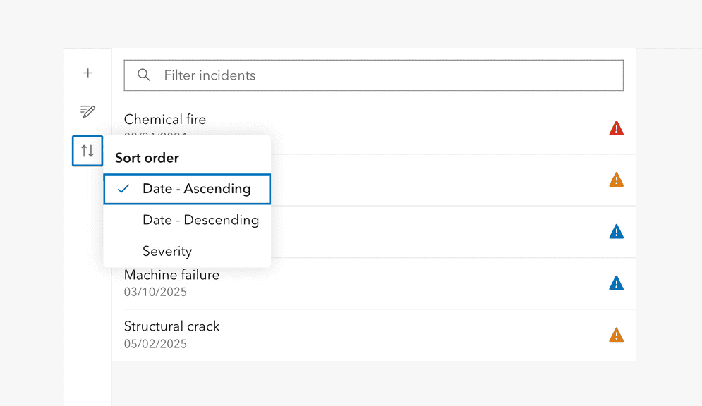
Tooltip's pointer property
Tooltip introduces a pointer property that allows for the removal of the caret pointer associated with the Tooltip's reference. Removing the pointer can be useful for certain user experiences where the pointer interferes with other elements or the desired spacing.
<calcite-link id="learn-gis">Learn about GIS</calcite-link>
<calcite-tooltip pointer-disabled reference-element="learn-gis" placement="top" offset-distance="-0.5">
<span>Geographic Information Systems, what are they?</span>
</calcite-tooltip>
Accessibility and internationalization improvements
- Nested component escape handling
- Action Bar expand placement positioning
- Dark mode contrast improvements
Nested component escape handling
Components that support focus trapping, such as Popover, Dialog, Input Date Picker, and Input Time Picker, now follow the DOM's order and hierarchy when nested and closed using the Escape key.

Action Bar positioning, accessibility and RTL support
Action Bar offers additional placement configurations and customizable context of its expand/collapse button including:
- An
"actions-start"slot, which supports adding Actions to the start of the component - An
actionsproperty, which when specified, sets an accessible label on the component'sStart Group Label "actions-start"slot, providing context to assistive technologies - An
expandproperty, which specifies the position of the expand/collapse button at thePosition "start"or"end"of the component
The new placement configurations for Action Bar in 5.1 provide more flexibility in your apps, while supporting more individuals with the ability to add a customized label and support right-to-left (RTL) locales when dir is set to "rtl".

<calcite-action-bar expanded expand-position="end" layout="horizontal" actions-start-group-label="Map configurations">
<calcite-action slot="actions-start" text-enabled text="Add" icon="plus">
</calcite-action>
...
</calcite-action-bar>Dark mode contrast improvements
Dark mode semantic tokens offer enhanced color contrast for their interactive states of :hover and :press. In 5.1, the dark mode tokens meet accessible criteria for contrast ratios when in their default, hover, and press states for the brand and status colors when combined with --calcite-color-text-inverse.
| Token name | v5.0 | v5.1 | v5.1 HEX value and contrast ratio |
|---|---|---|---|
--calcite-color-brand-hover |

|

| #40 with a contrast ratio of 8.42:1 |
--calcite-color-brand-press |

|

| #80 with a contrast ratio of 10.95:1 |
--calcite-color-status-info-hover |

|

| #40 with a contrast ratio of 8.42:1 |
--calcite-color-status-info-press |

|

| #80 with a contrast ratio of 10.95:1 |
--calcite-color-status-success-hover |

|

| #6 with a contrast ratio of 12.82:1 |
--calcite-color-status-success-press |

|

| #9 with a contrast ratio of 13.74:1 |
--calcite-color-status-warning-hover |

|

| # with a contrast ratio of 10.08:1 |
--calcite-color-status-warning-press |

|

| # with a contrast ratio of 11.79:1 |
--calcite-color-status-danger-hover |

|

| # with a contrast ratio of 7.08:1 |
--calcite-color-status-danger-press |

|

| # with a contrast ratio of 8.88:1 |
Changes since February 2026
Below is a full list of changes since February, which include:
Features
- action-bar: Add
expandandPosition actionsproperties andStart Group Label actions-startslot (#13995) (56722f2) - action-group: Add
calcitefor selection tracking (#13969) (cc39f0d)Action Group Change - action-group: Add overflow-actions-disabled (#14430) (5dcd697)
- action: Add overflow-disabled property (#14438) (4feb078)
- autocomplete-item: Add selected property (#14137) (1f0b079)
- card, card-group: Add scale prop (#14299) (c8d507b)
- carousel: Add
pagination-positionproperty (#14276) (dbe559b) - combobox: Add
selectionproperty (#14043) (0199108)Appearance - dropdown, split-button, sort-handle: Add additional placement options (#14132) (7cb3def)
- dropdown: Add
referenceproperty (#14172) (c1bfd78)Element - floating-ui: Apply semantic shadow tokens to components (#14337) (fb75394)
- label: Skip label focus behavior if click event is canceled (#14412) (cdd67b4)
- list, list-item-group: Stick list item group header to the top of the list (#14030) (2cce8ce)
- navigation-logo, navigation-user: Remove heading's padding top when there is no description (#14374) (a3d99f5)
- navigation-logo: Update standalone heading font size (#14480) (5238f34)
- navigation, navigation-logo, navigation-user: Add scale prop (#14265) (6506874)
- navigation: Set scale on nested calcite navigation (#14428) (977deab)
- panel, dialog, flow: Add space tokens for
"content-top"and"content-bottom"slots (#13999) (0b73c1d) - panel, flow-item, dialog: Add rich
headinganddescriptionslots (#14179) (daa8b51) - sort-handle: Hide reorder group title when no sibling groups; disable boundary items instead of hiding (#14105) (2ffec6b)
- Support one
referencehaving multiple popovers or tooltips (#13960) (af02a90)Element - tooltip: Add
pointerandDisabled scaleproperties (#14078) (064ba80)
Bug Fixes
- action-bar, action-pad: Ensure actions remain tabbable when tabbed through (#14429) (1dfdf94)
- action-bar: Remove attributeFilter from MutationObserver (#14476) (24fe334)
- avatar, meter, table, text area, time picker: Apply line-height (#14161) (654dc86)
- block: Independently style icons based on CSS tokens (#14423) (b1f0c25)
- combobox, input-time-zone: Only cancel
Escapekey event when open or clearing text (#14382) (6c35a23) - combobox, menu, textarea: Apply line-height (#14236) (a5eaecf)
- combobox: Honor max-items property (#13959) (9cda075)
- date-picker: Show adjacent-month days in single-calendar range (#14111) (36922b5)
- date-picker: Update selected day text color fallback (#14470) (75bf589)
- dropdown: Focus the first item when opening instead of the first selected item (#14131) (197aefc)
- dropdown: Keep focus on trigger with single-component keyboard navigation (#14079) (d308547)
- filter: Do not cancel
Escapewhen value is empty (#13975) (6f36776) - flow-item: Support overriding collapse message (#14305) (8836712)
- Handle
Escapein expected order with focus-trapping and non-focus-trapping hierarchies (#14313) (b832222) - input-date-picker: Bump
focus-trapto pick up shadow DOM focus-handling fix (#14381) (4a068c2) - input-date-picker: Honor minAsDate & maxAsDate properties when set (#14375) (8bd57bd)
- input-time-zone: Ensure item labels update on locale/reference date change (#14365) (dc0b91e)
- input, input-number: Fix handling of input for locales with same group and decimal separators (#14112) (2dae3be)
- link: Display underline properly when text breaks to multiple lines (#13784) (ab5840a)
- list: Ensure filter input displays over sticky headers (#14469) (65d7f38)
- list: Fix nested list-item property inheritance in calcite-list (#14344) (ea798c8)
- list: Refresh filter item data when list item and group properties change (#14442) (d9b4e0d)
- list: Remove interactive states for
interaction-mode=static(#14433) (fc9b45f) - meter: Update border color (#14167) (573aaf9)
- sheet, shell-panel: Fix mouse resizing when direction is changed dynamically (#14279) (bf713a5)
- sheet: Restore shadow (#14439) (718d293)
- stepper, stepper-item: Fix box sizing to prevent scrollbar from being displayed (#14018) (86d7ed0)
- stepper: Fix updating items when component is used within a shadow dom and items are slotted (#14021) (bc7a74a)
- stepper: Only stepper content should expand to available height (#14001) (4e27c10)
- switch: Remove double focus ring in certain browsers (#14156) (7176ed0)
- tabs: Ensure tabs and titles are loaded before syncing ARIA state (#14493) (462d153)
- tree-item: Smooth out expanding items transition (#13712) (f00f58c)
- tree: Restore lines containment (#14251) (6c983f3)
- tree: Restore tabbing through items (#14441) (637ce35)
Compatibility
The 5.1 release of the ArcGIS Maps SDK for JavaScript^5.1.1.
If you are using version 5.0 it is recommended to use Calcite's 5.0.2, or any minor version greater than ^5.0.2.