February 2026
Improved drawing experience
The drawing system has been overhauled to enhance both new and existing 2D workflows, introducing true curve geometry support and a segment-focused drawing experience.
Segment-based drawing
Users can now switch between drawing tools (line, freehand, and new curve tools) while actively drawing geometry segments on a polyline or polygon. This improvement allows for finer-grained control when digitizing geometries. This is integrated natively into the Sketch and Editor component user interfaces.
Curve support
At this release, we added support for drawing, editing, querying, and snapping with true curve segments. A user will now be able to construct geometries containing curve segments when drawing. New curve tools include Bezier curve, Arc segment, and Endpoint arc segment tools, enabling the construction of Bezier and circular arcs.
Additionally, it is now possible to convert an existing straight-line segment to circular arcs by holding Shift and dragging the midpoint vertex manipulator of the straight-line segment.
The new curve drawing tools are integrated natively into the Sketch and Editor components.
Editor snapping and true curve support
Update and create workflows with true curves
Editor now natively supports adding and updating geometries with true curves. For editing workflows, support is dependent on the feature service capabilities. The drawing toolbar will display the segment tools while drawing a polyline or polygon, including the new curve tools.
-
Update: If the feature service supports true curves, Editor fetches and allows modification of curve geometries. If the service does not support updating true curves, then geometry updates will be turned off for the true curve geometries.
-
Create: Regardless of whether the feature service supports true curves or not, Editor will provide the curve drawing tools to construct curve geometries. If the service doesn’t support the drawn curve type, segments are densified upon submission, with a warning provided to the user.
Snapping with true curves
The snapping engine now supports true curves, allowing snapping to any point along a curve segment. Snapping behavior depends on feature service support; unsupported curve types revert to densified geometry snapping.
Z Snapping support (2D)
Editor now supports Z snapping in 2D. When snapping is enabled, the z-value (elevation) of the feature being created or edited is preserved from the vertex or point it snaps to. In the example below, a Street Light point feature is added along a Low Voltage line in a utility network. Snapping to different vertices updates the point’s z-value shown in the tooltip to match the snapped vertex. This is supported in both create and update workflows and is available starting in patch 5.0.16.
FeatureTable enhancements
Contingent Attribute Value Constraints
The FeatureTable component and widget now respect contingent attribute value constraints during cell editing, with no additional configuration required. When contingent values are configured in the data, the FeatureTable automatically presents the recommended values while editing. Automatic saving is disabled so that invalid entries are flagged in the UI, giving users a chance to correct them before saving.
Disable auto-save behavior
It is now possible to disable automatic saving while editing in the FeatureTable component and widget. By default, any updates made to individual cell values are saved without needing any manual interaction to save. This behavior is disabled by default for data that contains contingent attribute values. Applications can be configured to disable automatic saving regardless of the dataset being edited. This is handled by setting the autoSaveDisabled to true. The FeatureTable will display a UI to proceed with saving edits.
Improved attachment viewing experience
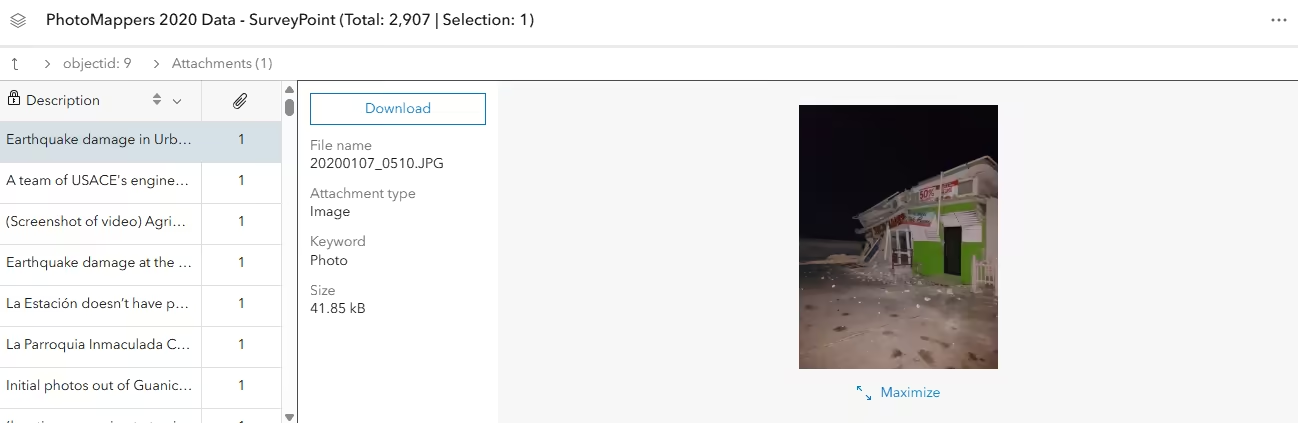
The default attachment viewing experience in the FeatureTable component and widget has been enhanced to provide richer file details, including name, type, size, and keywords. Image attachments can now be viewed directly within the table and expanded to full-page view without opening a new browser tab. This improvement streamlines review and editing workflows while minimizing context switching.
Syncing selection via SelectionManager (beta)
The SelectionManager (currently in beta), manages feature selection across layers and tables within a MapView or SceneView to help manage feature selection. It can be configured to listen for edits on selectable layers and automatically update selections in response, providing a centralized way to manage selection state within a view.
To support this workflow, new properties were added to the Editor and FeatureTable components and widgets. The syncViewSelection property allows a component to participate in the view’s shared selection state by syncing with the view’s selectionManager. When syncViewSelection is set to true, the component responds to selection changes managed by the view. This enables selections to remain consistent across different parts of an application that rely on the view’s selection state, without requiring direct coordination between individual components. The video below demonstrates this.
Light-emitting symbols and glow
3D scenes now support light-emitting visualization through emissive material properties and a global Glow effect.
Emissive materials make symbols produce light, enabling realistic nighttime scenes as well as visual emphasis and improved legibility. The emissive strength of individual symbols controls how much light they emit and can be used as an additional visual aspect to communicate information.
Any volumetric symbol can be turned into a light-emitting element by using source: "color" — well-suited for highlighting selected features, routes, or categories that should stand out in a scene. For realistic nighttime rendering, set source: "emissive" to display emissive information authored directly into 3D models (such as illuminated signage or windows) so they render naturally.
An optional global glow effect can be enabled to apply a more stylized look across the scene. Without glow, emissive elements display with a bright, natural appearance.
See the Visualizations with light-emitting symbols sample to learn how to use emissive materials and glow to highlight features and build nighttime scenes.
Gaussian splat layer
We are introducing the GaussianSplatLayer, a new 3D layer type that provides photorealistic visualization of complex built and natural environments in a 3D Scene. It delivers high-detail rendering for thin and intricate structures such as powerlines, railings, antennas, and dense vegetation, along with smooth transparency for materials like glass and other semi-translucent surfaces. These enhancements support advanced workflows like inspection, vegetation analysis, and high-fidelity presentation workflows.
GaussianSplatLayer integrates seamlessly with existing 3D and 2D content, enhancing overall scene realism. A multi-resolution level-of-detail system maintains smooth navigation by drawing higher detail only where it matters most. For data preparation, refer to the GaussianSplatLayer documentation. The layer also supports the ESRI_CRS vendor extension for 3D Tiles, ensuring correct visualization of projected datasets in both local and global scenes.
A new sample is available — jump in and experience how simple it is to add and visualize a Gaussian splat layer in a scene.
AI components (beta)
The new AI components (beta) package contains a set of components that enables developers to build agentic mapping web applications. It includes the Assistant component, which provides a chat interface that allows users to interact with a web map and its data using natural language.
This package also includes the following agents that can be registered with the Assistant component:
Read more about how to build agentic web applications in the AI components guide.
Map components
New map components
The following map components were added at this release:
- Link Chart Nonspatial Visibility Toggle
- Snapping Controls
- Utility Network Trace Analysis
- Volume Measurement (beta)
Refactoring web components
The following components in map-components have been updated internally so they no longer wrap widget code in their implementation for this release:
- Area Measurement 2D
- Building Explorer
- Distance Measurement 2D
- Elevation Profile
- Floor Filter
- Shadow Cast
By making components consistent across the SDK, their behavior will also more closely mimic what is expected from a standard web component.
We will continue to work on the remaining components in @arcgis/map-components that are currently wrapping widget code in their implementation.
See Esri’s move to web components for more information about the widget transition period and future.
Adjust component size
The visualScale property was added to the Compass, Expand, Fullscreen, Home, Locate, Navigation Toggle, Sketch, Track, and Zoom components to adjust the size of the component.
CSS Variable for focus color
The following CSS variable was added to the Map components package:
--arcgis-view-color-focus: adjusts the focus color on the Map, Scene, Link Chart, or Video components.
Legacy components
The following components were added at this release, but are designated as legacy, which means that they still rely on an underlying widget as part of the migration to native web components. Fully native replacements for these components are in development, and will be released when they reach feature parity. At that point, the legacy component will be deprecated, and development should use the native component.
- Binary Color Size Slider (legacy)
- Classed Color Slider (legacy)
- Classed Size Slider (legacy)
- Color Size Slider (legacy)
- Color Slider (legacy)
- Feature Templates (legacy)
- Heatmap Slider (legacy)
- Opacity Slider (legacy)
- Size Slider (legacy)
- Value Picker (legacy)
New analysis-based components
Elevation Profile, and
Shadow Cast components have been refactored to utilize the
ElevationProfileAnalysis and the
ShadowCastAnalysis. Similarly,
Volume Measurement (beta) was created as a new component on top of
VolumeMeasurementAnalysis.
This means the underlying logic of all these components is managed by an analysis object, while the component handles
the UI and user interactions.
When you connect an analysis-based component to a Map or
Scene, it automatically creates an analysis object and adds it to the
view.analyses collection. The analysis is then automatically removed when the component is destroyed.
Utility Network Trace Analysis component
Utility Network Trace Analysis component is now available. The Utility Network Trace Analysis component supersedes the Utility Network Trace component and is now the preferred approach for running Utility Network traces. The Utility Network Trace component is deprecated and planned for removal in a future major release.
Volume Measurement component (beta)
The new Volume Measurement component is now available in beta. It provides a declarative way to add volume measurement capabilities to web scenes using Cut & Fill and Stockpile modes. To use the Volume Measurement component, add it to the Scene component:
<arcgis-scene item-id="45f0389d12c44784891ac11342b94dd5"> <arcgis-volume-measurement slot="top-right"></arcgis-volume-measurement></arcgis-scene>Oriented Imagery
- The Oriented Imagery Viewer component (and widget) interface has been redesigned to deliver a more streamlined and intuitive user experience. Key tools with overlapping or related functionality are now grouped under consolidated parent toggles, reducing visual clutter and providing a cleaner, more organized layout.
- A new Search Tools group has been introduced to the component, providing three options for accessing imagery from an oriented imagery layer:
- Explore Images: Performs a best image search based on the user-selected map location.
- Explore Images 3D: Extends the explore images workflow by incorporating height-based filtering using the feature’s Z values.
- Display Images: Allows users to select an oriented imagery feature directly on the map or scene to view its associated image.
- Image caching can now be enabled during directional and sequential navigation, improving overall viewer performance and reducing image load times.
- Time Info filtering is now supported when querying for images, enabling retrieval based on temporal constraints for more precise and context-aware results.
Attribution updates
Attribution displays pipe (|) separators between items instead of commas and was enhanced to avoid duplication of attribution items.
Popup enhancements
Default Popup component
The Popup component (beta) can now be used as the default popup for the Map, Scene, and Link Chart components by setting the popup-component-enabled attribute. This enables the popup component to open automatically (instead of the widget) when features are selected in the view component.
<arcgis-map item-id="WEBMAP-ID" popup-component-enabled></arcgis-map>When the popup component is enabled, the new popupElement property on the Map, Scene, and Link Chart components can be used to reference the default popup component to set properties such as docking options.
const viewElement = document.querySelector("arcgis-map");await viewElement.viewOnReady();viewElement.popupElement.dockEnabled = true;viewElement.popupElement.dockOptions = { buttonEnabled: false, breakpoint: false, position: "top-right",};AttachmentsContent refreshed design
When viewing attachments with AttachmentsContent in the Popup component, a refreshed design has been applied to improve usability and accessibility by updating it to use Calcite Design System.
Edit waypoints within Directions component
The Directions component now allows users to fine-tune routes with waypoints in a familiar “drag-and-drop” experience. Waypoints are locations that routes must travel through but do not need to stop at.
Selecting the Edit route button now allows you to add, move, and remove waypoints. To add a new waypoint, first hover the cursor over the route and select the desired point. Then select and drag the point to move and place the waypoint.
Printing UI updates and dynamic legend items
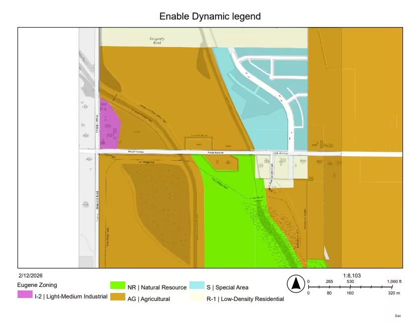
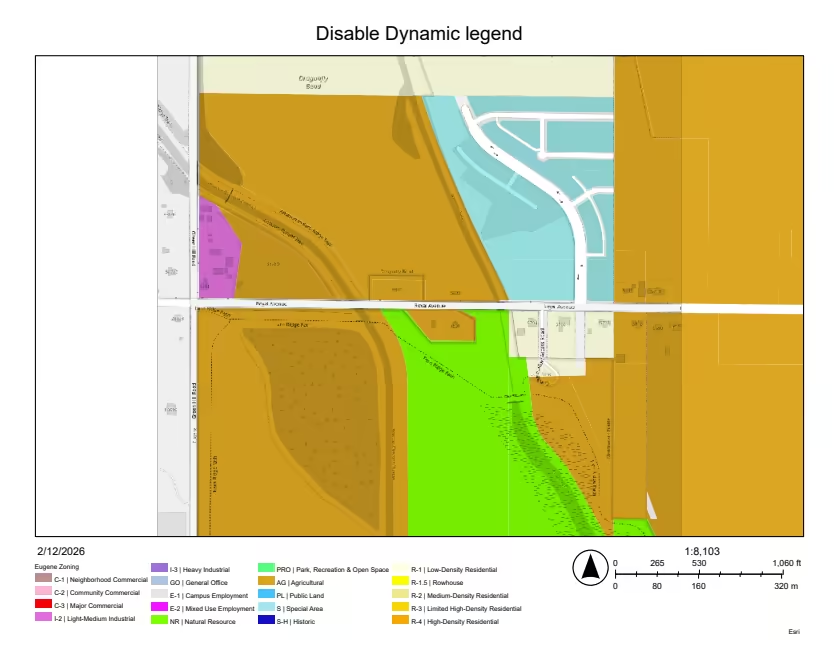
We enhanced printing to deliver a better user experience with several new capabilities. First, the Print component now allows users to choose scalebar units directly in the UI. We also added a configurable property that automatically populates the Author field when the user is signed in to a portal. Finally, we added support for Dynamic legend items, which requires a minimum of an 11.4 print service. When enabled, only currently visible features appear in the printed legend. When disabled, all features appear in the printed legend. Because ArcGIS print services have dynamic‑legend enabled by default for all layout templates, this option lets users turn it off for templates that support it, which will print all features in the legend, whether visible or not. See the image below for an example.
| Dynamic legend enabled | Dynamic legend disabled |
|---|---|
 |  |
BuildingFilter with BuildingSceneLayer
As of this release, the Building Explorer component no longer wraps the Building Explorer widget. As a result, the associated BuildingExplorerViewModel, along with its subclasses BuildingLevel and BuildingPhase, have been deprecated. The component’s public API has been enhanced with two new events, arcgisBuildingLevelChange and arcgisBuildingPhaseChange, which are emitted when the selected building level or construction phase changes.
Filtering features is an essential capability in BIM-related workflows. The BuildingSceneLayer supports attribute-based filtering through the BuildingFilter class, which defines the expressions and visual modes that are added to the BuildingSceneLayer#filters to show or hide specific features. Filtering is based on modelNames that are common to all BuildingSceneLayer. To filter a layer by level or construction phase, use bldgLevel, createdPhase, and demolishedPhase as the corresponding modelNames in #filterExpression.
Explore this new sample to see BuildingFilter in use.
Charts components
Class break support for heat charts
Class breaks can now be defined for heat charts to visualize data in distinct ranges. Use heatRulesType from the heat chart model to switch between renderer and gradient legend types.
- When using class breaks, an extra null value marker is added to represent the empty cells.
- Customization can be done via the
chartRendererproperty from the heat chart model.
Common components
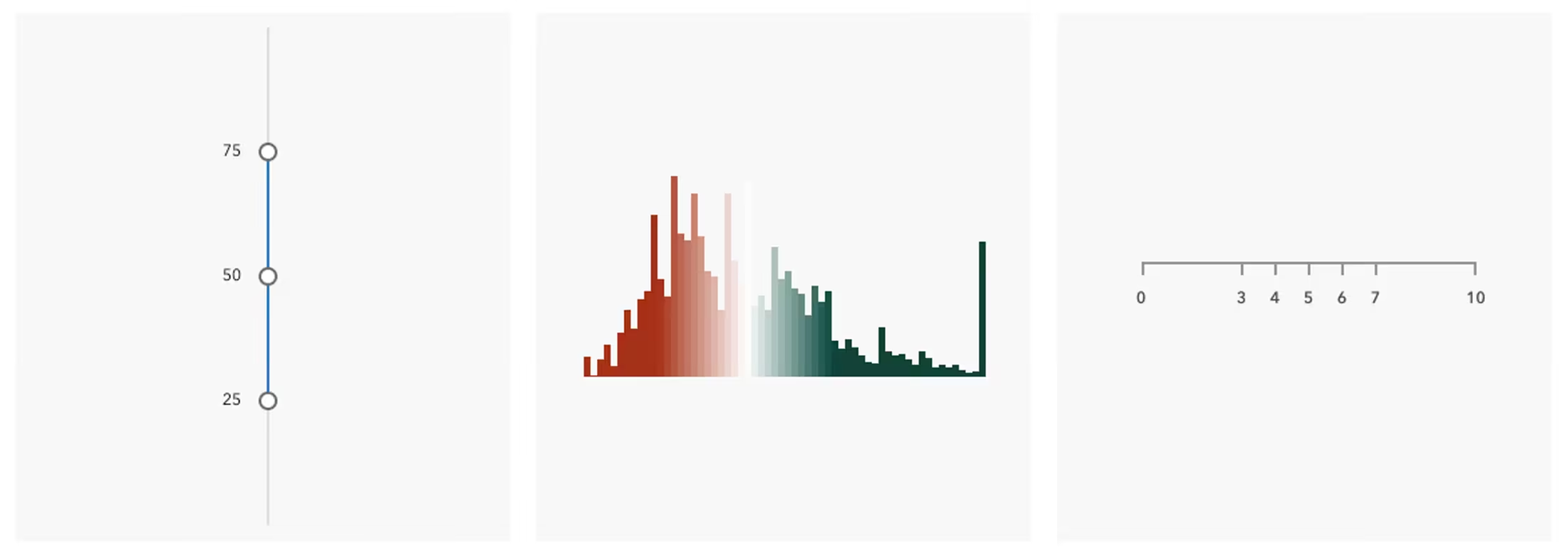
The new Common components package contains a set of shared UI components used by some of the higher-level components in the JavaScript Maps SDK. It includes the Slider, Histogram, and Ticks components.
CDN specific changes
Single script tag for CDN users
As of 5.0, the main CDN entry point at https://js.arcgis.com/5.0/ is module-based and includes core, map-components, charts-components, coding-components, ai-components, common-components, and calcite-components.
Thus, only a single script tag is needed in CDN-based apps.
<!-- Load the ArcGIS Maps SDK for JavaScript from CDN --><script type="module" src="https://js.arcgis.com/5.0/"></script>Prior to 5.0, you might have used multiple script tags like:
<!-- Load Calcite components from CDN --><script type="module" src="https://js.arcgis.com/calcite-components/3.3.3/calcite.esm.js"></script>
<!-- Load the ArcGIS Maps SDK for JavaScript from CDN --><script src="https://js.arcgis.com/4.34/"></script>
<!-- Load Map components from CDN --><script type="module" src="https://js.arcgis.com/4.34/map-components/"></script>
If you still want to use the old behavior to access only the core API, use https://js.arcgis.com/5.0/core.js.
Patch versions on CDN
As of 5.0, we provide CDN versions for specific patches in MAJOR.MINOR.PATCH format, for example https://js.arcgis.com/5.0.0/. This URL will also be used as the default assetsPath for CDN-hosted assets when working with npm and local builds. The MAJOR.MINOR syntax for 5+ is an alias to the latest patch. Use this syntax if you always want the latest CDN version, even though it might impact your application in unintended ways.
TypeScript import changes
The __esri namespace is no longer supported for importing types and will be removed at 6.0. Use individual ESM imports to directly import types from their respective module files instead.
See example below:
import type Geometry from "@arcgis/core/geometry/Geometry";import type FeatureLayer from "@arcgis/core/layers/FeatureLayer";
let geometry: __esri.Geometry;const layer = arcgisMapView.map?.allLayers.find((l) => l.id === layerId) as __esri.FeatureLayer;let geometry: Geometry;const layer = arcgisMapView.map?.allLayers.find((l) => l.id === layerId) as FeatureLayer;
Codemod to refactor types
A codemod has been provided that automatically refactors existing __esri usages to the recommended ESM imports. Please refer to the documentation.
Auto-reposition polygon labels
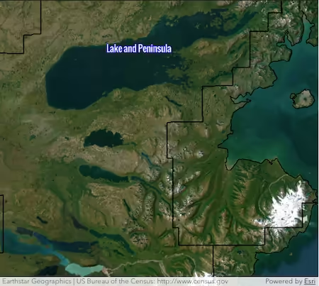
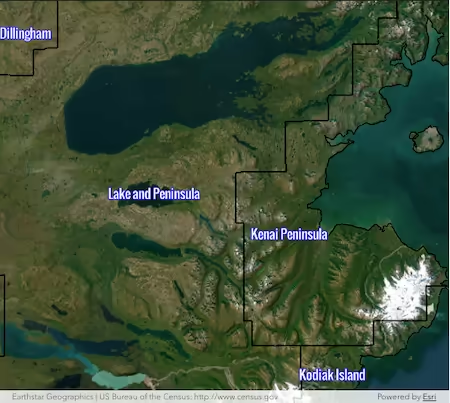
We enhanced polygon labeling by enhancing how labels are automatically repositioned when a polygon’s centroid is partially or fully out of view. This results in more labels appearing fully visible, and even partial labels can now be placed in areas where labels previously could not be shown. In the image below, compare the county labels when zoomed-in close in Alaska. Most of the county areas are outside the view of the map, but now more labels can display.
| 4.34 | 5.0 |
|---|---|
 |  |
Improved Transparent Ground Rendering
We improved the rendering of transparent terrain for the Google Photorealistic 3D Basemap and the new label and icon visibility modes. All transparent data, including terrain, is now rendered with the same order-independent transparency algorithm. This algorithm produces a close approximation of the physically correct visualization.
Icons and labels behind transparent geometries now behave in the same way, no matter if they are behind terrain or other data. For example, in mountainous areas it becomes easier to understand the spatial relationship of hills, valleys, and 3D data on the ground.
The Google integrated mesh ground layer can also be visualized with partial opacity, and is also drawn with order-independent transparency.
New ShadowCastAnalysis
Shadow cast is now available as an analysis object, replacing the deprecated programmatic ShadowCastViewModel pattern and aligning with the SDK’s analysis framework.
The analysis supports three visualization modes, as well as measuring shadow duration at the cursor location via view.whenAnalysisView() and getDurationAtScreen(). You can use the analysis and build custom panels, workflows, controls, and integrations while following the same analysis lifecycle as other analysis types.
Explore it in the Shadow Cast analysis object sample.
Migration notes
- The widget’s
visualizationTypemaps tomode:threshold→min-durationduration→total-durationdiscrete→discrete
- Mode-specific settings are now grouped under:
minDurationOptions,totalDurationOptions, anddiscreteOptions
- The corresponding Shadow Cast component provides a user interface to the analysis.
Improved occlusion handling for 3D labels and icons
This release introduces enhanced control over the visibility of labels and icons in 3D scenes with the new occludedVisibility property. Previously, labels and icons would disappear when hidden by buildings or terrain, causing users to lose context during navigation. Labels and icons now remain recognizable even when partially or fully occluded, providing better context, orientation, and spatial awareness.
When using either the adaptive or visible mode, occluded parts are rendered semi-opaque during navigation to provide depth cues, while labels become fully opaque when the view is idle for optimal readability. The new occludedVisibility property is available for both IconSymbol3DLayer and TextSymbol3DLayer, supporting three modes:
- Adaptive (default): Labels and icons that are behind other objects can still be rendered depending on how far behind an object they are. This automatically provides a good balance between depth cues, readability, and reduced distractions while navigating the scene. This mode is used in the 3D Basemaps.
- Visible: Labels and icons behind other objects are always rendered.
- Hidden: Labels and icons behind other objects are not rendered. This matches behavior of previous versions of the SDK.
Try out the new occlusion handling in the Basemap Gallery sample, featuring New York with the Topographic 3D Basemap, and experience adaptive labels and icons as you navigate the city. Additionally, explore the extended Point styles for cities sample, now showcasing all three occludedVisibility modes, to see how each setting affects label and icon visibility in the scene.
VolumeMeasurementAnalysis enhancements
VolumeMeasurementAnalysis was introduced as beta in 4.34, allowing you to interactively measure and visualize ground surface volumes in 3D web scenes using Cut & Fill and Stockpile measurements.
With this release, we improved the consistency of the measurement experience and updated the API.
Notable improvements
- Improved the heuristics for accuracy estimation
- Added supporting area and perimeter measurements to the input polygon
- Added support for self-intersecting polygons
- Improved label placement
Explore it in the Volume measurement analysis object sample.
ElevationProfileAnalysis out of beta
ElevationProfileAnalysis supports creating custom elevation profile workflows and was introduced as beta in version 4.34. It enables generating profiles from a drawn line or from an existing feature in the view using the new setGeometryFromFeature() method. As of this release, the API is considered complete and stable.
Explore it in the Elevation Profile Analysis sample.
Google Photorealistic 3D basemaps (beta)
The new Google Photorealistic 3D basemaps provide a three-dimensional mesh textured with high-resolution imagery. See 3D Basemaps for more information. In support of the new Photorealistic 3D basemaps, various related enhancements and fixes have been made to the SDK, including performance improvements for 3D Tiles integrated meshes and improved rendering of transparent ground.

FlowRenderer - continuous flow in 2D
The FlowRenderer now supports continuous flow in 2D, resulting in a smoother experience when zooming, panning, or changing the time extent.
Graphic’s origin
The Graphic.origin property is now populated when working with various layer types, providing contextual information about where a graphic originates from. For example, graphic’s origin is populated for graphics returned from MapView.hitTest or queryFeatures() on a layer or layer view instance. Use the Graphic.origin property in place of the removed Graphic.layer property.
Feature reduction field formatting
You can now use field configurations with both FeatureReductionBinning and FeatureReductionCluster on service-backed FeatureLayers. Incremental support for field configurations will be introduced in upcoming releases, enhancing areas of the SDK that involve working with field information.
Basemap sessions
Added a new basemap session API to support the session usage model for basemap styles, providing more control over how basemap requests are authenticated in applications. This is only supported for Location Platform.
import config from "@arcgis/core/config";
config.apiKey = "YOUR_API_KEY";config.sessions = { basemap: { enabled: true, styleFamily: "arcgis", // only access styles in the "arcgis" family autoRefresh: true, // automatically generate new token at end of duration duration: 3600, // session lasts 1 hour },};The sql utility functions
Added sqlBooleanLiteral, sqlNumericLiteral, sqlStringLiteral, sqlDateLiteral, sqlTimeLiteral, and sqlTimestampLiteral for safely creating SQL expressions from JavaScript values.
Typed values are converted as needed; untyped timestamps are passed through. For unknown types, use sqlLiteral.
Documentation improvements
Mapping application layouts
A new guide page Mapping application layouts introduces recommended patterns for structuring web mapping applications. The guide covers layout responsibilities and best practices for building scalable applications using the Calcite Design System and JavaScript Maps SDK. Three new layout-focused samples are now available under layout applications.
Get started with @arcgis/create
The Get started guide has been updated with guidance on creating an app with npm using the @arcgis/create CLI tool and starter templates from Esri/jsapi-resources. Now, you can create a ready-to-use application with one simple command:
npx @arcgis/create -n my-arcgis-app -t viteFor the full walkthrough and more template options, see Create an app with npm and Use @arcgis/create. Template sources are in jsapi-resources/templates.
Sample updates
The majority of the samples have been updated to use components to reflect the recommended usage patterns and best practices. The samples have been refreshed with a new search experience and UI design, allowing you to view the description, sample code, and live sample within the same page. This update also provides a better experience for users on mobile devices.
Improved types
With the TypeScript import changes, the TypeScript definitions now include type parameters, providing stronger type checking and an improved developer experience. This update provides more detailed and accurate information about types, parameters, and return values. Due to the improved types, some existing code may require adjustments to comply with the updated type definitions. See the added types in the SDK changes for more details.
Documentation for previous versions
Starting with version 4.34, we plan to make previous versions of the documentation easily available for supported versions of the SDK. These will be hosted on our website, allowing you to access the specific documentation you need for your project instead of having to download the SDK locally. The documentation for version 4.34 is now available.
Map components changes
- index/
- getAssetPath() - added function
- setAssetPath() - added function
- components/
- types/
- ArcgisReferenceElement - added type declaration
- IconName - added type declaration
- HeadingLevel - added type declaration
- LoadErrorSource - added type declaration
- GoToOverride - added type declaration
- GoToOwner - added type declaration
- ArcGISView - added type declaration
- GoToParameters - added type declaration
- GoToParameters2D - added type declaration
- GoToParameters3D - added type declaration
- arcgis-area-measurement-2d/
- arcgis-area-measurement-2d
- analysis - added field
- hideStartButton - added field
- hideUnitSelect - added field
- hideVisualization - added field
- position - removed field - deprecated since 4.34, use
slotinstead.
- types/
- AreaMeasurement2DState - added type declaration
- arcgis-area-measurement-2d
- arcgis-area-measurement-3d/
- arcgis-area-measurement-3d
- hideStartButton - added field
- hideUnitSelect - added field
- hideVisualization - added field
- position - removed field - deprecated since 4.34, use
slotinstead.
- types/
- AreaMeasurement3DState - added type declaration
- arcgis-area-measurement-3d
- arcgis-basemap-gallery/
- arcgis-basemap-gallery
- position - removed field - deprecated since 4.34, use
slotinstead.
- position - removed field - deprecated since 4.34, use
- arcgis-basemap-gallery
- arcgis-basemap-layer-list/
- arcgis-basemap-layer-list
- hideFlow - removed field
- position - removed field - deprecated since 4.34, use
slotinstead.
- arcgis-basemap-layer-list
- arcgis-basemap-toggle/
- arcgis-basemap-toggle
- position - removed field - deprecated since 4.34, use
slotinstead.
- position - removed field - deprecated since 4.34, use
- arcgis-basemap-toggle
- arcgis-bookmarks/
- arcgis-bookmarks
- hideFlow - removed field
- position - removed field - deprecated since 4.34, use
slotinstead.
- types/
- BookmarksState - added type declaration
- BookmarkOptions - added type declaration
- BookmarkEditEvent - added type declaration
- BookmarkSelectEvent - added type declaration
- arcgis-bookmarks
- arcgis-building-explorer/
- arcgis-building-explorer
- levelDisabled - added field
- levels - added field
- phaseDisabled - added field
- phases - added field
- position - removed field - deprecated since 4.34, use
slotinstead. - state - removed field
- @arcgisBuildingLevelChange - added event
- @arcgisBuildingPhaseChange - added event
- @arcgisPropertyChange - removed event
- arcgis-building-explorer
- arcgis-catalog-layer-list/
- arcgis-catalog-layer-list
- hideFlow - removed field
- position - removed field - deprecated since 4.34, use
slotinstead.
- arcgis-catalog-layer-list
- arcgis-compass/
- arcgis-compass
- visualScale - added field
- position - removed field - deprecated since 4.34, use
slotinstead.
- arcgis-compass
- arcgis-coordinate-conversion/
- arcgis-coordinate-conversion
- position - removed field - deprecated since 4.34, use
slotinstead.
- position - removed field - deprecated since 4.34, use
- types/
- Orientation - added type declaration
- StorageType - added type declaration
- arcgis-coordinate-conversion
- arcgis-daylight/
- arcgis-daylight
- position - removed field - deprecated since 4.34, use
slotinstead.
- position - removed field - deprecated since 4.34, use
- types/
- Season - added type declaration
- arcgis-daylight
- arcgis-directional-pad/
- arcgis-directional-pad
- position - removed field - deprecated since 4.34, use
slotinstead.
- position - removed field - deprecated since 4.34, use
- arcgis-directional-pad
- arcgis-directions/
- arcgis-directions
- autoSolveOnEditActive - added field
- hidePrintButton - added field
- startEditing() - added method
- stopEditing() - added method
- position - removed field - deprecated since 4.34, use
slotinstead.
- arcgis-directions
- arcgis-direct-line-measurement-3d/
- arcgis-direct-line-measurement-3d
- hideStartButton - added field
- hideUnitSelect - added field
- hideVisualization - added field
- position - removed field - deprecated since 4.34, use
slotinstead.
- types/
- DirectLineMeasurement3DState - added type declaration
- arcgis-direct-line-measurement-3d
- arcgis-distance-measurement-2d/
- arcgis-distance-measurement-2d
- analysis - added field
- hideStartButton - added field
- hideUnitSelect - added field
- hideVisualization - added field
- position - removed field - deprecated since 4.34, use
slotinstead.
- types/
- DistanceMeasurement2DState - added type declaration
- arcgis-distance-measurement-2d
- arcgis-editor/
- arcgis-editor
- selectionManager - added field
- syncViewSelection - added field
- useLegacyCreateTools - deprecated field
- cancelSelectionTool() - added method
- hideFlow - removed field
- position - removed field - deprecated since 4.34, use
slotinstead.
- arcgis-editor
- arcgis-elevation-profile/
- arcgis-elevation-profile
- analysis - added field
- distanceUnit - added field
- distanceUnitOptions - added field
- effectiveDisplayUnits - added field
- elevationInfo - added field
- elevationUnit - added field
- elevationUnitOptions - added field
- feature - added field
- geometry - added field
- hideDistanceDisplayUnitSelect - added field
- hideElevationDisplayUnitSelect - added field
- hideStartButton - added field
- hideVisualization - added field
- highlightDisabled - added field
- indicatorRelativePosition - added field
- messageOverrides - added field
- clear() - added method
- select() - added method
- effectiveUnits - removed field
- hideSketchButton - removed field
- hideUnitSelector - removed field
- highlightEnabled - removed field
- hoveredChartPosition - removed field
- input - removed field
- position - removed field - deprecated since 4.34, use
slotinstead. - unit - removed field
- unitOptions - removed field
- arcgis-elevation-profile
- arcgis-expand/
- arcgis-expand
- topLayerDisabled - added field
- visualScale - added field
- focusTrapEnabled - removed field - deprecated since 4.33, use
focusTrapDisabledinstead. - position - removed field - deprecated since 4.34, use
slotinstead.
- types/
- ExpandState - added type declaration
- arcgis-expand
- arcgis-feature/
- arcgis-feature
- hideContentAttachments - removed field - deprecated since 4.34, use
hideAttachmentsContentinstead. - hideContentExpression - removed field - deprecated since 4.34, use
hideExpressionContentinstead. - hideContentFields - removed field - deprecated since 4.34, use
hideFieldsContentinstead. - hideContentMedia - removed field - deprecated since 4.34, use
hideMediaContentinstead. - hideContentText - removed field - deprecated since 4.34, use
hideTextContentinstead. - hideLastEditInfo - removed field - deprecated since 4.33, use
hideLastEditedInfoinstead. - hideTitle - removed field - deprecated since 4.34, use
hideHeadinginstead. - position - removed field - deprecated since 4.34, use
slotinstead.
- hideContentAttachments - removed field - deprecated since 4.34, use
- arcgis-feature
- arcgis-feature-form/
- arcgis-feature-form
- disabled - added field
- hideReadOnlyNotice - added field
- map - added field
- position - removed field - deprecated since 4.34, use
slotinstead.
- arcgis-feature-form
- arcgis-feature-table/
- arcgis-feature-table
- autoSaveDisabled - added field
- canAddRelatedFeature - added field
- disabled - added field
- hasContingentValues - added field
- hasInvalidPendingEdits - added field
- hasPendingEdits - added field
- isSyncingAttachments - added field
- relationship - added field
- selectionManager - added field
- syncViewSelection - added field
- tableDisabled - deprecated field since 5.0, use
element.disabledinstead. - tableTitle - added field
- addPendingEdits() - added method
- discardPendingEdits() - added method
- getFeatureStoreItemByObjectId() - added method
- refreshCellContent() - added method
- savePendingEdits() - added method
- toggleColumnVisibility() - added method
- position - removed field - deprecated since 4.34, use
slotinstead.
- arcgis-feature-table
- arcgis-feature-templates-legacy/
- arcgis-feature-templates-legacy - added component
- DisabledItemFunction - added type declaration
- arcgis-features/
- arcgis-features
- chartAnimationDisabled - added field
- hideAttachmentsContent - added field
- hideContent - added field
- hideCustomContent - added field
- hideExpressionContent - added field
- hideFieldsContent - added field
- hideLastEditedInfo - added field
- hideMediaContent - added field
- hideRelationshipContent - added field
- hideTextContent - added field
- hideUtilityNetworkContent - added field
- updateLocationEnabled - added field
- closed - removed field - deprecated since 4.34, use
visibleinstead. - featuresTitle - removed field - deprecated since 4.34, use
headinginstead. - hideFlow - removed field
- position - removed field - deprecated since 4.34, use
slotinstead. - visible - removed field
- arcgis-features
- arcgis-floor-filter/
- arcgis-floor-filter
- goToOverride - added field
- messageOverrides - added field
- position - removed field - deprecated since 4.34, use
slotinstead.
- arcgis-floor-filter
- arcgis-fullscreen/
- arcgis-fullscreen
- visualScale - added field
- position - removed field - deprecated since 4.34, use
slotinstead.
- arcgis-fullscreen
- arcgis-grid-controls/
- arcgis-grid-controls
- position - removed field - deprecated since 4.34, use
slotinstead.
- position - removed field - deprecated since 4.34, use
- types/
- GridTheme - added type declaration
- arcgis-grid-controls
- arcgis-home/
- arcgis-home
- visualScale - added field
- position - removed field - deprecated since 4.34, use
slotinstead.
- arcgis-home
- arcgis-layer-list/
- arcgis-layer-list
- hideFlow - removed field
- position - removed field - deprecated since 4.34, use
slotinstead.
- arcgis-layer-list
- arcgis-legend/
- arcgis-legend
- position - removed field - deprecated since 4.34, use
slotinstead. - respectLayerVisibilityDisabled - removed field - deprecated since 4.34 use ignoreLayerVisibility instead.
- position - removed field - deprecated since 4.34, use
- arcgis-legend
- arcgis-line-of-sight/
- arcgis-line-of-sight
- hideContinueButton - added field
- hideDoneButton - added field
- hideStartButton - added field
- hideVisualization - added field
- position - removed field - deprecated since 4.34, use
slotinstead.
- arcgis-line-of-sight
- arcgis-link-chart/
- arcgis-link-chart
- attributionItems - added field
- attributionMode - added field
- baseCypherQuery - added field
- canZoomIn - added field
- canZoomOut - added field
- hideAttribution - added field
- popupComponentEnabled - added field
- popupElement - added field
- selectionManager - added field
- serviceUrl - added field
- zoomIn() - added method
- zoomOut() - added method
- addLayer() - removed method - deprecated since 4.33, use
element.map.add(layer)instead. - addLayers() - removed method - deprecated since 4.33, use
element.map.addMany([layer])instead. - highlightOptions - removed field - deprecated since version 4.32. Use the highlights property instead.
- @arcgisViewDoubleTapDrag - added event
- @arcgisViewVerticalTwoFingerDrag - added event
- —arcgis-view-color-focus - added css property
- arcgis-link-chart
- arcgis-link-chart-layout-switcher/
- arcgis-link-chart-layout-switcher
- position - removed field - deprecated since 4.34, use
slotinstead.
- position - removed field - deprecated since 4.34, use
- types/
- DiagramLayoutType - added type declaration
- arcgis-link-chart-layout-switcher
- arcgis-link-chart-nonspatial-visibility-toggle/
- arcgis-link-chart-nonspatial-visibility-toggle - added component
- types/
- State - added type declaration
- NonspatialMode - added type declaration
- arcgis-locate/
- arcgis-locate
- visualScale - added field
- position - removed field - deprecated since 4.34, use
slotinstead.
- types/
- State - added type declaration
- arcgis-locate
- arcgis-map/
- arcgis-map
- attributionItems - added field
- attributionMode - added field
- canZoomIn - added field
- canZoomOut - added field
- hideAttribution - added field
- popupComponentEnabled - added field
- popupElement - added field
- selectionManager - added field
- zoomIn() - added method
- zoomOut() - added method
- addLayer() - removed method - deprecated since 4.33, use
element.map.add(layer)instead. - addLayers() - removed method - deprecated since 4.33, use
element.map.addMany([layer])instead. - addTable() - removed method - deprecated since 4.33, use
element.map.tables.add(table)instead. - addTables() - removed method - deprecated since 4.33, use
element.map.tables.addMany([table])instead. - highlightOptions - removed field - deprecated since version 4.32. Use the highlights property instead.
- @arcgisViewDoubleTapDrag - added event
- @arcgisViewVerticalTwoFingerDrag - added event
- —arcgis-view-color-focus - added css property
- arcgis-map
- arcgis-navigation-toggle/
- arcgis-navigation-toggle
- visualScale - added field
- position - removed field - deprecated since 4.34, use
slotinstead.
- types/
- NavigationToggleState - added type declaration
- arcgis-navigation-toggle
- arcgis-oriented-imagery-viewer/
- arcgis-oriented-imagery-viewer
- preloadMedia - added field
- position - removed field - deprecated since 4.34, use
slotinstead.
- arcgis-oriented-imagery-viewer
- arcgis-popup/
- arcgis-popup
- featureMenuTitle - added field
- topLayerDisabled - added field
- updateLocationEnabled - added field
- visible - removed field
- types/
- PopupPositionResult - added type declaration
- PopupPositionValue - added type declaration
- Alignment - added type declaration
- PopupDockPosition - added type declaration
- DockOptions - added type declaration
- FetchFeaturesOptions - added type declaration
- PopupPositionVariable - added type declaration
- DockOptionsBreakpoint - added type declaration
- arcgis-popup
- arcgis-print/
- arcgis-print
- autoPopulateAuthor - added field
- hideAdvancedOptions - added field
- addPortalTemplate() - added method
- position - removed field - deprecated since 4.34, use
slotinstead. - @arcgisBrowseTemplatesChange - added event
- @arcgisSaveAs - added event
- types/
- arcgis-print
- arcgis-scale-bar/
- arcgis-scale-bar
- position - removed field - deprecated since 4.34, use
slotinstead.
- position - removed field - deprecated since 4.34, use
- types/
- ScaleBarStyle - added type declaration
- ScaleBarUnit - added type declaration
- arcgis-scale-bar
- arcgis-scale-range-slider/
- arcgis-scale-range-slider
- position - removed field - deprecated since 4.34, use
slotinstead.
- position - removed field - deprecated since 4.34, use
- arcgis-scale-range-slider
- arcgis-scene/
- arcgis-scene
- animationsDisabled - added field
- attributionItems - added field
- attributionMode - added field
- canZoomIn - added field
- canZoomOut - added field
- hideAttribution - added field
- popupComponentEnabled - added field
- popupElement - added field
- selectionManager - added field
- zoomIn() - added method
- zoomOut() - added method
- addLayer() - removed method - deprecated since 4.33, use
element.map.add(layer)instead. - addLayers() - removed method - deprecated since 4.33, use
element.map.addMany([layer])instead. - addTable() - removed method - deprecated since 4.33, use
element.map.tables.add(table)instead. - addTables() - removed method - deprecated since 4.33, use
element.map.tables.addMany([table])instead. - highlightOptions - removed field - deprecated since version 4.32. Use the highlights property instead.
- @arcgisViewDoubleTapDrag - added event
- @arcgisViewVerticalTwoFingerDrag - added event
- —arcgis-view-color-focus - added css property
- arcgis-scene
- arcgis-search/
- arcgis-search
- topLayerDisabled - added field
- position - removed field - deprecated since 4.34, use
slotinstead.
- types/
- ActiveMenu - added type declaration
- arcgis-search
- arcgis-shadow-cast/
- arcgis-shadow-cast
- analysis - added field
- discreteColor - added field
- discreteInterval - added field
- hideDiscreteColorPicker - added field
- hideDiscreteInterval - added field
- hideDiscreteOptions - added field
- hideMinDurationColorPicker - added field
- hideMinDurationContextColorPicker - added field
- hideMinDurationContextInterval - added field
- hideMinDurationContextOptions - added field
- hideMinDurationContextToggle - added field
- hideMinDurationOptions - added field
- hideMinDurationSlider - added field
- hideShadowDurationTooltip - added field
- hideTotalDurationColorPicker - added field
- hideTotalDurationModeSelect - added field
- hideTotalDurationOptions - added field
- hideVisualization - added field
- maxMinDuration - added field
- minDuration - added field
- minDurationColor - added field
- minDurationContextColor - added field
- minDurationContextEnabled - added field
- minDurationContextInterval - added field
- minMinDuration - added field
- mode - added field
- totalDurationColor - added field
- totalDurationMode - added field
- visualScale - added field
- getDurationAtScreen() - added method
- discreteOptions - removed field
- durationOptions - removed field
- getDuration() - removed method
- hideColorPicker - removed field
- hideThresholdContext - removed field
- hideThresholdContextColor - removed field
- hideThresholdContextTimeInterval - removed field
- hideThresholdContextToggle - removed field
- hideTooltip - removed field
- position - removed field - deprecated since 4.34, use
slotinstead. - start() - removed method
- stop() - removed method
- thresholdOptions - removed field
- visualizationType - removed field
- arcgis-shadow-cast
- arcgis-sketch/
- arcgis-sketch
- showCreateToolsText - added field
- textSymbol - added field
- useLegacyCreateTools - deprecated field
- visualScale - added field
- position - removed field - deprecated since 4.34, use
slotinstead. - scale - removed field
- arcgis-sketch
- arcgis-slice/
- arcgis-slice
- hideStartButton - added field
- hideVisualization - added field
- position - removed field - deprecated since 4.34, use
slotinstead.
- types/
- SliceableLayer - added type declaration
- arcgis-slice
- arcgis-slider-binary-color-size-legacy/
- arcgis-slider-binary-color-size-legacy - added component
- arcgis-slider-classed-color-legacy/
- arcgis-slider-classed-color-legacy - added component
- arcgis-slider-classed-size-legacy/
- arcgis-slider-classed-size-legacy - added component
- arcgis-slider-color-legacy/
- arcgis-slider-color-legacy - added component
- arcgis-slider-color-size-legacy/
- arcgis-slider-color-size-legacy - added component
- arcgis-slider-heatmap-legacy/
- arcgis-slider-heatmap-legacy - added component
- arcgis-slider-opacity-legacy/
- arcgis-slider-opacity-legacy - added component
- arcgis-slider-size-legacy/
- arcgis-slider-size-legacy - added component
- arcgis-snapping-controls/
- arcgis-snapping-controls - added component
- arcgis-swipe/
- arcgis-swipe
- endLayers - added field
- leadingLayers - deprecated field since 5.0, use startLayers instead.
- startLayers - added field
- swipePosition - deprecated field since 5.0, use position instead.
- trailingLayers - deprecated field since 5.0, use endLayers instead.
- arcgis-swipe
- arcgis-table-list/
- arcgis-table-list
- hideFlow - removed field
- position - removed field - deprecated since 4.34, use
slotinstead.
- arcgis-table-list
- arcgis-time-slider/
- arcgis-time-slider
- position - removed field - deprecated since 4.34, use
slotinstead.
- position - removed field - deprecated since 4.34, use
- arcgis-time-slider
- arcgis-time-zone-label/
- arcgis-time-zone-label
- actionIcon - added field
- expandDirection - removed field
- expanded - removed field
- position - removed field
- types/
- State - added type declaration
- arcgis-time-zone-label
- arcgis-track/
- arcgis-track
- visualScale - added field
- position - removed field - deprecated since 4.34, use
slotinstead.
- arcgis-track
- arcgis-utility-network-associations/
- arcgis-utility-network-associations
- position - removed field - deprecated since 4.34, use
slotinstead. - visibleElementsConnectivityAssociationsSettingsArrowsToggle - removed field - deprecated since 4.32, showConnectivityAssociationsSettingsArrowsToggle instead.
- visibleElementsConnectivityAssociationsSettingsCapSelect - removed field - deprecated since 4.32, use showConnectivityAssociationsSettingsCapSelect instead.
- visibleElementsConnectivityAssociationsSettingsColorPicker - removed field - deprecated since 4.32, use hideConnectivityAssociationsSettingsColorPicker instead.
- visibleElementsConnectivityAssociationsSettingsStylePicker - removed field - deprecated since 4.32, use hideConnectivityAssociationsSettingsStylePicker instead.
- visibleElementsConnectivityAssociationsSettingsWidthInput - removed field - deprecated since 4.32, use hideConnectivityAssociationsSettingsWidthInput instead.
- visibleElementsMaxAllowableAssociationsSlider - removed field - deprecated since 4.32, use showMaxAllowableAssociationsSlider instead.
- visibleElementsStructuralAttachmentAssociationsSettingsArrowsToggle - removed field - deprecated since 4.32, use showStructuralAttachmentAssociationsSettingsArrowsToggle instead.
- visibleElementsStructuralAttachmentAssociationsSettingsCapSelect - removed field - deprecated since 4.32, use showStructuralAttachmentAssociationsSettingsCapSelect instead.
- visibleElementsStructuralAttachmentAssociationsSettingsColorPicker - removed field - deprecated since 4.32, use hideStructuralAttachmentAssociationsSettingsColorPicker instead.
- visibleElementsStructuralAttachmentAssociationsSettingsStylePicker - removed field - deprecated since 4.32, use hideStructuralAttachmentAssociationsSettingsStylePicker instead.
- visibleElementsStructuralAttachmentAssociationsSettingsWidthInput - removed field - deprecated since 4.32, use hideStructuralAttachmentAssociationsSettingsWidthInput instead.
- position - removed field - deprecated since 4.34, use
- arcgis-utility-network-associations
- arcgis-utility-network-trace/
- arcgis-utility-network-trace - deprecated component since 5.0, use arcgis-utility-network-trace-analysis instead.
- position - removed field - deprecated since 4.34, use
slotinstead.
- position - removed field - deprecated since 4.34, use
- arcgis-utility-network-trace - deprecated component since 5.0, use arcgis-utility-network-trace-analysis instead.
- arcgis-utility-network-trace-analysis/
- arcgis-utility-network-trace-analysis - added component
- types/
- UtilityNetworkTraceAnalysisDisplayMode - added type declaration
- arcgis-utility-network-validate-topology/
- arcgis-utility-network-validate-topology
- position - removed field - deprecated since 4.34, use
slotinstead.
- position - removed field - deprecated since 4.34, use
- arcgis-utility-network-validate-topology
- arcgis-value-picker-legacy/
- arcgis-value-picker-legacy - added component
- arcgis-version-management/
- types/
- InitialVersionInfo - added type declaration
- VersioningStateEvent - added type declaration
- VersioningStateEventType - added type declaration
- arcgis-version-management
- position - removed field - deprecated since 4.34, use
slotinstead.
- position - removed field - deprecated since 4.34, use
- types/
- arcgis-video/
- arcgis-video
- attributionMode - added field
- —arcgis-view-color-focus - added css property
- arcgis-video
- arcgis-video-player/
- arcgis-video-player
- inline - added field
- showFullscreenToggle - added field
- position - removed field - deprecated since 4.34, use
slotinstead.
- arcgis-video-player
- arcgis-volume-measurement/
- arcgis-volume-measurement - added component
- types/
- VolumeMeasurementState - added type declaration
- arcgis-weather/
- types/
- WeatherState - added type declaration
- arcgis-weather
- position - removed field - deprecated since 4.34, use
slotinstead.
- position - removed field - deprecated since 4.34, use
- types/
- arcgis-zoom/
- types/
- arcgis-zoom
- visualScale - added field
- position - removed field - deprecated since 4.34, use
slotinstead. - @arcgisActionZoom - added event
- arcgis-placement/
- arcgis-placement - removed component - deprecated since version 4.34, use the component’s
slotattribute instead.
- arcgis-placement - removed component - deprecated since version 4.34, use the component’s
- types/
Charts components changes
- index/
- getAssetPath() - added function
- setAssetPath() - added function
- interfaces/
- SupportedLayer - added type declaration
- IntervalPopoverProps - added type declaration
- CSVOptions - added type declaration
- chart-rendering/
- common/
- interfaces/
- NotifyOptions - added type declaration
- PieChartLegendValueLabelFormatCallback - added type declaration
- GuideTooltipFormatCallback - added type declaration
- AxisLabelFormatCallback - added type declaration
- GaugeInnerLabelFormatCallback - added type declaration
- PreRenderCallback - added type declaration
- ChartOptions - added type declaration
- PieChartLabelFormatCallback - added type declaration
- HistogramLabelFormatCallback - added type declaration
- ScatterplotLabelFormatCallback - added type declaration
- BarAndLineDataLabelFormatCallback - added type declaration
- GuideTooltipFormatCallbackProps - added type declaration
- TooltipFormatters - added type declaration
- BarAndLineTooltipFormatCallback - added type declaration
- BoxPlotTooltipFormatCallback - added type declaration
- BarAndLineTooltipFormatCallbackProps - added type declaration
- BoxPlotTooltipFormatCallbackProps - added type declaration
- interfaces/
- common/
- components/
- arcgis-chart/
- arcgis-chart
- aria - added field
- autoDestroyDisabled - added field
- autoDisposeChart - deprecated field since 5.0. Use autoDestroyDisabled instead.
- featureIndex - deprecated field since 5.0. Use charts model’s featureIndex prop instead.
- legendPosition - deprecated field since 5.0. Use charts model’s legendPosition prop instead.
- legendVisibility - deprecated field since 5.0. Use charts model’s legendVisibility prop instead.
- messageOverrides - added field
- rotation - deprecated field since 5.0. Use charts model’s rotated prop instead.
- @arcgisInvalidConfigWarningRaise - added event
- @arcgisRenderingComplete - added event
- arcgis-chart
- arcgis-chart/
- model/
- bar-chart-model/
- bar-chart-model/
- BarChartModel - added class
- bar-chart-model/
- box-plot-model/
- box-plot-model/
- BoxPlotModel - added class
- box-plot-model/
- chart-model/
- chart-model-base/
- ChartModelBase - added class
- chart-model/
- ChartModel - added class
- utils/
- types/
- ModelConfigChangePayload - added type declaration
- types/
- chart-model-base/
- combo-bar-line-chart-model/
- combo-bar-line-chart-model/
- ComboBarLineChartModel - added class
- combo-bar-line-chart-model/
- gauge-model/
- gauge-model/
- GaugeModel - added class
- gauge-model/
- heat-chart-model/
- heat-chart-model/
- HeatChartModel - added class
- heat-chart-model/
- histogram-model/
- histogram-model/
- HistogramModel - added class
- histogram-model/
- interfaces/
- chart-interfaces/
- ModelParams - added type declaration
- SerialChartConfig - added type declaration
- SerialChartSeries - added type declaration
- common/
- customSortString - added variable
- SerialChartDataSortingKinds - added type declaration
- BoxPlotDataSortingKinds - added type declaration
- HeatChartDataSortingKinds - added type declaration
- PieChartDataSortingKinds - added type declaration
- PieChartDataModes - added type declaration
- PieChartSlicesDisplay - added type declaration
- FormatKeys - added type declaration
- LineFormatKeys - added type declaration
- TextFormatKeys - added type declaration
- ColorFormatKeys - added type declaration
- GuideOrientation - added type declaration
- SplitByFieldInfos - added type declaration
- PieSeriesDisplayOptions - added type declaration
- LayerInfo - added type declaration
- ModelTypes - added type declaration
- chart-interfaces/
- line-chart-model/
- line-chart-model/
- LineChartModel - added class
- line-chart-model/
- mixins/
- model-with-guides/
- ModelWithGuides - added class
- model-with-legend/
- ModelWithLegend - added class
- model-with-line-marker-styling/
- ModelWithLineMarkerStyling - added class
- model-with-multi-axes/
- ModelWithMultiAxes - added class
- model-with-temporal-binning/
- ModelWithTemporalBinning - added class
- model-with-tooltips/
- ModelWithTooltips - added class
- model-with-x-guides/
- ModelWithXGuides - added class
- model-with-y-guides/
- ModelWithYGuides - added class
- model-with-guides/
- pie-chart-model/
- pie-chart-legend-model/
- PieChartLegendModel - added class
- pie-chart-model/
- PieChartModel - added class
- pie-chart-legend-model/
- properties/
- background-color/
- WithBackgroundColor - added class
- chart-id/
- WithChartId - added class
- chart-renderer/
- WithChartRenderer - added class
- chart-sub-type/
- WithChartSubType - added class
- color-match/
- WithColorMatch - added class
- config/
- WithConfig - added class
- data-filters/
- WithDataFilters - added class
- data-tooltip-value-format/
- WithSeriesDataTooltipValueFormat - added class
- fetch-null-values/
- WithFetchNULLValues - added class
- layer/
- WithLayer - added class
- rotated-state/
- WithRotatedState - added class
- split-by-values/
- WithSplitByValues - added class
- version/
- WithVersion - added class
- axes/
- axis-labels-symbol/
- WithAxisLabelsSymbol - added class
- axis-lines-symbol/
- WithAxisLinesSymbol - added class
- x-axis/
- generate-x-axis-title/
- WithGenerateXAxisTitle - added class
- max-x-bound/
- WithMaxXBound - added class
- min-x-bound/
- WithMinXBound - added class
- x-axis-labels-visibility/
- WithXAxisLabelsVisibility - added class
- x-axis-title-symbol/
- WithXAxisTitleSymbol - added class
- x-axis-title-text/
- WithXAxisTitleText - added class
- x-axis-title-visibility/
- WithXAxisTitleVisibility - added class
- x-bounds/
- WithXBounds - added type declaration
- generate-x-axis-title/
- axis-labels-symbol/
- data-labels/
- data-labels-symbol/
- WithDataLabelsSymbol - added class
- data-labels-visibility/
- WithDataLabelsVisibility - added class
- data-labels-symbol/
- description/
- description-symbol/
- WithDescriptionSymbol - added class
- description-text/
- WithDescriptionText - added class
- description-visibility/
- WithDescriptionVisibility - added class
- description-symbol/
- series/
- negative-values-stacked-to-baseline/
- WithNegativeValuesStackedToBaseline - added class
- series-id/
- WithSeriesId - added class
- series-index/
- WithSeriesIndex - added class
- series-length/
- WithSeriesLength - added class
- series-visibility/
- WithSeriesVisibility - added class
- negative-values-stacked-to-baseline/
- subtitle/
- subtitle-symbol/
- WithSubtitleSymbol - added class
- subtitle-text/
- WithSubtitleText - added class
- subtitle-visibility/
- WithChartSubtitleVisibility - added class
- subtitle-symbol/
- title/
- title-symbol/
- WithTitleSymbol - added class
- title-text/
- WithTitleText - added class
- title-visibility/
- WithChartTitleVisibility - added class
- title-symbol/
- background-color/
- radar-chart-model/
- radar-chart-model/
- RadarChartModel - added class
- radar-chart-model/
- scatterplot-model/
- scatterplot-model/
- ScatterplotModel - added class
- scatterplot-model/
- serial-chart-model/
- serial-chart-model/
- SerialChartModel - added class
- serial-chart-model/
- shared/
- setup-utils/
- createModel() - added function
- CreateModelProps - added type declaration
- LayerAndType - added type declaration
- ILayerAndType - added type declaration
- LayerAndSourcelessConfig - added type declaration
- ILayerAndSourcelessConfig - added type declaration
- SourcedConfig - added type declaration
- type-guards/
- isChartModel() - added function
- isBarChartModel() - added function
- isLineChartModel() - added function
- isComboBarLineChartModel() - added function
- isSerialChartModel() - added function
- isPieChartModel() - added function
- isBoxPlotModel() - added function
- isScatterplotModel() - added function
- isHistogramModel() - added function
- isHeatChartModel() - added function
- isGaugeModel() - added function
- isModelWithMultiAxes() - added function
- isModelWithLineMarkerStyling() - added function
- isModelWithTooltips() - added function
- isModelWithGuides() - added function
- isModelWithXGuides() - added function
- isModelWithYGuides() - added function
- isModelWithLegend() - added function
- isPieChartLegendModel() - added function
- isModelWithTemporalBinning() - added function
- isModelOfType() - added function
- setup-utils/
- bar-chart-model/
- spec/
- chart-object-literals/
- WebChartTypes - added type declaration
- WebChartStatisticType - added type declaration
- WebChartDataTransformations - added type declaration
- WebChartColoringPatterns - added type declaration
- WebChartLegendPositions - added type declaration
- WebChartStackedKinds - added type declaration
- WebChartBoxPlotMultipleSeriesKinds - added type declaration
- WebChartSortOrderKinds - added type declaration
- StatisticsDefaults - added variable
- WebChartLineSmoothedKinds - added type declaration
- WebChartTemporalBinningUnits - added type declaration
- WebChartCalendarDatePartsUnits - added type declaration
- WebChartCalendarBinningOffsetUnits - added type declaration
- WebChartHeatChartHeatRulesTypes - added type declaration
- WebChartNullPolicyTypes - added type declaration
- WebChartTimeAggregationTypes - added type declaration
- WebChartLabelBehavior - added type declaration
- WebChartVersionStatus - added type declaration
- WebChartAxisTypes - added type declaration
- GaugeChartSubTypes - added type declaration
- SizePolicyScaleTypes - added type declaration
- WebChartRadarChartAxisLabelsOrientation - added type declaration
- WebChartOrderDataByTypes - added type declaration
- WebChartMultiAxesDataOrder - added type declaration
- WebChartDirectionalDataOrder - added type declaration
- WebChartPredefinedLabelsDataOrder - added type declaration
- WebChartOrderSeriesBy - added type declaration
- WebChartHeatChartViewTypes - added type declaration
- WebChartClassBreakTypes - added type declaration
- data-source/
- RGBObject - added type declaration
- IRendererSymbol - added type declaration
- WebChartDataItemColor - added type declaration
- WebChartDataItemValue - added type declaration
- WebChartDataItem - added type declaration
- WebChartBoxPlotDataItem - added type declaration
- ScatterplotTrendLineData - added type declaration
- WebChartScatterplotDataItem - added type declaration
- TimeIntervalInfo - added type declaration
- WebChartGenericDataItem - added type declaration
- WebChartBin - added type declaration
- WebChartHistogramDataItem - added type declaration
- WebChartDataTypes - added type declaration
- RGBArray - added type declaration
- events/
- OverlayTerms - added type declaration
- CalculatedMinMaxBoundsPayload - added type declaration
- ChartDeletePayload - added type declaration
- LegendItemVisibility - added type declaration
- rest-js-object-literals/
- RESTFieldType - added type declaration
- RESTSimpleLineSymbolStyle - added type declaration
- RESTSimpleMarkerSymbolStyle - added type declaration
- RESTSimpleFillSymbolStyle - added type declaration
- RESTHorizontalAlignment - added type declaration
- RESTVerticalAlignment - added type declaration
- RESTSymbolType - added type declaration
- RESTFontStyle - added type declaration
- RESTFontWeight - added type declaration
- RESTFontDecoration - added type declaration
- RESTRendererType - added type declaration
- RESTUnits - added type declaration
- rest-js-types/
- IFeature - added type declaration
- IFeatureSet - added type declaration
- IEnvelope - added type declaration
- GeometryType - added type declaration
- SpatialRelationship - added type declaration
- IExtent - added type declaration
- JsonCurve - added type declaration
- Units - added type declaration
- IStatisticDefinition - added type declaration
- Color - added type declaration
- IFont - added type declaration
- ISymbol - added type declaration
- IMarkerSymbol - added type declaration
- SimpleMarkerSymbolStyle - added type declaration
- SimpleLineSymbolStyle - added type declaration
- SimpleFillSymbolStyle - added type declaration
- SymbolType - added type declaration
- ISimpleFillSymbol - added type declaration
- ISimpleLineSymbol - added type declaration
- ISimpleMarkerSymbol - added type declaration
- ITextSymbol - added type declaration
- IField - added type declaration
- IDefinitionParameter - added type declaration
- IDefinitionInput - added type declaration
- IDrawingInfo - added type declaration
- ILayerDefinition - added type declaration
- ITemplate - added type declaration
- web-chart/
- WebChartCurrentVersion - added variable
- ValueConversion - added type declaration
- WebChartAxisScrollBar - added type declaration
- WebChartTextSymbol - added type declaration
- WebChartText - added type declaration
- WebChartCursorCrosshair - added type declaration
- WebChartLegend - added type declaration
- WebChartNullCategory - added type declaration
- WebChartPieChartLegend - added type declaration
- WebChartOverlay - added type declaration
- NumberFormatOptions - added type declaration
- WebChartDateTimeUnitFormatOptions - added type declaration
- DateTimeFormatOptions - added type declaration
- CategoryFormatOptions - added type declaration
- WebChartGuide - added type declaration
- WebChartAxis - added type declaration
- WebChartGaugeAxisTick - added type declaration
- WebChartNeedle - added type declaration
- WebChartGaugeAxis - added type declaration
- WebChartRadarChartAxis - added type declaration
- WebChartQuery - added type declaration
- WebChartSeriesQuery - added type declaration
- WebChartDataFilters - added type declaration
- WebChartSeries - added type declaration
- WebChartCalendarDatePartsBinning - added type declaration
- WebChartTemporalBinning - added type declaration
- WebChartTemporalSeries - added type declaration
- WebChartBarChartSeries - added type declaration
- HistogramOverlays - added type declaration
- WebChartHistogramSeries - added type declaration
- ScatterplotOverlays - added type declaration
- SizePolicy - added type declaration
- WebChartScatterplotSeries - added type declaration
- WebChartPieChartTick - added type declaration
- WebChartPieChartSlice - added type declaration
- WebChartPieChartGroupSlice - added type declaration
- WebChartPieChartSeries - added type declaration
- WebChartGaugeSeries - added type declaration
- WebChartLineChartSeries - added type declaration
- WebChartBoxPlotSeries - added type declaration
- WebChartHeatChartGradient - added type declaration
- WebChartHeatChartHeatClassBreaks - added type declaration
- WebChartHeatChartEmptyCell - added type declaration
- WebChartHeatChartSeries - added type declaration
- WebChartRadarChartSeries - added type declaration
- WebChartSeriesType - added type declaration
- WebChart - added type declaration
- WebGaugeChart - added type declaration
- WebBoxPlot - added type declaration
- WebRadarChart - added type declaration
- WebHeatChart - added type declaration
- WebChartTemporalBinningBase - added type declaration
- WebChartTemporalBinningExtras - added type declaration
- chart-object-literals/
- utils/
- chart-config/
- converter/
- index/
- convertChartSpec() - added function
- index/
- utils/
- index/
- hasNumberOfSeriesChanged() - added function
- index/
- validator/
- index/
- validateWebChart() - added function
- interfaces/
- DataWarningKeywords - added type declaration
- NumericAggregationParams - added type declaration
- DuplicateSeriesIdParams - added type declaration
- LayerLoadFailureParams - added type declaration
- index/
- converter/
- components/
- event-payloads/
- ModelListChangePayload - added type declaration
- DataProcessCompletePayload - added type declaration
- AxesMinMaxChangePayload - added type declaration
- SeriesColorChangePayload - added type declaration
- NoRenderPropChangePayload - added type declaration
- LegendItemVisibilityChangePayload - added type declaration
- SelectionCompletePayload - added type declaration
- DefaultActionSelectPayload - added type declaration
- interfaces/
- MissingSplitBySeriesProps - added type declaration
- DownloadableChartImagesTypes - added type declaration
- event-payloads/
- cursor/
- interfaces/
- ActionModes - added type declaration
- CursorRange - added type declaration
- interfaces/
- defaults/
- interfaces/
- LimitBehavior - added type declaration
- ChartElementLimit - added type declaration
- ChartElementTechnicalLimit - added type declaration
- interfaces/
- errors/
- index/
- ArcgisChartsError - added class
- interfaces/
- ErrorKeywords - added type declaration
- index/
- layer/
- interfaces/
- QueryObject - added type declaration
- interfaces/
- localization/
- interfaces/
- CommonStrings - added type declaration
- ErrorStrings - added type declaration
- UtilsStrings - added type declaration
- CommonStringsIdentity - added variable
- interfaces/
- misc/
- index/
- WebChartType - added type declaration
- interfaces/
- ChartSubType - added type declaration
- SelectionSource - added type declaration
- SelectionIndexes - added type declaration
- SelectionData - added type declaration
- SelectionThemeProperties - added type declaration
- SelectionTheme - added type declaration
- LoaderColors - added type declaration
- HeatSeriesColorChangePayload - added type declaration
- HeatSeriesColorChangePayloadGradient - added type declaration
- HeatSeriesColorChangePayloadClassSymbols - added type declaration
- BoxPlotSymbols - added type declaration
- LineChartSymbols - added type declaration
- SeriesSymbols - added type declaration
- PieSlicesSymbols - added type declaration
- SeriesSymbolsMap - added type declaration
- index/
- types/
- index/
- ActionBarHideActionsProps - added type declaration
- ChartComponentEvents - added variable
- DefaultChartActions - added type declaration
- ChartConfig - added type declaration
- ActionToggle - added type declaration
- ActionState - added type declaration
- ErrorPolicy - added type declaration
- ChangePolicy - added type declaration
- LayerFilterChangePolicy - added type declaration
- LayerRendererChangePolicy - added type declaration
- LayerFieldsChangePolicy - added type declaration
- ViewTimeExtentChangePolicy - added type declaration
- SyncSelectionsBetweenChartAndLayerViewPolicy - added type declaration
- index/
- chart-config/
Coding components changes
- index/
- getAssetPath() - added function
- setAssetPath() - added function
- components/
- types/
- Diagnostic - added type declaration
- IEditorProfileDefinition - added type declaration
- IPredefinedProfile - added type declaration
- ProfileVariableValueType - added type declaration
- IProfileVariable - added type declaration
- IProfileVariableBase - added type declaration
- IProfileValue - added type declaration
- IProfileDictionary - added type declaration
- IProfileArray - added type declaration
- IProfileFeature - added type declaration
- IProfileFeatureSet - added type declaration
- IProfileFeatureSetCollection - added type declaration
- IProfileVoxel - added type declaration
- IProfilePixel - added type declaration
- IFeatureLikeProfile - added type declaration
- IPortalItemProperties - added type declaration
- IPortalItemDefinition - added type declaration
- IFeatureLayerItemDefinition - added type declaration
- IUrlDefinition - added type declaration
- IFieldsDefinition - added type declaration
- FeatureDefinition - added type declaration
- VoxelDefinition - added type declaration
- PixelDefinition - added type declaration
- FeatureSetDefinition - added type declaration
- FeatureSetCollectionDefinition - added type declaration
- VariableDefinitions - added type declaration
- IExtendedPredefinedProfile - added type declaration
- IEditorCodeSuggestionGroup - added type declaration
- IEditorCodeSuggestion - added type declaration
- SidePanelName - added type declaration
- IContextReferences - added type declaration
- IEditorTestContext - added type declaration
- arcgis-arcade-editor/
- arcgis-arcade-editor
- getScript() - removed method - deprecated Deprecated since 4.30. Use
scriptproperty instead. - getTestResult() - removed method
- getScript() - removed method - deprecated Deprecated since 4.30. Use
- arcgis-arcade-editor
- types/
Core API changes
- Importing JS Maps SDK modules using
require()is deprecated since version 5.0 and may be removed at version 6.0.$arcgis.import()is the preferred way to import modules in your HTML applications - The
__esrinamespace is no longer supported for importing types and will be removed at 6.0. Use individual ESM imports to directly import types from their respective module files instead. See TypeScript import changes for more information.
- Basemap
- groundLayers - added field
- WebDocument2D
- focusAreas - added field
- WebLinkChart
- fromCypherQuery() - added method
- fromIdTypePairs() - added method
- focusAreas - added field
- WebMap
- focusAreas - added field
- arcade/
- createArcadeCache() - added function
- analysis/
- DistanceMeasurementAnalysis - added class
- ShadowCastAnalysis - added class
- Analysis
- AreaMeasurementAnalysis
- DimensionAnalysis
- DirectLineMeasurementAnalysis
- ElevationProfileAnalysis
- clear() - added method
- equals() - added method
- setGeometryFromFeature() - added method
- LineOfSightAnalysis
- SliceAnalysis
- ViewshedAnalysis
- VolumeMeasurementAnalysis
- ElevationProfile/
- ElevationProfileLineViewOptions
- indicatorPointVisible - added field
- hoveredPointVisible - removed field
- ElevationProfileLineViewOptions
- ShadowCast/
- DiscreteOptions - added class
- MinDurationOptions - added class
- TotalDurationOptions - added class
- VolumeMeasurement/
- core/
- Version - added class
- Accessor
- destroyed - added field
- initialized - added field
- _get() - added method
- _set() - added method
- destroy() - added method
- notifyChange() - added method
- watch() - deprecated method since version 4.32. Use watch() instead.
- Collection
- [Symbol.iterator]() - added method
- toString() - added method
- sql/
- sqlBooleanLiteral() - added function
- sqlNumericLiteral() - added function
- sqlStringLiteral() - added function
- sqlDateLiteral() - added function
- sqlTimeLiteral() - added function
- sqlTimestampLiteral() - added function
- sqlTimestampOffsetLiteral() - added function
- sqlLiteral() - added function
- sqlName() - added function
- urlUtils/
- addProxy() - added function
- accessorSupport/
- decorators/
- aliasOf() - deprecated function since version 5.0. Create a getter instead.
- decorators/
- editing/
- sharedTemplates/
- SharedTemplate
- templateId - added field
- load() - added method
- SharedTemplate
- sharedTemplates/
- form/
- elements/
- FieldElement - added variable
- GroupElement - added variable
- RelationshipElement - added variable
- TextElement - added variable
- UtilityNetworkAssociationsElement - added variable
- AttachmentElement - removed class
- TextElement
- description - added field
- label - added field
- inputs/
- BarcodeScannerInput - added variable
- ComboBoxInput - added variable
- DatePickerInput - added variable
- DateTimeOffsetPickerInput - added variable
- DateTimePickerInput - added variable
- RadioButtonsInput - added variable
- SwitchInput - added variable
- TextAreaInput - added variable
- TextBoxInput - added variable
- TimePickerInput - added variable
- Input - added class
- TextInput - added class
- attachments/
- AttachmentInput - removed class
- AudioInput - removed class
- DocumentInput - removed class
- ImageInput - removed class
- SignatureInput - removed class
- VideoInput - removed class
- elements/
- geometry/
- Extent - removed type declaration - deprecated since version 4.32. Import Extent directly instead.
- Geometry - removed type declaration - deprecated since version 4.32. Import GeometryUnion directly instead.
- Multipoint - removed type declaration - deprecated since version 4.32. Import Multipoint directly instead.
- Point - removed type declaration - deprecated since version 4.32. Import Point directly instead.
- Polygon - removed type declaration - deprecated since version 4.32. Import Polygon directly instead.
- Polyline - removed type declaration - deprecated since version 4.32. Import Polyline directly instead.
- SpatialReference - removed type declaration - deprecated since version 4.32. Import SpatialReference directly instead.
- Circle
- fromExtent() - added method
- centroid - deprecated field since version 4.34. Please use the centroidOperator instead.
- isSelfIntersecting - removed field
- Polygon
- centroid - deprecated field since version 4.34. Please use the centroidOperator instead.
- isSelfIntersecting - removed field
- SpatialReference
- falseM - added field
- falseX - added field
- falseY - added field
- falseZ - added field
- latestVcsWkid - added field
- latestWkid - added field
- mTolerance - added field
- mUnits - added field
- vcsWkid - added field
- xyTolerance - added field
- xyUnits - added field
- zTolerance - added field
- zUnits - added field
- geometryEngine/
- extendedSpatialReferenceInfo() - deprecated function since version 4.32.
- clip() - deprecated function since version 4.32. Use clipOperator instead.
- cut() - deprecated function since version 4.32. Use cutOperator instead.
- contains() - deprecated function since version 4.32. Use containsOperator instead.
- crosses() - deprecated function since version 4.32. Use crossesOperator instead.
- distance() - deprecated function since version 4.32. Use distanceOperator instead.
- equals() - deprecated function since version 4.32. Use equalsOperator instead.
- intersects() - deprecated function since version 4.32. Use intersectsOperator instead.
- touches() - deprecated function since version 4.32. Use touchesOperator instead.
- within() - deprecated function since version 4.32. Use withinOperator instead.
- disjoint() - deprecated function since version 4.32. Use disjointOperator instead.
- overlaps() - deprecated function since version 4.32. Use overlapsOperator instead.
- relate() - deprecated function since version 4.32. Use relateOperator instead.
- isSimple() - deprecated function since version 4.32. Use simplifyOperator’s isSimple() method instead.
- simplify() - deprecated function since version 4.32. Use simplifyOperator instead.
- convexHull() - deprecated function since version 4.32. Use convexHullOperator instead.
- difference() - deprecated function since version 4.32. Use differenceOperator instead.
- symmetricDifference() - deprecated function since version 4.32. Use symmetricDifferenceOperator instead.
- intersect() - deprecated function since version 4.32. Use intersectionOperator instead.
- union() - deprecated function since version 4.32. Use unionOperator instead.
- offset() - deprecated function since version 4.32. Use offsetOperator instead.
- buffer() - deprecated function since version 4.32. Use bufferOperator instead.
- geodesicBuffer() - deprecated function since version 4.32. Use geodesicBufferOperator instead.
- nearestCoordinate() - deprecated function since version 4.32. Use proximityOperator’s getNearestCoordinate() method instead.
- nearestVertex() - deprecated function since version 4.32. Use proximityOperator’s getNearestVertex() method instead.
- nearestVertices() - deprecated function since version 4.32. Use proximityOperator’s getNearestVertices() method instead.
- rotate() - deprecated function since version 4.32. Use Transformation’s rotate() method and the affineTransformOperator instead.
- flipHorizontal() - deprecated function since version 4.32. Use Transformation’s flipY() method and the affineTransformOperator instead.
- flipVertical() - deprecated function since version 4.32. Use Transformation’s flipX() method and the affineTransformOperator instead.
- generalize() - deprecated function since version 4.32. Use generalizeOperator instead.
- densify() - deprecated function since version 4.32. Use densifyOperator instead.
- geodesicDensify() - deprecated function since version 4.32. Use geodeticDensifyOperator instead.
- planarArea() - deprecated function since version 4.32. Use areaOperator instead.
- planarLength() - deprecated function since version 4.32. Use lengthOperator instead.
- geodesicArea() - deprecated function since version 4.32. Use geodeticAreaOperator instead.
- geodesicLength() - deprecated function since version 4.32. Use geodeticLengthOperator instead.
- intersectLinesToPoints() - deprecated function since version 4.32. Use intersectionOperator’s executeMany() method instead.
- support/
- MeshVertexAttributes - added class
- MeshMaterialMetallicRoughness
- emissiveStrength - added field
- geodesicUtils/
- geodesicAreas() - deprecated function since version 4.33. Use geodeticAreaOperator instead.
- geodesicLengths() - deprecated function since version 4.33. Use geodeticLengthOperator instead.
- geodesicDensify() - deprecated function since version 4.33. Use geodeticDensifyOperator instead.
- geodesicDistance() - deprecated function since version 4.33. Use geodeticUtilsOperator’s calculateDistanceAndAzimuth method instead.
- pointFromDistance() - deprecated function since version 4.33. Use geodeticUtilsOperator’s pointFromDistance method instead.
- meshUtils/
- georeference() - removed function - deprecated since version 4.30. Use convertVertexSpace instead.
- ungeoreference() - removed function - deprecated since version 4.30. Use convertVertexSpace instead.
- GeographicTransformation/
- steps - removed variable - deprecated since version 4.32. Use GeographicTransformation’s steps property instead.
- getInverse() - removed function - deprecated since version 4.32. Use GeographicTransformation’s getInverse() method instead.
- GeographicTransformationStep/
- isInverse - removed variable
- wkid - removed variable - deprecated since version 4.32. Use the GeographicTransformationStep’s wkid property instead.
- wkt - removed variable - deprecated since version 4.32. Use the GeographicTransformationStep’s wkt property instead.
- getInverse() - removed function - deprecated since version 4.32. Use the GeographicTransformationStep’s getInverse() method instead.
- geometryEngineAsync/
- buffer() - removed function - deprecated since 4.32. Use bufferOperator instead.
- clip() - removed function - deprecated since 4.32. Use clipOperator instead.
- contains() - removed function - deprecated since 4.32. Use containsOperator instead.
- convexHull() - removed function - deprecated since 4.32. Use convexHullOperator instead.
- crosses() - removed function - deprecated since 4.32. Use crossesOperator instead.
- cut() - removed function - deprecated since 4.32. Use cutOperator instead.
- densify() - removed function - deprecated since 4.32. Use densifyOperator instead.
- difference() - removed function - deprecated since 4.32. Use differenceOperator instead.
- disjoint() - removed function - deprecated since 4.32. Use disjointOperator instead.
- distance() - removed function - deprecated since 4.32. Use distanceOperator instead.
- equals() - removed function - deprecated since 4.32. Use equalsOperator instead.
- extendedSpatialReferenceInfo() - removed function - deprecated since 4.32.
- flipHorizontal() - removed function - deprecated since 4.32. Use Transformation’s flipY() method and the affineTransformationOperator instead.
- flipVertical() - removed function - deprecated since 4.32. Use Transformation’s flipX() method and the affineTransformationOperator instead.
- generalize() - removed function - deprecated since 4.32. Use generalizeOperator instead.
- geodesicArea() - removed function - deprecated since 4.32. Use geodeticAreaOperator instead.
- geodesicBuffer() - removed function - deprecated since 4.32. Use geodesicBufferOperator instead.
- geodesicDensify() - removed function - deprecated since 4.32. Use geodeticDensifyOperator instead.
- geodesicLength() - removed function - deprecated since 4.32. Use geodeticLengthOperator instead.
- intersect() - removed function - deprecated since 4.32. Use intersectionOperator instead.
- intersectLinesToPoints() - removed function - deprecated since 4.32. Use intersectionOperator’s executeMany() method instead.
- intersects() - removed function - deprecated since 4.32. Use intersectsOperator instead.
- isSimple() - removed function - deprecated since 4.32. Use simplifyOperator’s isSimple() method instead.
- nearestCoordinate() - removed function - deprecated since 4.32. Use proximityOperator’s getNearestCoordinate() method instead.
- nearestVertex() - removed function - deprecated since 4.32. Use proximityOperator’s getNearestVertex() method instead.
- nearestVertices() - removed function - deprecated since 4.32. Use proximityOperator’s getNearestVertices() method instead.
- offset() - removed function - deprecated since 4.32. Use offsetOperator instead.
- overlaps() - removed function - deprecated since 4.32. Use overlapsOperator instead.
- planarArea() - removed function - deprecated since 4.32. Use areaOperator instead.
- planarLength() - removed function - deprecated since 4.32. Use lengthOperator instead.
- relate() - removed function - deprecated since 4.32. Use relateOperator instead.
- rotate() - removed function - deprecated since 4.32. Use Transformation’s rotate() method and the affineTransformationOperator instead.
- simplify() - removed function - deprecated since 4.32. Use simplifyOperator instead.
- symmetricDifference() - removed function - deprecated since 4.32. Use symmetricDifferenceOperator instead.
- touches() - removed function - deprecated since 4.32. Use touchesOperator instead.
- union() - removed function - deprecated since 4.32. Use unionOperator instead.
- within() - removed function - deprecated since 4.32. Use withinOperator instead.
- projection/
- getTransformation() - removed function - deprecated since 4.32. Use the geographicTransformationUtils.getTransformation() method instead.
- getTransformations() - removed function - deprecated since 4.32. Use the geographicTransformationUtils.getTransformations() method instead.
- isLoaded() - removed function - deprecated since 4.32. Use the projectOperator.isLoaded() method instead.
- load() - removed function - deprecated since 4.32. Use the projectOperator.load() method instead.
- project() - removed function - deprecated since 4.32. Use the projectOperator instead.
- graphic/
- BuildingGraphicOrigin - added class
- CSVGraphicOrigin - added class
- CatalogGraphicOrigin - added class
- FeatureGraphicOrigin - added class
- GeoJSONGraphicOrigin - added class
- GeoRSSGraphicOrigin - added class
- ImageryGraphicOrigin - added class
- ImageryTileGraphicOrigin - added class
- KMLGraphicOrigin - added class
- KnowledgeGraphGraphicOrigin - added class
- LinkChartGraphicOrigin - added class
- MapImageGraphicOrigin - added class
- MapNotesGraphicOrigin - added class
- OGCFeatureGraphicOrigin - added class
- OrientedImageryGraphicOrigin - added class
- ParquetGraphicOrigin - added class
- PointCloudGraphicOrigin - added class
- SceneGraphicOrigin - added class
- StreamGraphicOrigin - added class
- SubtypeGroupGraphicOrigin - added class
- TileGraphicOrigin - added class
- VoxelGraphicOrigin - added class
- WCSGraphicOrigin - added class
- WFSGraphicOrigin - added class
- isBuildingGraphicOrigin() - added function
- isCSVGraphicOrigin() - added function
- isCatalogGraphicOrigin() - added function
- isFeatureGraphicOrigin() - added function
- isGeoJSONGraphicOrigin() - added function
- isGeoRSSGraphicOrigin() - added function
- isImageryGraphicOrigin() - added function
- isImageryTileGraphicOrigin() - added function
- isKMLGraphicOrigin() - added function
- isKnowledgeGraphGraphicOrigin() - added function
- isLinkChartGraphicOrigin() - added function
- isMapImageGraphicOrigin() - added function
- isMapNotesGraphicOrigin() - added function
- isOGCFeatureGraphicOrigin() - added function
- isOrientedImageryGraphicOrigin() - added function
- isParquetGraphicOrigin() - added function
- isPointCloudGraphicOrigin() - added function
- isSceneGraphicOrigin() - added function
- isStreamGraphicOrigin() - added function
- isSubtypeGroupGraphicOrigin() - added function
- isTileGraphicOrigin() - added function
- isVectorTileGraphicOrigin() - added function
- isVoxelGraphicOrigin() - added function
- isWCSGraphicOrigin() - added function
- isWFSGraphicOrigin() - added function
- ground/
- NavigationConstraint - added class
- layers/
- GaussianSplatLayer - added class
- BaseElevationLayer
- CSVLayer
- floorInfo - added field
- fetchAttributionData() - added method
- CatalogLayer
- editFieldsInfo - added field
- editingInfo - added field
- effectiveEditingEnabled - added field
- elevationInfo - added field
- floorInfo - added field
- gdbVersion - added field
- historicMoment - added field
- relationships - added field
- serviceItemId - added field
- @edits - added event
- DimensionLayer
- opacity - added field
- ElevationLayer
- version - added field
- FeatureLayer
- serviceItemId - added field
- GeoJSONLayer
- fetchAttributionData() - added method
- GeoRSSLayer
- fullExtent - added field
- portalItem - added field
- fetchAttributionData() - added method
- GraphicsLayer
- fetchAttributionData() - added method
- GroupLayer
- fullExtent - added field
- fetchAttributionData() - added method
- ImageryLayer
- queryExtent() - added method
- fetchImage() - removed method
- ImageryTileLayer
- refreshInterval - added field
- refresh() - added method
- @refresh - added event
- IntegratedMesh3DTilesLayer
- opacity - added field
- IntegratedMeshLayer
- opacity - added field
- KMLLayer
- refreshInterval - added field
- refresh() - added method
- @refresh - added event
- KnowledgeGraphLayer
- blendMode - added field
- customParameters - added field
- effect - added field
- maxScale - added field
- minScale - added field
- portalItem - added field
- refreshInterval - added field
- refresh() - added method
- @refresh - added event
- LineOfSightLayer
- opacity - added field
- LinkChartLayer
- MapImageLayer
- apiKey - added field
- OGCFeatureLayer
- timeExtent - added field
- timeInfo - added field
- timeOffset - added field
- useViewTime - added field
- OpenStreetMapLayer
- refreshInterval - added field
- fetchAttributionData() - added method
- refresh() - added method
- @refresh - added event
- OrientedImageryLayer
- apiKey - added field
- attributeTableTemplate - added field
- capabilities - added field
- charts - added field
- customParameters - added field
- dateFieldsTimeZone - added field
- datesInUnknownTimezone - added field
- dynamicDataSource - added field
- editFieldsInfo - added field
- editingEnabled - added field
- editingInfo - added field
- effectiveCapabilities - added field
- effectiveEditingEnabled - added field
- fieldConfigurations - added field
- fieldsIndex - added field
- floorInfo - added field
- formTemplate - added field
- gdbVersion - added field
- geometryFieldsInfo - added field
- globalIdField - added field
- hasM - added field
- hasZ - added field
- historicMoment - added field
- isTable - added field
- preferredTimeZone - added field
- publishingInfo - added field
- refreshInterval - added field
- relationships - added field
- returnM - added field
- returnZ - added field
- screenSizePerspectiveEnabled - added field
- serviceDefinitionExpression - added field
- serviceItemId - added field
- source - added field
- sourceJSON - added field
- subtypeField - added field
- subtypes - added field
- templates - added field
- timeExtent - added field
- timeInfo - added field
- timeOffset - added field
- trackInfo - added field
- typeIdField - added field
- types - added field
- uniqueIdFields - added field
- useViewTime - added field
- version - added field
- addAttachment() - added method
- applyEdits() - added method
- createFieldConfigurations() - added method
- createPopupTemplate() - added method
- deleteAttachments() - added method
- getFeatureTitle() - added method
- getFeatureType() - added method
- getField() - added method
- getFieldAlias() - added method
- getFieldConfiguration() - added method
- getFieldDomain() - added method
- queryAttachments() - added method
- queryAttributeBins() - added method
- queryExtent() - added method
- queryRelatedFeatures() - added method
- queryRelatedFeaturesCount() - added method
- queryTopFeatureCount() - added method
- queryTopFeatures() - added method
- queryTopFeaturesExtent() - added method
- queryTopObjectIds() - added method
- refresh() - added method
- updateAttachment() - added method
- @edits - added event
- @refresh - added event
- ParquetLayer
- geometryEncoding - added field
- legendEnabled - added field
- visibilityTimeExtent - added field
- encoding - removed field
- PointCloudLayer
- opacity - added field
- StreamLayer
- fullExtent - added field
- portalItem - added field
- refreshInterval - added field
- fetchAttributionData() - added method
- refresh() - added method
- @refresh - added event
- SubtypeGroupLayer
- apiKey - added field
- serviceItemId - added field
- UnknownLayer
- portalItem - added field
- UnsupportedLayer
- portalItem - added field
- VectorTileLayer
- copyright - added field
- VideoLayer
- customParameters - added field
- portalItem - added field
- ViewshedLayer
- opacity - added field
- VoxelLayer
- opacity - added field
- createLayerView() - added method
- WCSLayer
- refreshInterval - added field
- fetchAttributionData() - added method
- refresh() - added method
- @refresh - added event
- WFSLayer
- trackInfo - removed field
- WMSLayer
- fetchAttributionData() - added method
- WMTSLayer
- fetchAttributionData() - added method
- @refresh - added event
- WebTileLayer
- fetchAttributionData() - added method
- catalog/
- CatalogDynamicGroupLayer
- blendMode - added field
- visibilityTimeExtent - added field
- CatalogFootprintLayer
- attributeTableTemplate - added field
- visibilityTimeExtent - added field
- CatalogDynamicGroupLayer
- knowledgeGraph/
- KnowledgeGraphSublayer
- refreshInterval - added field
- refresh() - added method
- @refresh - added event
- KnowledgeGraphSublayer
- ogc/
- ogcFeatureUtils/
- getServerCollectionsPage() - added function
- getServerLandingPage() - added function
- ogcFeatureUtils/
- orientedImagery/
- core/
- ElevationSourceDefinitions/
- ConstantElevation - added class
- ElevationSourceDefinitions/
- core/
- support/
- BuildingFieldStatistics - added class
- BuildingFilterBlock - added class
- BuildingFilterMode - added class
- BuildingFilterModeSolid - added class
- BuildingFilterModeWireFrame - added class
- BuildingFilterModeXRay - added class
- CodedValue - added class
- ControlPoint - added class
- EditFieldsInfo - added class
- EditingCapabilities - added class
- FieldFormat - added class
- KMLMapImage - added class
- LabelExpressionInfo - added class
- MediaElementBase - added class
ParquetGeometryEncodingLocation- added classParquetGeometryEncodingWkb- added class- PurgeOptions - added class
- SpriteSource - added class
- ParquetEncodingLocation - removed class
- ParquetEncodingWkb - removed class
- FeatureReductionBinning
- fieldConfigurations - added field
- getField() - added method
- getFieldAlias() - added method
- getFieldConfiguration() - added method
- FeatureReductionCluster
- fieldConfigurations - added field
- getField() - added method
- getFieldAlias() - added method
- getFieldConfiguration() - added method
- KMLSublayer
- load() - added method
- LabelClass
- name - added field
- LocalMediaElementSource
- load() - added method
- PixelBlock
- bandMasks - added field
- SceneModifications
- isCollection() - added method
- ofType() - added method
- [Symbol.iterator]() - added method
- toString() - added method
- Sublayer
- editFieldsInfo - added field
- SubtypeSublayer
- getFeatureTitle() - added method
- voxel/
- VoxelColorStop - added class
- VoxelFormat - added class
- VoxelIsosurface - added class
- VoxelOpacityStop - added class
- VoxelRangeFilter - added class
- VoxelUniqueValue - added class
- networks/
- UtilityNetworkTraceAnalysis - added class
- support/
- CircuitLocation
- lastUnit - added field
- numUnits - removed field
- terminalId - removed field
- CircuitSection
- attributes - added field
- globalId - added field
- getAttribute() - added method
- setAttribute() - added method
- Subcircuit
- state - added field
- isReserved - removed field
- Terminal
- isUpstreamTerminal - added field
- TopologyValidationJobInfo
- discoveredSubnetworks - added field
- exceededTransferLimit - added field
- fullUpdate - added field
- moment - added field
- serviceEdits - added field
- validateErrorsCreated - added field
- TraceJobInfo
- aggregatedGeometry - added field
- circuits - added field
- elements - added field
- globalFunctionResults - added field
- kFeaturesForKNNFound - added field
- paths - added field
- startingPointsIgnored - added field
- warnings - added field
- UNTraceConfiguration
- conditionBarriers - added field
- functionBarriers - added field
- functions - added field
- ignoreBarriersAtStartingPoints - added field
- includeBarriers - added field
- outputConditions - added field
- shortestPathNetworkAttributeName - added field
- traversabilityScope - added field
- validateConsistency - added field
- CircuitLocation
- popup/
- content/
- AttachmentsContent - added variable
- CustomContent - added variable
- ExpressionContent - added variable
- FieldsContent - added variable
- MediaContent - added variable
- RelationshipContent - added variable
- TextContent - added variable
- UtilityNetworkAssociationsContent - added variable
- mixins/
- ChartMediaInfo - added class
- MediaInfo - added class
- content/
- renderers/
- ClassBreaksRenderer - removed type declaration - deprecated since version 4.32. Import ClassBreaksRenderer directly instead.
- DictionaryRenderer - removed type declaration - deprecated since version 4.32. Import DictionaryRenderer directly instead.
- DotDensityRenderer - removed type declaration - deprecated since version 4.32. Import DotDensityRenderer directly instead.
- HeatmapRenderer - removed type declaration - deprecated since version 4.32. Import HeatmapRenderer directly instead.
- PieChartRenderer - removed type declaration - deprecated since version 4.32. Import PieChartRenderer directly instead.
- Renderer - removed type declaration - deprecated since version 4.32. Use RendererUnion instead.
- RendererWithVisualVariables - removed type declaration - deprecated since version 4.32. Use RendererWithVisualVariablesUnion instead.
- SimpleRenderer - removed type declaration - deprecated since version 4.32. Import SimpleRenderer directly instead.
- UniqueValueRenderer - removed type declaration - deprecated since version 4.32. Import UniqueValueRenderer directly instead.
- DictionaryRenderer
- styleConfigProperties - added field
- styleName - added field
- styleSymbolFields - added field
- styleTextFields - added field
- styleUISchema - added field
- styleVersion - added field
- SimpleRenderer
- authoringInfo - added field
- VectorFieldRenderer
- inputUnit - added field
- outputUnit - added field
- support/
- AuthoringInfoClassBreakInfo - added class
- AuthoringInfoFieldInfo - added class
- DotDensityLegendOptions - added class
- HeatmapLegendOptions - added class
- OthersCategory - added class
- RendererLegendOptions - added class
- pointCloud/
- ColorClassBreakInfo - added class
- ColorModulation - added class
- ColorUniqueValueInfo - added class
- PointSizeAlgorithm - added class
- PointSizeFixedSizeAlgorithm - added class
- PointSizeSplatAlgorithm - added class
- visualVariables/
- support/
- SizeVariableLegendOptions - added class
- VisualVariableLegendOptions - added class
- support/
- rest/
- knowledgeGraphService/
- executeAddDomain() - added function
- executeUpdateDomain() - added function
- executeDeleteDomain() - added function
- featureService/
- FeatureService
- uid - added field
- FeatureService
- knowledgeGraph/
- GraphDataModelSingletonOperationResult - added class
- DataModel
- domains - added field
- GraphProperty
- domain - added field
- toolService/
- findPaths/
- CIMKGTraversalDirection
- relationshipTypeName - added field
- CIMKGTraversalDirection
- findPaths/
- layerSources/
- DynamicDataLayer - added class
- DynamicMapLayer - added class
- JoinTableDataSource - added class
- QueryTableDataSource - added class
- RasterDataSource - added class
- TableDataSource - added class
- networks/
- circuits/
- support/
- ExportCircuitsParameters - added class
- QueryCircuitsParameters - added class
- VerifyCircuitsParameters - added class
- support/
- support/
- QueryNamedTraceConfigurationsParameters - added class
- TelecomNetworkElement
- lastUnit - added field
- numUnits - removed field
- TraceLocation
- lastUnit - added field
- numUnits - removed field
- circuits/
- support/
- AddressToLocationsParameters - added class
- AddressesToLocationsParameters - added class
- BaseImageMeasureResultValue - added class
- BinParametersBase - added class
- DirectionsString - added class
- ImageMeasureResultAngleValue - added class
- ImageMeasureResultAreaValue - added class
- ImageMeasureResultLengthValue - added class
- LocateSetting - added class
- LocateSettingBase - added class
- LocateSettingSource - added class
- LocateSettings - added class
- LocateSettingsOverrides - added class
- LocationToAddressParameters - added class
- NetworkAttribute - added class
- NetworkServiceDescription - added class
- QuantizationParameters - added class
- SuggestLocationsParameters - added class
- SuggestionCandidate - added class
- TimeUnit - added class
- DirectionsFeature
- aggregateGeometries - added field
- isAggregate - added field
- layer - added field
- origin - added field
- popupTemplate - added field
- symbol - added field
- visible - added field
- getAttribute() - added method
- getEffectivePopupTemplate() - added method
- getGlobalId() - added method
- getObjectId() - added method
- setAttribute() - added method
- Query
- returnTrueCurves - added field
- RelationshipQuery
- returnTrueCurves - added field
- RouteParameters
- locateSettings - added field
- returnEmptyResults - added field
- Stop
- versionManagement/
- gdbVersion/
- support/
- AlterVersionParameters - added class
- PostResult - added class
- ReconcileParameters - added class
- ReconcileResult - added class
- support/
- support/
- CreateVersionParameters - added class
- GetVersionInfosParameters - added class
- gdbVersion/
- knowledgeGraphService/
- support/
- actions/
- ActionToggle
- className - added field
- ActionToggle
- actions/
- symbols/
- CIMSymbol - removed type declaration - deprecated since version 4.32. Import CIMSymbol directly instead.
- ExtrudeSymbol3DLayer - removed type declaration - deprecated since version 4.32. Import ExtrudeSymbol3DLayer directly instead.
- FillSymbol - removed type declaration - deprecated since version 4.32. Use FillSymbolUnion instead.
- FillSymbol3DLayer - removed type declaration - deprecated since version 4.32. Import FillSymbol3DLayer directly instead.
- Font - removed type declaration - deprecated since version 4.32. Import Font directly instead.
- IconSymbol3DLayer - removed type declaration - deprecated since version 4.32. Import IconSymbol3DLayer directly instead.
- LabelSymbol3D - removed type declaration - deprecated since version 4.32. Import LabelSymbol3D directly instead.
- LineSymbol3D - removed type declaration - deprecated since version 4.32. Import LineSymbol3D directly instead.
- LineSymbol3DLayer - removed type declaration - deprecated since version 4.32. Import LineSymbol3DLayer directly instead.
- MarkerSymbol - removed type declaration - deprecated since version 4.32. Use MarkerSymbolUnion instead.
- MeshSymbol3D - removed type declaration - deprecated since version 4.32. Import MeshSymbol3D directly instead.
- ObjectSymbol3DLayer - removed type declaration - deprecated since version 4.32. Import ObjectSymbol3DLayer directly instead.
- PathSymbol3DLayer - removed type declaration - deprecated since version 4.32. Import PathSymbol3DLayer directly instead.
- PictureFillSymbol - removed type declaration - deprecated since version 4.32. Import PictureFillSymbol directly instead.
- PictureMarkerSymbol - removed type declaration - deprecated since version 4.32. Import PictureMarkerSymbol directly instead.
- PointSymbol3D - removed type declaration - deprecated since version 4.32. Import PointSymbol3D directly instead.
- PolygonSymbol3D - removed type declaration - deprecated since version 4.32. Import PolygonSymbol3D directly instead.
- SimpleFillSymbol - removed type declaration - deprecated since version 4.32. Import SimpleFillSymbol directly instead.
- SimpleLineSymbol - removed type declaration - deprecated since version 4.32. Import SimpleLineSymbol directly instead.
- SimpleMarkerSymbol - removed type declaration - deprecated since version 4.32. Import SimpleMarkerSymbol directly instead.
- Symbol - removed type declaration - deprecated since version 4.32. Use SymbolUnion instead.
- Symbol2D - removed type declaration - deprecated since version 4.32. Use Symbol2DUnion instead.
- Symbol2D3D - removed type declaration - deprecated since version 4.32. Use Symbol2D3DUnion instead.
- Symbol3D - removed type declaration - deprecated since version 4.32. Use Symbol3DUnion instead.
- Symbol3DLayer - removed type declaration - deprecated since version 4.32. Use Symbol3DLayerUnion instead.
- TextSymbol - removed type declaration - deprecated since version 4.32. Import TextSymbol directly instead.
- TextSymbol3DLayer - removed type declaration - deprecated since version 4.32. Import TextSymbol3DLayer directly instead.
- WaterSymbol3DLayer - removed type declaration - deprecated since version 4.32. Import WaterSymbol3DLayer directly instead.
- WebStyleSymbol - removed type declaration - deprecated since version 4.32. Import WebStyleSymbol directly instead.
- CIMSymbol
- color - added field
- FillSymbol
- color - added field
- IconSymbol3DLayer
- occludedVisibility - added field
- LabelSymbol3D
- color - added field
- styleOrigin - added field
- LineSymbol3D
- color - added field
- MarkerSymbol
- color - added field
- MeshSymbol3D
- color - added field
- PictureFillSymbol
- color - added field
- PictureMarkerSymbol
- color - added field
- PointSymbol3D
- color - added field
- PolygonSymbol3D
- color - added field
- Symbol3D
- color - added field
- TextSymbol3DLayer
- occludedVisibility - added field
- WebStyleSymbol
- color - added field
- fetchCIMSymbol() - removed method
- callouts/
- LineCallout3DBorder - added class
- patterns/
- LinePattern3D - added class
- Pattern3D - added class
- support/
- IconSymbol3DLayerResource - added class
- ObjectSymbol3DLayerResource - added class
- OccludedVisibility - added class
- Symbol3DAnchorPosition2D - added class
- Symbol3DAnchorPosition3D - added class
- Symbol3DEmissive - added class
- Symbol3DFillMaterial - added class
- Symbol3DHalo - added class
- Symbol3DIconOutline - added class
- Symbol3DMaterial - added class
- Symbol3DOutline - added class
- Symbol3DTextBackground - added class
- tables/
- elements/
- AttributeTableFieldElement - deprecated variable since version 4.34. Import AttributeTableFieldElement directly instead.
- AttributeTableGroupElement - deprecated variable since version 4.34. Import AttributeTableGroupElement directly instead.
- AttributeTableRelationshipElement - deprecated variable since version 4.34. Import AttributeTableRelationshipElement directly instead.
- AttributeTableAttachmentElement - deprecated variable since version 4.34. Import AttributeTableAttachmentElement directly instead.
- support/
- FieldOrder/
- AttributeTableFieldOrder - added class
- FieldOrder/
- elements/
- versionManagement/
- VersionManager - added class
- views/
- SelectionManager - added class
- LinkChartView
- views - added field
- attributionHeight - added field
- attributionItems - added field
- attributionMode - added field
- attributionVisible - added field
- canZoomIn - added field
- canZoomOut - added field
- selectionManager - added field
- type - added field
- focus() - added method
- zoomIn() - added method
- zoomOut() - added method
- highlightOptions - removed field
- @analysis-view-create - added event
- @analysis-view-create-error - added event
- @analysis-view-destroy - added event
- @double-tap-drag - added event
- @vertical-two-finger-drag - added event
- MapView
- views - added field
- attributionHeight - added field
- attributionItems - added field
- attributionMode - added field
- attributionVisible - added field
- canZoomIn - added field
- canZoomOut - added field
- selectionManager - added field
- focus() - added method
- zoomIn() - added method
- zoomOut() - added method
- highlightOptions - removed field
- @analysis-view-create - added event
- @analysis-view-create-error - added event
- @analysis-view-destroy - added event
- @double-tap-drag - added event
- @vertical-two-finger-drag - added event
- SceneView
- views - added field
- animationsEnabled - added field
- attributionHeight - added field
- attributionItems - added field
- attributionMode - added field
- attributionVisible - added field
- canZoomIn - added field
- canZoomOut - added field
- selectionManager - added field
- focus() - added method
- zoomIn() - added method
- zoomOut() - added method
- highlightOptions - removed field
- @double-tap-drag - added event
- @vertical-two-finger-drag - added event
- VideoView
- attributionHeight - added field
- attributionMode - added field
- focus() - added method
- @analysis-view-create - added event
- @analysis-view-create-error - added event
- @analysis-view-destroy - added event
- @blur - added event
- @click - added event
- @double-click - added event
- @double-tap-drag - added event
- @drag - added event
- @focus - added event
- @hold - added event
- @immediate-click - added event
- @immediate-double-click - added event
- @key-down - added event
- @key-up - added event
- @layerview-create - added event
- @layerview-create-error - added event
- @layerview-destroy - added event
- @mouse-wheel - added event
- @pointer-down - added event
- @pointer-enter - added event
- @pointer-leave - added event
- @pointer-move - added event
- @pointer-up - added event
- @resize - added event
- @vertical-two-finger-drag - added event
- View
- animationsEnabled - added field
- attributionItems - added field
- attributionVisible - added field
- canZoomIn - added field
- canZoomOut - added field
- selectionManager - added field
- @double-tap-drag - added event
- @vertical-two-finger-drag - added event
- View2D
- views - added field
- attributionHeight - added field
- attributionItems - added field
- attributionMode - added field
- attributionVisible - added field
- canZoomIn - added field
- canZoomOut - added field
- selectionManager - added field
- focus() - added method
- zoomIn() - added method
- zoomOut() - added method
- highlightOptions - removed field
- @analysis-view-create - added event
- @analysis-view-create-error - added event
- @analysis-view-destroy - added event
- @double-tap-drag - added event
- @vertical-two-finger-drag - added event
- 2d/
- MapViewConstraints - added class
- analysis/
- AnalysisView2D - added class
- AreaMeasurementAnalysisView2D - added class
- DistanceMeasurementAnalysisView2D - added class
- ElevationProfileAnalysisView2D
- indicatorPoints - added field
- indicatorRelativePosition - added field
- hoveredPoints - removed field
- hoveredPosition - removed field
- 3d/
- analysis/
- AnalysisView3D - added class
- ShadowCastAnalysisView3D - added class
- ElevationProfileAnalysisView3D
- indicatorPoints - added field
- indicatorRelativePosition - added field
- hoveredPoints - removed field
- hoveredPosition - removed field
- VolumeMeasurement/
- VolumeMeasurementResult
- area - added field
- measureType - added field
- perimeter - added field
- VolumeMeasurementResult
- constraints/
- AltitudeConstraint - added class
- ClipDistanceConstraint - added class
- Constraints - added class
- TiltConstraint - added class
- environment/
- Environment - added class
- SunLighting
- glow - added field
- VirtualLighting
- glow - added field
- layers/
- support/
- MediaLayerInteractionOptions - added class
- MediaLayerInteractionReshapeOptions - added class
- support/
- webgl/
- ManagedColorAttachment - added class
- ManagedDepthAttachment - added class
- ManagedFBOAttachment - added class
- ManagedFBOResource - added class
- ManagedFBO
- obtainDepthTexture() - added method
- analysis/
- analysis/
- AnalysisView - added class
- draw/
- CursorUpdateEvent - added class
- DrawCompleteEvent - added class
- VertexAddEvent - added class
- VertexRemoveEvent - added class
- interactive/
- sketch/
- SketchTooltipVisibleElements - added class
- Units - added class
- sketch/
- layers/
- FeatureLikeLayerView - added class
- KnowledgeGraphSublayerView - added class
- OrientedImageryLayerView - added class
- SubtypeGroupLayerView - added class
- BuildingSceneLayerView
- spatialReferenceSupported - added field
- CSVLayerView
- highlightOptions - deprecated field since version 4.34. Use the View.highlights property instead.
- CatalogFootprintLayerView
- highlightOptions - deprecated field since version 4.34. Use the View.highlights property instead.
- DimensionLayerView
- spatialReferenceSupported - added field
- FeatureLayerView
- highlightOptions - deprecated field since version 4.34. Use the View.highlights property instead.
- GeoJSONLayerView
- highlightOptions - deprecated field since version 4.34. Use the View.highlights property instead.
- ImageryLayerView
- highlightOptions - deprecated field since version 4.34. Use the View.highlights property instead.
- ImageryTileLayerView
- highlight() - added method
- LineOfSightLayerView
- spatialReferenceSupported - added field
- MediaLayerView
- spatialReferenceSupported - added field
- OGCFeatureLayerView
- highlightOptions - deprecated field since version 4.34. Use the View.highlights property instead.
- ParquetLayerView
- highlightOptions - deprecated field since version 4.34. Use the View.highlights property instead.
- maximumNumberOfFeatures - added field
- maximumNumberOfFeaturesExceeded - added field
- SceneLayerView
- spatialReferenceSupported - added field
- StreamLayerView
- availableFields - added field
- dataUpdating - added field
- hasAllFeatures - added field
- hasAllFeaturesInView - added field
- hasFullGeometries - added field
- highlightOptions - deprecated field since version 4.34. Use the View.highlights property instead.
- maximumNumberOfFeatures - added field
- maximumNumberOfFeaturesExceeded - added field
- createAggregateQuery() - added method
- queryAggregates() - added method
- queryAttributeBins() - added method
- ViewshedLayerView
- spatialReferenceSupported - added field
- WFSLayerView
- highlightOptions - deprecated field since version 4.34. Use the View.highlights property instead.
- navigation/
- Navigation
- mouseWheelZoomEnabled - removed field
- Navigation
- support/
- AttributionItem - added class
- webdoc/
- Widgets - added class
- support/
- SlideThumbnail - added class
- widgets/
- FloorFilter - added class
- webscene/
- Glow - added class
- SunLighting
- glow - added field
- VirtualLighting
- glow - added field
- support/
- Description - added class
- SlideEnvironment - added class
- SlideGround - added class
- SlideVisibleLayer - added class
- Title - added class
- widgets/
- AreaMeasurement2D - deprecated class since version 5.0. Use the Area Measurement 2D component instead. For information on widget deprecation, read about Esri’s move to web components.
- AreaMeasurement3D - deprecated class since version 4.33. Use the Area Measurement 3D component instead. For information on widget deprecation, read about Esri’s move to web components.
- Attachments - deprecated class since version 5.0. Use the Popup and Editor components to view and edit attachments instead. For information on widget deprecation, read about Esri’s move to web components.
- Attribution - deprecated class since version 5.0. As of 5.0, attribution is handled automatically by the Map, Scene, and Link Chart components, with properties for extracting attribution items, hiding the attribution, as well as setting dark and light mode for the attribution. For information on widget deprecation, read about Esri’s move to web components.
- BasemapGallery - deprecated class since version 4.32. Use the Basemap Gallery component instead. For information on widget deprecation, read about Esri’s move to web components.
- BasemapLayerList - deprecated class since version 5.0. Use the Basemap Layer List component instead. For information on widget deprecation, read about Esri’s move to web components.
- BasemapToggle - deprecated class since version 4.32. Use the Basemap Toggle component instead. For information on widget deprecation, read about Esri’s move to web components.
- BatchAttributeForm - deprecated class since version 5.0. Use the Editor component to edit attributes of multiple features instead. For information on widget deprecation, read about Esri’s move to web components.
- Bookmarks - deprecated class since version 4.34. Use the Bookmarks component instead. For information on widget deprecation, read about Esri’s move to web components.
- BuildingExplorer - deprecated class since version 5.0. Use the Building Explorer component instead. For information on widget deprecation, read about Esri’s move to web components.
- CatalogLayerList - deprecated class since version 5.0. Use the Catalog Layer List component instead. For information on widget deprecation, read about Esri’s move to web components.
- Compass - deprecated class since version 4.32. Use the Compass component instead. For information on widget deprecation, read about Esri’s move to web components.
- CoordinateConversion - deprecated class since version 4.34. Use the CoordinateConversion component instead. For information on widget deprecation, read about Esri’s move to web components.
- Daylight - deprecated class since version 4.34. Use the Daylight component instead. For information on widget deprecation, read about Esri’s move to web components.
- DirectLineMeasurement3D - deprecated class since version 4.33. Use the Direct Line Measurement 3D component instead. For information on widget deprecation, read about Esri’s move to web components.
- DirectionalPad - deprecated class since version 4.32. Use the Directional Pad component instead. For information on widget deprecation, read about Esri’s move to web components.
- Directions - deprecated class since version 5.0. Use the Directions component instead. For information on widget deprecation, read about Esri’s move to web components.
- DistanceMeasurement2D - deprecated class since version 5.0. Use the Distance Measurement 2D component instead. For information on widget deprecation, read about Esri’s move to web components.
- Editor - deprecated class since version 5.0. Use the Editor component instead. For information on widget deprecation, read about Esri’s move to web components.
- ElevationProfile - deprecated class since version 5.0. Use the Elevation Profile component instead. For information on widget deprecation, read about Esri’s move to web components.
- Expand - deprecated class since version 4.34. Use the Expand component instead. For information on widget deprecation, read about Esri’s move to web components.
- Feature - deprecated class since version 4.34. Use the Feature component instead. For information on widget deprecation, read about Esri’s move to web components.
- FeatureForm - deprecated class since version 5.0. Use the Feature Form component instead. For information on widget deprecation, read about Esri’s move to web components.
- FeatureTable - deprecated class since version 5.0. Use the Feature Table component instead. For information on widget deprecation, read about Esri’s move to web components.
- FeatureTemplates - deprecated class since version 5.0. Use the Feature Templates (Legacy) component instead. For information on widget deprecation, read about Esri’s move to web components.
- Features - deprecated class since version 4.34. Use the Features component instead. For information on widget deprecation, read about Esri’s move to web components.
- FloorFilter - deprecated class since version 5.0. Use the Floor Filter component instead. For information on widget deprecation, read about Esri’s move to web components.
- Fullscreen - deprecated class since version 4.32. Use the Fullscreen component instead. For information on widget deprecation, read about Esri’s move to web components.
- Histogram - deprecated class since version 5.0. Use the Histogram component instead. For information on widget deprecation, read about Esri’s move to web components.
- HistogramRangeSlider - deprecated class since version 5.0. Use the Histogram and Slider components instead. For information on widget deprecation, read about Esri’s move to web components.
- Home - deprecated class since version 4.32. Use the Home component instead. For information on widget deprecation, read about Esri’s move to web components.
- LayerList - deprecated class since version 5.0. Use the Layer List component instead. For information on widget deprecation, read about Esri’s move to web components.
- Legend - deprecated class since version 4.34. Use the Legend component instead. For information on widget deprecation, read about Esri’s move to web components.
- LineOfSight - deprecated class since version 4.33. Use the Line Of Sight component instead. For information on widget deprecation, read about Esri’s move to web components.
- Locate - deprecated class since version 4.32. Use the Locate component instead. For information on widget deprecation, read about Esri’s move to web components.
- Measurement - deprecated class since version 5.0. Use the Area Measurement 2D, Area Measurement 3D, Direct Line Measurement 3D, or Distance Measurement 2D components instead. For information on widget deprecation, read about Esri’s move to web components.
- NavigationToggle - deprecated class since version 4.32. Use the Navigation Toggle component instead. For information on widget deprecation, read about Esri’s move to web components.
- OrientedImageryViewer - deprecated class since version 5.0. Use the Oriented Imagery Viewer component instead. For information on widget deprecation, read about Esri’s move to web components.
- Popup - deprecated class since 5.0. Use the Popup component instead. For information on widget deprecation, read about Esri’s move to web components.
- Print - deprecated class since version 4.33. Use the Print component instead. For information on widget deprecation, read about Esri’s move to web components.
- ScaleBar - deprecated class since version 4.32. Use the Scale Bar component instead. For information on widget deprecation, read about Esri’s move to web components.
- ScaleRangeSlider - deprecated class since version 5.0. Use the Scale Range Slider component instead. For information on widget deprecation, read about Esri’s move to web components.
- Search - deprecated class since version 4.33. Use the Search component instead. For information on widget deprecation, read about Esri’s move to web components.
- ShadowCast - deprecated class since version 5.0. Use the Shadow Cast component instead. For information on widget deprecation, read about Esri’s move to web components.
- Sketch - deprecated class since version 5.0. Use the Sketch component instead. For information on widget deprecation, read about Esri’s move to web components.
- Slice - deprecated class since version 4.33. Use the Slice component instead. For information on widget deprecation, read about Esri’s move to web components.
- Slider - deprecated class since version 5.0. Use the Slider component instead. For information on widget deprecation, read about Esri’s move to web components.
- Swipe - deprecated class since version 4.32. Use the Swipe component instead. For information on widget deprecation, read about Esri’s move to web components.
- TableList - deprecated class since version 5.0. Use the Table List component instead. For information on widget deprecation, read about Esri’s move to web components.
- TimeSlider - deprecated class since version 5.0. Use the Time Slider component instead. For information on widget deprecation, read about Esri’s move to web components.
- TimeZoneLabel - deprecated class since version 4.33. Use the Time Zone Label component instead.
- Track - deprecated class since version 4.32. Use the Track component instead. For information on widget deprecation, read about Esri’s move to web components.
- UtilityNetworkAssociations - deprecated class since version 5.0. Use the Utility Network Associations component instead. For information on widget deprecation, read about Esri’s move to web components.
- UtilityNetworkTrace - deprecated class since version 5.0. Use the Utility Network Trace Analysis component instead. For information on widget deprecation, read about Esri’s move to web components.
- UtilityNetworkValidateTopology - deprecated class since version 5.0. Use the Utility Network Validate Topology component instead. For information on widget deprecation, read about Esri’s move to web components.
- ValuePicker - deprecated class since version 5.0. Use the Value Picker component instead. For information on widget deprecation, read about Esri’s move to web components.
- VideoPlayer - deprecated class since version 4.33. Use the Video Player component instead. For information on widget deprecation, read about Esri’s move to web components.
- Weather - deprecated class since version 4.33. Use the Weather component instead. For information on widget deprecation, read about Esri’s move to web components.
- Zoom - deprecated class since version 4.32. Use the Zoom component instead. For information on widget deprecation, read about Esri’s move to web components.
- AreaMeasurement3D/
- AreaMeasurement3DViewModel - deprecated class since version 4.33. Use the AreaMeasurementAnalysis or Area Measurement 3D component instead. For information on widget deprecation, read about Esri’s move to web components.
- Attribution/
- AttributionViewModel - deprecated class since version 5.0. Attribution is handled automatically by the Map and Scene components, with properties for extracting attribution items, hiding the attribution, as well as setting dark and light mode for the attribution.
- Bookmarks/
- BookmarksViewModel - deprecated class since version 5.0. Use the Bookmarks component directly instead.
- BuildingExplorer/
- BuildingExplorerViewModel - deprecated class since version 5.0. Use the Building Explorer component instead. For information on widget deprecation, read about Esri’s move to web components.
- BuildingLevel - deprecated class since version 5.0. Use the Building Explorer component instead. For information on widget deprecation, read about Esri’s move to web components.
- BuildingNumericFilterViewModel - deprecated class since version 5.0. Use the Building Explorer component instead. For information on widget deprecation, read about Esri’s move to web components.
- BuildingPhase - deprecated class since version 5.0. Use the Building Explorer component instead. For information on widget deprecation, read about Esri’s move to web components.
- Daylight/
- DaylightViewModel - deprecated class since version 4.34. Use the Daylight component instead. For information on widget deprecation, read about Esri’s move to web components.
- VisibleElements - deprecated class since version 4.34. Use the Daylight component instead. For information on widget deprecation, read about Esri’s move to web components.
- DirectLineMeasurement3D/
- DirectLineMeasurement3DViewModel - deprecated class since version 4.33. Use the DirectLineMeasurementAnalysis or Direct Line Measurement 3D component instead. For information on widget deprecation, read about Esri’s move to web components.
- ElevationProfile/
- ElevationProfileLine - deprecated class since version 5.0. Use the Elevation Profile component or ElevationProfileLine from ElevationProfileAnalysis instead. For information on widget deprecation, read about Esri’s move to web components.
- ElevationProfileLineGround - deprecated class since version 5.0. Use the Elevation Profile component or ElevationProfileLineGround from ElevationProfileAnalysis instead. For information on widget deprecation, read about Esri’s move to web components.
- ElevationProfileLineInput - deprecated class since version 5.0. Use the Elevation Profile component or ElevationProfileLineInput from ElevationProfileAnalysis instead. For information on widget deprecation, read about Esri’s move to web components.
- ElevationProfileLineQuery - deprecated class since version 5.0. Use the Elevation Profile component or ElevationProfileLineQuery from ElevationProfileAnalysis instead. For information on widget deprecation, read about Esri’s move to web components.
- ElevationProfileLineView - deprecated class since version 5.0. Use the Elevation Profile component or ElevationProfileLineScene from ElevationProfileAnalysis instead. For information on widget deprecation, read about Esri’s move to web components.
- ElevationProfileViewModel - deprecated class since version 5.0. Use the ElevationProfileAnalysis or Elevation Profile component instead. For information on widget deprecation, read about Esri’s move to web components.
- ElevationProfileVisibleElements - deprecated class since version 5.0. Use the Elevation Profile component instead. For information on widget deprecation, read about Esri’s move to web components.
- Expand/
- ExpandViewModel - deprecated class since version 5.0. Use the Expand component directly instead.
- Features/
- FeaturesVisibleElements - deprecated class since 5.0, use the Features component instead.
- Fullscreen/
- FullscreenViewModel - deprecated class since version 4.33. Use the JavaScript Fullscreen API directly instead.
- Home/
- HomeViewModel - deprecated class since 5.0. Use the Home component directly instead.
- LineOfSight/
- LineOfSightTarget - deprecated class since version 4.33. Use the LineOfSightAnalysisTarget on LineOfSightAnalysis instead.
- LineOfSightViewModel - deprecated class since version 4.33. Use the LineOfSightAnalysis or Line Of Sight component instead. For information on widget deprecation, read about Esri’s move to web components.
- Locate/
- LocateViewModel - deprecated class since version 4.34. Use the Locate component instead. For information on widget deprecation, read about Esri’s move to web components.
- NavigationToggle/
- NavigationToggleViewModel - deprecated class since version 4.33. Use the Navigation Toggle component instead. For information on widget deprecation, read about Esri’s move to web components.
- Popup/
- PopupVisibleElements - deprecated class since 5.0, use the Popup component instead.
- ShadowCast/
- DiscreteOptions - deprecated class since version 5.0. Use the Shadow Cast component or ShadowCastAnalysis instead. For information on widget deprecation, read about Esri’s move to web components.
- DurationOptions - deprecated class since version 5.0. Use the Shadow Cast component or ShadowCastAnalysis instead. For information on widget deprecation, read about Esri’s move to web components.
- ShadowCastViewModel - deprecated class since version 5.0. Use the Shadow Cast component or ShadowCastAnalysis instead. For information on widget deprecation, read about Esri’s move to web components.
- ShadowCastVisibleElements - deprecated class since version 5.0. Use the ShadowCastAnalysis or Shadow Cast component instead. For information on widget deprecation, read about Esri’s move to web components.
- ThresholdOptions - deprecated class since version 5.0. Use the ShadowCastAnalysis or Shadow Cast component instead. For information on widget deprecation, read about Esri’s move to web components.
- Slice/
- SliceViewModel - deprecated class since version 4.33. Use the SliceAnalysis or Slice component instead. For information on widget deprecation, read about Esri’s move to web components.
- UtilityNetworkAssociations/
- UtilityNetworkAssociationsViewModel - deprecated class since version 5.0. Use UtilityNetwork.synthesizeAssociationGeometries() instead.
- UtilityNetworkTrace/
- UtilityNetworkTraceViewModel - deprecated class since version 5.0. Use UtilityNetworkTraceAnalysis.
- UtilityNetworkTraceAnalysis/
- UtilityNetworkTraceAnalysisViewModel - deprecated class since version 5.0. Use UtilityNetworkTraceAnalysis.
- UtilityNetworkValidateTopology/
- UtilityNetworkValidateTopologyViewModel - deprecated class since version 5.0. Use UtilityNetwork.validateTopology() instead.
- VersionManagement/
- VersionManagementViewModel - deprecated class since version 5.0. Use VersionManager instead since the VersionManagementViewModel will be removed in 6.0.
- Weather/
- VisibleElements - deprecated class since version 4.33. Use the Weather component instead. For information on widget deprecation, read about Esri’s move to web components.
- WeatherViewModel - deprecated class since version 4.33. Use the Weather component instead. For information on widget deprecation, read about Esri’s move to web components.
- Zoom/
- ZoomViewModel - deprecated class since 5.0. Use the Zoom component instead. To access the
canZoomIn,canZoomOut,zoomIn(), andzoomOut()functionality, use the corresponding properties and methods on the Map component, Scene component, MapView, or SceneView directly.
- ZoomViewModel - deprecated class since 5.0. Use the Zoom component instead. To access the
- smartMapping/
- BinaryColorSizeSlider - deprecated class since version 5.0. Use the Slider Binary Color Size component instead. For information on widget deprecation, read about Esri’s move to web components.
- ClassedColorSlider - deprecated class since version 5.0. Use the Slider Classed Color component instead. For information on widget deprecation, read about Esri’s move to web components.
- ClassedSizeSlider - deprecated class since version 5.0. Use the Slider Classed Size component instead. For information on widget deprecation, read about Esri’s move to web components.
- ColorSizeSlider - deprecated class since version 5.0. Use the Slider Color Size component instead. For information on widget deprecation, read about Esri’s move to web components.
- ColorSlider - deprecated class since version 5.0. Use the Slider Color component instead. For information on widget deprecation, read about Esri’s move to web components.
- OpacitySlider - deprecated class since version 5.0. Use the Slider Opacity component instead. For information on widget deprecation, read about Esri’s move to web components.
- SizeSlider - deprecated class since version 5.0. Use the Slider Size component instead. For information on widget deprecation, read about Esri’s move to web components.
- SmartMappingSliderBase - deprecated class since version 5.0. For information on widget deprecation, read about Esri’s move to web components.
- HeatmapSlider - deprecated class since version 5.0. Use the Slider Heatmap component instead. For information on widget deprecation, read about Esri’s move to web components.
- @max-change - added event
- @min-change - added event
- @segment-drag - added event
- support/
- GridControls - deprecated class since version 4.33. Use the Grid Controls component instead. For information on widget deprecation, read about Esri’s move to web components.
- pointCloudRenderers/
- PointCloudClassBreaksRenderer - removed type declaration - deprecated since version 4.32. Import PointCloudClassBreaksRenderer directly instead.
- PointCloudRGBRenderer - removed type declaration - deprecated since version 4.32. Import PointCloudRGBRenderer directly instead.
- PointCloudRenderer - removed type declaration - deprecated since version 4.32. Import PointCloudRenderer directly instead.
- PointCloudStretchRenderer - removed type declaration - deprecated since version 4.32. Import PointCloudStretchRenderer directly instead.
- PointCloudUniqueValueRenderer - removed type declaration - deprecated since version 4.32. Import PointCloudUniqueValueRenderer directly instead.
- rasterRenderers/
- ClassBreaksRenderer - removed type declaration - deprecated since version 4.32. Import ClassBreaksRenderer directly instead.
- FlowRenderer - removed type declaration - deprecated since version 4.32. Import FlowRenderer directly instead.
- RasterColormapRenderer - removed type declaration - deprecated since version 4.32. Import RasterColormapRenderer directly instead.
- RasterShadedReliefRenderer - removed type declaration - deprecated since version 4.32. Import RasterShadedReliefRenderer directly instead.
- RasterStretchRenderer - removed type declaration - deprecated since version 4.32. Import RasterStretchRenderer directly instead.
- UniqueValueRenderer - removed type declaration - deprecated since version 4.32. Import UniqueValueRenderer directly instead.
- VectorFieldRenderer - removed type declaration - deprecated since version 4.32. Import VectorFieldRenderer directly instead.
Breaking changes
Core API breaking changes
- Setting locale with
dojoConfig.localeis no longer supported. See the Localization guide for more information on how to set the locale in your JavaScript Maps SDK applications. - The following named
easingpresets on GoToOptions3D presets were deprecated at 4.33 and have now been removed:in-cubic,out-cubic,in-out-cubic,in-expo,out-expo,in-out-expo, andin-out-coast-quad. Please use a supported EasingName instead. - The IPSInfo.SmoothingProperties are no longer enabled by default. To enable smoothing, set the
enabledproperty totrue. - Attribution is no longer in the DefaultUI and is now a part of the View. To control the visibility of the attribution, use the
attributionVisibleproperty on the Map, Scene, Link Chart, and View. - The
attributionTextproperty on the Attribution widget is no longer accessible. To access the attribution text, use theattributionItemsproperty on the Map, Scene, Link Chart, and View, which contains an array of attribution items with their respective text and score. - The SceneLayer.convertMesh now returns an object containing the converted
meshand optionalgeoreferenceInfo. It no longer returns a Mesh directly. - The projectOperator may apply a linear Z unit conversion for projecting geometries with Z values (when needed and supported).
The following classes, methods, properties and events were previously deprecated and have now been removed from the API:
| Class/Property/Method/Event | Alternate option | Version deprecated |
|---|---|---|
esri/geometry | Use GeometryUnion or import geometry classes directly, for example esri/geometry/Point. | 4.32 |
esri/geometry#Extent | esri/geometry/Extent | 4.32 |
esri/geometry#Geometry | esri/geometry/Geometry | 4.32 |
esri/geometry#Multipoint | esri/geometry/Multipoint | 4.32 |
esri/geometry#Point | esri/geometry/Point | 4.32 |
esri/geometry#Polygon | esri/geometry/Polygon | 4.32 |
esri/geometry#Polyline | esri/geometry/Polyline | 4.32 |
esri/geometry#SpatialReference | esri/geometry/SpatialReference | 4.32 |
esri/geometry/geometryEngineAsync | geometry operators | 4.32 |
esri/geometry/projection | @arcgis/core/geometry/operators/projectOperator | 4.32 |
esri/geometry/support/GeographicTransformation | @arcgis/core/geometry/operators/support/GeographicTransformation | 4.32 |
esri/geometry/support/GeographicTransformationStep | @arcgis/core/geometry/operator/support/GeographicTransformationStep | 4.32 |
esri/layers/ImageryLayer.fetchImage | ImageryLayer.fetchPixels | 4.33 |
esri/pointCloudRenderers | Use PointCloudRendererUnion or import classes directly, for example esri/renderers/PointCloudStretchRenderer. | 4.32 |
esri/pointCloudRenderers#PointCloudClassBreaksRenderer | esri/renderers/PointCloudClassBreaksRenderer | 4.32 |
esri/pointCloudRenderers#PointCloudRGBRenderer | esri/renderers/PointCloudRGBRenderer | 4.32 |
esri/pointCloudRenderers#PointCloudStretchRenderer | esri/renderers/PointCloudStretchRenderer | 4.32 |
esri/pointCloudRenderers#PointCloudUniqueValueRenderer | esri/renderers/PointCloudUniqueValueRenderer | 4.32 |
esri/rasterRenderers | Use RasterRendererUnion or import classes directly, for example esri/renderers/RasterStretchRenderer. | 4.32 |
esri/rasterRenderers#ClassBreaksRenderer | esri/renderers/ClassBreaksRenderer | 4.32 |
esri/rasterRenderers#FlowRenderer | esri/renderers/FlowRenderer | 4.32 |
esri/rasterRenderers#RasterColormapRenderer | esri/renderers/RasterColormapRenderer | 4.32 |
esri/rasterRenderers#RasterShadedReliefRenderer | esri/renderers/RasterShadedReliefRenderer | 4.32 |
esri/rasterRenderers#RasterStretchRenderer | esri/renderers/RasterStretchRenderer | 4.32 |
esri/rasterRenderers#UniqueValueRenderer | esri/renderers/UniqueValueRenderer | 4.32 |
esri/rasterRenderers#VectorFieldRenderer | esri/renderers/VectorFieldRenderer | 4.32 |
esri/renderers | Use RendererUnion or import classes directly, for example esri/renderers/DotDensityRenderer. | 4.32 |
esri/renderers#ClassBreaksRenderer | esri/renderers/ClassBreaksRenderer | 4.32 |
esri/renderers#DictionaryRenderer | esri/renderers/DictionaryRenderer | 4.32 |
esri/renderers#DotDensityRenderer | esri/renderers/DotDensityRenderer | 4.32 |
esri/renderers#HeatmapRenderer | esri/renderers/HeatmapRenderer | 4.32 |
esri/renderers#PieChartRenderer | esri/renderers/PieChartRenderer | 4.32 |
esri/renderers#RendererWithVisualVariables | Use RendererWithVisualVariablesUnion from esri/unionTypes. | 4.32 |
esri/renderers#SimpleRenderer | esri/renderers/SimpleRenderer | 4.32 |
esri/renderers#UniqueValueRenderer | esri/renderers/UniqueValueRenderer | 4.32 |
esri/views/View2D#highlightOptions | esri/views/View2D#highlights | 4.32 |
esri/views/SceneView#highlightOptions | esri/views/SceneView#highlights | 4.32 |
esri/widgets/FeatureTable#clearSelectionFilter | filterBySelectionEnabled or objectIds | 4.30 |
esri/widgets/FeatureTable#filterBySelection | filterBySelectionEnabled or objectIds | 4.30 |
GeographicParameters.geographic | Use the mesh vertexSpace together with the spatial reference to control global versus local operations. | 4.30 |
meshUtils.georeference() | meshUtils.convertVertexSpace | 4.30 |
meshUtils.ungeoreference() | meshUtils.convertVertexSpace | 4.30 |
Navigation.mouseWheelZoomEnabled | Set Navigation.actionMap.mouseWheel to control mouse-wheel behavior. | 4.32 |
Polygon.isSelfIntersecting | Use simplifyOperator.isSimple to validate polygon geometry. | 4.33 |
WebStyleSymbol.fetchCIMSymbol() | WebStyleSymbol.fetchSymbol() | 4.33 |
ConvertMeshOptions.location | ConvertMeshOptions.origin | 4.34 |
Map components breaking changes
- State property changes no longer reflect to DOM attributes. As a result, any CSS or JavaScript that depended on observing state via reflected attributes (for example, attribute selectors,
getAttribute, or mutation observers) will no longer work and should be updated to rely on property values or other supported APIs. - The Time Zone Label component is no longer expandable by default. To keep the previous behavior, add Time Zone Label to an Expand component explicitly.
- The
expandDirectionandexpandedproperties have been removed from Time Zone Label since it no longer manages its own Expand behavior. - The Time Zone Label component no longer displays a
time-zonecalcite icon by default. To display an icon, set itsactionIconproperty to any Calcite icon.
The following components, methods, properties and events have been removed from the API:
| Component/Property/Method/Event | Alternate option | Version deprecated |
|---|---|---|
arcgis-placement component | Use the slot attribute directly on a component or element instead. | 4.34 |
position attribute | Use slot instead. | 4.34 |
arcgis-map#highlightOptions | Use arcgis-map#highlights | 4.32 |
arcgis-scene#highlightOptions | Use arcgis-scene#highlights | 4.32 |
hideFlow property on BasemapLayerList, Bookmarks, CatalogLayerList, Editor, Features, LayerList, and TableList components | N/A | N/A |
addLayer() on Map, Scene, and Link Chart components | Map.add() | 4.33 |
addLayers() on Map, Scene, and Link Chart components | Map.addMany() | 4.33 |
addTable() on Map, Scene, and Link Chart components | Map.tables.add() | 4.33 |
addTables() on Map, Scene, and Link Chart components | Map.tables.addMany() | 4.33 |
ElevationProfile.effectiveUnits | effectiveDisplayUnits | N/A |
ElevationProfile.hideSketchButton | hideStartButton | N/A |
ElevationProfile.hideUnitSelector | hideDistanceDisplayUnitSelect or hideElevationDisplayUnitSelect | N/A |
ElevationProfile.highlightEnabled | highlightDisabled | N/A |
ElevationProfile.hoveredChartPosition | indicatorRelativePosition | N/A |
ElevationProfile.input | feature or geometry | N/A |
ElevationProfile.unit | distanceUnit or elevationUnit | N/A |
ElevationProfile.unitOptions | distanceUnitOptions or elevationUnitOptions | N/A |
Expand.focusTrapEnabled | Expand.focusTrapDisabled | 4.33 |
Feature.hideContentAttachments property | hideAttachmentsContent | 4.34 |
Feature.hideContentExpression property | hideContentExpression | 4.34 |
Feature.hideContentFields property | hideFieldsContent | 4.34 |
Feature.hideContentMedia property | hideMediaContent | 4.34 |
Feature.hideContentText property | hideTextContent | 4.34 |
Feature.hideLastEditInfo property | hideLastEditedInfo | 4.33 |
Feature.hideTitle property | hideHeading | 4.34 |
Features.closed property | open | 4.34 |
Features.featuresTitle property | heading | 4.34 |
Features.open() method | open property | N/A |
Features.visible property | open property | N/A |
Legend.respectLayerVisibilityDisabled property. | ignoreLayerVisibility | 4.34 |
Popup.open() method | open property | N/A |
Popup.visible property | open property | N/A |
UtilityNetworkAssociations.visibleElementsConnectivityAssociationsSettingsArrowsToggle property | showConnectivityAssociationsSettingsArrowsToggle | 4.32 |
UtilityNetworkAssociations.visibleElementsConnectivityAssociationsSettingsCapSelect property | showConnectivityAssociationsSettingsCapSelect | 4.32 |
UtilityNetworkAssociations.visibleElementsConnectivityAssociationsSettingsColorPicker property | hideConnectivityAssociationsSettingsColorPicker | 4.32 |
UtilityNetworkAssociations.visibleElementsConnectivityAssociationsSettingsStylePicker property | hideConnectivityAssociationsSettingsStylePicker | 4.32 |
UtilityNetworkAssociations.visibleElementsConnectivityAssociationsSettingsWidthInput property | hideConnectivityAssociationsSettingsWidthInput | 4.32 |
UtilityNetworkAssociations.visibleElementsMaxAllowableAssociationsSlider property | showMaxAllowableAssociationsSlider | 4.32 |
UtilityNetworkAssociations.visibleElementsStructuralAttachmentAssociationsSettingsArrowsToggle property | showStructuralAttachmentAssociationsSettingsArrowsToggle | 4.32 |
UtilityNetworkAssociations.visibleElementsStructuralAttachmentAssociationsSettingsCapSelect property | showStructuralAttachmentAssociationsSettingsCapSelect | 4.32 |
UtilityNetworkAssociations.visibleElementsStructuralAttachmentAssociationsSettingsColorPicker property | hideStructuralAttachmentAssociationsSettingsColorPicker | 4.32 |
UtilityNetworkAssociations.visibleElementsStructuralAttachmentAssociationsSettingsStylePicker property | hideStructuralAttachmentAssociationsSettingsStylePicker | 4.32 |
UtilityNetworkAssociations.visibleElementsStructuralAttachmentAssociationsSettingsWidthInput property | hideStructuralAttachmentAssociationsSettingsWidthInput | 4.32 |
Charts components breaking changes
- Properties on the
<arcgis-chart>and<arcgis-charts-action-bar>components now no longer reflect to DOM attributes. - Unsupported properties and methods have been removed from the heat chart model:
setAssignToSecondValueAxis()stackedType
- The
WebChartCalendarDatePartsBinninginterface now has an additional required parametertypewhich impacts the usage of heat chart model’sxTemporalBinningandyTemporalBinningproperties.heatChartModel.xTemporalBinning = { type: "calendarDateParts", unit: "monthOfYear" };
Coding components breaking changes
- The
getScript()method has been removed from the Arcade Editor component. Instead, use thescriptattribute/property. - The
getTestResult()method has been removed from the Arcade Editor component. Test results are no longer exposed via this component API.
Bug fixes and enhancements
- BUG-000105331: Resolved an issue where SimpleMarkerSymbol point graphic were not visible when positioned behind a transparent polygon graphic.
- BUG-000146922: Fixed an issue with printing without a legend includes the background and legend title.
- BUG-000171108: Fixed an issue that prevented saving a WebMap when its spatialReference differed from the basemap’s spatialReference.
- BUG-000173701: Fixed an issue where rendering large features in client-side FeatureLayers resulted in poor performance.
- BUG-000174729: Fixed an issue where the Shadow Cast component displays shadows for zero time range in “Area above threshold” visualization.
- BUG-000176561: Fixed an issue where a dashed line CIMSymbol was not rendering correctly if the
dashTemplatehad an odd number of values. - BUG-000176880: Fixed the loading order of the IntegratedMeshLayer when its elevation differs from terrain elevation.
- BUG-000178607: Fixed an issue where VectorTileLayer did not return results from hitTest when the
allow-overlappingandignore-placementlayout styles were set to true for icon and text layers. - BUG-000178993: Fixed an issue with some MapImageLayer visibility not updating until there was movement in the map.
- BUG-000179403: Fixed an issue when printing a map with a GCS projection, the printout scale was different from the set scale.
- BUG-000179696: Fixed an issue when printing a map with a GCS projection, adjusting the DPI value can affect the preview size.
- BUG-000181304: Fixed an issue in the LayerList component where legends for nested sublayers were not displaying correctly.
- BUG-000181339: Fixed an issue with the Area Measurement 2D component where it did not expose any activation event or state change.
- BUG-000181685: Fixed an issue where network requests for image services were not being sent at high zoom levels.
- BUG-000181712: Fixed an issue where popups/hitTest didn’t work in specific local scenes.
- BUG-000181749: Fixed an issue that prevented saving a WebScene with a WMTS basemap layer belonging to a Presentation Slide.
- BUG-000181813: Fixed an issue where the
Config.apiKeywas being used to request a FeatureLayer’s data when the layer was configured with its own API key. - BUG-000182193: Fixed an issue when enabling geometry editing in the Editor canceled the active selection operation. This did not occur in attribute-only mode.
- BUG-000182829: Fixed an issue where MapView.hitTest() returned inaccurate results for line features in VectorTileLayer.
- BUG-000182732: Fixed an issue with the Directions component display when placed inside an Expand component on some mobile devices.
- BUG-000182788: Fixed an issue where the Expand component’s close button would become inaccessible on some mobile devices.
- Esri Community - 1680182: Fixed an issue where the Coordinate Conversion component’s display can become truncated.
- Fixed an issue with print filtering the sublayers based on the entered export scale.
- Fixed a memory leak in the geodeticAreaOperator.
- Fixed an issue in the Legend component where the
basemapLegendVisibleproperty was not working as expected. - Fixed an issue in the Locate component where the
goToOverridefunction was not being returned. - Fixed an issue in the Video Player component where the “Settings” string was not being localized.
- Fixed an issue with the integrateOperator to allow for the returning of null values that indicate when geometries were removed, e.g. slivers and collapsed close vertices. The use case is to match the number of input geometries with the same number of output values (null or geometry). This will allow users to determine which vertices got removed as a result of the operation.
- Fixed an issue with the focus order for Map components. The focus will now go to the Map, Scene, Link Chart, or Video first before focusing on any slotted components.
- ENH-000169527: Enhanced polygon labeling by better auto-repositioning the label when the polygon centroid is not in view.
- ENH-000173303: Enhanced the Print component to allow users to select the units for the scalebar.
- ENH-000179216: Enhanced the Print component to have a parameter that allows for disabling access to the advanced options.
- ENH-000181991: Added support for locate_settings in RouteParameters.
- Enhanced the projectOperator to apply a linear Z unit conversion when projecting Z-aware geometries (when needed and supported).
- To allow users to easily set their own styling on Map components, we’ve removed the default padding when a component is not slotted in the Map, Scene, Link Chart, or Video components.
- Added the
double-tap-dragandvertical-two-finger-dragview events to provide more control over view navigation. - Enhanced the Print component by adding support for a configurable property to allow Author be auto-populated by the current signed-in user.
- Enhanced the Print component to support Dynamic legend items(requires 11.4 print service).
- Enhanced the Print component to support printing tables with a supported layout template.
- Enhanced the Directions component with the ability to add and edit Waypoints.
- Added the
colorModeproperty to CIMSymbolAnimationColor to provide control over how the animation color combines with symbol layer colors. - Added the
keepUprightproperty to CIMMarkerStrokePlacement to allow markers to stay upright when angled to the line. - Added properties to the DictionaryRenderer to support getting information about the style properties, such as the dictionary name, configuration properties, symbol fields, and more.
Charts components fixes and enhancements
- Hide empty rows and columns via the
hideEmptyRowsAndColumnsproperty from the heat chart model. - Added support for legend positioning via the
legendPositionproperty and legend title customization via thelegendTitleTextandlegendTitleSymbolproperties from the heat chart model. - Added support for including leap day, this is
falseby default and can be enabled via theincludeLeapDayproperty from the heat chart model. - Added support for coded domains and subtypes on the heat chart leveraging one or multiple category axes.
- Added support for sorting x and y axes orders via the
setXAxisSortOrderandsetYAxisSortOrderproperties from the heat chart model.
Patch fixes
5.0.19 (4/29/2026)
Core API:
- BUG-000184422: Fixed an issue where updating a style layer with a filter in a
VectorTileLayerwas causing crashes due to a race condition during style layer update. - BUG-000184481: Fixed an issue where multiple calls to
VectorTileLayer.setStyleLayer()could lead to a crash because the collision engine failed to synchronize deleted or updated layers.
5.0.18 (04/22/2026)
Core API:
- Various fixes to support ArcGIS Enterprise.
5.0.17 (04/16/2026)
Components:
- BUG-000183782 & Esri Community-1691923: Fixed an issue where Sketch didn’t allow drawing points in 3D scenes.
5.0.16 (04/08/2026)
Core API:
- ENH-000173862: Added support for z snapping in 2D to the Editor component. See Z Snapping support (2D) for more details.
5.0.15 (03/27/2026)
Core API:
- Fixed a bug where an ArcGIS Knowledge entity with a Polygon geometry that had a null value would cause converting a link chart with that entity into geographic layout to fail.
- Fixed an unintentional change in the way z values are scaled when the output spatial reference does not specify a vertical coordinate system.
5.0.14 (03/25/2026)
- Various fixes to support ArcGIS Enterprise.
5.0.13 (03/20/2026)
Core API:
- Fixed an issue where snapping was not available when creating
polylineorpolygongraphics in Sketch inhybridandfreehandmodes.
5.0.12 (03/18/2026)
Components:
- Various fixes to support ArcGIS Online.
5.0.11 (03/17/2026)
Core API:
- BUG-000169910: Fixed an issue with printing PictureMarkerSymbols using a UniqueValueRenderer.
- BUG-000183472: Fixed an issue where the Arcade Geometry function was returning incorrect Z values when the feature layer had a custom spatial reference.
- Fixed an issue where transition animations were not being disabled on virtual machines.
- Fixed an issue where emissive materials and glow effects were ignored when Gaussian Splat layers were rendered in a web scene.
- Fixed an issue in the FeatureTable where the selection did not properly sync when switching to a target layer that already had an existing selection.
- Fixed an issue where
hybridmode in Sketch was not allowing forfreehanddrawing, when it should have allowed for bothfreehandandclick. - Added
maxFeaturesparameter toCreateFeaturesCreationInfoin Editor to allow for further control of the number of features that can submitted at a time in a create workflow.
Components:
- Fixed an issue where the Utility Network Trace Analysis component did not display the function type in the Function Results pane.
- Added missing workflow methods to the Editor web components documentation.
- Fixed an issue where the time input UI displayed incorrectly when using the Editor.
5.0.10 (03/06/2026)
Core API:
- Esri community - 1687933: Fixed an issue with FlowRenderer where it would unexpectedly flash in areas with no data.
- Fixed an issue where a CIMSymbol with CIMGeometricEffectDashes was not rendering consistently in some layers when snapshot mode was used.
- Fixed an issue where specific 3D tiles weren’t fully rendering.
- Fixed an issue where the Arc Segment and Endpoint Arc Segment tools in the Editor could create polygons with empty geometries.
Components:
- BUG-000183272: Fixed an issue with being unable to completely clear the Output Spatial Reference input with the Print component UI.
- BUG-000183275: Fixed a link to the spatial reference documentation from the Print component UI.
- Fixed an issue in the Chart component where the calendar heat chart did not respect the user’s system time zone.
- Fixed an issue where the Popup remained open when clicking on the view element did not return any feature results.
5.0.9 (03/04/2026)
Core API:
- BUG-000183154: Fixed an issue where the FeatureTable triggered multiple requests when the browser cache was disabled.
- Esri Community - 1680182: Fixed an issue where PictureMarkerSymbols with GIFs were no longer animating by default.
- Fixed an issue where dragging and dropping columns in the FeatureTable caused rendering flicker.
- Fixed an issue where feature selection was possible in layers that were not currently visible on the map.
Components:
- Fixed an issue in the Chart component where calendar heat chart would sometimes render full null values upon data updates.
- Fixed an issue in the Chart component where calendar heat chart axis labels were not displaying correctly.
5.0.8 (03/02/2026)
Core API:
- Fixed an intermittent rendering issue in VectorTileLayer where lines were not displaying in 3D.
Components:
- Bug fixes for charts components.
- Fixed an issue with the Utility Network Trace Analysis component where users could not run a trace when an edge object was used as the starting point in a map with SubtypeGroupLayers.
5.0.7 (03/02/2026)
Core API:
- BUG-000183109: Fixed an issue where dashed lines with a value of 0 caused the VectorTileLayer to render incorrectly.
- BUG-000183112: Fixed an intermittent rendering issue in VectorTileLayer where lines were not displaying in 2D.
- BUG-000183132: Fixed a rendering issue that prevented fill outlines from displaying in VectorTileLayer.
Components:
- Fix for legacy Esri global icon font format.
- Bug fixes for charts components.
- Fixed an issue with the Utility Network Trace Analysis component where users could not run a trace when an edge object was used as the starting point in a map with FeatureLayers.
- Fixed an issue with Map Viewer that was causing trace configurations to not be saved on a map.
5.0.6 (02/27/2026)
Core API:
- BUG-000173122: Fixed an issue where using the
refresh()method on ImageryTileLayer was causing high memory usage. - BUG-000183054: Fixed an issue where some CIM symbols with a thin geometry inside a tall frame were causing a crash.
- BUG-000183064: Fixed an issue where the Arcade Geometry function was failing with an error when using a basemap with a custom projection.
- Various fixes for Sketch and Editor.
Components:
- Updated translations and minor fixes for map components.
5.0.5 (02/26/2026)
Core API:
- BUG-000183048: Fixed an issue where relative time queries were not working in some cases.
- Fixed a crash affecting the Swiss Topo Light Base Map.
- Fixed an issue in the Editor where the split line would not render correctly for polygon features
- Fixed an issue that could prevent SketchViewModel on-map visualization from rendering as expected.
- Fixed an issue where setting multipleSelectionEnabled on FeatureTable would not work correctly with layer change.
- Fixed an issue where default values for subtype sublayer would not set properly within the FeatureForm.
Components:
- Regression and bug fixes for charts components.
- Minor fixes for map components.
- Fixed an issue in the Utility Network Trace Analysis component where users were able to add SubnetLine features as trace locations.
- Fixed an issue in the Utility Network Trace Analysis component that allowed users to zoom to non-spatial objects.
- Fixed a bug where aggregated geometry graphics would disappear when selecting a feature in the results pane of the Utility Network Trace Analysis component
- Fixed an issue in the Utility Network Trace Analysis component where traces would fail if an edge object was used as a trace location.
- Fixed a bug that prevented users from selecting a new feature after an initial feature had been selected within the Utility Network Trace Analysis component.
5.0.4 (02/25/2026)
Core API:
- Fixed an issue where interpolated style layers were not rendering correctly in VectorTileLayer.
- Fixed an issue where the symbol preview did not render curved geometries in the pending features in Editor.
- Fixed an issue where the
clear()method was not working on Area Measurement and Distance Measurement components.
Components:
- Bug and regression fixes for charts, coding and map components.
arcgis-slider: fixed focus issues and improved error handling when thestepsproperty is 0 or negative
5.0.3 (02/24/2026)
Core API:
- Fixed an issue where FeatureReductionBinning and FeatureReductionClustering was not being read from a web map.
- Enhanced the loading time for PointCloudLayer.
Components:
- Regression fixes for Charts and Map components.
5.0.2 (02/23/2026)
Core API:
- Fixed issues with Sketch UI and updating point symbols.
- Fixed an issue where VectorTileLayer point features were not displaying correctly.
- Enabled curve sketching to be on by default with the Editor in 2D.
Components:
- Minor fixes for Common and Map components.
- Minor fixes for beta components: AI components.
5.0.1 (02/23/2026)
Core API:
- Fixed an issue with Google basemaps.
- Fixed an issue with snapping to point features.
- Fixed rendering issues with SimpleMarkerSymbol.
- Fixed an issue with VideoLayer and animation options.
- Fixed an issue with highlighting pixels in ImageryLayer.
Components:
- Minor fixes for Charts and Map components.
- Fixes for beta components : Volume measurement and AI components.
- Updated translations/localization.
Additional packages
Version 5.0 of the ArcGIS Maps SDK for JavaScript uses ArcGIS Arcade 1.35 (since 5.0).
Version 5.0 of the ArcGIS Maps SDK for JavaScript uses Calcite Design System, version 5.0.2. In your application, we recommend using the same version or any minor version greater than ^5.0.2.
How to access the SDK
- The API library is available on both CDN and npm, read more at Get started.
- For supported versions, you can also download both the documentation and the API library. These downloads are typically available 3-4 weeks after release.