Popovers are floating, dismissible containers for small to medium amounts of content and interactions.
Overview
Popover is useful for providing non-critical interactions in space restrained workflows, which float over other elements in the z-axis. Avoid putting large amounts of content and using scrollbars in Popovers. Popover positioning can be automatic or set manually by using the placement or overlay properties respectfully.
Popover should not be placed within its reference element, and it is recommended to place the component shallowly in the DOM.
For minimal text-only content, consider using Tooltip. For workflows that require more space and focus, consider using Dialog.
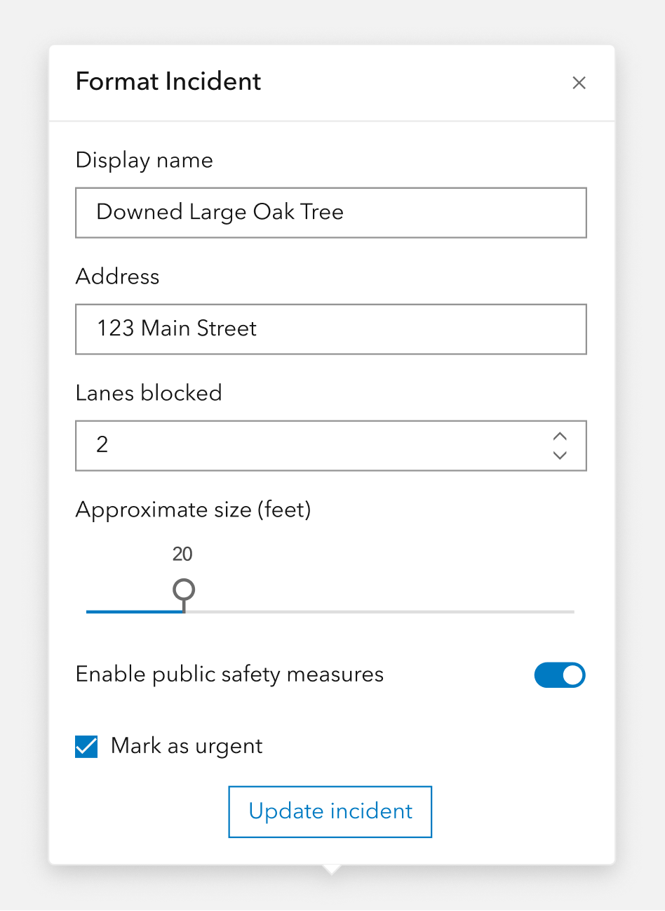
Sample
Usage
- Secondary workflow support that can be invoked from an action
- Descriptions of content
- A few contextual actions or inputs to modify an element
- Clicking an element to show date, author, or other relevant details
Component comparison
Popovers, Tooltips, and Dialogs may look similar, but each component is designed for a different level of content complexity and user interaction.
Best practices
Below are important guidelines on using the Popover component.


Accessibility
Focus order
The Popover's focus will navigate content sequentially to preserve meaning and expected use in support of Success Criterion 2.4.3: Focus Order. For this reason the first element depicted visually in the Popover will recieve keyboard focus, such as the component's close button (default).
Keyboard focus
It is strongly recommended to have focusable elements cycle through Popover where focus is false (default) to support assistive technology users. The expected behavior for assistive technologies is while the component is open only the contents and focusable elements are accessible.
Keyboard navigation
| Key | Function |
|---|---|
Tab | Moves focus to next focusable element. If the current focus is the last element and focus is false, focus will cycle to the first element. |
Tab and Shift | Moves focus to previous focusable element. If the current focus is the first element and focus is false, focus will cycle to the last element. |
Esc | Closes the component. |
API reference
Properties
| Property | Attribute | Description | Type | Default |
|---|---|---|---|---|
| autoClose | auto-close | When true, clicking outside of the component automatically closes open calcite-popovers. | boolean | false |
| closable | closable | When true, displays a close button in the component. | boolean | false |
| flipDisabled | flip-disabled | When true, prevents flipping the component's placement when overlapping its referenceElement. | boolean | false |
| flipPlacements | Specifies the component's fallback placement for slotted content when it's initial or specified placement has insufficient space available. | FlipPlacement[] | ||
| focusTrapDisabled | focus-trap-disabled | When true, prevents focus trapping. | boolean | false |
| focusTrapOptions | Specifies custom focus trap configuration on the component, where
"allowOutsideClick" allows outside clicks,
"initialFocus" enables initial focus,
"returnFocusOnDeactivate" returns focus when not active,
"extraContainers" specifies additional focusable elements external to the trap, such as 3rd-party components appending elements to the document body, and
"setReturnFocus" customizes the element to which focus is returned when the trap is deactivated. Return false to prevent focus return, or undefined to use the default behavior (returning focus to the element focused before activation). | Partial<FocusTrapOptions> | ||
| heading | heading | Specifies the component's heading text. | string | |
| headingLevel | heading-level | Specifies the heading level number of the component's heading for proper document structure, without affecting visual styling. | HeadingLevel | |
| label | label | Specifies an accessible label for the component. | string | |
| messageOverrides | Overrides individual strings used by the component. | Record<string, unknown> | undefined | ||
| offsetDistance | offset-distance | Specifies the distance to position the component away from the referenceElement. | number | |
| offsetSkidding | offset-skidding | Specifies the distance to position the component along the referenceElement. | number | 0 |
| open | open | When true, displays and positions the component. | boolean | false |
| overlayPositioning | overlay-positioning | Specifies the type of positioning to use for overlaid content, where:
"absolute" works for most cases - positioning the component inside of overflowing parent containers, which affects the container's layout, and
"fixed" is used to escape an overflowing parent container, or when the reference element's position CSS property is "fixed". | OverlayPositioning | "absolute" |
| placement | placement | Determines where the component will be positioned relative to the referenceElement. | LogicalPlacement | "auto" |
| pointerDisabled | pointer-disabled | When true, removes the caret pointer. | boolean | false |
| referenceElement | reference-element | The referenceElement is used to position the component according to its placement value.
Setting the value to an HTMLElement is preferred so the component does not need to query the DOM.
However, a string id of the reference element can also be used.
The component should not be placed within its own referenceElement to avoid unintended behavior. | ReferenceElement | string | |
| scale | scale | Specifies the size of the component. | Scale | "m" |
| topLayerDisabled | top-layer-disabled | When true and the component is open, disables top layer placement.
Only set this if you need complex z-index control or if top layer placement causes conflicts with third-party components. | boolean | false |
| triggerDisabled | trigger-disabled | When true, disables automatically toggling the component when its referenceElement has been triggered.
This property can be set to true to manage when the component is open. | boolean | false |
Slots
| Name | Description |
|---|---|
| default (unnamed) | A slot for adding custom content. |
Styles
| Name | Description |
|---|---|
| --calcite-popover-background-color | Specifies the component's background color. |
| --calcite-popover-border-color | Specifies the component's border color. |
| --calcite-popover-corner-radius | Specifies the component's corner radius. |
| --calcite-popover-max-size-x | Specifies the component's maximum width. |
| --calcite-popover-text-color | Specifies the component's text color. |
Events
| Name | Description | Behavior |
|---|---|---|
| calcitePopoverBeforeClose | Fires when the component is requested to be closed and before the closing transition begins. | |
| calcitePopoverBeforeOpen | Fires when the component is added to the DOM but not rendered, and before the opening transition begins. | |
| calcitePopoverClose | Fires when the component is closed and animation is complete. | |
| calcitePopoverOpen | Fires when the component is open and animation is complete. |
Methods
| Name | Description | Signature |
|---|---|---|
| componentOnReady | Creates a promise that resolves once the component is fully loaded. | componentOnReady(): Promise<this> |
| reposition | Updates the position of the component. | reposition(delayed?: boolean): Promise<void> |
| setFocus | Sets focus on the component's first focusable element. | setFocus(options?: FocusOptions): Promise<void> |
| updateFocusTrapElements | Updates the element(s) that are included in the component's focus-trap. | updateFocusTrapElements(extraContainers?:
FocusTrapOptions["extraContainers"]): Promise<void> |