Tiles are presentational components, useful for presenting consequential information in a compact, consistent format.
Overview
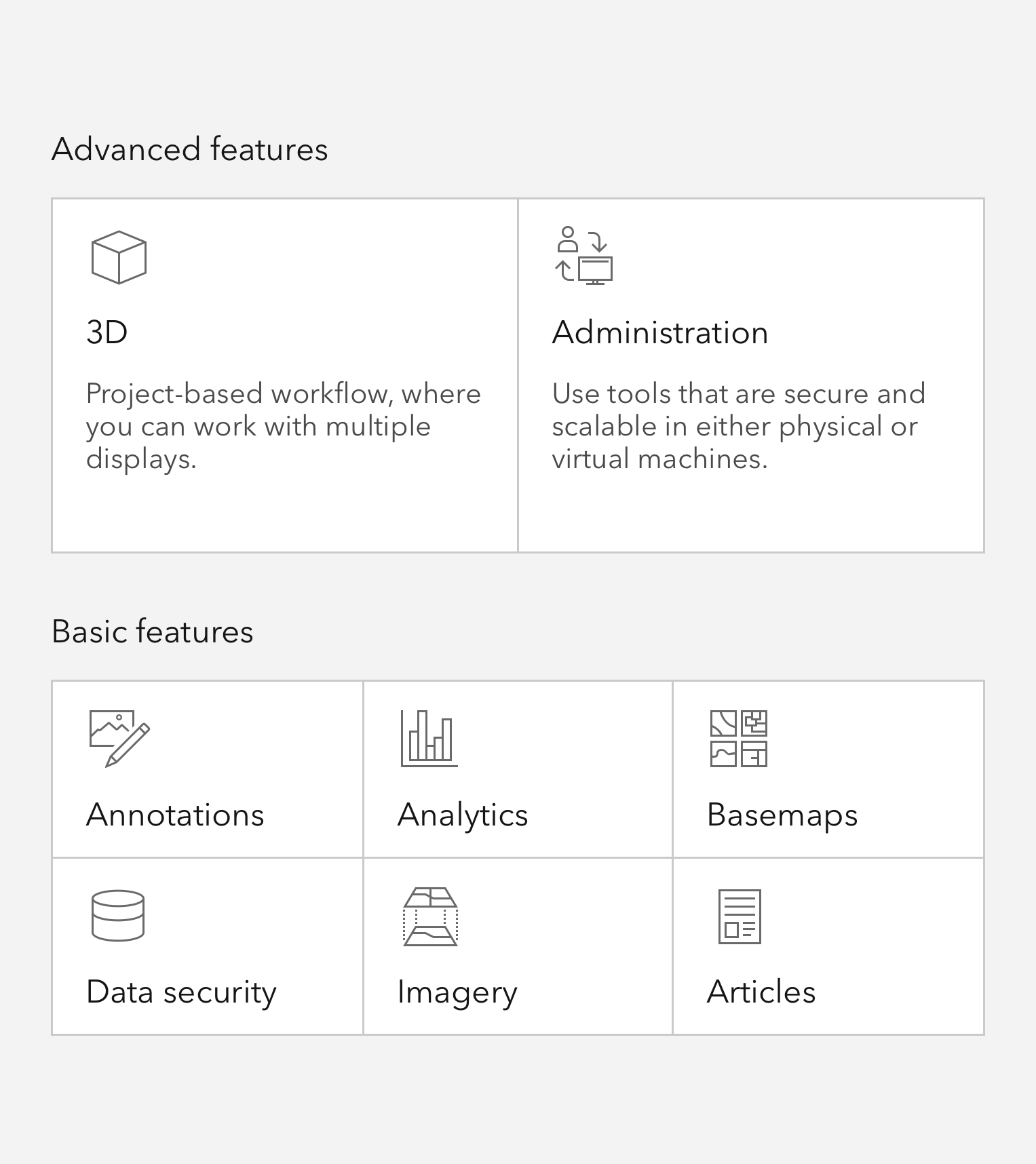
Tiles can contain supportive icons, a heading, and a description, and offer support for slotted, non-interactive content.
Sample
Usage
- Display of key content or information
- Selection workflows
- Primary navigational actions
Component comparison
While visually similar to the Card, a Tile has distinct capabilities and intended use cases.
Best used to represent one of a limited number of options, actions, or choices.
The component is wholly focusable - it may not contain slotted focusable elements.
Most often used to represent a single entity or item that is part of a group.
Can contain custom content and supports multiple slotted focusable elements.
Best practices
Recommendations
A Tile is a single focusable element and should not contain slotted interactive elements, whereas Cards may contain one or many individually focusable elements. Because the entire element is interactive, avoid placing focusable elements within the Tile to ensure users can interact with the Tile as a single entity.

Writing and copy
Text for Tiles should be on the shorter side, and as concise as possible.
- Use sentence case for heading and description
- End description with proper punctuation
- Avoid forming questions in Tiles
- Recommended heading character maximum: 50
- Recommended description character maximum: 175
API reference
Properties
| Property | Attribute | Description | Type | Default |
|---|---|---|---|---|
| active | active | true, the component is active. | boolean | false |
| alignment | alignment | Specifies alignment of the component's content. | Exclude<Alignment, "end"> | "start" |
| description | description | Specifies a description for the component. Displays below the heading. | string | |
| disabled | disabled | When true, interaction is prevented and the component is displayed with lower opacity. | boolean | false |
| embed | embed | true, renders without a border and padding for use by other components. | boolean | false |
| heading | heading | Specifies the component's heading text. displays between the icon and description. | string | |
| headingLevel | heading-level | Specifies the heading level number of the component's heading for proper document structure, without affecting visual styling. | HeadingLevel | |
| href | href | When embed is false, specifies the URL for the component. | string | |
| icon | icon | Specifies an icon to display. | IconName | |
| iconFlipRtl | icon-flip-rtl | When true, the icon will be flipped when the element direction is right-to-left ("rtl"). | boolean | false |
| label | label | Specifies an accessible label for the component. | string | |
| scale | scale | Specifies the component's size. | Scale | "m" |
| selected | selected | When true and the parent's selectionMode is "single", "single-persist"', or "multiple"`, the component is selected. | boolean | false |
Slots
| Name | Description |
|---|---|
| content-top | A slot for adding non-actionable elements above the component's content. Content slotted here will render in place of the icon property. |
| content-bottom | A slot for adding non-actionable elements below the component's content. |
Styles
| Name | Description |
|---|---|
| --calcite-tile-accent-color-press | When the parent calcite-tile-group has a selectionMode that is not "none", specifies the color of the component's selection elements, such as the radio, checkbox, and border. |
| --calcite-tile-background-color | Specifies the component's background color. |
| --calcite-tile-border-color | Specifies the component's border color. |
| --calcite-tile-corner-radius | Specifies the component's corner radius. |
| --calcite-tile-heading-text-color | Specifies the component's heading text color. |
| --calcite-tile-link-color | When href is present, specifies the component's link color. |
| --calcite-tile-shadow | Specifies the shadow around the component. |
| --calcite-tile-text-color | Specifies the component's description and icon text color, but not the heading text color. |
| --calcite-tile-link-text-color | Specifies the component's link text color. |
Events
| Name | Description | Behavior |
|---|---|---|
| calciteTileSelect | Fires when the selected state of the component changes. |
Methods
| Name | Description | Signature |
|---|---|---|
| componentOnReady | Creates a promise that resolves once the component is fully loaded. | componentOnReady(): Promise<this> |
| setFocus | Sets focus on the component. | setFocus(options?: FocusOptions): Promise<void> |