Progress is a thin and linear visual designed to show processing time for a task or workflow.
Overview
Designed to be used on a top or bottom edge of an area, Progress can be a helpful UX device to show the user something is being processed or loaded.
Progress has a smaller height than Loader and is less obtrusive, which can be handy in tight spaces. Prefer the "determinate" type when processing time can be accurately represented.
Sample
Usage
- Add to the top or bottom of a Panel, Popover, Dialog, Card, Tile, or area with a clear edge to show processing time
Component comparison
Progress and Loader are similar in purpose but differ in appearance. Conversely, Progress and Meter are similar in appearance but differ in purpose.
Best for compactly representing processing time and advancement towards completion.
Used adjacent to the top or bottom edge of other elements.
When
type="determinate", value must be between 0 and 100.Best for representing processing time.
Used independently or as built-in functionality such as Button's
loading propertyWhen
type="determinate", value must be between 0 and 100.Best for displaying a measured value within fixed bounds.
Used independently.
value can be any number.Best practices
Progress type | Usage |
|---|---|
"determinate" | Preferred type. Use when processing percentage is known. |
"indeterminate" | Use when processing percentage is unknown. |
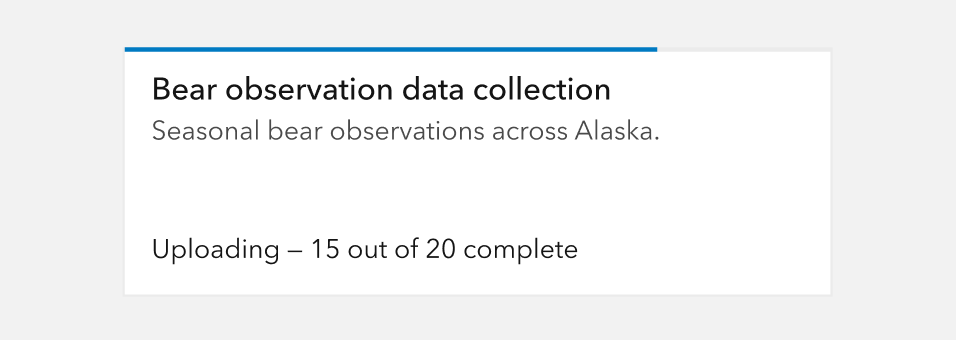
determinate Progress bars when processing percentage is known and updates reliably.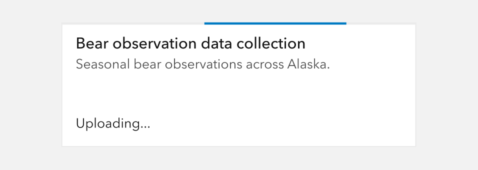
indeterminate Progress bars when the processing percentage is unknown or unpredictable. User trust can be diminished by inaccurate percentages such as those that stall, jump, or move backward.API reference
Properties
| Property | Attribute | Description | Type | Default |
|---|---|---|---|---|
| label | label | Specifies an accessible label for the component. | string | |
| reversed | reversed | When true and type is "indeterminate", reverses the animation direction. | boolean | false |
| text | text | Text that displays under the component's indicator. | string | |
| type | type | Specifies the component type.
Use "indeterminate" if finding actual progress value is impossible. | "indeterminate" | "determinate" | "determinate" |
| value | value | When type is "determinate", specifies the component's value with a range of 0 to 100. | number | 0 |
Styles
| Name | Description |
|---|---|
| --calcite-progress-background-color | Specifies the component's background color. |
| --calcite-progress-fill-color | Specifies the component's fill color. |
| --calcite-progress-text-color | Specifies the component's text color. |
Methods
| Name | Description | Signature |
|---|---|---|
| componentOnReady | Creates a promise that resolves once the component is fully loaded. | componentOnReady(): Promise<this> |