Switch provides "on" and "off" choices and can be useful for opt-in and additive actions.
Overview
Switches should be used for boolean and "on" and "off" choices. They should not be for binary choices such as "1 or 2", "blue or red", "sky or ground", "miles or kilometers", "large or small", etc.
For "yes" and "no" interactions, multiple selections, and interactions where a choice is optional, please consider Checkbox.
For single choice interactions, please consider Radio Button or Segmented Control.
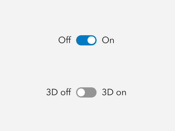
Sample
Usage
- Dark mode switch
- Layer visibility
Component comparison
Switches, Checkboxes, and Segmented Controls are similar, but each component is designed for a different purpose.
Best practices
Below are important guidelines on using the Switch component.

Accessibility
Switch should include a label property value, or be accompanied by a Label, which provides context of the intent to support assistive technologies.
Keyboard navigation
| Key | Function |
|---|---|
Tab | Moves focus in or out of component. |
Tab and Shift | Move focus in or out of component. |
Enter | Toggles the component. |
Space | Toggles the component. |
Writing and copy
Keep labels for Switches succinct. Do not use contractions such as "you're", "aren't", "can't", and "haven't" for Switch labels in order to reduce confusion. Avoid writing Switch text as a question.
A label for a Switch should be supporting "On" as additive, not subtractive. For example:
- Show layer
- Enable editing
- Allow credit usage
- Display controls
- Update automatically
API reference
Properties
| Property | Attribute | Description | Type | Default |
|---|---|---|---|---|
| checked | checked | When true, the component is checked. | boolean | false |
| disabled | disabled | When true, interaction is prevented and the component is displayed with lower opacity. | boolean | false |
| form | form | Specifies the id of the component's associated form.
When not set, the component is associated with its ancestor form element, if one exists. | string | |
| label | label | Specifies an accessible label for the component. | string | |
| labelTextEnd | label-text-end | Specifies the component's end label text. | string | |
| labelTextStart | label-text-start | Specifies the component's start label text. | string | |
| name | name | Specifies the name of the component. Required to pass the component's value on form submission. | string | |
| scale | scale | Specifies the component's size. | Scale | "m" |
| value | value | The component's value. | any |
Styles
| Name | Description |
|---|---|
| --calcite-switch-background-color | Specifies the component's background color. |
| --calcite-switch-background-color-hover | Specifies the component's background color when hovered or pressed. |
| --calcite-switch-border-color | |
| --calcite-switch-corner-radius | Specifies the component's corner radius. |
| --calcite-switch-handle-background-color | Specifies the handle's background color. |
| --calcite-switch-handle-border-color | |
| --calcite-switch-handle-shadow |
Events
| Name | Description | Behavior |
|---|---|---|
| calciteSwitchChange | Fires when the checked value has changed. |
Methods
| Name | Description | Signature |
|---|---|---|
| componentOnReady | Creates a promise that resolves once the component is fully loaded. | componentOnReady(): Promise<this> |
| setFocus | Sets focus on the component. | setFocus(options?: FocusOptions): Promise<void> |