<meta name="viewport" content="width=device-width, initial-scale=1, shrink-to-fit=no" />
<title>Histogram component | Sample | ArcGIS Maps SDK for JavaScript</title>
<!-- Load the ArcGIS Maps SDK for JavaScript from CDN -->
<script type="module" src="https://js.arcgis.com/5.0/"></script>
background-color: #6cc2ea;
--arcgis-histogram-bar-color: rgba(221, 68, 65, 0.8);
<arcgis-zoom slot="top-left"></arcgis-zoom>
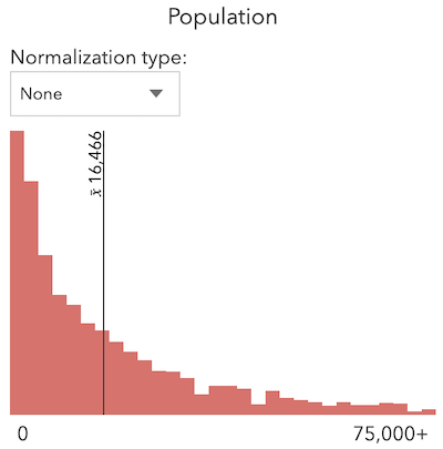
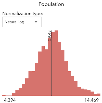
heading="Total Population"
description="Censo Mexico 2020">
<calcite-panel slot="bottom-left" heading="Population">
<calcite-block expanded label="histogram block">
<calcite-select id="normalization-type">
<calcite-option value="none">None</calcite-option>
<calcite-option value="log" selected>Log</calcite-option>
<calcite-option value="natural-log">Natural log</calcite-option>
<calcite-option value="square-root">Square root</calcite-option>
<calcite-option value="percent-of-total">Percent of total</calcite-option>
<arcgis-histogram layout="horizontal"></arcgis-histogram>
<span style="float: left" id="min"></span>
<span style="float: right" id="max"></span>
const [Map, FeatureLayer, histogram, summaryStatistics, Color] = await $arcgis.import([
"@arcgis/core/layers/FeatureLayer.js",
"@arcgis/core/smartMapping/statistics/histogram.js",
"@arcgis/core/smartMapping/statistics/summaryStatistics.js",
const viewElement = document.querySelector("arcgis-map");
const histogramElement = document.querySelector("arcgis-histogram");
const basemapLayer = new FeatureLayer({
id: "2b93b06dc0dc4e809d3c8db5cb96ba69",
effect: "drop-shadow(0px 0px 15px #cae7f1)",
color: [225, 225, 225, 1],
// change the default highlight group object options
const layerColor = new Color("rgba(221, 68, 65, 0.8)");
const layer = new FeatureLayer({
id: "5f4d25bbc83e440c98585f3feb179a0c",
effect: "drop-shadow(2px 2px 2px gray)",
title: "{nom_mun}, {nom_ent}",
content: "Population: {pobtot}",
color: [240, 240, 240, 1],
color: [200, 200, 200, 0.5],
color: "rgba(255,255,255,0.5)",
// set map component's spatial reference and constraints
viewElement.spatialReference = {
viewElement.constraints = {
viewElement.map = new Map({
baseLayers: [basemapLayer],
// wait for the map component to be ready
await viewElement.viewOnReady();
// set the map's viewpoint to Mexico
viewElement.viewpoint = {
viewElement.highlights.forEach((option) => {
if (option.name === "default") {
((option.fillOpacity = 0.1),
(option.haloColor = layerColor),
(option.color = layerColor));
const normalizationTypeElement = document.getElementById("normalization-type");
normalizationTypeElement.addEventListener("calciteSelectChange", createHistogram);
async function fetchStats(field) {
const normalizationType =
normalizationTypeElement.value === "none" ? null : normalizationTypeElement.value;
normalizationTotal: normalizationType === "percent-of-total" ? 126014024 : null,
maxValue: !normalizationType
: normalizationType === "percent-of-total"
const result = await Promise.all([histogram(params), summaryStatistics(params)]);
async function createHistogram() {
// fetches summary statistics and histogram bins
// from the feature service
const histogramResult = response[0];
const statsResult = response[1];
const normType = normalizationTypeElement.value;
const minElement = document.getElementById("min");
const maxElement = document.getElementById("max");
minElement.textContent = formatLabel(histogramResult.minValue);
const suffix = normType === "none" || normType === "percent-of-total" ? "+" : "";
maxElement.textContent = formatLabel(histogramResult.maxValue) + suffix;
// Update the histogram component with the new data
histogramElement.min = histogramResult.minValue;
histogramElement.max = histogramResult.maxValue;
histogramElement.bins = histogramResult.bins;
histogramElement.average = formatLabel(statsResult.avg);
function formatLabel(value) {
if (normalizationTypeElement.value === "none") {
return Math.round(value).toLocaleString();
if (normalizationTypeElement.value === "percent-of-total") {
return (value * 100).toLocaleString() + "%";
return value.toLocaleString();