Current version: 4.34 (October 2025)
This guide describes how to use the ArcGIS Maps SDK for JavaScript to build compelling web apps that unlock your data’s potential with interactive user experiences and stunning 2D and 3D visualizations.
Animated streamline visualization of wind speed and direction during Hurricane Ida in August 2021. Double-click the map to zoom in and see the renderer change.
Where to start
- Discover key features of the SDK.
- Get started overview the SDK.
- Explore the tutorials and sample code.
Sample code
Explore our full collection of samples in our samples directory, or play around with one of the highlighted samples below.
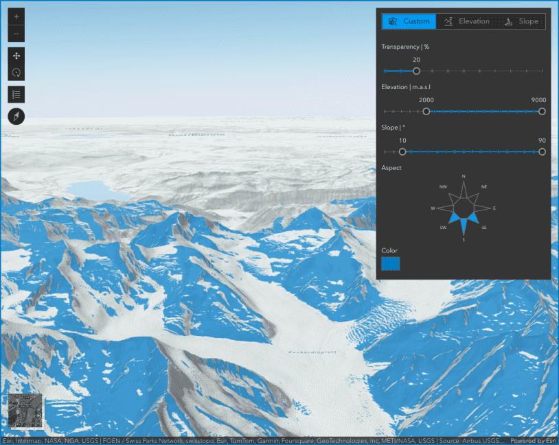
Terrain analysis with raster functions

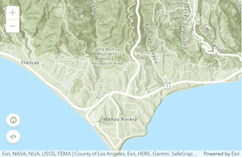
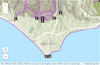
Select features by rectangle

Basemap Gallery component
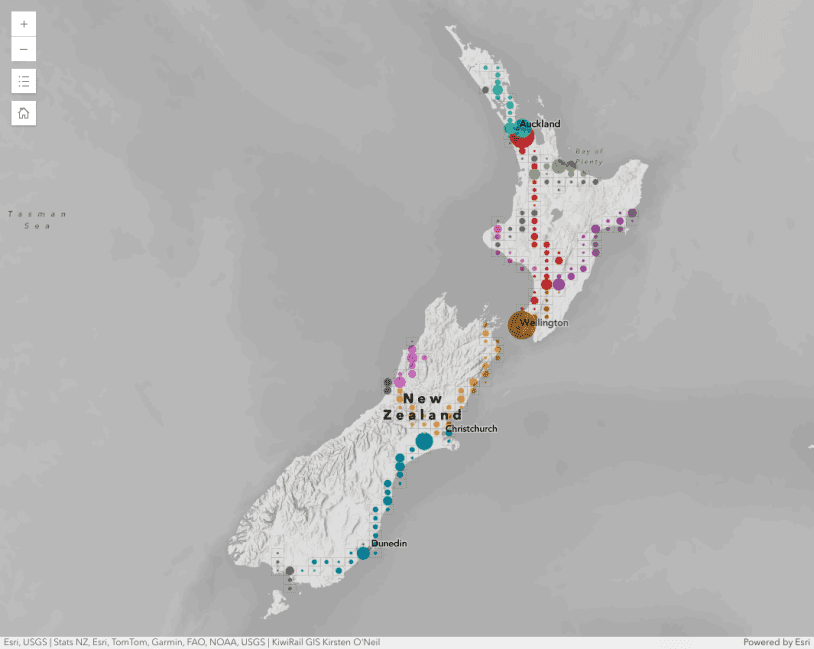
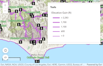
Binning polylines

Interactive viewshed analysis

Sketch component
Showcase
See how to combine functionality into interactive and compelling applications.
Tutorials
Display a map

Display your location

Add a point, line, and polyline
Add a feature layer

Find places
Display a web map
Blog
Fetching Data