Current version: 5.0 (February 2026)
This guide describes how to use the ArcGIS Maps SDK for JavaScript
Where to start
- Discover key features of the SDK.
- Get started overview the SDK.
- Explore the tutorials and sample code.
Sample code
Explore our extensive collection of samples, or play around with one of the highlighted samples below.
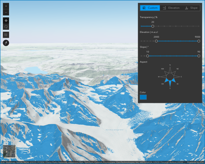
Terrain analysis with raster functions
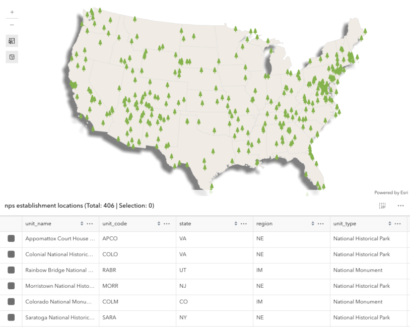
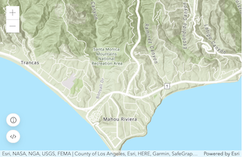
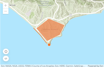
Select features by rectangle
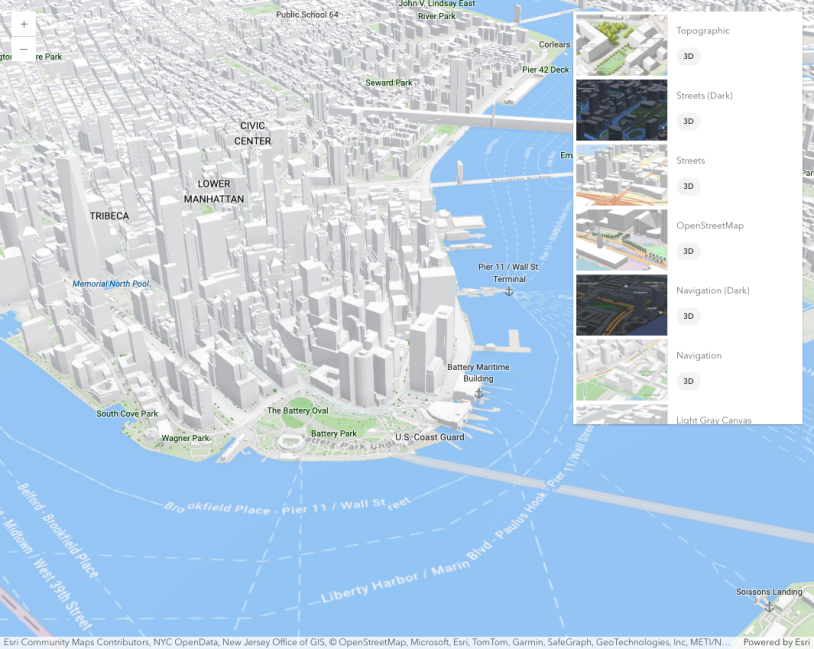
Basemap Gallery component
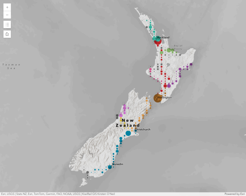
Binning polylines

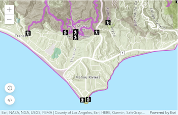
Interactive viewshed analysis
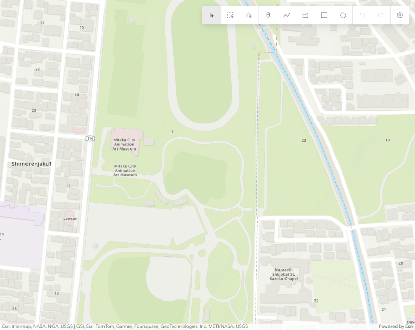
Sketch component
Showcase
See how to combine functionality into interactive and compelling applications.
Tutorials
Display a map

Display your location
Add a point, line, and polyline
Add a feature layer
Find places
Display a web map
Blog
What is ArcGIS Maps SDK for JavaScript? A Practical Guide for Builders and Decision‑Makers
Explore JavaScript Maps SDK, Esri's leading solution for creating custom, interactive, and data-rich 2D and 3D web mapping …

Retirement of custom widgets in ArcGIS Experience Builder built with Maps SDK for JavaScript
ArcGIS Experience Builder custom built widgets using ArcGIS Maps SDK for JavaScript widgets will retire in Q1 …

Federal Technical Webinar Series
Register for this technical webinar series designed specifically for federal government professionals who rely on Esri’s ArcGIS …