Learn how to display and create charts using Charts Components and Charts Model.
In this tutorial, you will:
- Load and display a chart from a webmap and feature layer stored in ArcGIS Online.
- Create a new chart using the charts model and display it in your app.
Steps
Create a new pen
- Go to CodePen to create a new pen for your application.
Add basic HTML
Define a basic HTML page.
- In CodePen > HTML, add HTML to create a basic page.
<html>
<head>
<meta charset="utf-8" />
<meta name="viewport" content="initial-scale=1, maximum-scale=1, user-scalable=no" />
<title>ArcGIS Maps SDK for JavaScript Tutorials: Display and create charts with charts-components & charts-model</title>
<style>
</style>
</head>
<body>
</body>
</html>Display a chart with @arcgis/charts-components
Add references
- In the
<headtag, add references to the ArcGIS core library and CSS, and the @arcgis/charts-components package.>
<link rel="stylesheet" href="https://js.arcgis.com/4.30/esri/themes/dark/main.css" />
<script src="https://js.arcgis.com/4.30"></script>
<script type="module" src="https://js.arcgis.com/charts-components/4.30/arcgis-charts-components.esm.js"></script>Add a chart component
- In the
<bodytag, create a> <divelement with a class set to> chart-container. Add the<arcgis-charts-scatter-plotcomponent inside the> <divwith an id set to> scatterplot.
<div class="chart-container">
<arcgis-charts-scatter-plot id="scatterplot"></arcgis-charts-scatter-plot>
</div>Add styling
- In the
<styletag, add CSS to style the chart container and the scatterplot.>
.chart-container {
display: flex;
height: 80vh;
}
#scatterplot {
flex: 1;
}Add script logic for displaying a chart
- Add a
<script type="module"section in the> <body.> - Define a function named
loadfor loading a feature layer from a webmap by passing in theFeature Layer() webmapandId layer.Title - Load the feature layer item by calling the asynchronous function
load.Feature Layer(webmap Id, layer Title) - Use
document.getto refer theElement By Id() arcgis-charts-scatter-plotComponent. - Get the first chart's configuration from the feature layer.
- Assign the scatterplot configuration and the feature layer to the scatterplot element.
<!-- Step 1 -->
<script type="module">
// Step 2
async function loadFeatureLayer(webmapId, layerTitle) {
const WebMap = await $arcgis.import("esri/WebMap");
const webmap = new WebMap({
portalItem: {
id: webmapId
}
});
await webmap.loadAll();
const featureLayer = webmap.layers.find((layer) => layer.title === layerTitle);
return featureLayer;
}
// Step 3
const featureLayer = await loadFeatureLayer("96cb2d2825dc459abadcabc941958125", "College Scorecard");
// Step 4
const scatterplotElement = document.getElementById("scatterplot");
// Step 5
const scatterplotConfig = await featureLayer.charts[0];
// Step 6
scatterplotElement.config = scatterplotConfig;
scatterplotElement.layer = featureLayer;
</script>Create a chart with @arcgis/charts-model
Add a chart component
- Add the
<arcgis-charts-pie-chartcomponent inside the> <div class="chart-container"with an id set to> pie-chart.
<div class="chart-container">
...
<arcgis-charts-pie-chart id="pie-chart"></arcgis-charts-pie-chart>
</div>Add styling
- In the
<styletag, add CSS to style the pie chart.>
#pie-chart
#scatterplot {
flex: 1;
}Add script logic for creating a chart
- Import the
PiefromChart Model @arcgis/charts-modelCDN. - Use
document.getto refer theElement By Id() arcgis-charts-pie-chartcomponent. - Create a new instance of pie chart model by passing in the necessary parameters (Layer and mode).
- Modify some of the properties of the pie chart model.
- Get the chart's configuration from the pie chart model.
- Assign the pie chart config and the feature layer to the pie chart element.
<script type="module">
// Step 1
import { PieChartModel } from "https://js.arcgis.com/charts-model/4.30/index.js";
// Step 2
const pieChart = document.getElementById("pie-chart");
// Step 3
const pieChartModel = new PieChartModel({
layer: featureLayer,
mode: 'category'
});
// Step 4
pieChartModel.category = 'Type';
pieChartModel.showDataLabels = true;
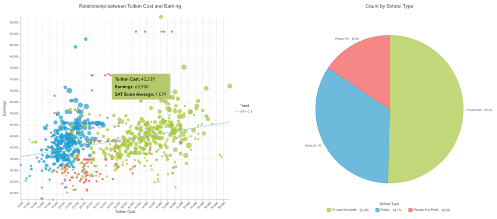
pieChartModel.title = "Count by School Type";
pieChartModel.legendTitleText = "School Type";
pieChartModel.legendPosition = "bottom";
// Step 5
const pieChartConfig = await pieChartModel.config;
// Step 6
pieChart.config = pieChartConfig;
pieChart.layer = featureLayer;
</script>Run the app
In CodePen, run your code to display the chart.
The app should display a chart (scatterplot) showing the relationship between education cost and income earnings with a line displaying the linear trend.
What's next?
- Go to the component reference for more detailed information about components.