Accessibility is the practice of making applications usable by people with disabilities, including those who are sight, hearing, or motor impaired. ArcGIS Maps SDK for Kotlin leverages the W3C Accessibility Standards to help ensure the applications and experiences you create are usable by a wide range of audiences.
Basic content accessibility guidelines are defined by the Web Content Accessibility Guidelines (WCAG), which provide a set of recommendations for making content more accessible. These guidelines are organized around four principles:
- Perceivable: Information and user interface components must be presentable to users in ways they can perceive. This includes guidelines for text alternatives, time-based media, adaptable content, and distinguishable elements.
- Operable: User interface components and navigation must be operable. This includes guidelines for keyboard accessibility, enough time to read and use content, seizures and physical reactions, navigable content, and input modalities.
- Understandable: Information and the operation of user interface must be understandable. This includes guidelines for readable text, predictable screens, and input assistance.
- Robust: Content must be robust enough that it can be interpreted reliably by a wide variety of user agents, including assistive technologies.
Accessibility in ArcGIS Maps SDK for Kotlin
While originally created for web apps, the principles defined in the Web Content Accessibility Guidelines (WCAG) have also been adapted for native apps. See Guidance on Applying WCAG 2 to Non-Web Information and Communications Technology for details about applying these criteria in non-web apps.
Where applicable, ArcGIS Maps SDK for Kotlin supports key accessibility features that allow developers to create apps for a broader audience. While ArcGIS Maps SDK for Kotlin is created with accessibility in mind, it relies on your app, Android platform APIs, and assistive technologies for complete accessibility support. As an ArcGIS Maps SDK for Kotlin developer, address concerns such as:
- Providing text alternatives for non-text content.
- Ensuring sufficient color contrast.
- Making all functionality available from keyboard input and non-touch input.
- Providing clear and consistent focus navigation.
- Allowing users to customize their experience.
- Giving controls and map-related UI accessible names, roles, and descriptions.
- Making applications screen-reader compatible with TalkBack.
- Supporting Android text scaling and display size settings.
Color and contrast
Color contrast is expressed as a ratio between the luminance (brightness) of foreground and background colors. In general, higher contrast ratios make text and UI elements easier to distinguish.
When designing apps with color in mind, consider the following:
- Use sufficient color contrast to ensure text is readable against its background. WCAG 2.1 recommends a contrast ratio of at least 4.5:1 for normal text and 3:1 for large text.
- Use color with other visual cues (such as labels, icons, or patterns) to convey information. Do not rely only on color to convey meaning.
- Use color palettes that are friendly to color-blind users. Tools such as Color Brewer can help you select appropriate schemes.
- Ensure interactive elements have sufficient contrast against their backgrounds to remain discoverable.
For tips on accessible map design, see Accessibility essentials for GIS and mapping. For a Kotlin-specific contrast implementation example, see Update basemap for contrast accessibility.
WCAG Guideline: Keep map styling aligned with user contrast preferences (WCAG perceivable content) by using a basemap style that reflects the selected contrast mode. The following code selects a basemap based on the current contrast appearance.
private fun contrastBasemapFor(contrast: ContrastAppearance): Basemap { return when (contrast) { ContrastAppearance.Light -> Basemap(BasemapStyle.ArcGISLightGray) ContrastAppearance.Dark -> Basemap(BasemapStyle.ArcGISDarkGray) ContrastAppearance.HighContrastLight -> Basemap("https://www.arcgis.com/home/item.html?id=084291b0ecad4588b8c8853898d72445") ContrastAppearance.HighContrastDark -> Basemap("https://www.arcgis.com/home/item.html?id=3e23478909194c54992eaaee78b5f754") }}
Keyboard and focus
Keyboard accessibility for controls in your app helps users who are visually impaired, have motor disabilities, or use external keyboards and switch-like input devices. Ensure all interactive elements in your app can be reached and operated without touch.
This includes:
- Providing a logical focus order for navigating interactive elements.
- Using clear focus indicators for the currently focused element.
- Allowing users to navigate map and scene content with keyboard input.
- Ensuring all functionality is available via keyboard shortcuts, key events, or accessible actions.
The keyboard navigation for geoview controls in ArcGIS Maps SDK for Kotlin is described in the following topics:
In the ArcGIS Maps SDK for Kotlin Toolkit (Compose-based), be aware of the following when designing accessible keyboard and focus interactions.
- Geoview composables provide the
canFocus: Boolean = trueparameter to the composable by default, which allows keyboard users to interact with the map, scene, or local scene view (including the data attribution and the required Powered by Esri attribution). Toolkit geoviews includeMapView,SceneView, andLocalSceneView. - While the
Calloutcontainer is visible, the geoview composable is not focusable (that is, geoview-keyboard interaction is disabled). Keyboard interaction resumes when theCalloutis removed from the composition tree. - Use
Modifier.preferredContentFocusTargetinGeoViewScopeto set the initial focus target when aCalloutis displayed.
In the ArcGIS Maps SDK for Kotlin core API (View-based), be aware of the following when designing accessible keyboard and focus interactions:
- A
GeoView(including data attribution and the Powered by Esri attribution) honors theisFocusableflag.isFocusableis true by default.GeoViews in the core API areMapView,SceneView, andLocalSceneView
WCAG Guideline: Provide predictable keyboard alternatives for common map actions (WCAG operable input) by handling key events with explicit shortcuts and numeric selection logic. The following code maps keyboard input to app-level actions such as help, identify mode, geoview switching, and feature selection.
    fun onKeyEvent(event: KeyEvent): Boolean {        if (event.type != KeyEventType.KeyDown) return false
        if (event.isCtrlPressed) {            when (event.key) {                Key.H -> {                    toggleHelp()                    return true                }
                Key.I -> {                    toggleIdentifyMode()                    return true                }
                Key.G -> {                    toggleBasemapStyle()                    return true                }
                Key.C -> {                    clearSelection()                    return true                }
                else -> Unit            }        }
        if (event.key == Key.Enter && isIdentifyEnabled) {            identifyAtCenter()            return true        }
        val index = numberKeyToIndex(event.key)        if (index != null && isIdentifyEnabled) {            return updateSelectedFeature(index)        }
        return false    }
WCAG Guideline: Keep keyboard and assistive technology workflows continuous by directing focus to callout content when it appears. The following code configures a map view focus and assigns the callout text as the preferred focus target.
MapView( modifier = Modifier .fillMaxSize() .weight(1f) .onSizeChanged(mapViewModel::updateMapViewSize), arcGISMap = mapViewModel.arcGISMap, mapViewProxy = mapViewModel.mapViewProxy, onSingleTapConfirmed = mapViewModel::identifyAtTap ) { mapViewModel.selectedFeatureResult?.let { selected -> Callout(geoElement = selected.feature) { Column( modifier = Modifier.padding(8.dp), verticalArrangement = Arrangement.spacedBy(6.dp) ) { Text( text = selected.displayName, style = MaterialTheme.typography.titleSmall, modifier = Modifier.preferredContentFocusTarget() ) Button(onClick = mapViewModel::clearSelection) { Text("Close callout") } } } } }
TalkBack
Screen reading is a helpful tool that describes content on the screen. With TalkBack, users can hear spoken feedback, move accessibility focus through UI controls, and perform actions without relying on vision.
In ArcGIS-based apps, TalkBack users should be able to:
- Reach map and scene containers in a predictable order.
- Hear meaningful labels and descriptions for map UI controls, callouts, and actionable content.
- Move focus in and out of callout content without getting trapped.
- Continue interacting with the app when map gestures are limited by screen-reader mode.
When TalkBack is enabled, avoid gesture-only interactions and provide accessible alternatives for map operations such as setting custom viewpoint, performing identify, or opening/closing callout operations. Note that once a geoview has captured focus, keyboard interactions are available even through TalkBack.
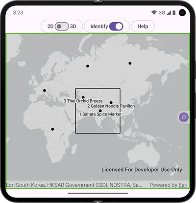
WCAG Guideline: Announce meaningful context changes without interrupting active speech by using a live region semantics to configure audible announcements. The following patterns define a hidden announcer and trigger spoken updates when the map or interaction mode changes.
@Composableprivate fun A11yHiddenAnnouncer(a11yMessage: String) { Text( text = a11yMessage, color = Color.Transparent, modifier = Modifier.semantics { liveRegion = LiveRegionMode.Polite hideFromAccessibility() contentDescription = a11yMessage } )} LaunchedEffect(isGeoViewMapView) { val prev = prevIsGeoViewMapView prevIsGeoViewMapView = isGeoViewMapView if (prev != null && prev != isGeoViewMapView) { val message = if (isGeoViewMapView) "Entering 2D view" else "Entering 3D view" sendAnnouncement(message) } }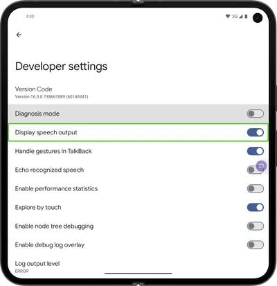
Voice Access and Switch Access
In addition to touch and keyboard input, Android assistive technologies such as Voice Access and Switch Access enable hands-free and alternative input navigation.
To support these technologies:
- Use descriptive labels so controls can be identified by voice commands.
- Ensure all important actions are exposed as standard clickable controls.
- Avoid custom interactions that do not expose accessibility semantics.
- Test critical workflows without touch input.
Other accessibility features
Additional accessibility support in Android apps commonly includes:
- Respecting user text scaling (font size) and display size settings.
- Avoiding fixed-size text containers that truncate larger text.
- Ensuring callout content and overlays remain readable and reachable at larger text sizes.
Resources
- W3C Accessibility Standards: W3C accessibility standards overview.
- Web Content Accessibility Guidelines (WCAG) - Quick Reference: WCAG 2.1 quick reference.
- Android Accessibility overview: Android accessibility guidance.
- Esri Accessibility: Esri’s approach to accessibility.
- Accessibility essentials for GIS and mapping: Tips for creating accessible maps.
- Accessibility - Calcite Design System: Best practices when designing accessible experiences.
- Esri Legal Accessibility: Esri legal accessibility statement.

