With the
Adding and positioning UI components
The JavaScript Maps SDK uses web components for the user interface (UI). Components such as <arcgis-zoom> and <arcgis-basemap-toggle> are placed in the map or scene through slots.
Slots
Slots are placeholders inside a web component that allow you to insert custom content. They are a standard feature of Web Components and come in two types: named slots, which map to specific, predefined positions, and the default slot, which is used when no slot is specified. When a slot is defined in a component, you can add your content and assign it to a named slot using the slot attribute.
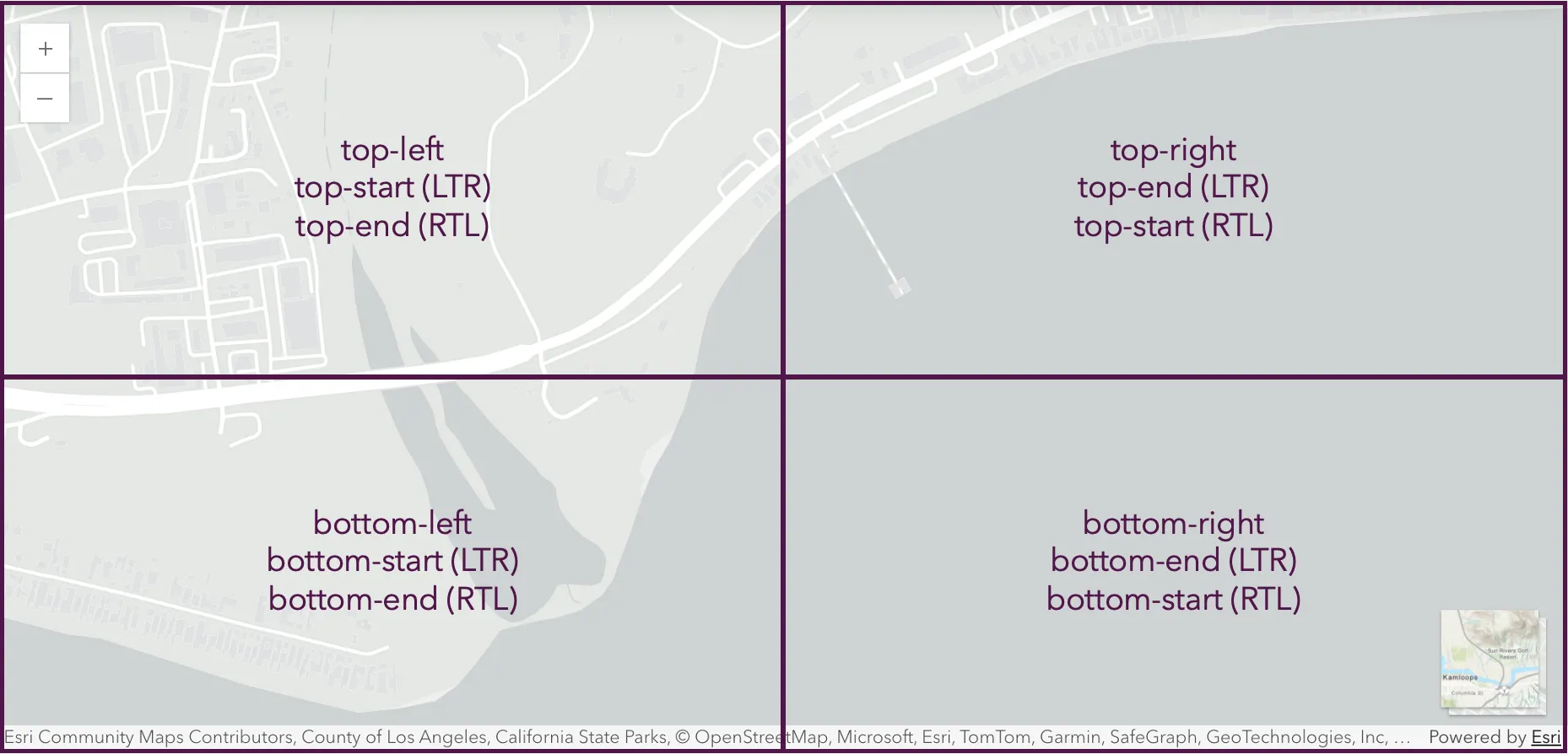
The following named slots are supported in the Map, Scene, Link Chart, and Video components:
top-lefttop-rightbottom-leftbottom-righttop-starttop-endbottom-startbottom-end
Example
<arcgis-map> <arcgis-zoom slot="top-left"></arcgis-zoom> <arcgis-basemap-toggle slot="bottom-right"></arcgis-basemap-toggle></arcgis-map>When multiple components are placed in the same slot, the top- slots will stack vertically, and the bottom- slots will stack horizontally. To override this behavior, place the elements manually.
Custom placement
For additional configuration, you can omit slots and position elements using your own layout or CSS. When no slot is specified, the element is placed in the component’s default slot, which allows you to freely position it however you like.
<style> #toggle {    position: absolute;    bottom: 2rem;    left: 2rem;  }</style>
<arcgis-map item-id="02b37471d5d84cacbebcccd785460e94">  <arcgis-basemap-toggle id="toggle"></arcgis-basemap-toggle></arcgis-map>
Map component layout CSS variables
The Map, Scene, Link Chart, and Video components provide CSS variables that reserve space around their content to prevent overlaying UI elements (like toolbars, legends, or panels) from obscuring slotted components.
- Variables:
--arcgis-layout-overlay-space-top--arcgis-layout-overlay-space-right--arcgis-layout-overlay-space-bottom--arcgis-layout-overlay-space-left
- Default: 0 for all sides
- Applies to:
<arcgis-map>,<arcgis-scene>,<arcgis-link-chart>,<arcgis-video>
Usage
You can use these variables to adjust the visual layout of your content within Map, Scene, Link Chart, or Video. For calculations like centering or fitting an extent, combine them with the padding property so the respects the reserved space.
arcgis-map { --arcgis-layout-overlay-space-top: 100px; --arcgis-layout-overlay-space-right: 100px;}const viewElement = document.querySelector("arcgis-map");// Ensure map center/extent calculations also respect overlay spaceviewElement.padding = { top: 100, right: 100 };Styling and theming with Calcite
Map components are built with Calcite components, which provide a consistent look and feel to your UI via CSS variables, modes, and ready-to-use UI elements.
Build a UI
When constructing your own UI, it is recommended to build with Calcite components for a cohesive and accessible experience. Since the SDK’s components are built with Calcite, you can achieve maximum consistency by constructing the rest of your UI using the same components. Explore Calcite’s offering of tutorials to get started, and many of the JavaScript Maps SDK samples showcase Calcite components in action. Refer to the samples gallery for examples.
Light and dark modes
Calcite components support light and dark modes. Apply the mode by adding a class on the component itself or its parent container.
<!-- Dark mode --><body class="calcite-mode-dark"> <arcgis-map item-id="02b37471d5d84cacbebcccd785460e94"> <arcgis-zoom slot="top-left"></arcgis-zoom> <arcgis-basemap-gallery slot="bottom-right"></arcgis-basemap-gallery> </arcgis-map></body>You can also switch between light and dark mode dynamically with JavaScript:
document.body.classList.toggle("calcite-mode-dark");Theming with CSS variables
Map components and Calcite components share the same CSS variables. This means you can use Calcite variables to theme all components in your app — map components (like arcgis-time-slider) and Calcite components (like calcite-button).
Global overrides
Apply styles that affect every instance of a component in your application. The example below updates the global values of certain CSS variables at the :root level. Any component that uses these variables will automatically reflect the new styles.
An example of this pattern is available in the Layer List component sample.
<style> :root { --calcite-color-text-1: #3c83b7; --calcite-color-text-2: #3c83b7; --calcite-color-text-3: #3c83b7; }</style>
Local overrides
Target a specific component without affecting others. Here, the overrides are applied to the Time Slider component:
<style>  #time-slider {    --calcite-color-brand: #f9c653;    --calcite-color-brand-press: #c79e42;  }</style>
<arcgis-map item-id="70b726074af04a7e9839d8a07f64c039"></arcgis-map><arcgis-time-slider id="time-slider"></arcgis-time-slider>
Theming with variables
Calcite provides CSS overrides that cascade across all components — so customizing their styles to your organization’s branding colors applies consistently to map components and Calcite components. Examples of implementing this pattern are in the Color theming for interactive tools sample.
<style> body { --calcite-color-brand: #8f4a89; --calcite-color-brand-hover: #823b7c; --calcite-color-brand-press: #7d3b77; } body.calcite-mode-dark { --calcite-color-brand: #d6b9eb; --calcite-color-brand-hover: #c59cd6; --calcite-color-brand-press: #b399c4; }</style>For more details, see Calcite’s Theming guide.
Custom UI Development
You can slot in any custom DOM element or framework component within your map. For example:
<arcgis-map item-id="02b37471d5d84cacbebcccd785460e94"> <div slot="top-right"> <calcite-button>Custom Tool</calcite-button> </div></arcgis-map>Migration notes
If you’re upgrading from earlier SDK versions, use this table as a guide to ease transition:
| Legacy pattern | Updated pattern |
|---|---|
view.ui.add(widget, "top-right") | <component slot="top-right"></component> |
view.ui.remove(widget) | component.remove() |
esri-widget CSS class | Use Calcite components and CSS variables |
| Manual widget styling | Override Calcite CSS variables |
| Light/dark stylesheets from Core API | Apply themes via calcite-mode-light or calcite-mode-dark |
Additional resources
- Calcite components library — full catalog of Calcite web components.
- Calcite Design System - Foundations
- Foundations — Design token usage — learn about design tokens and how to use them.
- Foundations — Colors & Theming — view default tokens and best practices.
- Getting Started with Calcite — how to import and configure Calcite components in your project.