This sample demonstrates how to visualize features in a layer along a continuous color ramp based on data in a numeric field.
In this case, we’ll use a SimpleRenderer with visual variables to alter the color of each feature based on the percentage of the population living below the poverty line.
Prior to completing the following steps, you should be familiar with the Map component and FeatureLayer. The basic components of this app, such as creating instances of the Map component, and understanding HTML and CSS structure will not be reviewed in this sample.
Create a SimpleRenderer with a default symbol
All that’s required when creating a renderer with a continuous color ramp is a SimpleRenderer with visual variables.
In the snippet below, we set a default symbol on the symbol property of the renderer. We don’t need to define a color on the symbol because each feature’s color will be determined by visual variables.
let renderer = { type: "simple", // autocasts as new SimpleRenderer() label: "U.S. County", // legend label for the default symbol symbol: { type: "simple-fill", // autocasts as new SimpleFillSymbol() outline: { // autocasts as new SimpleLineSymbol() // makes the outlines of all features consistently light gray color: [128, 128, 128, 0.2], width: "0.5px", }, }, };Set a color visual variable on the renderer
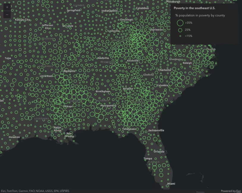
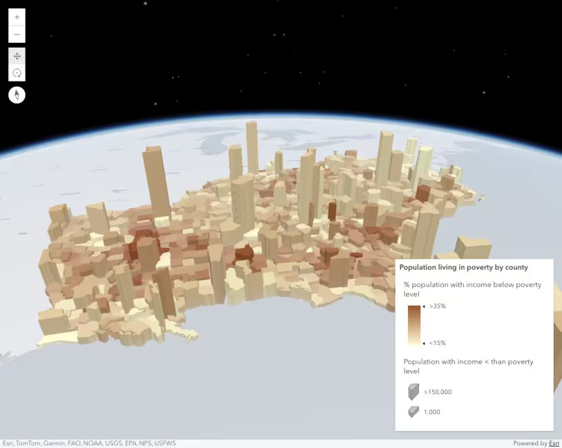
Setting a color visual variable requires a field name, which indicates the data to for the visualization. You can also specify a normalizationField to normalize data values specified in field. In this sample, we’re pointing the field to POP_POVERTY, which stores the total number of people living in poverty within the boundaries of the feature. We’ll normalize based on the total population with the TOTPOP_CY field.
Then you set the color ramp using a series of stops in the stops array.
renderer.visualVariables = [ { type: "color", // indicates this is a color visual variable field: "POP_POVERTY", // total population in poverty normalizationField: "TOTPOP_CY", // total population legendOptions: { title: "% population in poverty by county", // legend label for the visual variable }, stops: [ { value: 0.1, // features where < 10% of the pop in poverty color: "#FFFCD4", // will be assigned this color (beige) label: "<10%", // label to display in the legend }, { value: 0.3, // features where > 30% of the pop in poverty color: "#350242", // will be assigned this color (purple) label: ">30%", // label to display in the legend }, // features with values between 0.1 and 0.3 will be assigned // a color on a ramp between beige and purple proportional // to where the value falls between 0.1 and 0.3 ], }, ];Once the renderer is defined, you can set it on the layer and the view and legend will automatically update.
Additional visualization samples and resources
Esri Color Ramps
Techniques and best practices
Data-driven continuous size
Data-driven extrusion
Data-driven opacity
Thematic multivariate visualization (2D)