This sample shows how to use the Editor component in 3D. This component is useful as it provides an out-of-the-box experience to help streamline the editing experience within an application.
How it works
The component automatically recognizes if there are any editable feature layer(s) within the scene. If there are, the layer or layers will display within the component. Based on the editing functionality set on the feature layer, you can Edit existing features and/or Add new features.
When points use 3D object symbol layer, the editing tool allows you to configure size and rotation interactively by using the 3D manipulators:

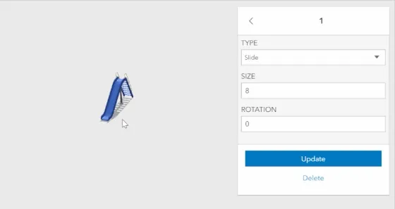
For the editing tool to identify the size and the rotation, you need to set them as visual variables in the renderer:
const renderer = { type: "unique-value", // autocasts as new UniqueValueRenderer() // define visual variable for size and rottion and connect to the corresponding fields visualVariables: [ { // size can be modified with the interactive handle type: "size", field: "SIZE", axis: "height", valueUnit: "meters", }, { // rotation can be modified with the interactive handle type: "rotation", field: "ROTATION", }, ],};For more samples, see Edit features with the Editor component and Editor widget with configurations.
Snapping
It is also possible to configure snapping within the Editor component. This is handled via the snappingOptions property or via the component’s UI.
Snapping to self and to other features can be toggled separately.
Use the Ctrl key to dynamically toggle snapping on/off.
...editorElement.snappingOptions.enabled = true;editorElement.snappingOptions.featureSources = [{ layer: graphicsLayer }];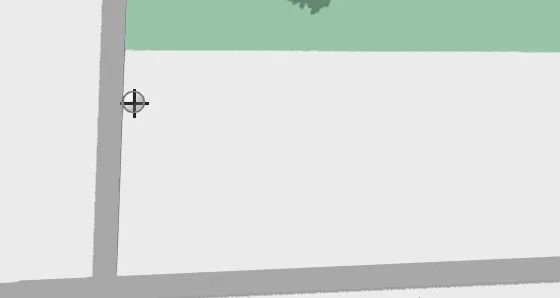
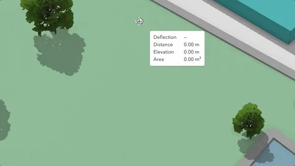
Tooltips, labels and sketching with constraints
The tooltips and segment labels provide useful information when creating or updating existing features. They can be enabled programmatically or toggled via the Editor component’s UI.
Pressing Tab while drawing a new feature activates the tooltips’ input mode. Then, one can set editing constraints to achieve greater control over segment lengths, angles, and elevation values.
...editorElement.tooltipOptions.enabled = true;editorElement.labelOptions.enabled = true;