st.plot() is a lightweight plotting method included with ArcGIS GeoAnalytics for Microsoft Fabric
that allows you to quickly view geometries stored in a PySpark DataFrame. This tutorial will show you how to use st.plot
to plot one or more geometry columns, how to customize plot axes and add a legend, and how to symbolize on continuous and
categorical column values.
Steps
Import
-
In your notebook, import
geoanalytics._fabric PythonUse dark colors for code blocks Copy import geoanalytics_fabric
Plot geometry columns
You can plot the geometries in any PySpark DataFrame by calling st.plot() on the DataFrame. Different arguments
can be used to customize the plot depending on the geometry type being plotted. The arguments supported by
each geometry type are documented in the API reference for st.plot
and in matplotlib. For points see matplotlib.pyplot.scatter,
for linestrings see matplotlib.collections.LineCollection,
and for polygons see matplotlib.collections.PatchCollection.
-
Load a polygon feature service of US county boundaries into a DataFrame.
PythonUse dark colors for code blocks Copy url = "https://services.arcgis.com/P3ePLMYs2RVChkJx/ArcGIS/rest/services/USA_Counties_Generalized_Boundaries/FeatureServer/0" us_counties = spark.read.format("feature-service").load(url) -
Plot the county boundaries using default plot settings.
PythonUse dark colors for code blocks Copy us_counties.st.plot()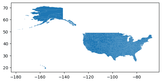
-
Customize the geometry symbology using
st.plotarguments andmatplotlib.collections.class attributes. In this example the following parameters are used:Patch Collection facecolor—The color used to fill each polygon.edgecolor—The color of the polygon outlines.figsize—Adjusts the size of the result plot.aspect—Sets the ratio of the height of the plot to the width of the plot. Setting this to "equal" maintains the original aspect of the data when adjustingfigsize.basemap—Adds a basemap to the plot. Choose from "light" (Light Gray Canvas), "dark" (Dark Gray Canvas), "streets" (Esri Streets Basemap) or "osm" (OpenStreetMap Vector Basemap).
PythonUse dark colors for code blocks Copy us_counties.st.plot( facecolor="lightblue", edgecolor="white", figsize=(14, 14), basemap="light" )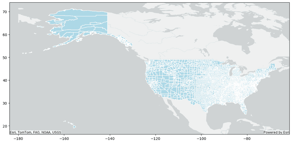
-
Customize the plot axes by calling the
setmethod on the axes returned fromst.plot. In this example the following parameters are used:xlim,ylim—The minimum and maximum x and y values to plot. These can be used to limit the extent of your plot.frame—Set to False so that axes lines are hidden._on xticks,yticks—Set to an empty list to hide ticks.
PythonUse dark colors for code blocks Copy axes = us_counties.st.plot( facecolor="lightblue", edgecolor="white", figsize=(14, 14), basemap="light" ) axes.set( xlim=(-127.6209447668401, -64.08109605872191), ylim=(23.73560869553325, 50.59249779819335), frame_on=False, xticks=[], yticks=[])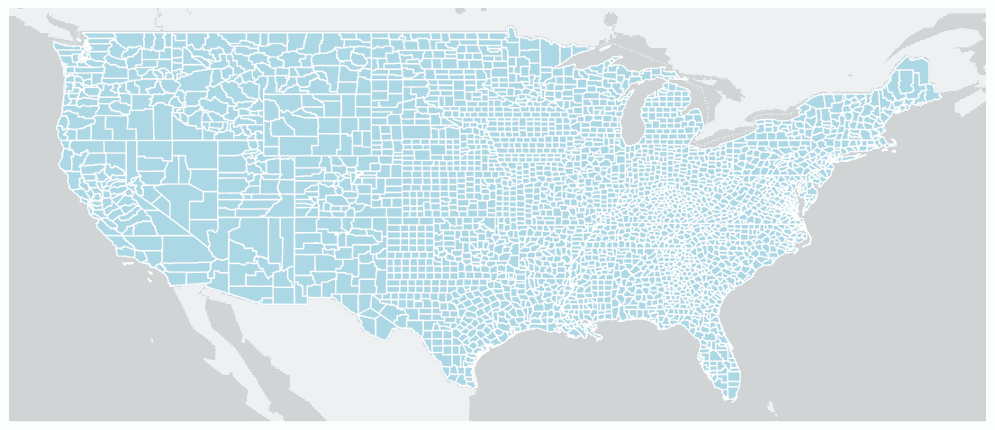
-
The Axes returned from
st.plotcan be used to plot multiple geometry columns. Load a point feature service of major cities in the United States and plot it with the county polygons.PythonUse dark colors for code blocks Copy axes = us_counties.st.plot( facecolor="lightblue", edgecolor="white", figsize=(14, 14), basemap="light" ) axes.set( xlim=(-127.6209447668401, -64.08109605872191), ylim=(23.73560869553325, 50.59249779819335), frame_on=False, xticks=[], yticks=[] ) url = "https://services.arcgis.com/P3ePLMYs2RVChkJx/arcgis/rest/services/USA_Major_Cities_/FeatureServer/0" us_cities = spark.read.format("feature-service").load(url) us_cities.st.plot(ax=axes)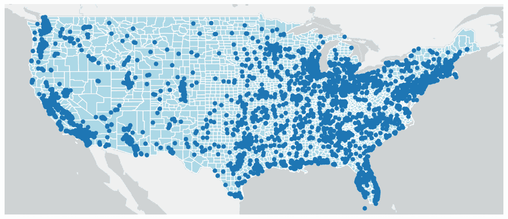
Plot continuous field values
There are three ways to color geometries in a plot:
- All geometries are the same color (this is the default)
- Using a continuous color scheme based on numeric values in a column
- Using a categorical color scheme based on values in a column
Using a continuous color scheme visualizes how numeric column values change across the spatial extent of your data.
-
Load a feature service containing the current wind speed at point locations across the United States.
PythonUse dark colors for code blocks Copy url = "https://services9.arcgis.com/RHVPKKiFTONKtxq3/ArcGIS/rest/services/NDFD_WindForecast_v1/FeatureServer/0" wind_speed = spark.read.format("feature-service").load(url) -
Plot the wind speed points with the county boundary polygons and use the
Windcolumn to color the points. In this example the following parameters are used:Speed cmap—The numeric column to use for continuous coloring._value cmap—The colormap to use when plotting.vmin,vmax—The minimum and maximum values to show.marker—The size of the points. An attribute of matplotlib.pyplot.scatter._size
PythonUse dark colors for code blocks Copy axes = us_counties.st.plot( facecolor="lightblue", edgecolor="white", figsize=(14, 14), basemap="light" ) axes.set( xlim=(-127.6209447668401, -64.08109605872191), ylim=(23.73560869553325, 50.59249779819335), frame_on=False, xticks=[], yticks=[] ) most_recent_measure_time = wind_speed.agg({"IntervalStart": "min"}).collect()[0][0] wind_speed = wind_speed.where(wind_speed.IntervalStart == most_recent_measure_time) wind_speed.st.plot( ax=axes, cmap_values="WindSpeed", cmap="plasma", marker_size=150, vmax=30, vmin=5 )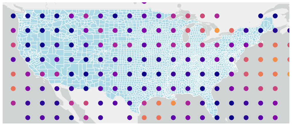
-
Create the same plot but add a legend and customize it using a dictionary of legend keyword arguments. When the legend is continuous, any properties of matplotlib.pyplot.colorbar can be used. This example uses the following parameters:
label—The title of the legend to display.orientation—Orients the legend horizontally or vertically.location—Determines which side of the plot the legend will appear at.shrink—Determines the size of the legend relative to the default.pad—The distance between the legend and the plot.
PythonUse dark colors for code blocks Copy axes = us_counties.st.plot( facecolor="lightblue", edgecolor="white", figsize=(14, 14), basemap="light" ) axes.set( xlim=(-127.6209447668401, -64.08109605872191), ylim=(23.73560869553325, 50.59249779819335), frame_on=False, xticks=[], yticks=[] ) wind_speed.st.plot( ax=axes, cmap_values="WindSpeed", cmap="plasma", marker_size=150, vmax=30, vmin=5, legend=True, legend_kwds={ "label": "Current Wind Speed (mph)", "orientation": "horizontal", "location": "bottom", "shrink": 0.8, "pad": 0.02 } )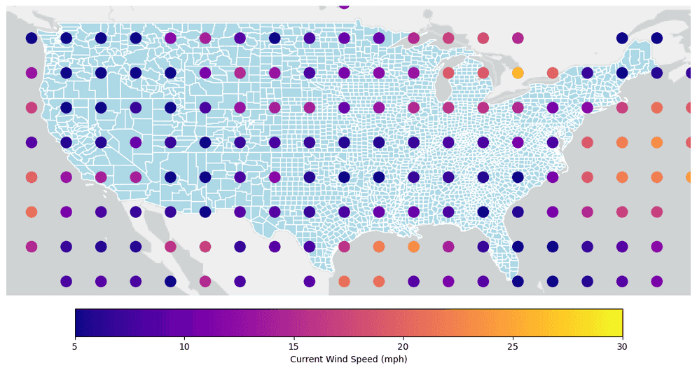
Plot categorical field values
A categorical color scheme is the best choice when symbolizing with a column that contains discrete data such as strings or boolean values.
-
Load a polygon feature service of areas representing different seabed lithologies throughout the world.
PythonUse dark colors for code blocks Copy url = "https://services.arcgis.com/P3ePLMYs2RVChkJx/arcgis/rest/services/Seabed_Lithology/FeatureServer/0" seabed_lithology = spark.read.format("feature-service").load(url) -
Plot the lithological areas using a categorical color scheme by setting
isto_categorical Trueand setting theClassfield forcmap._values PythonUse dark colors for code blocks Copy axes = seabed_lithology.st.plot( is_categorical=True, cmap_values="Class", cmap="gist_ncar", figsize=(14,14) ) axes.set(frame_on=False, xticks=[], yticks=[]);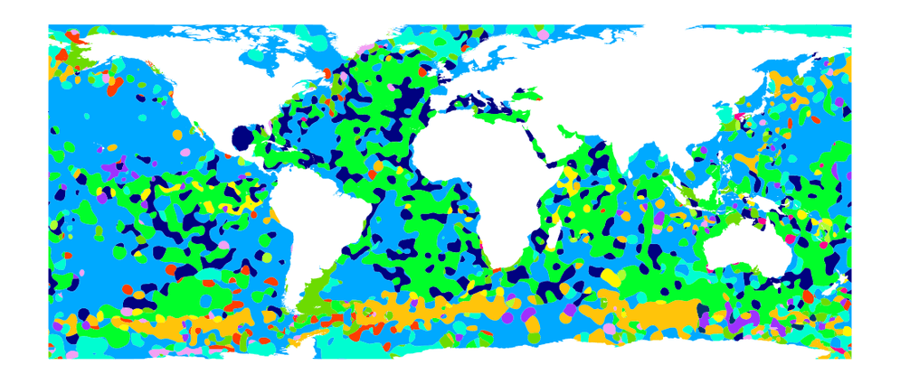
-
Create the same plot but add a legend and customize it using a dictionary of legend keyword arguments. When the legend is categorical, any properties of matplotlib.axes.Axes.legend can be used. This example uses the following parameters:
bbox—The location of the legend relative to the plot._to _anchor fontsize—The size of the class labels.markerscale—The size of the legend marker relative to the default.title,title—Can be omitted for no title._fontsize
PythonUse dark colors for code blocks Copy axes = seabed_lithology.st.plot( is_categorical=True, cmap_values="Class", cmap="gist_ncar", figsize=(14,14), legend=True, legend_kwds={ "bbox_to_anchor": (1.22, 0.8), "fontsize": "medium", "markerscale": 3, "title": "World Seabed Lithology", "title_fontsize": "x-large" } ) axes.set(frame_on=False, xticks=[], yticks=[]);
What's next?
Because st.plot extends matplotlib, you can leverage the rich plotting capabilities in matplotlib for plotting
your geometry data. The examples shown here are a basic introduction to what's possible with
st.plot and matplotlib. For more ideas see the
GeoAnalytics for Microsoft Fabric sample notebooks and
matplotlib's documentation.