This sample demonstrates how to generate a relationship visualization (or bivariate choropleth) to compare two numeric fields in a SceneLayer. This is accomplished with the createRenderer() method in the relationship renderer creator helper object.
While this visualization style was originally designed for 2D choropleth maps, it is particularly useful in 3D scenes where bivariate visualizations of color and size would not otherwise be possible since the size of features is reserved for real-world sizes of objects, such as buildings. Therefore, the relationship renderer becomes ideal for creating thematic bivariate visualizations of 3D Object SceneLayers.
Creating bivariate choropleth visualizations is typically tedious and time consuming because it involves creating two classifications of your data and carefully combining them into bins on a 2x2, 3x3, or 4x4 grid. Creating color schemes that work well and properly communicate the message can also be very difficult. The createRenderer method in the relationshipRendererCreator module removes a lot of the guesswork and time required to create relationship visualizations. All you have to do is provide the following information and the renderer is generated for you, including a predetermined color scheme. Other color schemes are also available to you in the relationship symbology module.
const params = {  layer: layer,  view: viewElement.view,  field1: {    field: "StarScore",  },  field2: {    field: "ElectricUse",  },  focus: "HH", // changes orientation of the legend  numClasses: 2, // 2x2 grid (value can also be 3 or 4)};
// That's it! Now apply the renderer to your layer
relationshipRendererCreator.createRenderer(params).then((response) => {  layer.renderer = response.renderer;});
Technically, the output renderer is a UniqueValueRenderer instance. By default, the legend has generic labels for indicating which field is high and low for various regions of the legend. You can customize this text by modifying the label property of each UniqueValueInfo object.
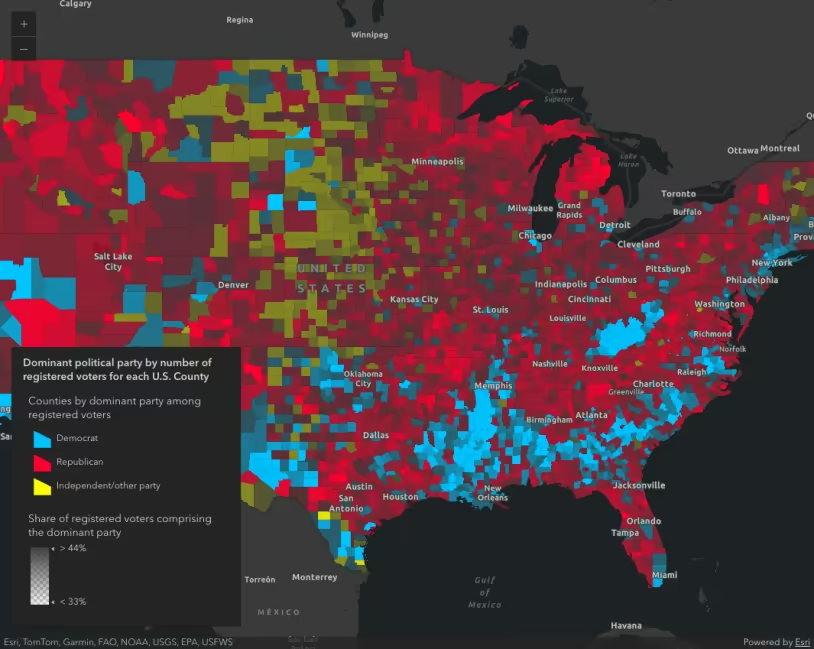
renderer.uniqueValueInfos.forEach((info) => { switch (info.value) { case "HH": info.label = "High energy score, High electric use"; break; case "HL": info.label = "High energy score, Low electric use"; break; case "LH": info.label = "Low energy score, High electric use"; break; case "LL": info.label = "Low energy score, Low electric use"; break; }});Note that even if you observe a positive relationship between the two variables of interest, it doesn’t mean they are statistically correlated. It also doesn’t imply the presence of one variable influences the other. Therefore, this renderer should be used judiciously with some prior knowledge that two variables may likely be related.
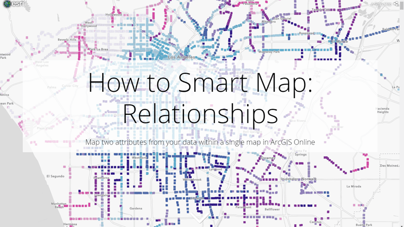
Relationship renderers are most easily authored and configured in ArcGIS Online. Read this blog to learn more about how to do this.
A word of caution
Keep in mind that generating renderers should be avoided in most applications because of the performance cost affecting the end user. As stated in the Smart Mapping guide topic, the Smart Mapping APIs were designed for two types of applications: data exploration apps and visualization authoring apps similar to ArcGIS Online. In all other cases, renderers should be saved to the layer or manually created using any of the renderer classes.
Related samples and resources
Create a custom visualization using Arcade
What is a Relationship Map?