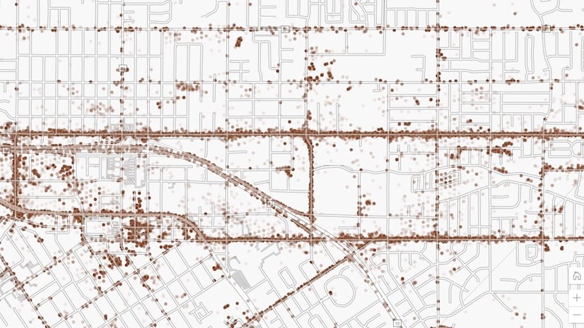
Census tracts styled with a dot density renderer to show population density by race and ethnicity
Why does view scale matter?
Web maps often span multiple scale levels. This makes styling layers complicated. For example, you may define icon sizes that work well at one scale, but zooming in or out could quickly turn your good cartographic decisions into mediocre ones.
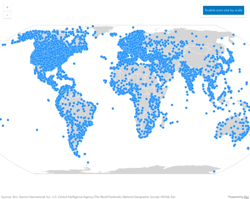
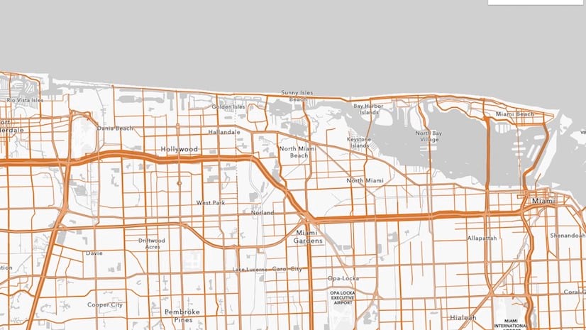
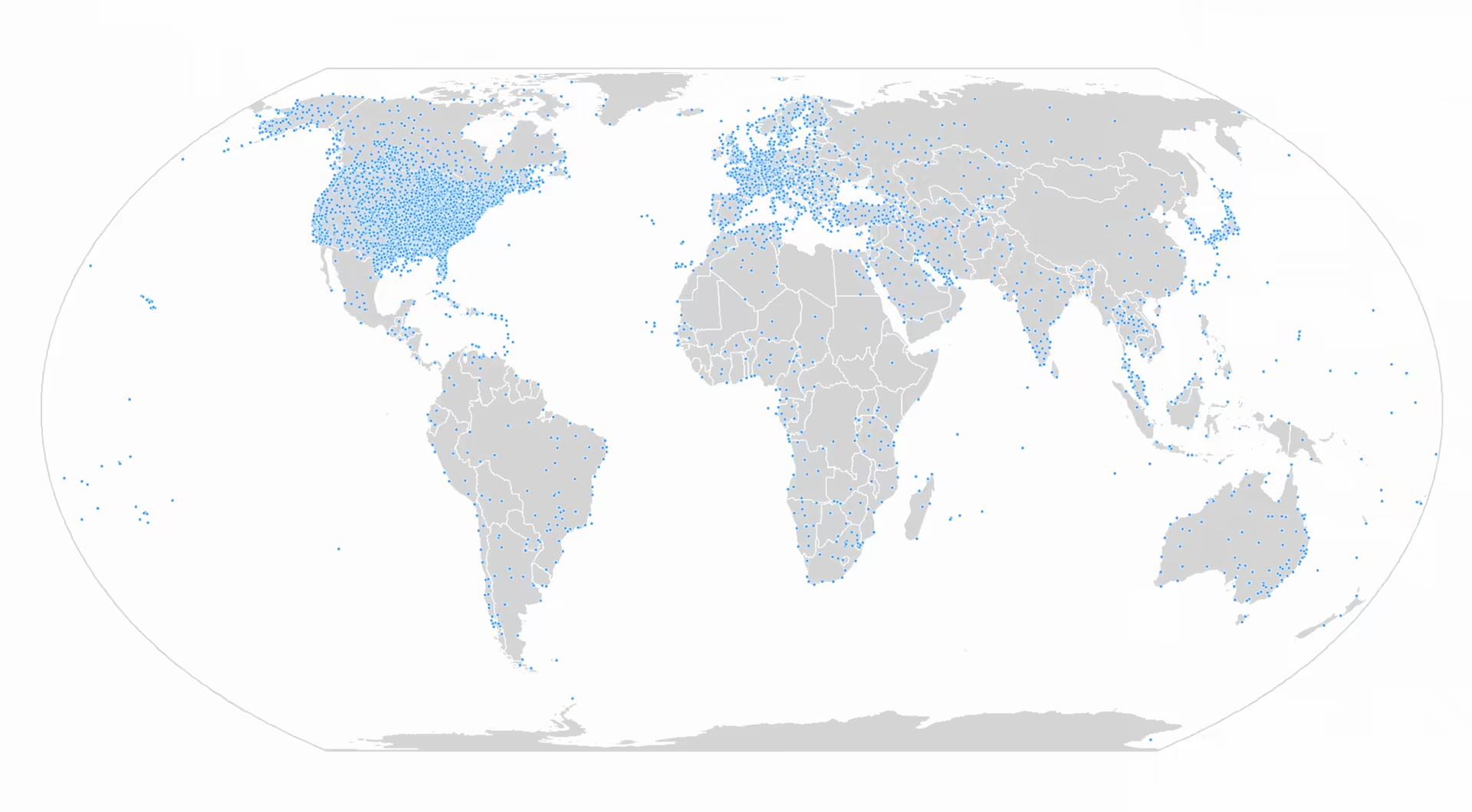
In fact, one icon size usually doesn’t look good at all scales. This is especially true for dense layers. For example, the points in the map below look good with a size of 10px at a national scale.
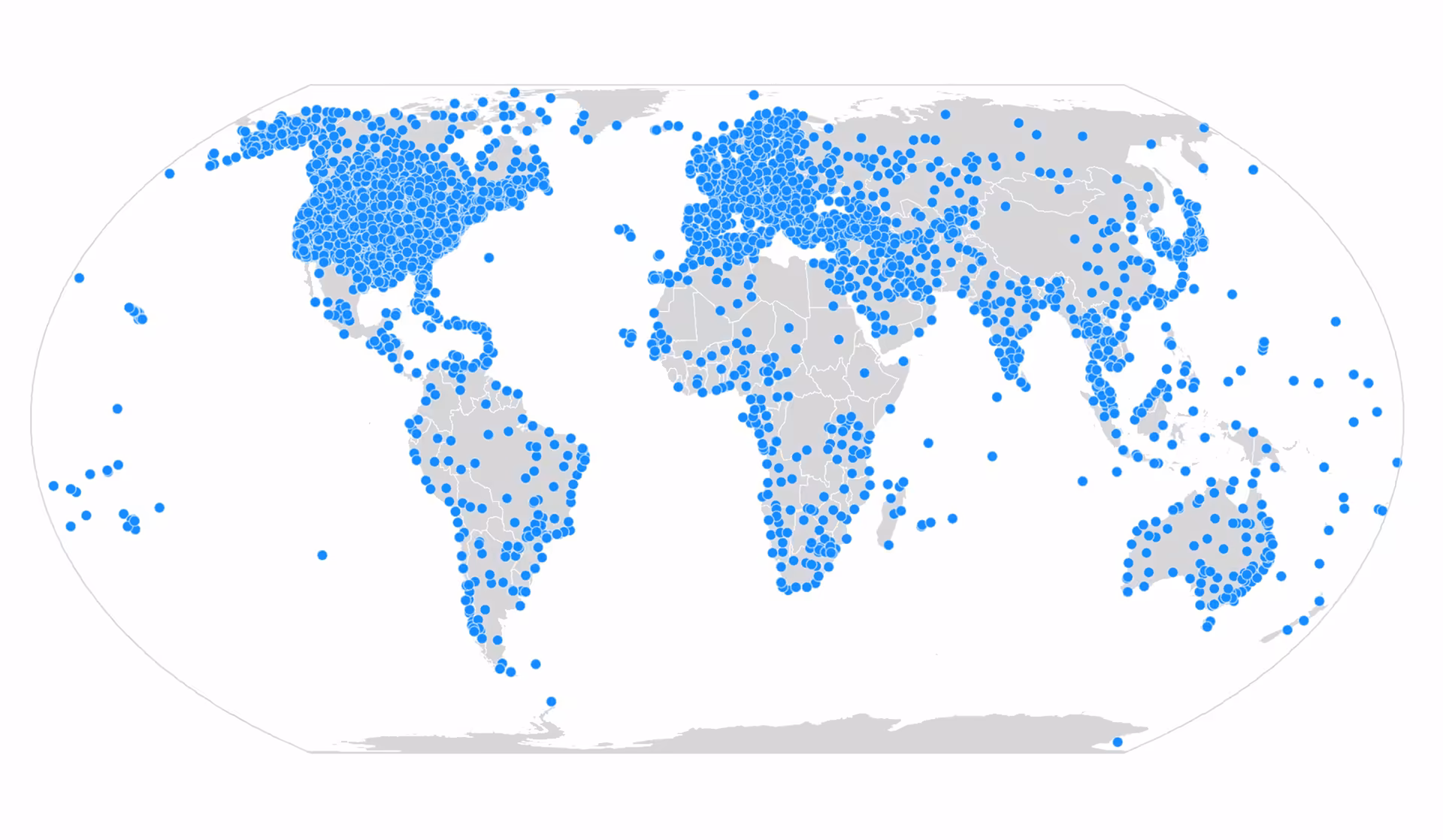
But when zoomed out to a worldwide extent, 10px appears too big in the dense areas. The large icon size obscures the underlying data, potentially misrepresenting its density.
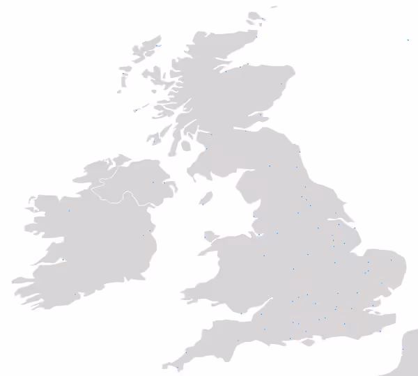
With a smaller point symbol, many of the issues listed above can be reduced or eliminated.
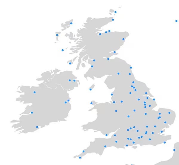
However, the 3px size makes the points almost impossible to see when you zoom back to regional scales or beyond.
Scale-dependent properties
Because icon sizes, line widths, and densities don’t display well at all scales, the ArcGIS JS API allows you to configure various symbol and renderer properties based on view scale.
The following symbol and renderer properties can be adjusted according to the view scale.
- Symbol sizes
- Polygon outline widths
- Data-driven size ranges (i.e. graduated symbols)
- Dot density values
Symbol sizes
You can dynamically change point sizes and line widths to work well at any scale using a size visual variable. You must add an Arcade expression that returns the view scale to the size variable (e.g. $view.scale). Then you can map specific scale values to sizes in the stops property. All other scale levels will interpolate the size linearly.
The following snippet treats the view scale as if it were a data value. The raw scale value is returned, and the values in the size stops correspond to scale levels. The renderer will display point sizes (or line widths) at the sizes indicated for each scale in the stops.
renderer.visualVariables = [ { type: "size", valueExpression: "$view.scale", stops: [ // view scales larger than 1:1,155,581 // will have a symbol size of 7.5 pts { size: 7.5, value: 1155581 }, { size: 6, value: 9244648 }, { size: 3, value: 73957190 }, // view scales smaller than 1:591,657,527 // will have a symbol size of 1.5 pts { size: 1.5, value: 591657527 }, ], },];Example
The following example demonstrates how to adjust the size of points by view scale. This size variable can be used for any point or polyline visualization regardless of renderer type (as long as it supports visual variables).
Use the Disable/enable auto size by scale button to explore how not adjusting icon sizes by scale affects the visualization at various scale levels.
Pan and zoom the map to explore population density by race and ethnicity.
49 collapsed lines
<!doctype html><html> <head> <meta charset="utf-8" /> <meta name="viewport" content="width=device-width, initial-scale=1, shrink-to-fit=no" /> <title>Vary point sizes by scale</title>
<style> html, body, #viewDiv { height: 100%; margin: 0; } #infoDiv { background: white; padding: 10px; } #codeDiv { color: rgb(148, 4, 40); overflow-y: auto; /* overflow: scroll; */ max-height: 250px; } #scaleInfo { background: white; padding: 10px; font-family: monospace; } </style>
<link rel="stylesheet" href="https://js.arcgis.com/5.1/esri/themes/light/main.css" /> <!-- Load the ArcGIS Maps SDK for JavaScript from CDN --> <script type="module" src="https://js.arcgis.com/5.1/"></script>
<script type="module"> const [Map, MapView, FeatureLayer, SimpleRenderer, Expand, Bookmarks, Bookmark, reactiveUtils] = await $arcgis.import([ "@arcgis/core/Map.js", "@arcgis/core/views/MapView.js", "@arcgis/core/layers/FeatureLayer.js", "@arcgis/core/renderers/SimpleRenderer.js", "@arcgis/core/widgets/Expand.js", "@arcgis/core/widgets/Bookmarks.js", "@arcgis/core/webmap/Bookmark.js", "@arcgis/core/core/reactiveUtils.js", ]);
const sizeVV = { type: "size",
valueExpression: "$view.scale",
stops: [ { size: 9, value: 1155581 }, { size: 6, value: 9244648 }, { size: 3, value: 73957190 }, { size: 1.5, value: 591657527 }, ], };
const renderer = new SimpleRenderer({ symbol: { type: "simple-marker", color: "dodgerblue", outline: { color: [255, 255, 255, 0.7], width: 0.5, }, size: "3px", },
visualVariables: [sizeVV],
});237 collapsed lines
const layer = new FeatureLayer({ portalItem: { id: "cb1886ff0a9d4156ba4d2fadd7e8a139", }, renderer: renderer, });
const spatialReference = { wkid: 54035, };
const baseLayer = new FeatureLayer({ portalItem: { id: "2b93b06dc0dc4e809d3c8db5cb96ba69", }, legendEnabled: false, popupEnabled: false, renderer: { type: "simple", symbol: { type: "simple-fill", color: [200, 200, 200, 0.75], outline: { color: "white", width: 0.5, }, }, }, });
const map = new Map({ layers: [baseLayer, layer], });
const view = new MapView({ container: "viewDiv", map: map, center: { x: 0, y: 0, spatialReference, }, spatialReference, scale: 200000000, constraints: { rotationEnabled: false, }, graphics: [ { symbol: { type: "simple-fill", color: null, outline: { width: 1, color: [200, 200, 200, 0.75], }, }, geometry: { type: "extent", xmin: -180, xmax: 180, ymin: -90, ymax: 90, spatialReference: { wkid: 4326 }, }, }, ], });
view.when(toggleAutoSize);
view.ui.add( new Expand({ view: view, group: "top-left", content: new Bookmarks({ view: view, bookmarks: [ new Bookmark({ name: "Worldwide", viewpoint: { rotation: 0, scale: 100000000, targetGeometry: { type: "extent", spatialReference: { wkid: 54035, }, xmin: -18825141.816950303, ymin: -10953771.907543816, xmax: 18825141.816950303, ymax: 10953771.907543816, }, }, }), new Bookmark({ name: "United Kingdom", viewpoint: { rotation: 0, scale: 5928725.090579714, targetGeometry: { type: "extent", spatialReference: { wkid: 54035, }, xmin: -1441704.7573362407, ymin: 5722452.8511557, xmax: 790477.055141252, ymax: 7021290.898050545, }, }, }), ], }), }), "top-left", );
const scaleInfo = document.getElementById("scaleInfo"); const infoExpand = new Expand({ content: scaleInfo, view: view, group: "top-left", });
view.ui.add(infoExpand, "top-left");
const infoDiv = document.getElementById("infoDiv"); view.ui.add(infoDiv, "top-right");
const toggleButton = document.getElementById("toggle-auto-size"); toggleButton.addEventListener("click", toggleAutoSize);
const codeElement = document.getElementById("codeDiv");
const viewScaleElement = document.getElementById("viewScale"); const sizeElement = document.getElementById("size");
let scaleWatchHandle;
function toggleAutoSize() { let sizeOptimizationEnabled = false;
if (toggleButton.innerText === "Enable auto size by scale") { toggleButton.innerText = "Disable auto size by scale"; sizeOptimizationEnabled = true; } else { toggleButton.innerText = "Enable auto size by scale"; clearInfoDisplay(); }
const renderer = layer.renderer.clone(); if (renderer.visualVariables && renderer.visualVariables.length > 0) { renderer.symbol.size = getSizeFromScale(renderer.visualVariables[0], view.scale); } renderer.visualVariables = sizeOptimizationEnabled ? [sizeVV] : null; layer.renderer = renderer;
if (renderer.visualVariables) { const scaleVVs = getScaleVariables(renderer.visualVariables); const scaleVVsStringified = JSON.stringify(scaleVVs, null, 2);
codeElement.innerHTML = `<pre>${scaleVVsStringified}</pre>`;
displayScaleAndSizeValues(view.scale);
scaleWatchHandle = reactiveUtils.watch(() => view.scale, displayScaleAndSizeValues);
function displayScaleAndSizeValues(scale) { viewScaleElement.innerHTML = Math.round(scale); const effectiveSize = getSizeFromScale(scaleVVs[0], scale); sizeElement.innerHTML = effectiveSize.toPrecision(2); } } }
function getScaleVariables(visualVariables) { return visualVariables.filter(function (vv) { return vv.valueExpression && vv.valueExpression === "$view.scale"; }); }
function clearInfoDisplay() { sizeElement.innerHTML = null; viewScaleElement.innerHTML = null; codeElement.innerHTML = null; scaleWatchHandle.remove(); scaleWatchHandle = null; infoExpand.expanded = false; }
function getSizeFromScale(sizeVV, scale) { const sizeStops = sizeVV.stops; const stopsCount = sizeStops.length; const finalIndex = stopsCount - 1; const scaleMin = sizeStops[0].value; const scaleMax = sizeStops[finalIndex].value;
if (scale <= scaleMin) { return sizeStops[0].size; }
if (scale >= scaleMax) { return sizeStops[finalIndex].size; }
for (let i = 0; i <= finalIndex; i++) { const currentStop = sizeStops[i]; const nextStop = sizeStops[i + 1];
if (scale >= currentStop.value && scale < nextStop.value) { const scaleRange = nextStop.value - currentStop.value; const sizeRange = currentStop.size - nextStop.size; const relativePosition = (scale - currentStop.value) / scaleRange;
const effectiveSize = currentStop.size - sizeRange * relativePosition; return effectiveSize; } } } </script> </head>
<body> <div id="viewDiv"></div> <div id="infoDiv" class="esri-widget"> <button id="toggle-auto-size" class="esri-button">Enable auto size by scale</button> </div> <div id="scaleInfo"> <div id="scaleDiv">View scale: <span id="viewScale"></span></div> <div id="sizeDiv">Icon size (pt): <span id="size"></span></div> <div id="codeDiv"></div> </div> </body></html>Polygon outlines
Overly thick outlines can hide small features and distract from the purpose of a visualization. Because of this, many people instinctively remove outlines. However, this practice can be problematic.
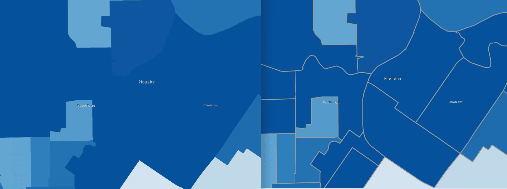
For example, the image below shows outlines that are so thick they completely obscure the fill color of small polygons in the downtown Houston area.

That outline width is clearly unacceptable. But if you zoom to a very large scale, that outline choice may actually work well.

Removing outlines at large scales makes it impossible to see the boundaries of neighboring features with the same color.
Similar to adjusting symbol sizes by scale, you can adjust polygon outline widths using a size visual variable with a $view.scale Arcade expression. This scenario requires setting the target property to outline so the renderer knows to apply the size variable to the symbol outline.
renderer.visualVariables = [ { type: "size", valueExpression: "$view.scale", target: "outline", stops: [ { size: 2, value: 56187 }, { size: 1, value: 175583 }, { size: 0.5, value: 702332 }, { size: 0, value: 1404664 }, ], },];Example
The following example demonstrates how to adjust the outline of polygons by view scale. Zoom in to observe the thickening of the outlines. Zoom out to see the outlines get thinner and eventually disappear.
Pan and zoom the map to explore population density by race and ethnicity.
89 collapsed lines
<!doctype html><html> <head> <meta charset="utf-8" /> <meta name="viewport" content="width=device-width, initial-scale=1, shrink-to-fit=no" /> <title>Esri Developer Guide: Class breaks</title>
<link rel="stylesheet" href="https://js.arcgis.com/5.1/esri/themes/light/main.css" /> <!-- Load the ArcGIS Maps SDK for JavaScript from CDN --> <script type="module" src="https://js.arcgis.com/5.1/"></script>
<style> html, body, #viewDiv { height: 100%; margin: 0; } </style>
<script type="module"> const [Map, ClassBreaksRenderer, MapView, FeatureLayer, Legend, Expand] = await $arcgis.import([ "@arcgis/core/Map.js", "@arcgis/core/renderers/ClassBreaksRenderer.js", "@arcgis/core/views/MapView.js", "@arcgis/core/layers/FeatureLayer.js", "@arcgis/core/widgets/Legend.js", "@arcgis/core/widgets/Expand.js", ]);
function createSymbol(color) { return { type: "simple-fill", color, style: "solid", outline: { width: 0.2, color: [255, 255, 255, 0.2], }, }; }
const renderer = new ClassBreaksRenderer({ field: "NOHS_CY", normalizationField: "EDUCBASECY", legendOptions: { title: "% of adults with no high school education", }, defaultSymbol: { type: "simple-fill", color: "black", style: "backward-diagonal", outline: { width: 0.5, color: [50, 50, 50, 0.6], }, }, defaultLabel: "no data", classBreakInfos: [ { minValue: 0, maxValue: 0.04999, symbol: createSymbol("#edf8fb"), label: "< 5%", }, { minValue: 0.05, maxValue: 0.14999, symbol: createSymbol("#b3cde3"), label: "5 - 15%", }, { minValue: 0.15, maxValue: 0.24999, symbol: createSymbol("#8c96c6"), label: "15 - 25%", }, { minValue: 0.25, maxValue: 1.0, symbol: createSymbol("#88419d"), label: "> 25%", }, ], });
renderer.visualVariables = [ { type: "size", valueExpression: "$view.scale", target: "outline", stops: [ { size: 2, value: 56187 }, { size: 1, value: 175583 }, { size: 0.5, value: 702332 }, { size: 0, value: 1404664 }, ], }, ];52 collapsed lines
const layer = new FeatureLayer({ portalItem: { id: "1cbb0faa0f1f424bbe213bfae9319309", }, title: "Census tracts", renderer: renderer, popupTemplate: { content: "{NOHS_CY} adults 25 years old and older in this census tract did not attend high school.", }, opacity: 1, });
const map = new Map({ basemap: { portalItem: { id: "3582b744bba84668b52a16b0b6942544", }, }, layers: [layer], constraints: { snapToZoom: false, }, });
const view = new MapView({ container: "viewDiv", map: map, scale: 577790, center: [-117.8099, 34.0441], });
const legend = new Legend({ view: view, });
view.ui.add( new Expand({ view: view, content: legend, expanded: true, }), "top-right", ); </script> </head>
<body> <div id="viewDiv"></div> </body></html>Data-driven size ranges
You can also optimize visualizations of data-driven continuous size (i.e. graduated symbols) by scale. This will cause the entire range of symbols to grow in size as you zoom in, and shrink as you zoom out. When creating a continuous size visualization, you set a minSize and maxSize that correspond to a minDataValue and a maxDataValue.
renderer.visualVariables = [ { type: "size", field: "Population", minDataValue: 1, maxDataValue: 1000000, maxSize: 40, minSize: 4, },];You can adjust the range of all symbol sizes by scale even though they vary depending on a data value. In this scenario you must set a scale-dependent size variable to both the maxSize and minSize properties. See the example below.
Example
The following example demonstrates how to adjust symbol sizes that vary based on a data value by view scale.
Pan and zoom the map to explore electoral shift in the 2020 U.S. presidential election
98 collapsed lines
<!doctype html><html> <head> <meta charset="utf-8" /> <meta name="viewport" content="width=device-width, initial-scale=1, shrink-to-fit=no" /> <title>Change in votes between parties</title>
<link rel="stylesheet" href="https://js.arcgis.com/5.1/esri/themes/light/main.css" /> <!-- Load the ArcGIS Maps SDK for JavaScript from CDN --> <script type="module" src="https://js.arcgis.com/5.1/"></script>
<style> html, body, #viewDiv { height: 100%; margin: 0; } </style>
<script type="module"> const [Map, MapView, FeatureLayer, Expand, Legend] = await $arcgis.import([ "@arcgis/core/Map.js", "@arcgis/core/views/MapView.js", "@arcgis/core/layers/FeatureLayer.js", "@arcgis/core/widgets/Expand.js", "@arcgis/core/widgets/Legend.js", ]);
const sizeValueExpression = ` var all20 = $feature["rep_2020"] + $feature["oth_2020"] + $feature["dem_2020"]; var all16 = $feature["rep_2016"] + $feature["oth_2016"] + $feature["dem_2016"];
var demShare16 = ($feature["dem_2016"] / all16) * 100; var demShare20 = ($feature["dem_2020"] / all20) * 100;
var repShare16 = ($feature["rep_2016"] / all16) * 100; var repShare20 = ($feature["rep_2020"] / all20) * 100;
var othShare16 = ($feature["oth_2016"] / all16) * 100; var othShare20 = ($feature["oth_2020"] / all20) * 100;
var repChange = repShare20 - repShare16; var demChange = demShare20 - demShare16; var othChange = othShare20 - othShare16;
return Max(repChange, demChange, othChange) `;
const layer = new FeatureLayer({ title: "2020 U.S. presidential election", portalItem: { id: "fe9e032e4a854c74890750214a3edd8b", }, renderer: { type: "unique-value", valueExpression: ` var all20 = $feature["rep_2020"] + $feature["oth_2020"] + $feature["dem_2020"]; var all16 = $feature["rep_2016"] + $feature["oth_2016"] + $feature["dem_2016"];
var demShare16 = ($feature["dem_2016"] / all16) * 100; var demShare20 = ($feature["dem_2020"] / all20) * 100;
var repShare16 = ($feature["rep_2016"] / all16) * 100; var repShare20 = ($feature["rep_2020"] / all20) * 100;
var othShare16 = ($feature["oth_2016"] / all16) * 100; var othShare20 = ($feature["oth_2020"] / all20) * 100;
var repChange = repShare20 - repShare16; var demChange = demShare20 - demShare16; var othChange = othShare20 - othShare16;
return Decode(Max(repChange, demChange, othChange), repChange, "republican", demChange, "democrat", "other" ); `, valueExpressionTitle: "Predominant voter shift 2016-2020", uniqueValueInfos: [ { value: "republican", label: "Republican", symbol: createSymbol("rgba(220, 75, 0, 1)"), }, { value: "democrat", label: "Democrat", symbol: createSymbol("rgba(60, 108, 204,1)"), }, { value: "other", label: "Other", symbol: createSymbol("rgba(181, 166, 0, 1)"), }, ],
visualVariables: [ { type: "size", valueExpression: sizeValueExpression, valueExpressionTitle: "Shift in percentage points", minDataValue: 0, maxDataValue: 30,
maxSize: { type: "size", valueExpression: "$view.scale", stops: [ { size: 42, value: 288895 }, { size: 38.6, value: 2311162 }, { size: 24, value: 18489297 }, { size: 11, value: 147914381 }, ], }, minSize: { type: "size", valueExpression: "$view.scale", stops: [ { size: 8, value: 288895 }, { size: 4, value: 2311162 }, { size: 1, value: 18489297 }, { size: 0.4, value: 147914381 }, ], },
}, ],64 collapsed lines
}, });
function createSymbol(color) { return { type: "simple-marker", color, style: "circle", outline: { width: 0.5, color: [255, 255, 255, 0.3], }, }; }
const map = new Map({ basemap: { portalItem: { id: "fbfb62f3599f41e5a77845f863e2872f", }, }, layers: [layer], });
const view = new MapView({ container: `viewDiv`, map, center: [-95, 40], scale: 2311162 * 8, constraints: { minScale: 0, maxScale: 4622324 / 16, snapToZoom: false, rotationEnabled: false, }, breakpoints: { large: 1200, medium: 992, small: 768, xsmall: 544, }, popup: { visibleElements: { collapseButton: false, }, }, }); view.highlights.items[0].fillOpacity = 0;
view.ui.add( new Expand({ content: new Legend({ view }), view, }), "bottom-left", ); </script> </head>
<body> <div id="viewDiv"></div> </body></html>Dot density values
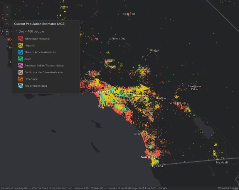
Dot density visualizations are sensitive to view scale. At a constant dot value, the density of features will appear inconsistent as the user zooms in and out. The DotDensityRenderer allows you to linearly scale the dot value based on the view scale. This is configured with the referenceScale property. As you zoom in and out of the initial view, the relative density of points remains the same across scales.
In addition to setting a referenceScale, you should typically set a minScale on the layer. Dot density visualizations are difficult to read when dots are no longer distinguishable, either because they coalesce or because they are too dispersed.
Setting a maxScale on the layer is also important because dot density maps tend to become unreadable at larger scales. Users may start seeing patterns in the random distribution of dots that do not exist in reality. They may also mistakenly interpret the location of each dot as an actual point feature. Users are particularly susceptible to this when the dotValue is set to 1. As an example, dot density visualizations on county datasets should only be viewed at the state or regional level.
Example
The example below visualizes the density of the population by race in the United States. At a scale of 1:577,790, each dot represents 100 people. That dotValue will automatically adjust as the user zooms in and out. You can note this change in the legend.
Pan and zoom the map to explore population density by race and ethnicity.
59 collapsed lines
<!doctype html><html> <head> <meta charset="utf-8" /> <meta name="viewport" content="width=device-width, initial-scale=1, shrink-to-fit=no" />
<title>Esri Developer Guide: Population density by race and ethnicity</title>
<link rel="stylesheet" href="https://js.arcgis.com/5.1/esri/themes/dark/main.css" />
<style> html, body, #viewDiv { height: 100%; margin: 0; } </style>
<!-- Load the ArcGIS Maps SDK for JavaScript from CDN --> <script type="module" src="https://js.arcgis.com/5.1/"></script>
<script type="module"> const [WebMap, MapView, FeatureLayer, DotDensityRenderer, Legend, Bookmarks, Expand] = await $arcgis.import([ "@arcgis/core/WebMap.js", "@arcgis/core/views/MapView.js", "@arcgis/core/layers/FeatureLayer.js", "@arcgis/core/renderers/DotDensityRenderer.js", "@arcgis/core/widgets/Legend.js", "@arcgis/core/widgets/Bookmarks.js", "@arcgis/core/widgets/Expand.js", ]);
const map = new WebMap({ portalItem: { id: "56b5bd522c52409c90d902285732e9f1", }, });
const view = new MapView({ container: "viewDiv", map: map, popup: { dockEnabled: true, dockOptions: { position: "bottom-right", breakpoint: false, }, }, constraints: { maxScale: 35000, snapToZoom: false, }, }); view.highlights.items[0].fillOpacity = 0; view.highlights.items[0].color = [50, 50, 50];
view.when().then(function () {
const dotDensityRenderer = new DotDensityRenderer({ dotValue: 100, outline: null, referenceScale: 577790, // 1:577,790 view scale legendOptions: { unit: "people", }, });174 collapsed lines
dotDensityRenderer.attributes = [ { field: "B03002_003E", color: "#f23c3f", label: "White (non-Hispanic)", }, { field: "B03002_012E", color: "#e8ca0d", label: "Hispanic", }, { field: "B03002_004E", color: "#00b6f1", label: "Black or African American", }, { field: "B03002_006E", color: "#32ef94", label: "Asian", }, { field: "B03002_005E", color: "#ff7fe9", label: "American Indian/Alaskan Native", }, { field: "B03002_007E", color: "#e2c4a5", label: "Pacific Islander/Hawaiian Native", }, { field: "B03002_008E", color: "#ff6a00", label: "Other race", }, { field: "B03002_009E", color: "#96f7ef", label: "Two or more races", }, ];
// Add renderer to the layer and define a popup template const url = "https://services.arcgis.com/P3ePLMYs2RVChkJx/arcgis/rest/services/ACS_Population_by_Race_and_Hispanic_Origin_Boundaries/FeatureServer/2"; const layer = new FeatureLayer({ url: url, minScale: 20000000, maxScale: 35000, title: "Current Population Estimates (ACS)", popupTemplate: { title: "{County}, {State}", content: [ { type: "fields", fieldInfos: [ { fieldName: "B03002_003E", label: "White (non-Hispanic)", fieldFormat: { type: "number", minimumFractionDigits: 0, maximumFractionDigits: 0, useGrouping: "always", }, }, { fieldName: "B03002_012E", label: "Hispanic", fieldFormat: { type: "number", minimumFractionDigits: 0, maximumFractionDigits: 0, useGrouping: "always", }, }, { fieldName: "B03002_004E", label: "Black or African American", fieldFormat: { type: "number", minimumFractionDigits: 0, maximumFractionDigits: 0, useGrouping: "always", }, }, { fieldName: "B03002_006E", label: "Asian", fieldFormat: { type: "number", minimumFractionDigits: 0, maximumFractionDigits: 0, useGrouping: "always", }, }, { fieldName: "B03002_005E", label: "American Indian/Alaskan Native", fieldFormat: { type: "number", minimumFractionDigits: 0, maximumFractionDigits: 0, useGrouping: "always", }, }, { fieldName: "B03002_007E", label: "Pacific Islander/Hawaiian Native", fieldFormat: { type: "number", minimumFractionDigits: 0, maximumFractionDigits: 0, useGrouping: "always", }, }, { fieldName: "B03002_008E", label: "Other race", fieldFormat: { type: "number", minimumFractionDigits: 0, maximumFractionDigits: 0, useGrouping: "always", }, }, { fieldName: "B03002_009E", label: "Two or more races", fieldFormat: { type: "number", minimumFractionDigits: 0, maximumFractionDigits: 0, useGrouping: "always", }, }, ], }, ], }, renderer: dotDensityRenderer, });
map.add(layer);
view.ui.add( [ new Expand({ view: view, content: new Legend({ view: view }), group: "top-right", expanded: true, }), new Expand({ view: view, content: new Bookmarks({ view: view }), group: "top-right", }), ], "top-right", ); }); </script> </head>
<body> <div id="viewDiv"></div> </body></html>