Use the swipe widget to compare a classified version of this data to a continuous (unclassed) visualization along the same color ramp.
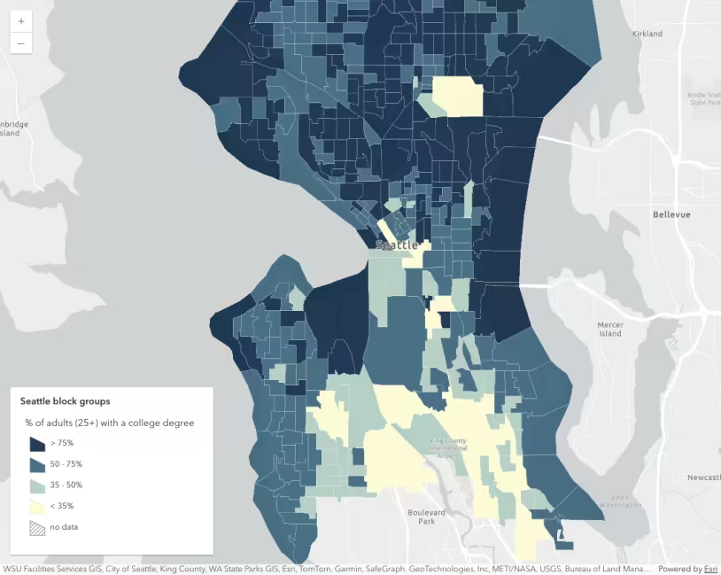
Census tracts colored based on the percentage of people that did not finish high school. Use the swipe widget to compare a classified version of this data to a continuous (unclassed) visualization along the same color ramp.
Which approach for visualizing numbers in a choropleth map is better, class breaks, or a continuous color gradient? That question has been debated for decades. This page compares class breaks and continuous color visualizations and offers suggestions to help guide you in choosing a proper way to create choropleth maps in your own apps.
Note the following excerpt from the blog, Better Breaks Define Your Map’s Purpose:
Classed color
A classed color visualization assigns numeric data values to predefined ranges (i.e. classes, brackets, bins, buckets, or cohorts). Each class is assigned a distinct color or symbol, so all features with values in a single range will be rendered the same.
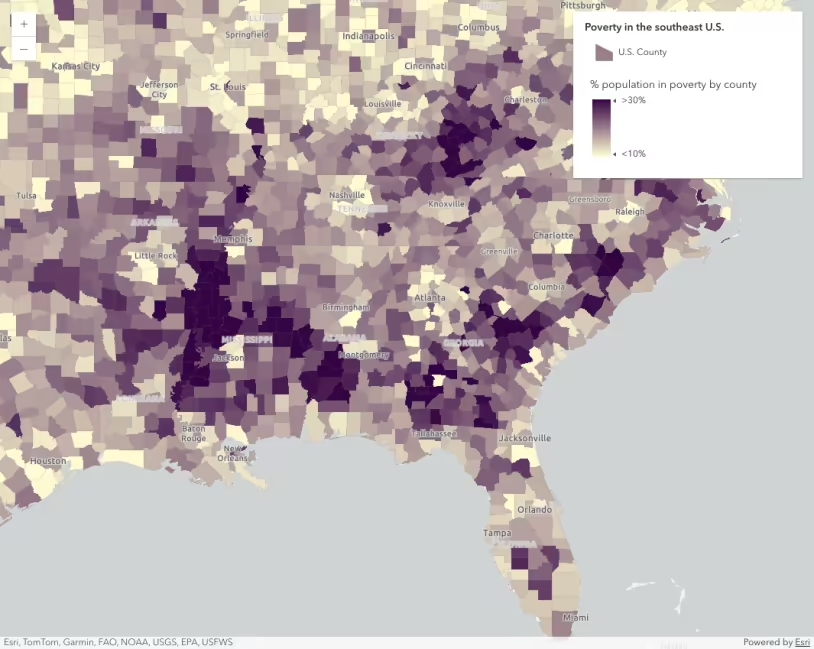
Data can be classified with manual breaks, Jenks natural breaks, at equal intervals, or with quantile breaks. The following map shows the percentage of the adult population that did not complete high school with manually defined class breaks.
This map uses a class breaks renderer to visualize census tracts based on the percentage of the population that did not finish high school.
Continuous color
A continuous color visualization uses an unclassified approach to visualize numeric data along a continuous color gradient instead of predefined ranges. This approach lets the data speak for itself, visualizing each feature with an interpolated color representative of the data value’s position in relation to the full range of the data.
This approach removes the complexity of classification schemes and shows a more detailed view of the data.
This map uses a continuous color ramp to visualize census tracts based on the percentage of the population that did not finish high school.
When you should use continuous color
Some argue that class breaks is preferable to a continuous (unclassed) visualization because it is easier to interpret the actual value of the data, whereas the user can only “guess” the value of the feature in the continuous visualization. This claim is misleading.
It is true that including fewer hues on the map make it easier to match features in the map with a color in the legend. However, generalizing the data into a few categories can actually cause the user to incorrectly assume features belong in meaningful cohorts, when in reality they do not.
Without a label or a popup, the user is always left guessing the value of a feature in both continuous and classified visualizations (where each class represents a range of values). For example, take a look at the image below and guess the value of polygon B.
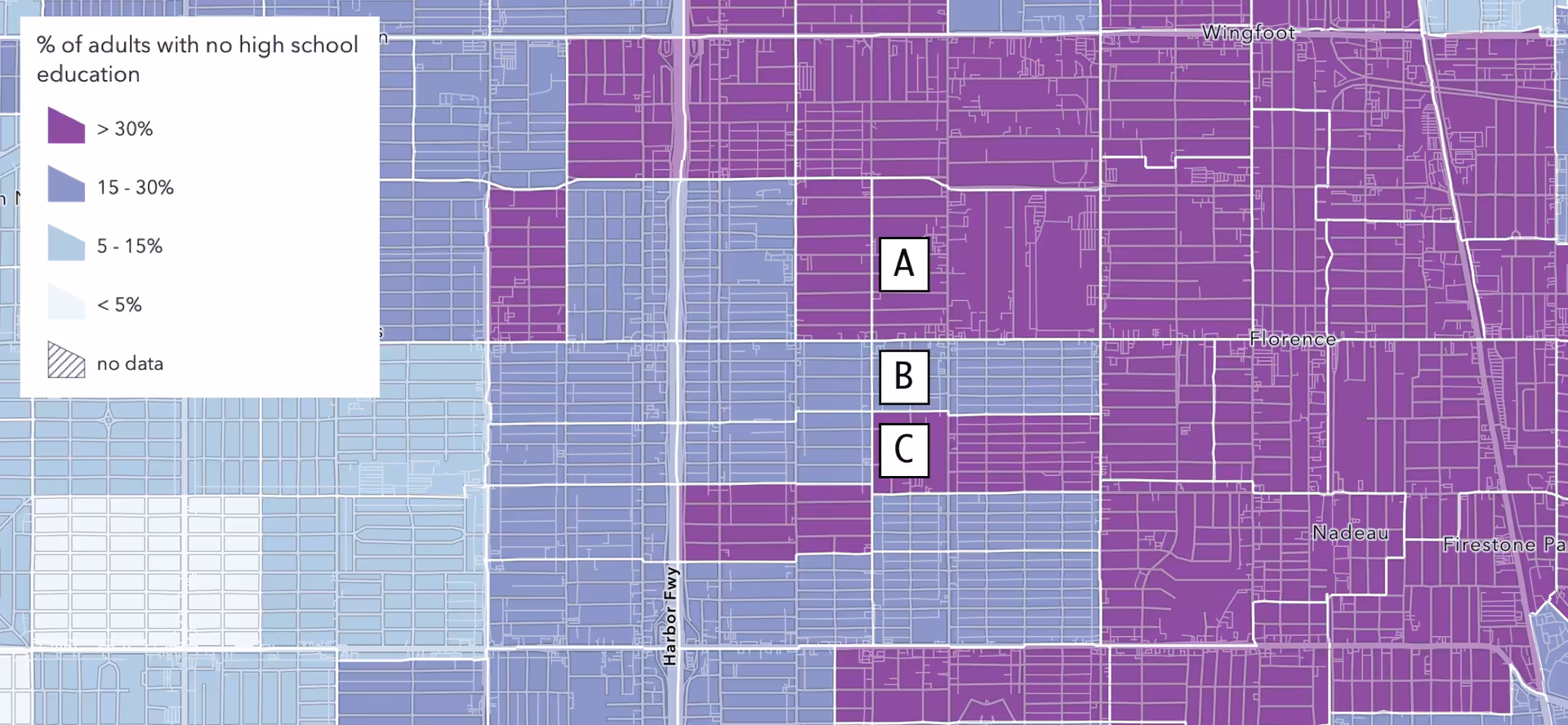
Polygons A and C clearly have a value above 30%. All we know about polygon B is that it has a value of somewhere between 15-30%. Because of the stark difference in hue between polygon B and its neighbors, A and C, you might easily assume the value is significantly different than the values of A and C.
Now take a look at this image and guess the value of polygon B.
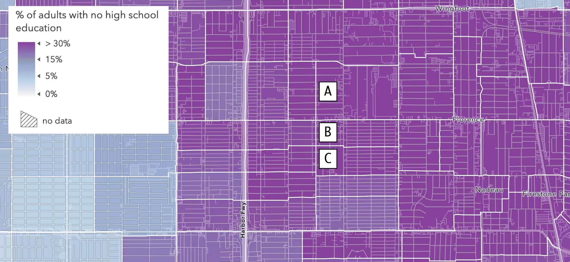
Note this map uses the same color ramp and data stops as the map in Figure A. However, this one uses a continuous gradient rather than distinct class breaks. The user would likely assume the value of polygon B is greater than 30%.
In both scenarios, the user is left guessing the value. In Figure A, they are more likely to associate polygon B as much different than its neighbors. In Figure B, the user is more likely to associate polygon B as similar to its neighbors.
Now look at the same maps with labels indicating the actual value of each polygon.
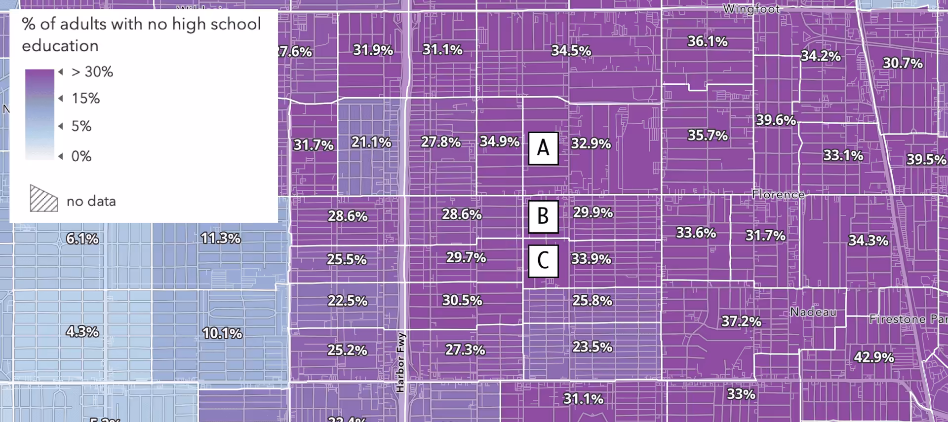
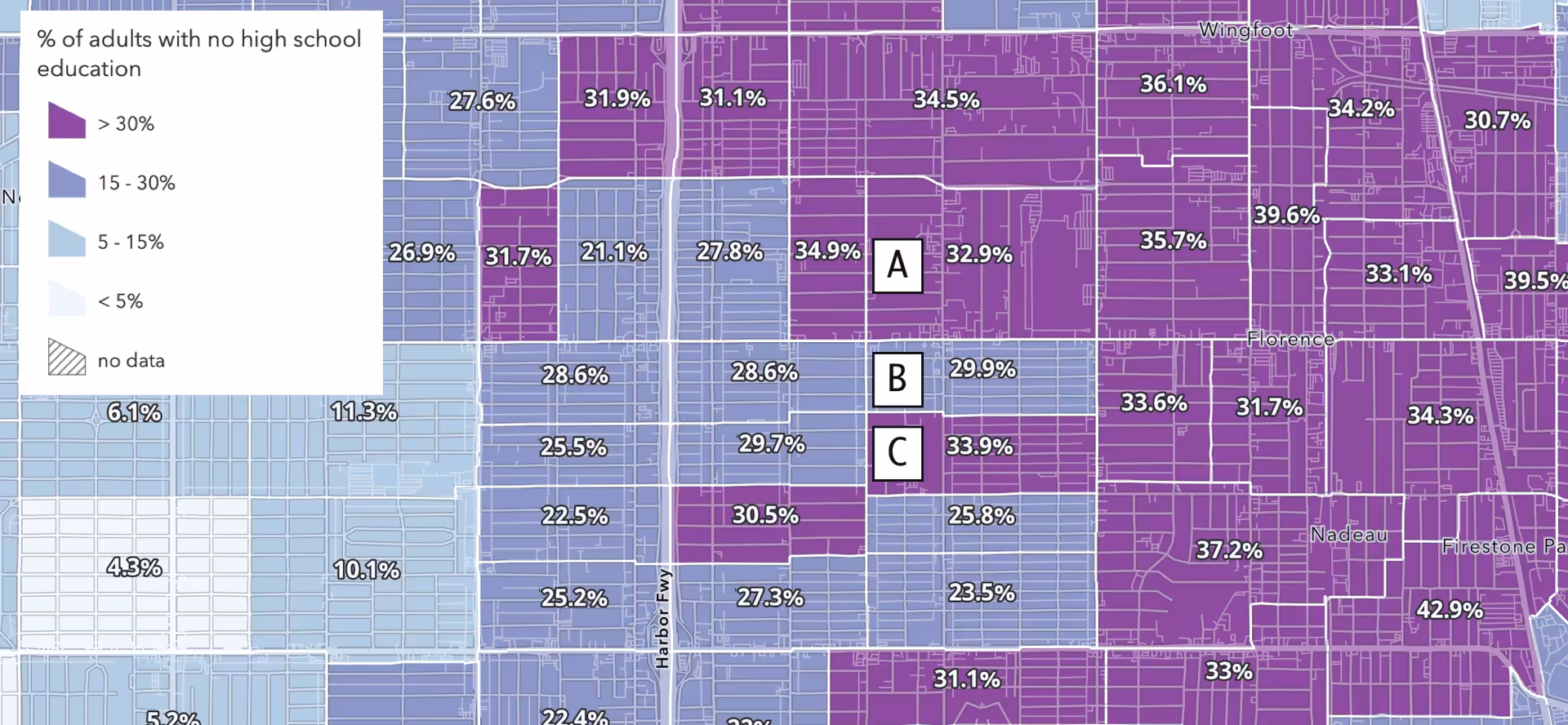
Because the breaks are more or less arbitrary in this example, it would be more appropriate to use a continuous color ramp for this visualization.
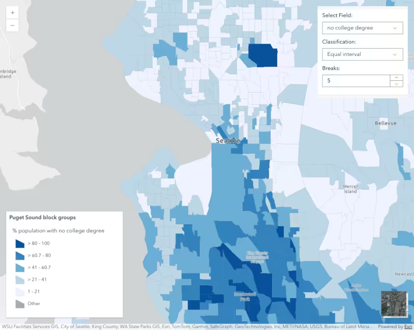
Use the swipe widget in the app below to explore the difference between a classed and a continuous visualization using the same data, break points, and color ramp.
Census tracts colored based on the percentage of people that did not finish high school. Use the swipe widget to compare a classified visualization of this data to a coninuous (unclassed) visualization along the same color ramp.
While the continuous gradient can add as many colors to the map as there are features, making it hard to match colors in the map to colors in a legend, it avoids the bias often created in a classed approach, providing a more honest view of each data point in the context of the entire dataset.
The legend is a nothing more than a guide in unclassified visualizations. It is not a tool for getting the exact value of a feature. In either scenario, if the exact value of a feature is important to the end user, then you should provide them access to the value in a popup or as a label.
When you should use class breaks
Class breaks are more appropriate than continuous color gradients in many scenarios. Keep in mind that the method for the data classification should be justified and clearly understood by the user.
You should use a classified color scheme in the following scenarios.
- The data is already classified into meaningful groups (e.g. the data is represented by a few integers).
- You need to group the data in statistically meaningful ways (e.g. percentiles, standard deviations from the mean, etc.)
- The user expects the data to be visualized as summary groups that hold more meaning than the actual data value.
For example, if you’re working with income data and your organization defines meaningful income brackets, such as those defined in the app below, then you should use a class breaks renderer.
Use the swipe widget in the app below to compare a classed color visualization with a continuous color visualization representing median household income in Los Angeles. Both visualizations are valid. You should use the classed version only if the breaks hold meaningful value to the end user. Otherwise, the continuous color version is preferred.
Median household income visualized with class breaks (left) and a continuous color gradient (right).
If an organization segments the data into meaningful tiers or cohorts, then classified should be used.
The app below shows the same income data classified in tiers. Note how the classed color visualization is much more clear than the continuous color version. In the continuous color visual, the gradient makes it unclear which areas belong to each tier.
A classed color visualization is preferred when visualizing data already segmented into tiers.
Other reasons for classifying data include to segment data into meaningful statistical buckets.
Quick reference
Remember the following when creating a visualization for any numeric data attribute.
- Classify the data only if the classes have an obvious meaning to the end user. This could be in the form of named cohorts, or statistical brackets.
- Use a continuous ramp to help the user properly understand the relative value of each feature in relation to all other features. This is a more honest representation of unclassified data.
- Never arbitrarily assign break points in any visualization. Continuous color visualizations typically use statistics to set stop values (e.g. mean for the middle stop, standard deviation or max/min for the first and last stops).
- If the exact value of a feature is important to the end user, then configure a popup or labels so the user can easily get that value when needed.