Raster functions are lightweight and process only the pixels visible on your screen, in memory, without creating intermediate files. They are powerful because you can chain them together and apply them on huge rasters and mosaics on the fly. This guide will introduce you to the different capabilities of Imagery Layers and how to apply raster functions. As a sample, it uses Landsat imagery data.
Note: This guide requires bokeh python plotting library. Install it in your conda environment using the command below. This command should be typed in the terminal, not in the notebook
conda install bokeh
Access Landsat imagery
We've added a multispectral imagery layer item to our organization from ArcGIS Online that we'll use for this tutorial. Let's connect and get the specific item by its ID value in our organization:
from arcgis.gis import GISgis = GIS(profile="your_enterprise_profile")landsat_item = gis.content.get("48ed95f1658e49cab3cd2918197b1709")landsat_item
View Landsat imagery layer item description
from IPython.display import HTML
HTML(landsat_item.description)
Multispectral Landsat image service covering the landmass of the World. This service includes scenes from Landsat 8 and Global Land Survey (GLS) data from epochs 1990, 2000, 2005 and 2010 at 30 meter resolution as well as GLS 1975 at 60 meter resolution. GLS datasets are created by the United States Geological Survey (USGS) and the National Aeronautics and Space Administration (NASA) using Landsat images. This service can be used for mapping and change detection of urban growth, change of natural resources and comparing Landsat 8 imagery with GLS data. Using on-the-fly processing, the raw DN values are transformed to scaled (0 - 10000) apparent reflectance values and then different service based renderings for band combinations and indices are applied. The band names are in line with Landsat 8 bands; GLS data band names are mapped along the same lines.
This layer includes Landsat GLS, Landsat 8, and Landsat 9 imagery for use in visualization and analysis. This layer is time enabled and includes a number band combinations and indices rendered on demand. The Landsat 8 and 9 imagery includes nine multispectral bands from the Operational Land Imager (OLI) and two bands from the Thermal Infrared Sensor (TIRS). It is updated daily with new imagery directly sourced from the collection on AWS.
Geographic Coverage
Global Land Surface.
Polar regions are available in polar-projected Imagery Layers:
Landsat Arctic Viewsand
Landsat Antarctic Views.
Temporal Coverage
This layer is updated daily with new imagery.
Working in tandem, Landsat 8 and 9 revisit each point on Earth's land surface every 8 days.
Most images collected from January 2015 to present are included.
Approximately 5 images for each path/row from 2013 and 2014 are also included.
This layer also includes imagery from the Global Land Survey* (circa 2010, 2005, 2000, 1990, 1975).
Product Level
The Landsat 8 and 9 imagery in this layer is comprised of Collection 2 Level-1 data.
The imagery has Top of Atmosphere (TOA) correction applied.
TOA is applied using the radiometric rescaling coefficients provided the USGS.
The
TOA reflectance values (ranging 0 – 1 by default) are scaled using a range of 0 – 10,000.
Image Selection/Filtering
A number of fields are available for filtering, including Acquisition Date, Estimated Cloud Cover, and Product ID.
To isolate and work with specific images, either use the ‘Image Filter’ to create custom layers or add a ‘Layer Filter’ to restrict the default layer display to a specified image or group of images.
To isolate a specific mission, use the Layer Filter and the dataset_id or SensorName fields.
Visual Rendering
The default rendering in this layer is Agriculture (bands 6,5,2) with Dynamic Range Adjustment (DRA). Brighter green indicates more vigorous vegetation.
The DRA version of each layer enables visualization of the full dynamic range of the images.
Rendering (or display) of band combinations and calculated indices is done on-the-fly from the source images via Raster Functions.
Various pre-defined Raster Functions can be selected or custom functions can be created.
Pre-defined functions:
Natural Color with DRA,
Agriculture with DRA,
Geology with DRA,
Color Infrared with DRA,
Bathymetric with DRA,
Short-wave Infrared with DRA,
Normalized Difference Moisture Index Colorized,
NDVI Raw,
NDVI Colorized,
NBR Raw15 meter Landsat Imagery Layers are also available:
Panchromatic and Pansharpened.
Multispectral Bands
Band | Description | Wavelength (µm) | Spatial Resolution (m) |
1 | Coastal aerosol | 0.43 - 0.45 | 30 |
2 | Blue | 0.45 - 0.51 | 30 |
3 | Green | 0.53 - 0.59 | 30 |
4 | Red | 0.64 - 0.67 | 30 |
5 | Near Infrared (NIR) | 0.85 - 0.88 | 30 |
6 | SWIR 1 | 1.57 - 1.65 | 30 |
7 | SWIR 2 | 2.11 - 2.29 | 30 |
8 | Cirrus (in OLI this is band 9) | 1.36 - 1.38 | 30 |
9 | QA Band (available with Collection 1)* | NA | 30 |
*More about the
TIRS Bands
Band | Description | Wavelength (µm) | Spatial Resolution (m) |
10 | TIRS1 | 10.60 - 11.19 | 100 * (30) |
11 | TIRS2 | 11.50 - 12.51 | 100 * (30) |
*TIRS bands are acquired at 100 meter resolution, but are resampled to 30 meter in delivered data product.
Additional Usage Notes
Image exports are limited to 4,000 columns x 4,000 rows per request.
This dynamic imagery layer can be used in Web Maps and ArcGIS Pro as well as web and mobile applications using the ArcGIS REST APIs.
WCS and WMS compatibility means this imagery layer can be consumed as WCS or WMS services.
The
Landsat Explorer Appis another way to access and explore the imagery.
Data Source
Landsat imagery is sourced from the U.S. Geological Survey (USGS) and the National Aeronautics and Space Administration (NASA). Data is hosted in Amazon Web Services as part of their .
For information, see and .
*The Global Land Survey includes images from Landsat 1 through Landsat 7. Band numbers and band combinations differ from those of Landsat 8, but have been mapped to the most appropriate band as in the above table. For more information about the Global Land Survey, visit
GLS.
Access the layers available with the Landsat Imagery Layer item
This imagery layer item contains the imagery layer that we'll be using for this tutorial. Let's save a reference to the layer in the landsat variable. Querying the variable in Jupyter Notebook will quickly render it as an image.
landsat = landsat_item.layers[0]
landsat
Explore different wavelength bands
import pandas as pdpd.DataFrame(landsat.key_properties()['BandProperties'])| BandName | WavelengthMin | WavelengthMax | |
|---|---|---|---|
| 0 | CoastalAerosol | 430.00 | 450.00 |
| 1 | Blue | 450.00 | 510.00 |
| 2 | Green | 530.00 | 590.00 |
| 3 | Red | 640.00 | 670.00 |
| 4 | NearInfrared | 850.00 | 880.00 |
| 5 | ShortWaveInfrared_1 | 1570.00 | 1650.00 |
| 6 | ShortWaveInfrared_2 | 2110.00 | 2290.00 |
| 7 | Cirrus | 1360.00 | 1380.00 |
| 8 | QA | 0.00 | 0.00 |
| 9 | ThermalInfrared1 | 10600.00 | 11190.00 |
| 10 | ThermalInfrared2 | 11500.00 | 12150.00 |
Visualize the layer in the map widget
Let's visualize the layer by creating a map widget around our area of interest and adding the Landsat Imagery layer to it:
m = gis.map('Redlands, CA')
m
m.content.add(landsat)Apply built-in raster functions
The multispectral imagery layer can be rendered using several different raster functions (also known as raster function templates). Each raster function template incorporates different satellite bands to highlight different land cover features. Obtain a list of predefined raster function templates defined by the service backing the imagery layer:
for rasterfunc in landsat.properties.rasterFunctionInfos:
    print(rasterfunc.name)
Agriculture with DRA Bathymetric with DRA Color Infrared with DRA Geology with DRA Natural Color with DRA Short-wave Infrared with DRA Agriculture Bathymetric Color Infrared Geology Natural Color Short-wave Infrared NDVI Colorized Normalized Difference Moisture Index Colorized NDVI Raw NBR Raw Band 10 Surface Temperature in Celsius Band 10 Surface Temperature in Fahrenheit Band 11 Surface Temperature in Celsius Band 11 Surface Temperature in Fahrenheit None
Let's apply the 'Color Infrared with DRA' raster function to visualize the color infrared view. This can be done using the apply function in the arcgis.raster.functions module. This function applies a server-defined raster function template, given its name, to the Imagery layer.
from arcgis.raster.functions import applycolor_infrared = apply(landsat, 'Color Infrared with DRA')m = gis.map('Redlands, CA')
m.content.add(color_infrared)
m
A true-color image uses red, green, and blue satellite bands to create an image that looks like a photograph. The color infrared view, on the other hand, uses the near infrared, red and green satellite bands to create an image. As a result, vegetation appears bright red in the image above.
Interactive raster processing in Jupyter Notebook
Imagery layers can be queried in the Jupyter Notebok. This displays a raster representation of the layer as an image:
color_infrared
Setting an area of interest
When working with Imagery layers, you are typically working in an area of interest. You can set the extent of the Imagery layer to that area of interest and query it to visualize the imagery layer to that extent within the notebook:
from arcgis.geocoding import geocode
area = geocode('Redlands, CA', out_sr=landsat.properties.spatialReference)[0]
color_infrared.extent = area['extent']color_infrared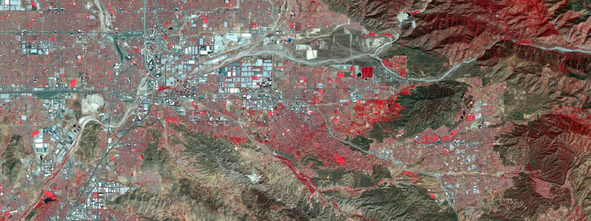
Since we will be using the landsat layer further down in this notebook, let's set its extent to our area of extent as well:
landsat.extent = area['extent']
landsat
Exporting Images from Imagery Layer
In addition to visualizing the imagery layers in Jupyter Notebook, or using a map widget, they can be exported using the export_image method provided by ImageryLayers:
from IPython.display import Imageimg = landsat.export_image(bbox=area['extent'], size=[1200,450], f='image')Image(img)
The exported image can be saved to a file by specifying a folder and file name:
savedimg = landsat.export_image(bbox=area['extent'], size=[1200,450], f='image', save_folder='.', save_file='img.jpg')savedimg'./img.jpg'
from IPython.display import ImageImage(filename=savedimg, width=1200, height=450)
Exporting images from an imagery layer to which a raster function has been applied
The above techniques can be used to visualize imagery layers to which raster functions (or a chain of raster functions) have been applied:
color_infrared = apply(landsat, 'Color Infrared with DRA')img = color_infrared.export_image(bbox=area['extent'], size=[1200, 450], f='image')Image(img)
Vegetation Index
An index combines two or more wavelengths to indicate the relative abundance of different land cover features, like vegetation or moisture.
Let's use the 'NDVI Colorized' raster function to visualize healthy, green vegetation:
ndvi_colorized = apply(landsat, 'NDVI Colorized')
ndvi_colorized
NDVI is an index that indicates the presence of healthy, green vegetation (seen in green above).
Custom Bands
You can also create your own indexes and band combinations and specify stretch and gamma values to adjust the image contrast.
The code below first extracts the [3 (Red), 2 (Green), 1 (Blue)] bands using the extract_bands function and passes its output to the stretch function to enhance the image:
from arcgis.raster.functions import stretch, extract_bandnaturalcolor = stretch(extract_band(landsat, [3,2,1]),
stretch_type='percentclip', min_percent=0.1, max_percent=0.1, gamma=[1, 1, 1], dra=True)naturalcolor
This is a true-color image (similar to a photograph) created using the red, green, and blue satellite bands. Notice how much easier it was to find healthy vegetation using the NDVI vegetation index compared to the true-color image.
Image Attributes
The get_samples() method returns pixel values of the source data (i.e before any rendering rules or raster functions are applied) for a given geometry as well as image attributes, like Scene ID, Acquisition Date, and Cloud Cover.
import arcgis
g = arcgis.geometry.Geometry(area['extent'])
samples = landsat.get_samples(g, sample_count=50,
out_fields='AcquisitionDate,OBJECTID,GroupName,Category,SunAzimuth,SunElevation,CloudCover')samples[0]{'location': {'x': -13049044.788841708,
'y': 4044790.7833781266,
'spatialReference': {'wkid': 102100, 'latestWkid': 3857}},
'locationId': 1,
'value': '1604 1509 1400 1492 2234 2047 1714 9 21824 32429 29240',
'rasterId': 3826993,
'resolution': 30,
'attributes': {'AcquisitionDate': 1663698168000,
'OBJECTID': 3826993,
'GroupName': 'LC08_L1TP_040036_20220920_20220928_02_T1_MTL',
'Category': 1,
'SunAzimuth': 147.54650879,
'SunElevation': 51.70867157,
'CloudCover': 0.0004},
'values': [1604.0,
1509.0,
1400.0,
1492.0,
2234.0,
2047.0,
1714.0,
9.0,
21824.0,
32429.0,
29240.0]}import datetime
value = samples[0]['attributes']['AcquisitionDate']
datetime.datetime.fromtimestamp(value /1000).strftime("Acquisition Date: %d %b, %Y")'Acquisition Date: 20 Sep, 2022'
Here's the same information visualized as a table using Pandas:
pd.DataFrame(samples[0]['attributes'], index=[0])| AcquisitionDate | OBJECTID | GroupName | Category | SunAzimuth | SunElevation | CloudCover | |
|---|---|---|---|---|---|---|---|
| 0 | 1663698168000 | 3826993 | LC08_L1TP_040036_20220920_20220928_02_T1_MTL | 1 | 147.546509 | 51.708672 | 0.0004 |
Spectral profile from the sampled values at a location
The get_samples method can also estimate which type of land cover most closely matches any point on the map by comparing their spectral profiles. The example below adds a 'click handler' to the map widget. When the map is clicked, a spectral profile for the clicked location is displayed using the bokeh charting library.
m = gis.map('Redlands, CA')
m
m.content.add(landsat)Clipping to an area of interest
Imagery layers can be clipped to an area of interest using the clip raster function. The clipping geometry can be obtained from a feature layer or spatial dataframe as well. Here's a simple example of clipping the landsat layer:
from arcgis.geometry import Geometry, bufferThe unit parameter indicates the units for calculating each buffer distance. If not specified, the units are derived from bufferSR. If bufferSR is not specified, the units are derived from in_sr. In the example below, we are calling the buffer method with unit set to be a constant string "9001":
poly = buffer(geometries=[Geometry(area['location'])],
              in_sr=102100, distances=6000,
              unit="9001")[0]
Equivalently we can use a constant Enum, e.g., LengthUnits.METER, or the integer 9001, to specify the same requirement.
from arcgis.geometry import LengthUnits
geom_buffered_b = buffer(geometries = [polyline1],
                         in_sr=3857,
                         distances=50,
                         unit=LengthUnits.METER,
                         out_sr=None,
                         buffer_sr=None,
                         union_results=None,
                         geodesic=None,
                         gis=gis)
from arcgis.raster.functions import clipredclip = clip(landsat, poly)The clipped layer can also be added to a map widget:
m = gis.map('Redlands, CA')m
m.content.add(redclip)Select images by where clause, geometry and time range
You can select images by attributes using a where clause as well as using spatial and temporal filters using the filter_by method.
The code snippet below limits the images available to those that have less than 10% cloud cover and which intersect with our area of interest:
from arcgis.geometry.filters import intersects
selected = landsat.filter_by(where="(Category = 1) AND (CloudCover <=0.10) AND (WRS_Row = 36)",
                   geometry=intersects(area['extent']))
You can query the filtered rasters as a FeatureSet:
fs = selected.query(out_fields="AcquisitionDate, GroupName, Best, CloudCover, WRS_Row, Month, Name",
              return_geometry=True,
              return_distinct_values=False,
              order_by_fields="AcquisitionDate")
Attributes of the selected rasters can be queried using a Pandas dataframe using the 'df' property of the FeatureSet.
df = fs.sdf
df.head()| OBJECTID | AcquisitionDate | GroupName | Best | CloudCover | WRS_Row | Month | Name | SHAPE | |
|---|---|---|---|---|---|---|---|---|---|
| 0 | 3106827 | 1977-05-30 | p043r036_2x19770530 | 95957036 | -0.01 | 36 | 5 | p043r036_2dm19770530_z11_MS | {"rings": [[[-12889114.8652, 4207339.365500003... |
| 1 | 3098872 | 1990-05-07 | p040r036_5x19900507 | 91960036 | -0.01 | 36 | 5 | p040r036_5dt19900507_z11_MS | {"rings": [[[-12902153.7239, 4064989.857699997... |
| 2 | 3089612 | 2000-04-24 | p040r036_7x20000424 | 88960036 | 0.0 | 36 | 4 | p040r036_7dt20000424_z11_MS | {"rings": [[[-12872961.873599999, 4197538.7916... |
| 3 | 3080651 | 2005-05-24 | L7040036_03620050524 | 79960036 | 0.0 | 36 | 5 | L72040036_03620050524_MS | {"rings": [[[-12867140.4332, 4198647.7443], [-... |
| 4 | 3645274 | 2009-05-11 | L5040036_03620090511 | 72960036 | 0.0 | 36 | 5 | L5040036_03620090511_MS | {"rings": [[[-12862615.619800001, 4191651.0291... |
Looking at the shape of the dataframe we see that 46 scenes match the specified criteria:
df.shape(157, 9)
The footprints of the rasters matching the criteria can be drawn using the map widget:
df['Time'] = pd.to_datetime(df['AcquisitionDate'], unit='ms')
df['Time'].head(10)
0 1977-05-30 00:00:00 1 1990-05-07 00:00:00 2 2000-04-24 00:00:00 3 2005-05-24 00:00:00 4 2009-05-11 00:00:00 5 2013-03-19 18:20:57 6 2013-04-20 18:23:57 7 2013-05-22 18:24:11 8 2013-06-07 18:24:11 9 2013-06-23 18:24:05 Name: Time, dtype: datetime64[ns]
Resolving overlapping pixels in selected rasters
When a set of rasters are selected by filtering an Imagery layer, they may have overlapping pixels.
The Imagery layer has methods like first(), last(), min(), max(), mean(), blend(), and sum() to resolve overlap pixel values from the first or last raster, use the min, max or mean of the pixel values, or blend them:
Here's the same information visualized using the map widget. This shows the selected rasters covering only our area of interest:
m = gis.map('Southern California')
display(m)
m.content.add(selected.last())
m = gis.map('Southern California')
display(m)
m.content.add(selected.first())
Change Detection
It's quite common to compare images of the same area from two different times. The example below selects the old and new images using the filter_by() method and specifying an object id. The object id can be obtained from the query() method described above.
old = landsat.filter_by('OBJECTID=3098872')new = landsat.filter_by('OBJECTID=3089612')Difference Image
Difference Image mode illustrates all the changes in NDVI (vegetation index) between the two dates:
Increases are shown in green, and decreases are shown in magenta.
from arcgis.raster.functions import *diff = stretch(composite_band([ndvi(old, '5 4'),
ndvi(new, '5 4'),
ndvi(old, '5 4')]),
stretch_type='stddev', num_stddev=3, min=0, max=255, dra=True, astype='u8')
diff
Applying a threshold mask
The difference can also be computed using map algebra, as shown below:
ndvi_diff = ndvi(new, '5 4') - ndvi(old, '5 4')ndvi_diff
However, in the image above is hard to visualize in which areas the vegetation index changed by a specified threshold. The example below renders the areas where the change is above the specified threshold and renders it using a green color:
threshold_val = 0.1masked = colormap(remap(ndvi_diff,
input_ranges=[threshold_val, 1],
output_values=[1],
no_data_ranges=[-1, threshold_val], astype='u8'),
colormap=[[1, 124, 252, 0]], astype='u8')
Image(masked.export_image(bbox=area['extent'], size=[1200,450], f='image'))
The difference image and threshold mask can be visualized using the map widget:
m = gis.map('Redlands, CA')
m
m.content.add(diff)m.content.add(masked)Persisting your analysis for visualization or analysis
The save() method on ImageryLayer class persists this imagery layer to the GIS as an Imagery Layer item. If the for_viz parameter is True, a new Item is created that uses the applied raster functions for visualization at display resolution using on-the-fly image processing. If for_viz is False, distributed raster analysis is used for generating a new raster information product by applying raster functions at source resolution across the extent of the output imagery layer.
In the example below, the threshold mask is being saved as an item for visualization:
lyr = masked.save('Test_viz_layer3', for_viz=True)lyr