Inline Editable is an input-based component which when focused, the text can be saved or discarded.
Overview
Inline Editable was designed to keep input borders to a minimum when not engaged. The "Save" and "Discard" controls can be disabled using the controls property.
Inline Editable must contain an Input in its default slot.
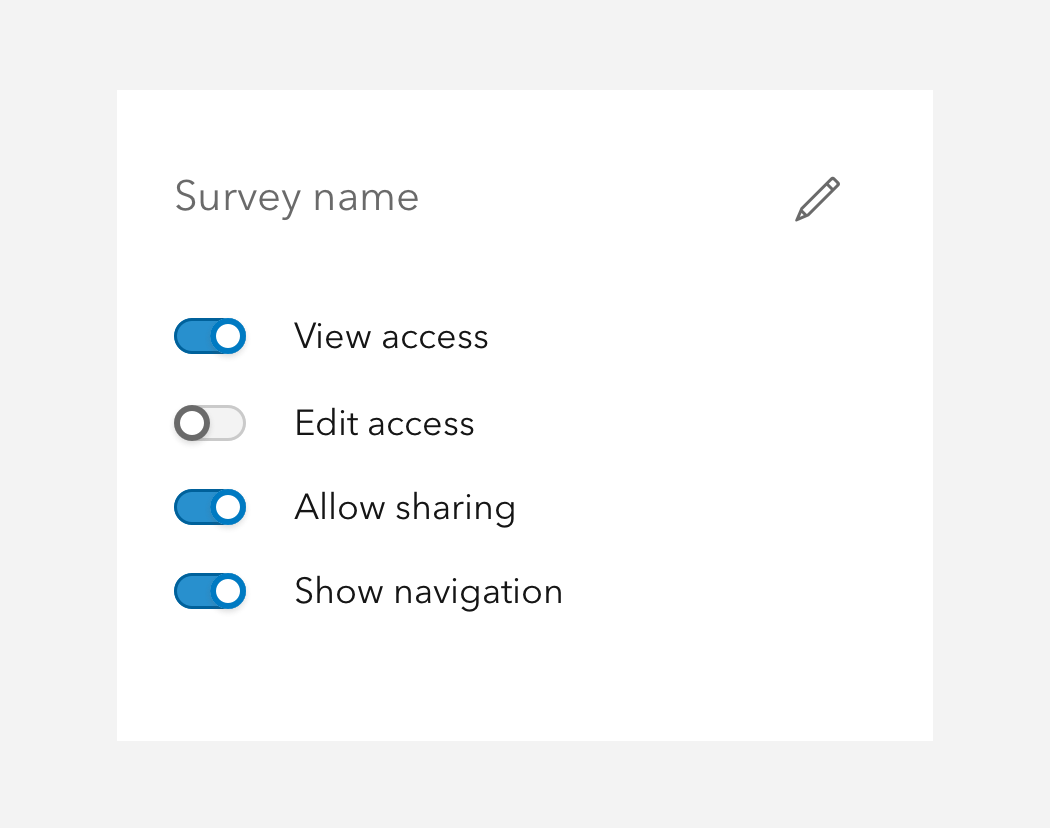
Sample
Usage
- As a more deliberate interaction to change text than a standard Input
- Situations where text input is not a primary function
- A title or header for a section of content
- Content that can have a text change after being submitted
Best practices
Below are important guidelines on using the Inline Editable component.

Accessibility
Keyboard navigation
| Key | Function |
|---|---|
Tab | Moves focus in and out of the component. |
Tab and Shift | Moves focus in and out of the component. |
Enter | When editing is false, enables inline editing. |
Space | When editing is false, enables inline editing. |
API reference
Properties
| Property | Attribute | Description | Type | Default |
|---|---|---|---|---|
| afterConfirm | Specifies a callback to be executed prior to disabling editing via the controls. When provided, the component's loading state will be handled automatically. | () => Promise<void> | ||
| controls | controls | When true and editingEnabled is true, displays save and cancel controls. | boolean | false |
| disabled | disabled | When true, prevents interaction and decreases the component's opacity. | boolean | false |
| editingEnabled | editing-enabled | When true, inline editing is enabled. | boolean | false |
| loading | loading | When true, a busy indicator is displayed. | boolean | false |
| messageOverrides | Overrides individual strings used by the component. | Record<string, unknown> | undefined | ||
| scale | scale | Specifies the size of the component. | Scale | "m" |
Slots
| Name | Description |
|---|---|
| default (unnamed) | A slot for adding a calcite-input. |
Styles
| Name | Description |
|---|---|
| --calcite-inline-editable-background-color-hover | Specifies the component's background color when hovered. |
| --calcite-inline-editable-background-color | Specifies the component's background color. |
| --calcite-inline-editable-button-background-color | When appearance="solid" or appearance="outline-fill", specifies the background color of the component's button element. |
| --calcite-inline-editable-button-corner-radius | Specifies the corner radius of the component's button element. |
| --calcite-inline-editable-button-loader-color | Specifies the loader color of the components's button element. |
| --calcite-inline-editable-button-text-color | Specifies the text color of the component's button element. |
Events
| Name | Description | Behavior |
|---|---|---|
| calciteInlineEditableEditCancel | Fires when the component's "cancel editing" button is pressed. | |
| calciteInlineEditableEditConfirm | Fires when the component's "confirm edits" button is pressed. |
Methods
| Name | Description | Signature |
|---|---|---|
| componentOnReady | Create a promise that resolves once component is fully loaded. | componentOnReady(): Promise<this> |
| setFocus | Sets focus on the component. | setFocus(options?: FocusOptions): Promise<void> |