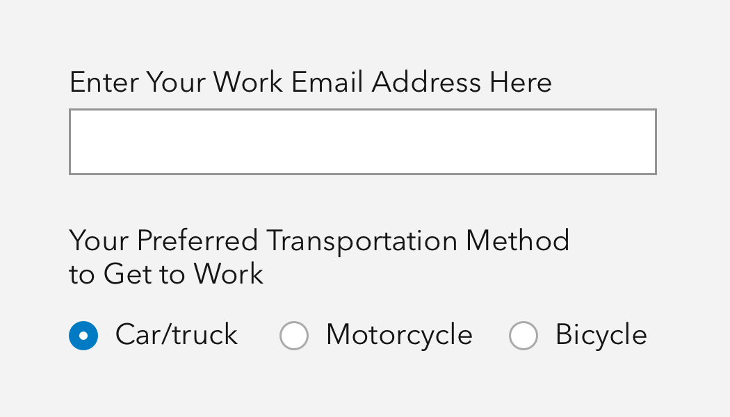
Label is a container for individual form elements with useful utilities.
Overview
Label provides a text label, positioning, alignment, and accessibility helpers for wrapped control components.
Label's display is configurable with the layout property, which adjusts the form element to display beneath, adjacent to, or with space between the Label's text.
Sample
Usage
- A container for individual form elements, which provides layout and context for components such as Input, Checkbox, Combobox, Radio Button, Slider, Switch, etc.
- As a visual anchor for sections of content
Accessibility
Label should accompany each form-based control, including Inputs, Checkboxes, Radio buttons, and Dropdowns. It provides a purposeful description to each form control supporting a more diverse audience and assistive technologies.
Each element can be wrapped with a Label, or use the for property, where the value is represented by the associated component's id value. Learn more about the label for attribute on MDN.
Writing and copy

API reference
Properties
| Property | Attribute | Description | Type | Default |
|---|---|---|---|---|
| alignment | alignment | Specifies the component's text alignment. | Alignment | "start" |
| for | for | Specifies the id of the component the label is bound to. Use when the component the label is bound to does not reside within the component. | string | undefined | |
| layout | layout | Defines the component's layout in relation to the slotted component. Use "inline" positions to wrap the label and slotted component on the same line. [Deprecated] The "default" value is deprecated, use "block" instead. | "block" | "inline" | "inline-space-between" | "default" | "default" |
| scale | scale | Specifies the size of the component. | Scale | "m" |
Slots
| Name | Description |
|---|---|
| default (unnamed) | A slot for adding text and a component that can be labeled. |
Styles
| Name | Description |
|---|---|
| --calcite-label-margin-bottom | Specifies the component's bottom spacing. |
| --calcite-label-text-color | Specifies the component's text color. |
Methods
| Name | Description | Signature |
|---|---|---|
| componentOnReady | Create a promise that resolves once component is fully loaded. | componentOnReady(): Promise<this> |