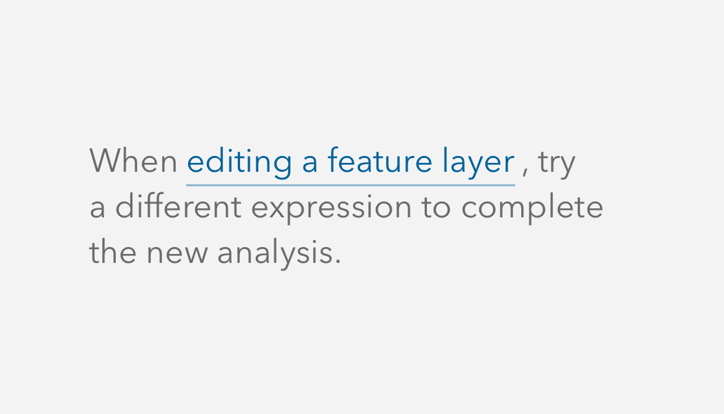
Links are actions that can be used to navigate or perform tasks.
Overview
As a basic action, Links can be useful when a Button or FAB would be too prominent. Links are great as
From the user experience perspective there is a difference between a Link and Button. Buttons should be used when you are performing tasks such as: "Create new", "Submit", "Upload", etc. Link usage should be based on navigating to another place, such as: "Explore data", "Profile settings", "Subscribe to our newsletter", etc.
Sample
Usage
- A basic navigable element
- A tertiary-level action in a group of actions
- An inline action in a sentence
Accessibility
Use unique Link text to provide a purpose to assistive technologies and a larger audience. Avoid Link text such as "Click here" or "Learn more", which can be confusing to assistive technologies and users that are not provided with proper context.
<calcite-link href="https://developers.arcgis.com/calcite-design-system/get-started/">
Get started with Calcite
</calcite-link>Opens in a new window or tab
It is strongly recommended to provide users with guidance when a Link opens in a new window or tab in support of WCAG's Success Criterion's 3.2.1: On Focus and 3.2.2: On Input. Both success criteria are defined as level A conformance, or the minimum level of conformance.
To communicate the guidance to users, provide context with Link's default slot when it opens in a new window or tab.
<calcite-link href="https://developers.arcgis.com/calcite-design-system/" target="_blank">
Calcite Design System (opens in a new window)
</calcite-link>Keyboard navigation
| Key | Function |
|---|---|
Enter | Presses the component. |
Tab | Moves focus in and out of the component. |
Tab and Shift | Moves focus in and out of the component. |
Writing and copy

API reference
Properties
| Property | Attribute | Description | Type | Default |
|---|---|---|---|---|
| disabled | disabled | When true, prevents interaction and decreases the component's opacity. | boolean | false |
| download | download | When specified, prompts the user to save the linked URL instead of navigating to it. Can be used with or without a value: Without a value, the browser will suggest a filename/extension. | string | boolean | false |
| href | href | Specifies the URL of the linked resource, which can be set as an absolute or relative path. | string | undefined | |
| iconEnd | icon-end | Specifies an icon to display at the end of the component. | IconName | undefined | |
| iconFlipRtl | icon-flip-rtl | When true and the element direction is right-to-left ("rtl"), flips the component's iconStart and/or iconEnd. | FlipContext | undefined | |
| iconStart | icon-start | Specifies an icon to display at the start of the component. | IconName | undefined | |
| rel | rel | Specifies the relationship to the linked resource defined in href. | string | undefined | |
| target | target | Specifies the frame or window to open the linked resource. | string | undefined |
Slots
| Name | Description |
|---|---|
| default (unnamed) | A slot for adding text. |
Styles
| Name | Description |
|---|---|
| --calcite-link-text-color | Specifies the component's text color. |
Methods
| Name | Description | Signature |
|---|---|---|
| componentOnReady | Creates a promise that resolves once the component is fully loaded. | componentOnReady(): Promise<this> |
| setFocus | Sets focus on the component. | setFocus(options?: FocusOptions): Promise<void> |