Notices provide inline contextual tips or advice to the user.
Overview
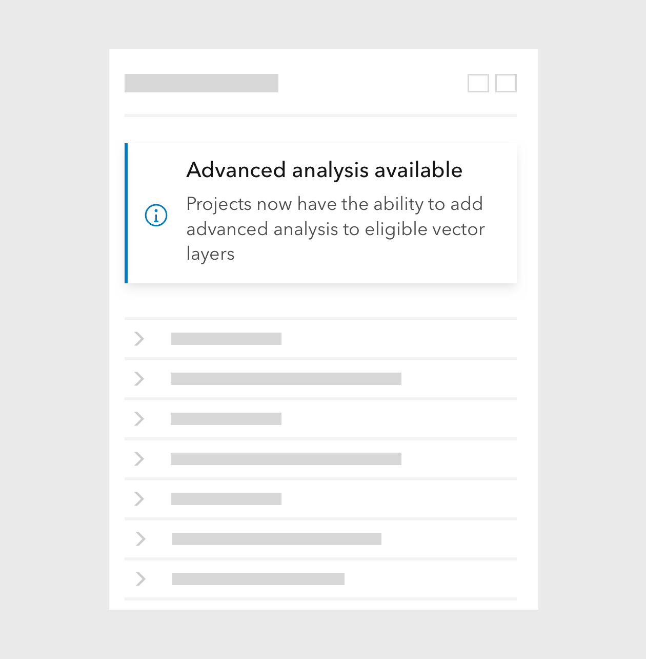
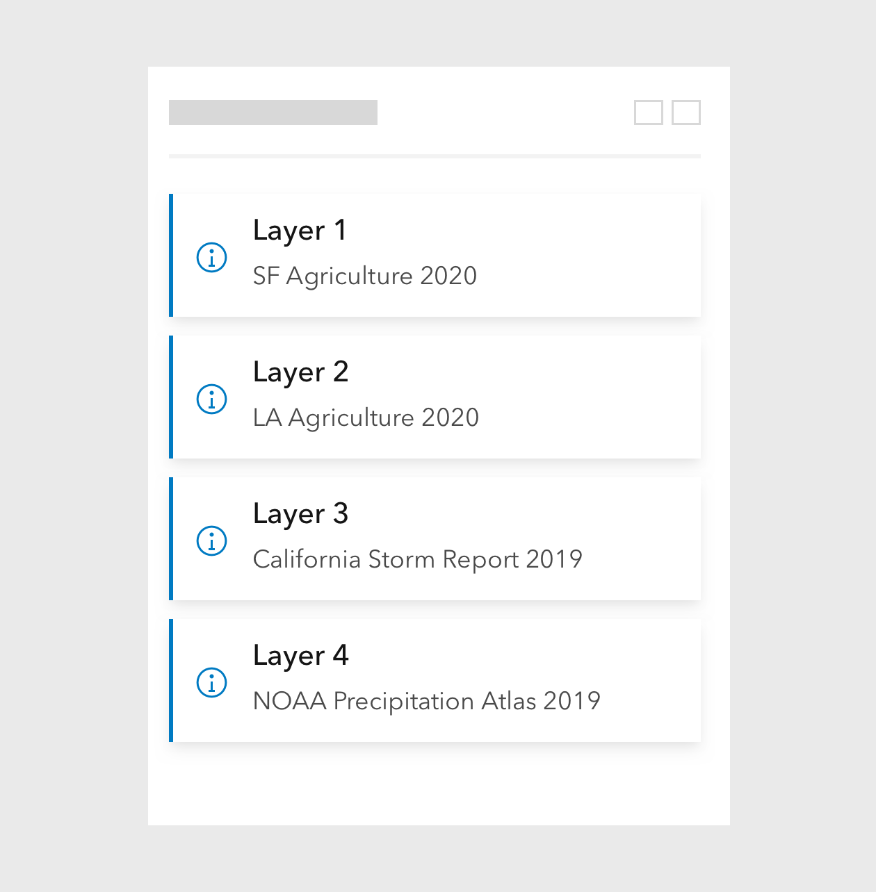
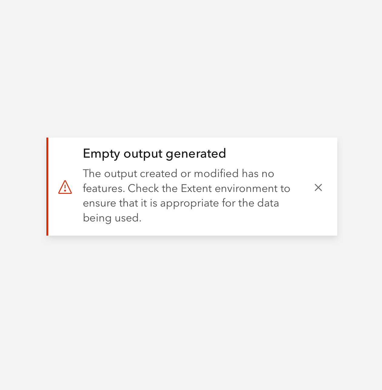
Notice provides information on page load and utilizes UI state colors to help convey meaning. Use Notice when required attention is low to moderate. Notice can provide a single action for the user, such as a Link in the Link slot along with a dismissal option. Notice is designed to be used sparingly and not in groups. Don't rely too heavily on Notice for critical messages as its styling is meant to be relatively unobtrusive.
Refer to Dialog or Alert when more immediate attention is needed.
Sample
Usage
- Inline tip messaging
- Advisory or warning messaging
- Hints and other non-critical info
Component comparison
While visually similar to Alert, Notice has distinct capabilities and intended use cases. It is positioned relatively within a parent element.
open at page load, or displayed as a result of user action.closable.open at page load.open at page load for introductory messaging.Best practices
Recommendations
Accessibility
If using the Link slot, follow the Link accessibility guidance on unique link text.
Keyboard navigation
| Key | Function |
|---|---|
Tab | Moves focus to the next focusable element. If the current focus is the last element, focus will exit the component. |
Tab and Shift | Moves focus to previous focusable element. If the current focus is the first element, focus will exit the component. |
Writing and copy

API reference
Properties
| Property | Attribute | Description | Type | Default |
|---|---|---|---|---|
| appearance | appearance | Specifies the appearance of the component. | Extract<"transparent" | "outline-fill", Appearance> | "outline-fill" |
| closable | closable | When true, displays a close button in the component. | boolean | false |
| icon | icon | When true, shows a default recommended icon. Alternatively, pass a Calcite UI Icon name to display a specific icon. | IconName | boolean | |
| iconFlipRtl | icon-flip-rtl | When true, the icon will be flipped when the element direction is right-to-left ("rtl"). | boolean | false |
| kind | kind | Specifies the kind of the component, which will apply to the top border and icon. | Extract<"brand" | "danger" | "info" | "success" | "warning" | "neutral", Kind> | "brand" |
| messageOverrides | Overrides individual strings used by the component. | Record<string, unknown> | undefined | ||
| open | open | When true, the component is visible. | boolean | false |
| scale | scale | Specifies the size of the component. | Scale | "m" |
| width | width | Specifies the width of the component. [Deprecated] The "half" value is deprecated, use "full" instead. | Extract<Width, "auto" | "half" | "full"> | "auto" |
Slots
| Name | Description |
|---|---|
| title | A slot for adding a title. |
| message | A slot for adding a message. |
| link | A slot for adding a calcite-action to take, such as: "undo", "try again", "link to page", etc. |
| actions-end | A slot for adding calcite-actions to the end of the component. It is recommended to use two or less calcite-actions. |
Styles
| Name | Description |
|---|---|
| --calcite-notice-background-color | When appearance="outline-fill", specifies the component's background color. |
| --calcite-notice-border-color | When appearance="outline-fill", specifies the component's border color. |
| --calcite-notice-corner-radius | Specifies the component's border radius. |
| --calcite-notice-close-background-color | Specifies the background color of the component's close element. |
| --calcite-notice-close-background-color-hover | Specifies the background color of the component's close element when hovered. |
| --calcite-notice-close-background-color-focus | --calcite-notice-close-background-color-hover instead. |
| --calcite-notice-close-background-color-press | Specifies the background color of the component's close element when active. |
| --calcite-notice-close-icon-color-hover | Specifies the icon color of the component's close element when hovered or active. |
| --calcite-notice-close-icon-color | Specifies the icon color of the component's close element. |
| --calcite-notice-title-text-color | Specifies the component's slotted "title" content text color. |
| --calcite-notice-content-text-color | Specifies the component's slotted "message" content text color. |
| --calcite-notice-width | |
| --calcite-notice-shadow | Specifies the component's shadow. |
Events
| Name | Description | Behavior |
|---|---|---|
| calciteNoticeBeforeClose | Fires when the component is requested to be closed and before the closing transition begins. | |
| calciteNoticeBeforeOpen | Fires when the component is added to the DOM but not rendered, and before the opening transition begins. | |
| calciteNoticeClose | Fires when the component is closed and animation is complete. | |
| calciteNoticeOpen | Fires when the component is open and animation is complete. |
Methods
| Name | Description | Signature |
|---|---|---|
| componentOnReady | Create a promise that resolves once component is fully loaded. | componentOnReady(): Promise<this> |
| setFocus | Sets focus on the component's first focusable element. | setFocus(options?: FocusOptions): Promise<void> |