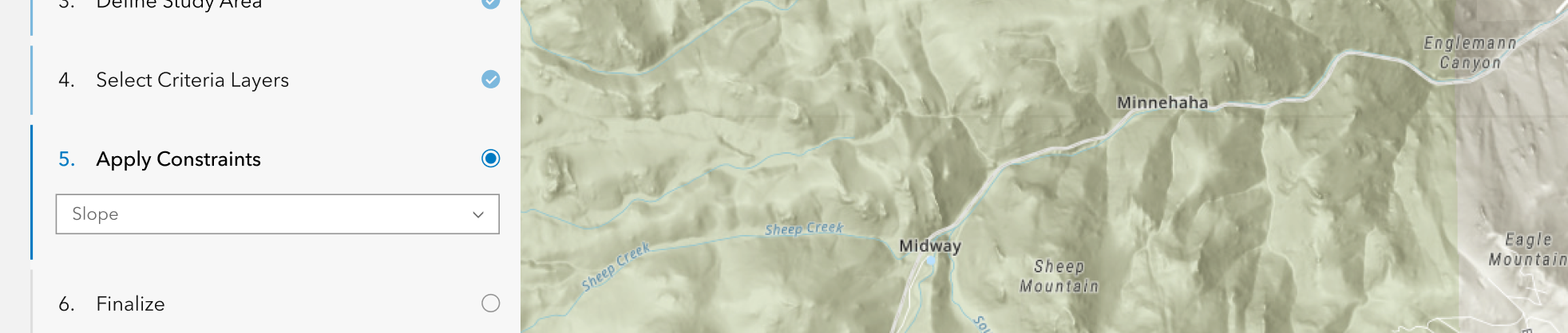
Steppers are used to show context and linear progress through a workflow.
Overview
Stepper has the ability to display a variety of applications with Stepper Items, such as completed steps. Functionally similar to Tabs, Stepper switches content in the display based on which step the user is on. Stepper can be used in vertical or horizontal layouts.
Sample
Usage
- Multiple step workflows
- Onboarding experiences
Component comparison
Stepper, Tabs, and Navigation may look similar, but each supports a distinct type of user flow and interaction.
Best for guiding users through processes with sequential steps.
Interactions typically advance users to a next step, either within the same page or to a different page.
Best for grouping related content into separate sections.
Interactions typically switch content within same page.
Best for navigating an application.
Interactions typically take users to a different page.
Best practices
Below are important guidelines on using the Stepper component.


"vertical" layout when space is limited.
"horizontal-single" layout when space is limited, but a horizontal Stepper is preferred.Accessibility
Keyboard navigation
| Key | Function |
|---|---|
Arrow left | Moves focus to the previous non-disabled calcite-stepper-item. If the current focus and selection is the first calcite-stepper-item, focus will cycle to the last calcite-stepper-item. |
Arrow right | Moves focus to the next non-disabled calcite-stepper-item. If the current focus and selection is the last calcite-stepper-item, focus will cycle to the first calcite-stepper-item. |
Arrow down | Moves focus to the next non-disabled calcite-stepper-item. If the current focus and selection is the last calcite-stepper-item, focus will cycle to the first calcite-stepper-item. |
Arrow up | Moves focus to the previous non-disabled calcite-stepper-item. If the current focus and selection is the first calcite-stepper-item, focus will cycle to the last calcite-stepper-item. |
Home | Moves focus to first non-disabled calcite-stepper-item. |
End | Moves focus to last non-disabled calcite-stepper-item. |
Space | Selects the currently focused calcite-stepper-item. |
Enter | Selects the currently focused calcite-stepper-item. |
Tab | Moves focus to next non-disabled calcite-stepper-item. If the currently focused calcite-stepper-item is the last calcite-stepper-item, focus will leave the component. |
Tab and Shift | Moves focus to previous non-disabled calcite-stepper-item. If the currently focused calcite-stepper-item is the first calcite-stepper-item, focus will leave the component. |
Writing and copy

headings.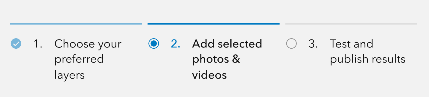
headings.API reference
Properties
| Property | Attribute | Description | Type | Default |
|---|---|---|---|---|
| icon | icon | When true, displays a status icon in the calcite-stepper-item heading. | boolean | false |
| layout | layout | Defines the component's layout. | StepperLayout | "horizontal" |
| messageOverrides | Overrides individual strings used by the component. | Record<string, unknown> | undefined | ||
| numbered | numbered | When true, displays the step number in the calcite-stepper-item heading. | boolean | false |
| numberingSystem | numbering-system | Specifies the Unicode numeral system used by the component for localization. | NumberingSystem | undefined | |
| scale | scale | Specifies the component's size. | Scale | "m" |
| selectedItem | Specifies the component's selected item. | StepperItem |
Slots
| Name | Description |
|---|---|
| default (unnamed) | A slot for adding calcite-stepper-items. |
Events
| Name | Description | Behavior |
|---|---|---|
| calciteStepperChange | Fires when the active calcite-stepper-item changes. |
Styles
| Name | Description |
|---|---|
| --calcite-stepper-bar-gap | Specifies the space between the component's calcite-stepper-items. |
| --calcite-stepper-bar-inactive-fill-color | --calcite-stepper-bar-fill-color instead. Specifies the calcite-stepper-items' bar fill color of the component's calcite-stepper-items. |
| --calcite-stepper-bar-active-fill-color | --calcite-stepper-bar-selected-fill-color instead. Specifies the calcite-stepper-items' bar fill color of the component's active calcite-stepper-items. |
| --calcite-stepper-bar-complete-fill-color | When calcite-stepper-items are complete, specifies the component's calcite-stepper-items' bar fill color. |
| --calcite-stepper-bar-error-fill-color | When calcite-stepper-items contain an error, specifies the component's calcite-stepper-items' bar fill color. |
Methods
| Name | Description | Signature |
|---|---|---|
| componentOnReady | Creates a promise that resolves once the component is fully loaded. | componentOnReady(): Promise<this> |
| endStep | Set the last calcite-stepper-item as active. | endStep(): Promise<void> |
| goToStep | Set a specified calcite-stepper-item as active. | goToStep(step: number): Promise<void> |
| nextStep | Set the next calcite-stepper-item as active. | nextStep(): Promise<void> |
| prevStep | Set the previous calcite-stepper-item as active. | prevStep(): Promise<void> |
| startStep | Set the first calcite-stepper-item as active. | startStep(): Promise<void> |