Tooltips are small text-based components that when triggered by a reference element provide context to the user.
Overview
Tooltips float over other elements in the z-axis and provide text to quickly assist the user to understand context, actions, and other elements. A Tooltip can be a helpful UX device to give the user clarity before committing to an action. Avoid relying heavily on Tooltips, as you should prefer headers and labels that accurately describe a workflow. Tooltip positioning can be automatic or manually set to avoid clipping in the interface.
Tooltip should not be placed within its reference element, and it is recommended to place the component shallowly in the DOM.
To support interactive content, consider Popover.
For more advanced floating workflows, refer to Dialog.
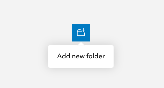
Sample
Usage
- General helper text
- Succinct action hints
Component comparison
Tooltips, Popovers, and Dialogs may look similar, but each component is designed for a different level of content complexity and user interaction.
Best practices
Below are important guidelines on using the Tooltip component.


Accessibility
It is strongly recommended to house the component's content in an element, such as a span or p, providing context to assistive technologies when accessed.
Tooltips should not be placed on disabled components, as keyboard users will not be able to access the component's contents. Instead, it is recommended to change the component's appearance using the kind and/or appearance attributes and prevent its default JavaScript behavior with the prevent method:
<!-- Non-disabled button with tooltip-->
<calcite-button id="non-disabled-btn" kind="neutral" label="Add new folder not available" icon-start="folder-plus"></calcite-button>
<calcite-tooltip reference-element="non-disabled-btn">
<span>Context on prevented interaction provided to assistive technologies</span>
</calcite-tooltip>
<script>
document.getElementById("non-disabled-btn").addEventListener("click", (evt) => evt.preventDefault());
</script>Keyboard navigation
| Key | Function |
|---|---|
Tab | Moves focus to access the component's contents from its reference element. If the current focus is the reference element, focus will leave the element. |
Tab and Shift | Moves focus to access the component's contents from its reference element. If the current focus is the reference element, focus will leave the element. |
Writing and copy


- Tooltip text should be succinct and straight to the point
- Periods are not necessary for ending Tooltip text
- Avoid contractions such as "you're", "aren't", "don't", and "can't" to avoid confusion and to assist with internationalization
- For longer content, please consider Popover
- Recommended character maximum: 75
API reference
Properties
| Property | Attribute | Description | Type | Default |
|---|---|---|---|---|
| closeOnClick | close-on-click | Closes the component when the referenceElement is clicked. | boolean | false |
| label | label | string | ||
| offsetDistance | offset-distance | Specifies the distance to position the component away from the referenceElement. | number | |
| offsetSkidding | offset-skidding | Specifies the distance to position the component along the referenceElement. | number | 0 |
| open | open | When true, the component is open. | boolean | false |
| overlayPositioning | overlay-positioning | Specifies the type of positioning to use for overlaid content, where:
"absolute" works for most cases - positioning the component inside of overflowing parent containers, which affects the container's layout, and
"fixed" is used to escape an overflowing parent container, or when the reference element's position CSS property is "fixed". | OverlayPositioning | "absolute" |
| placement | placement | Determines where the component will be positioned relative to the referenceElement. | LogicalPlacement | "auto" |
| referenceElement | reference-element | The referenceElement is used to position the component according to its placement value.
Setting the value to an HTMLElement is preferred so the component does not need to query the DOM.
However, a string id of the reference element can also be used.
The component should not be placed within its own referenceElement to avoid unintended behavior. | ReferenceElement | string | |
| topLayerDisabled | top-layer-disabled | When true and the component is open, disables top layer placement.
Only set this if you need complex z-index control or if top layer placement causes conflicts with third-party components. | boolean | false |
Slots
| Name | Description |
|---|---|
| default (unnamed) | A slot for adding text. |
Styles
| Name | Description |
|---|---|
| --calcite-tooltip-background-color | Specifies the component's background color. |
| --calcite-tooltip-border-color | Specifies the component's border color. |
| --calcite-tooltip-corner-radius | Specifies the component's corner radius. |
| --calcite-tooltip-max-size-x | Specifies the component's maximum width. |
| --calcite-tooltip-text-color | Specifies the component's text color. |
Events
| Name | Description | Behavior |
|---|---|---|
| calciteTooltipBeforeClose | Fires when the component is requested to be closed and before the closing transition begins. | |
| calciteTooltipBeforeOpen | Fires when the component is added to the DOM but not rendered, and before the opening transition begins. | |
| calciteTooltipClose | Fires when the component is closed and animation is complete. | |
| calciteTooltipOpen | Fires when the component is open and animation is complete. |
Methods
| Name | Description | Signature |
|---|---|---|
| componentOnReady | Create a promise that resolves once component is fully loaded. | componentOnReady(): Promise<this> |
| reposition | Updates the position of the component. | reposition(delayed?: boolean): Promise<void> |