<meta name="viewport" content="width=device-width, initial-scale=1, shrink-to-fit=no" />
<title>SketchViewModel Styler | Sample | ArcGIS Maps SDK for JavaScript</title>
<link rel="stylesheet" href="https://js.arcgis.com/5.1/esri/themes/light/main.css" />
<!-- Load the ArcGIS Maps SDK for JavaScript from CDN -->
<script type="module" src="https://js.arcgis.com/5.1/"></script>
const [SketchViewModel, SnappingControls, Map, GraphicsLayer, MapView, Expand] = await $arcgis.import([
"@arcgis/core/widgets/Sketch/SketchViewModel.js",
"@arcgis/core/widgets/support/SnappingControls.js",
"@arcgis/core/layers/GraphicsLayer.js",
"@arcgis/core/views/MapView.js",
"@arcgis/core/widgets/Expand.js",
const graphicsLayer = new GraphicsLayer({ title: "graphicsLayer" });
const view = new MapView({
center: [-65.82579570034679, -37.385467010889435],
const sketchVM = new SketchViewModel({
// Add the calcite-panel for the styler to an Expand to hide/show the panel
const stylerExpand = new Expand({
content: document.getElementById("propPanel"),
expandTooltip: "Open Styler",
// Add SnappingControls to handle snapping
const snappingControls = new SnappingControls({
// Sets the widget to use the SketchViewModel's SnappingOptions
snappingOptions: sketchVM.snappingOptions,
// Add the SnappingControls to an Expand widget to hide/show the widget
const snappingExpand = new Expand({
content: snappingControls,
expandTooltip: "Snapping Controls",
// Add the shortcut key description panel to an Expand widget
const shortcutKeysExpand = new Expand({
content: document.getElementById("sketchVM-controls"),
expandIcon: "information",
expandTooltip: "Keyboard Shortcuts",
// Configure the UI to use the default property values from our SketchViewModel
setDefaultCreateOptions();
setDefaultUpdateOptions();
setDefaultPolylineSymbol();
setDefaultPolygonSymbol();
view.ui.add(stylerExpand, "top-right"); // Add the calcite panel
view.ui.add(snappingExpand, "bottom-left"); // Add the Expand with SnappingControls widget
view.ui.add(shortcutKeysExpand, "top-left");
// Connecting the calcite actions with their corresponding SketchViewModel tools
const pointBtn = document.getElementById("pointBtn");
const polylineBtn = document.getElementById("polylineBtn");
const polygonBtn = document.getElementById("polygonBtn");
const circleBtn = document.getElementById("circleBtn");
const rectangleBtn = document.getElementById("rectangleBtn");
const clearBtn = document.getElementById("clearBtn");
const selectBtn = document.getElementById("selectBtn");
pointBtn.onclick = () => {
sketchVM.create("point");
polylineBtn.onclick = () => {
sketchVM.create("polyline");
polygonBtn.onclick = () => {
sketchVM.create("polygon");
circleBtn.onclick = () => {
sketchVM.create("circle");
rectangleBtn.onclick = () => {
sketchVM.create("rectangle");
clearBtn.onclick = () => {
sketchVM.layer.removeAll();
selectBtn.onclick = () => {
// Auto-populate UI with default SketchViewModel properties set.
// If no default values are set, UI will be set accordingly.
function setDefaultCreateOptions() {
const options = sketchVM.defaultCreateOptions;
const modeSelect = document.getElementById("mode-select");
// set default mode in the select element if defined
setDefaultOption(modeSelect, options.mode);
// handles mode select changes
modeSelect.addEventListener("calciteSelectChange", () => {
sketchVM.defaultCreateOptions["mode"] = modeSelect.selectedOption.value;
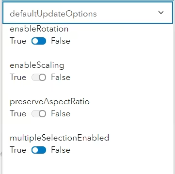
function setDefaultUpdateOptions() {
const options = sketchVM.defaultUpdateOptions;
const rotationSwitch = document.getElementById("rotationSwitch");
const scaleSwitch = document.getElementById("scaleSwitch");
const multipleSelectionSwitch = document.getElementById("multipleSelectionSwitch");
const aspectRatioSwitch = document.getElementById("aspectRatioSwitch");
// set the UI elements to the default property values
rotationSwitch.checked = options.enableRotation;
scaleSwitch.checked = options.enableScaling;
multipleSelectionSwitch.checked = options.multipleSelectionEnabled;
aspectRatioSwitch.checked = options.preserveAspectRatio;
// event listeners for UI interactions
rotationSwitch.addEventListener("calciteSwitchChange", (evt) => {
sketchVM.defaultUpdateOptions.enableRotation = evt.target.checked;
scaleSwitch.addEventListener("calciteSwitchChange", (evt) => {
sketchVM.defaultUpdateOptions.enableScaling = evt.target.checked;
multipleSelectionSwitch.addEventListener("calciteSwitchChange", (evt) => {
sketchVM.defaultUpdateOptions.multipleSelectionEnabled = evt.target.checked;
aspectRatioSwitch.addEventListener("calciteSwitchChange", (evt) => {
sketchVM.defaultUpdateOptions.preserveAspectRatio = evt.target.checked;
function setDefaultPointSymbol() {
const pointSymbol = sketchVM.pointSymbol;
const pointStyleSelect = document.getElementById("point-style-select");
const pointSymbolOutlineBtn = document.getElementById("point-outline-btn");
const pointSizeInput = document.getElementById("point-size-input");
const pointXOffsetInput = document.getElementById("point-xoffset-input");
const pointYOffsetInput = document.getElementById("point-yoffset-input");
const pointAngleInput = document.getElementById("point-angle-input");
const pointColorInput = document.getElementById("point-color-input");
const slsWidthInput = document.getElementById("point-sls-width-input");
const slsColorInput = document.getElementById("point-sls-color-input");
pointSizeInput.value = pointSymbol.size.toString();
pointXOffsetInput.value = pointSymbol.xoffset.toString();
pointYOffsetInput.value = pointSymbol.yoffset.toString();
pointAngleInput.value = pointSymbol.angle.toString();
slsWidthInput.value = pointSymbol.outline.width.toString();
// set default style in the select element
setDefaultOption(pointStyleSelect, pointSymbol.style);
pointSizeInput.addEventListener("calciteInputInput", (evt) => {
pointSymbol.size = parseInt(evt.target.value);
pointXOffsetInput.addEventListener("calciteInputInput", (evt) => {
pointSymbol.xoffset = parseInt(evt.target.value);
pointYOffsetInput.addEventListener("calciteInputInput", (evt) => {
pointSymbol.yoffset = parseInt(evt.target.value);
pointAngleInput.addEventListener("calciteInputInput", (evt) => {
pointSymbol.angle = parseInt(evt.target.value);
pointStyleSelect.addEventListener("calciteSelectChange", () => {
pointSymbol.style = pointStyleSelect.selectedOption.value;
pointColorInput.addEventListener("calciteInputInput", (evt) => {
pointSymbol.color = evt.target.value;
pointSymbolOutlineBtn.onclick = () => {
openModal("point-outline-modal");
// point outline modal event listeners
slsWidthInput.addEventListener("calciteInputInput", (evt) => {
pointSymbol.outline.width = parseInt(evt.target.value);
slsColorInput.addEventListener("calciteInputInput", (evt) => {
pointSymbol.outline.color = evt.target.value;
function setDefaultPolylineSymbol() {
const lineSymbol = sketchVM.polylineSymbol;
const lineStyleSelect = document.getElementById("line-style-select");
const lineWidthInput = document.getElementById("line-width-input");
const lineColorInput = document.getElementById("line-color-input");
lineWidthInput.value = lineSymbol.width.toString();
// set default style in the select element
setDefaultOption(lineStyleSelect, lineSymbol.style);
lineStyleSelect.addEventListener("calciteSelectChange", () => {
lineSymbol.style = lineStyleSelect.selectedOption.value;
lineWidthInput.addEventListener("calciteInputInput", (evt) => {
lineSymbol.width = parseInt(evt.target.value);
lineColorInput.addEventListener("calciteInputInput", (evt) => {
lineSymbol.color = evt.target.value;
function setDefaultPolygonSymbol() {
const polygonSymbol = sketchVM.polygonSymbol;
const polygonStyleSelect = document.getElementById("polygon-style-select");
const polygonSymbolOutlineBtn = document.getElementById("polygon-outline-btn");
const polygonColorInput = document.getElementById("polygon-color-input");
const slsStyleSelect = document.getElementById("polygon-sls-style-select");
const slsWidthInput = document.getElementById("polygon-sls-width-input");
const slsColorInput = document.getElementById("polygon-sls-color-input");
slsWidthInput.value = polygonSymbol.outline.width.toString();
// set default style in the select element
setDefaultOption(polygonStyleSelect, polygonSymbol.style);
setDefaultOption(slsStyleSelect, polygonSymbol.outline.style);
polygonStyleSelect.addEventListener("calciteSelectChange", () => {
polygonSymbol.style = polygonStyleSelect.selectedOption.value;
polygonColorInput.addEventListener("calciteInputInput", (evt) => {
polygonSymbol.color = evt.target.value;
polygonSymbolOutlineBtn.onclick = () => {
openModal("polygon-outline-modal");
// polygon outline modal event listeners
slsStyleSelect.addEventListener("calciteSelectChange", () => {
polygonSymbol.outline.style = slsStyleSelect.selectedOption.value;
slsWidthInput.addEventListener("calciteInputInput", (evt) => {
polygonSymbol.outline.width = parseInt(evt.target.value);
slsColorInput.addEventListener("calciteInputInput", (evt) => {
polygonSymbol.outline.color = evt.target.value;
// function to auto-populate calcite select components
function setDefaultOption(selectElement, value) {
for (let i = 0; i < selectElement.children.length; i++) {
let option = selectElement.children[i];
if (option.value === value) {
// displays the appropriate modals
document.getElementById(id).open = true;
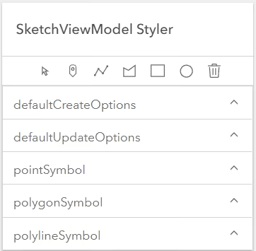
<calcite-panel heading="SketchViewModel Styler" id="propPanel">
<calcite-block id="headingBlock" label="heading block">
<calcite-action icon="pin" title="Draw a point" scale="s" slot="actions-end" id="pointBtn"></calcite-action>
<calcite-action icon="rectangle" title="Draw a rectangle" scale="s" slot="actions-end" id="rectangleBtn">
<calcite-action icon="trash" title="Clear graphics" scale="s" slot="actions-end" id="clearBtn"></calcite-action>
<calcite-accordion selection-mode="single">
<!--- defaultCreateOptions -->
<calcite-accordion-item heading="defaultCreateOptions">
<calcite-select scale="s" id="mode-select">
<calcite-option value="" selected disabled>choose mode</calcite-option>
<calcite-option value="click">click</calcite-option>
<calcite-option value="freehand">freehand</calcite-option>
<calcite-option value="hybrid">hybrid</calcite-option>
</calcite-accordion-item>
<!--- defaulteUpdateOptions -->
<calcite-accordion-item heading="defaultUpdateOptions">
<calcite-label layout="inline">
<calcite-switch scale="s" dir="rtl" id="rotationSwitch"></calcite-switch>
<calcite-label layout="inline">
<calcite-switch scale="s" dir="rtl" id="scaleSwitch"></calcite-switch>
<calcite-label layout="inline">
<calcite-switch scale="s" dir="rtl" id="aspectRatioSwitch"></calcite-switch>
>multipleSelectionEnabled
<calcite-label layout="inline">
<calcite-switch scale="s" dir="rtl" id="multipleSelectionSwitch"></calcite-switch>
</calcite-accordion-item>
<calcite-accordion-item heading="pointSymbol">
<div class="scrollSection">
<calcite-select scale="s" id="point-style-select">
<calcite-option value="circle" selected>circle</calcite-option>
<calcite-option value="cross">cross</calcite-option>
<calcite-option value="diamond">diamond</calcite-option>
<calcite-option value="square">square</calcite-option>
<calcite-option value="x">x</calcite-option>
<calcite-input placeholder="Placeholder" type="color" scale="s" id="point-color-input"> </calcite-input>
<calcite-button id="point-outline-btn" scale="s">Set Outline</calcite-button>
placeholder="Placeholder"
<calcite-input id="point-xoffset-input" placeholder="Placeholder" type="number" scale="s"></calcite-input>
<calcite-input id="point-yoffset-input" placeholder="Placeholder" type="number" scale="s"></calcite-input>
placeholder="Placeholder"
</calcite-accordion-item>
<calcite-accordion-item heading="polygonSymbol">
<calcite-select scale="s" id="polygon-style-select">
<calcite-option disabled id="blankOption">choose a style</calcite-option>
<calcite-option value="backward-diagonal">backward-diagonal</calcite-option>
<calcite-option value="cross">cross</calcite-option>
<calcite-option value="diagonal-cross">diagonal-cross</calcite-option>
<calcite-option value="forward-diagonal">forward-diagonal</calcite-option>
<calcite-option value="horizontal">horizontal</calcite-option>
<calcite-option value="none">none</calcite-option>
<calcite-option value="vertical">vertical</calcite-option>
<calcite-option value="solid" selected>solid</calcite-option>
<calcite-button id="polygon-outline-btn" scale="s">Set Outline</calcite-button>
<calcite-input placeholder="Placeholder" type="color" scale="s" id="polygon-color-input" format="rgb">
</calcite-accordion-item>
<calcite-accordion-item heading="polylineSymbol">
<calcite-select scale="s" id="line-style-select">
<calcite-option disabled id="blankOption">choose a style</calcite-option>
<calcite-option value="dash">dash</calcite-option>
<calcite-option value="dash-dot">dash-dot</calcite-option>
<calcite-option value="dot">dot</calcite-option>
<calcite-option value="long-dash">long-dash</calcite-option>
<calcite-option value="long-dash-dot">long-dash-dot</calcite-option>
<calcite-option value="long-dash-dot-dot">long-dash-dot-dot</calcite-option>
<calcite-option value="none">none</calcite-option>
<calcite-option value="short-dash">short-dash</calcite-option>
<calcite-option value="short-dash-dot">short-dash-dot</calcite-option>
<calcite-option value="short-dash-dot-dot">short-dash-dot-dot</calcite-option>
<calcite-option value="short-dot">short-dot</calcite-option>
<calcite-option value="solid" selected>solid</calcite-option>
placeholder="Placeholder"
<calcite-input placeholder="Placeholder" type="color" scale="s" id="line-color-input" format="rgb">
</calcite-accordion-item>
<!-- sketchViewModel shortcut keys -->
<calcite-panel heading="SketchViewModel Shortcut Keys" id="sketchVM-controls">
description="Adds a vertex to the polyline or polygon graphic. Completes the rectangle or circle polygon graphic in click mode."
description="Completes the polyline or polygon graphic sketch. Adds a point graphic at the pointer location."
<calcite-list-item label="Z" description="Incrementally undo actions recorded in the stack.">
<calcite-list-item label="R" description="Incrementally redo actions recorded in the stack.">
description="Toggle snapping dependent on the configuration in snappingOptions."
<calcite-list-item label="Delete" description="Remove the selected graphic(s) from the layer.">
<calcite-list-item label="Shift+Left-click" description="Select multiple graphics."></calcite-list-item>
<!-- modal point outline -->
<calcite-dialog heading="SimpleLineSymbol" id="point-outline-modal" modal width="300">
<calcite-input min="0" placeholder="Placeholder" type="number" scale="s" id="point-sls-width-input">
<calcite-input placeholder="Placeholder" type="color" scale="s" id="point-sls-color-input" format="rgb">
<!-- modal polygon outline -->
<calcite-dialog heading="SimpleLineSymbol" id="polygon-outline-modal" modal width="300">
<calcite-select scale="s" id="polygon-sls-style-select">
<calcite-option disabled id="blankOption">choose a style</calcite-option>
<calcite-option value="dash">dash</calcite-option>
<calcite-option value="dash-dot">dash-dot</calcite-option>
<calcite-option value="dot">dot</calcite-option>
<calcite-option value="long-dash">long-dash</calcite-option>
<calcite-option value="long-dash-dot">long-dash-dot</calcite-option>
<calcite-option value="long-dash-dot-dot">long-dash-dot-dot</calcite-option>
<calcite-option value="none">none</calcite-option>
<calcite-option value="short-dash">short-dash</calcite-option>
<calcite-option value="short-dash-dot">short-dash-dot</calcite-option>
<calcite-option value="short-dash-dot-dot">short-dash-dot-dot</calcite-option>
<calcite-option value="short-dot">short-dot</calcite-option>
<calcite-option value="solid" selected>solid</calcite-option>
<calcite-input min="0" placeholder="Placeholder" type="number" scale="s" id="polygon-sls-width-input">
<calcite-input placeholder="Placeholder" type="color" scale="s" id="polygon-sls-color-input" format="rgb">