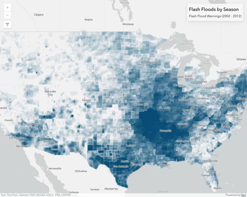
Flash flood warnings (2002 - 2012). All warning areas are given the same transparent symbol, which allows areas of more frequent flood activity to show more clearly.
What is per feature opacity?
Layers with lots of overlapping features can be effectively visualized by setting a highly transparent symbol on all features (at least 90-99 percent transparency works best). This is particularly effective for showing areas where many polygons and polylines stack on top of one another.
For example, the following map shows areas that underwent a flash flood warning over a 10-year period. Each polygon represents one flash flood warning that lasted a time span of one to 12 hours. Each is assigned a blue fill symbol with an alpha level of 0.04 (96% transparency).
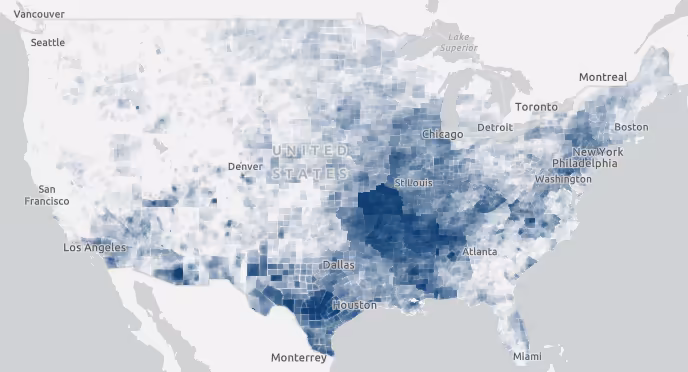
Flash flood warnings visualized as highly transparent polygons. Opaque areas experienced a high number of flash flood warnings. Transparent areas experienced fewer flash flood warnings.
Areas that experienced just one flash flood warning will have an opacity value of 0.04. Areas that experienced more than one will have a higher opacity value, making it more visible.
When opacity is not set on a per feature basis, you can only distinguish areas that experienced at least one flash flood warning.
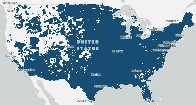
Flash flood warnings visualized as opaque polygons. There is no visual cue indicating areas that experienced more warnings than others.
This visualization technique works whether you have all your data stored in one layer, or separated in multiple layers. Each feature’s transparency multiplies with other overlapping features in either scenario, so you can easily see where a higher density of features exist compared to areas with sparse features.
How per feature opacity works
Opacity can only be set on a feature per feature basis via the color property of the symbol representing each feature. This allows the opacity at a given pixel to multiply across overlapping features.
Note the color value in the snippet below. Each parameter represents a color channel (i.e. rgba(red, green, blue, alpha)). The alpha (i.e. opacity) value must be a very small number. Depending on the density of features, a number between 0.01 and 0.1 usually works best.
layer.renderer = new SimpleRenderer({ symbol: new SimpleFillSymbol({ color: "rgba(0,76,115,0.04)", outline: null, }), });Examples
Polygon density from one layer
The following example demonstrates how to set opacity on a feature per feature basis to effectively show the density of overlapping polygons.
- Create a simple renderer.
- Set a symbol in the renderer with a very small alpha value (e.g. 0.01 - 0.1) in the color property.
45 collapsed lines
<!doctype html><html> <head> <meta charset="utf-8" /> <meta name="viewport" content="width=device-width, initial-scale=1, shrink-to-fit=no" /> <title>Location style - polygons</title>
<link rel="stylesheet" href="https://js.arcgis.com/5.1/esri/themes/light/main.css" /> <!-- Load the ArcGIS Maps SDK for JavaScript from CDN --> <script type="module" src="https://js.arcgis.com/5.1/"></script>
<style> html, body, #viewDiv { height: 100%; margin: 0; } #titleDiv { padding: 10px; }
#titleText { font-size: 20pt; font-weight: 60; padding-bottom: 10px; } </style> <script type="module"> const [MapView, Map, FeatureLayer, SimpleRenderer, SimpleFillSymbol] = await $arcgis.import([ "@arcgis/core/views/MapView.js", "@arcgis/core/Map.js", "@arcgis/core/layers/FeatureLayer.js", "@arcgis/core/renderers/SimpleRenderer.js", "@arcgis/core/symbols/SimpleFillSymbol.js", ]);
// flash flood warnings layer const layer = new FeatureLayer({ portalItem: { id: "f9e348953b3848ec8b69964d5bceae02", }, });
layer.renderer = new SimpleRenderer({ symbol: new SimpleFillSymbol({ color: "rgba(0,76,115,0.04)", outline: null, }), });25 collapsed lines
const map = new Map({ basemap: "gray-vector", layers: [layer], });
const view = new MapView({ map, container: "viewDiv", center: [-98, 40], zoom: 3, }); view.ui.add("titleDiv", "top-right"); </script> </head>
<body> <div id="viewDiv"></div> <div id="titleDiv" class="esri-widget"> <div id="titleText">Flash Floods by Season</div> <div>Flash Flood Warnings (2002 - 2012)</div> </div> </body></html>Flash flood warnings (2002 - 2012). All warning areas are given the same transparent symbol, which allows areas of more intense activity to show more clearly.
Polygon density from two layers
You many need to consider the density of features between multiple layers. The following example demonstrates how to show the density of polygons from two layers representing burn areas. Because layers draw on top of one another, we can set the same symbol on features from two or more layers to achieve the same visualization as the previous example.
- Create a simple renderer.
- Set a symbol in the renderer with a very small alpha value (e.g. 0.01 - 0.1).
- Apply the same renderer to two or more layers representing the same, or similar phenomena.
57 collapsed lines
<!doctype html><html> <head> <meta charset="utf-8" /> <meta name="viewport" content="width=device-width, initial-scale=1, shrink-to-fit=no" /> <title>Location style - polygons</title>
<link rel="stylesheet" href="https://js.arcgis.com/5.1/esri/themes/light/main.css" /> <!-- Load the ArcGIS Maps SDK for JavaScript from CDN --> <script type="module" src="https://js.arcgis.com/5.1/"></script>
<style> html, body, #viewDiv { height: 100%; margin: 0; } #titleDiv { padding: 10px; }
#titleText { font-size: 20pt; font-weight: 60; padding-bottom: 10px; } </style> <script type="module"> const [MapView, WebMap, FeatureLayer, SimpleRenderer, SimpleFillSymbol, LayerList] = await $arcgis.import([ "@arcgis/core/views/MapView.js", "@arcgis/core/WebMap.js", "@arcgis/core/layers/FeatureLayer.js", "@arcgis/core/renderers/SimpleRenderer.js", "@arcgis/core/symbols/SimpleFillSymbol.js", "@arcgis/core/widgets/LayerList.js", ]);
const burnsLayer = new FeatureLayer({ title: "Burn areas", url: "https://services.arcgis.com/jIL9msH9OI208GCb/ArcGIS/rest/services/California_Fire_Perimeters_1878_2019/FeatureServer", layerId: 1, opacity: 1, blendMode: "multiply", });
const prescribedLayer = new FeatureLayer({ title: "Prescribed burns", url: "https://services.arcgis.com/jIL9msH9OI208GCb/ArcGIS/rest/services/California_Fire_Perimeters_1878_2019/FeatureServer", layerId: 2, opacity: 1, blendMode: "multiply", });
const renderer = new SimpleRenderer({ symbol: new SimpleFillSymbol({ color: "rgba(168, 0, 0, 0.17)", outline: null, }), }); burnsLayer.renderer = renderer; prescribedLayer.renderer = renderer;26 collapsed lines
const map = new WebMap({ portalItem: { id: "16bbd616637c4af29683d45eff023dfa", }, layers: [burnsLayer, prescribedLayer], });
const view = new MapView({ map, container: "viewDiv", }); view.ui.add("titleDiv", "top-right"); view.ui.add(new LayerList({ view }), "top-right"); </script> </head>
<body> <div id="viewDiv"></div> <div id="titleDiv" class="esri-widget"> <div id="titleText">California fires</div> <div>Burn areas (1878 - 2020)</div> </div> </body></html>California burn areas (1878 - 2020). This visualization shows which areas experienced more fires whether they were prescribed, natural, or accidental.
Density of multiple types
The following example demonstrates how to show the density of polygons from two layers representing different types of features. This app visualizes the locations of all flash flood and tornado warnings over a 10-year period. Flash flood warnings are given a transparent blue fill symbol, and tornado warnings are given a transparent orange symbol.
This allows you to see areas with a high density of floods, versus a high density of tornadoes, and areas that have a high density of both.
- Create two simple renderer objects.
- Set a symbol in each renderer with a different color. The colors must be different hues, but the alpha values of the colors should be the same value (e.g. 0.01 - 0.1).
- Apply each renderer to its respective layer.
- Set the
averageblend mode on the topmost layer. This will average the color of all layers below it. This ensures the topmost layer isn’t dominating the visualization simply because of the layer order in the map.
Flash flood and tornado warning areas (2002 - 2012). Symbols with the same transparency, but different hues are applied to each layer. This allows the end user to see areas that experienced a high density of flash flood warnings, or tornado warnings, or both.
57 collapsed lines
<!doctype html><html> <head> <meta charset="utf-8" /> <meta name="viewport" content="width=device-width, initial-scale=1, shrink-to-fit=no" /> <title>Location style - polygons</title>
<link rel="stylesheet" href="https://js.arcgis.com/5.1/esri/themes/light/main.css" /> <!-- Load the ArcGIS Maps SDK for JavaScript from CDN --> <script type="module" src="https://js.arcgis.com/5.1/"></script>
<style> html, body, #viewDiv { height: 100%; margin: 0; } #titleDiv { padding: 10px; }
#titleText { font-size: 20pt; font-weight: 60; padding-bottom: 10px; } </style> <script type="module"> const [MapView, Map, FeatureLayer, GroupLayer, SimpleRenderer, SimpleFillSymbol, LayerList] = await $arcgis.import([ "@arcgis/core/views/MapView.js", "@arcgis/core/Map.js", "@arcgis/core/layers/FeatureLayer.js", "@arcgis/core/layers/GroupLayer.js", "@arcgis/core/renderers/SimpleRenderer.js", "@arcgis/core/symbols/SimpleFillSymbol.js", "@arcgis/core/widgets/LayerList.js", ]);
// flash flood warnings layer const floods = new FeatureLayer({ title: "Flash flood warnings", portalItem: { id: "f9e348953b3848ec8b69964d5bceae02", }, renderer: new SimpleRenderer({ symbol: new SimpleFillSymbol({ color: "rgba(0,76,115,0.03)", outline: null, }), }), popupEnabled: false, blendMode: "average", });
const tornadoes = new FeatureLayer({ title: "Tornado warnings", portalItem: { id: "105fee001d244d33b90bf3ae5a243679", }, popupEnabled: false, blendMode: "average", renderer: new SimpleRenderer({ symbol: new SimpleFillSymbol({ color: "rgba(255, 128, 26,0.03)", outline: null, }), }), });31 collapsed lines
const map = new Map({ basemap: "gray-vector", layers: [ new GroupLayer({ title: "Severe weather warnings", layers: [floods, tornadoes], }), ], });
const view = new MapView({ map, container: "viewDiv", center: [-98, 40], zoom: 4, }); view.ui.add("titleDiv", "top-right"); view.ui.add(new LayerList({ view }), "top-right"); </script> </head>
<body> <div id="viewDiv"></div> <div id="titleDiv" class="esri-widget"> <div id="titleText">Severe weather warnings</div> <div>Flash Floods and tornadoes (2002 - 2012)</div> </div> </body></html>Related samples and resources
API support
The following table describes the geometry and view types that are suited well for each visualization technique.
| 2D | 3D | Points | Lines | Polygons | Mesh | Client-side | Server-side | |
|---|---|---|---|---|---|---|---|---|
| | | | | | | | | |
| | | | | | | | | |
| | | | | | | | | |
| | | | | | | | | |
| | | | | | | | | |
| | | | | | | | | |
| | | | ||||||
| | | | | | | | |
- Feature reduction selection not supported
- Only by feature reduction selection
- Only by scale-driven filter