What is aggregation?
Aggregation allows you to summarize (or aggregate) large datasets with many features to layers with fewer features. This is typically done by summarizing points within polygons where each polygon visualizes the number of points contained in the polygon.
While the examples in this topic focus on point-to-polygon aggregation, each of the principles described also apply to point-to-polyline and polygon-to-polygon aggregation.
Why is aggregation useful?
You may reasonably ask: Why should I aggregate points to polygons when clustering takes care of aggregation for me on the fly?
There are two scenarios where aggregating points to a polygon layer is advantageous to clustering:
- The point dataset is too large to cluster client-side. Some point datasets are so large they cannot reasonably be loaded to the browser and visualized with good performance. Aggregating points to a polygon layer allows you to represent the data in a performant way.
- Data can be summarized within irregular polygon boundaries. You may be required to summarize point data to meaningful, predefined polygon boundaries, such as counties, congressional districts, school districts, or police precincts. Clustering is always handled in screen space without regard for geopolitical boundaries. There are scenarios where summarizing by predefined irregular polygons is required for policy makers.
How aggregation works
Point-to-polygon aggregation is a data preprocessing step usually done before visualizing data in a web map. There are a variety of tools that allow you to do this, but the examples below were prepared using the Aggregate Points analysis tool in the ArcGIS Online Map Viewer.
To aggregate points in ArcGIS Online, you must select the point layer to aggregate, and a polygon layer used to calculate summary statistics. This creates a new feature service. By default, the count of points intersecting each polygon will be included in the output table. You may optionally select fields in the point layer to summarize with various statistics such as the average of a numeric field, or the predominant value of a string field. You can also group numeric statistics by the values of a string field.
Examples
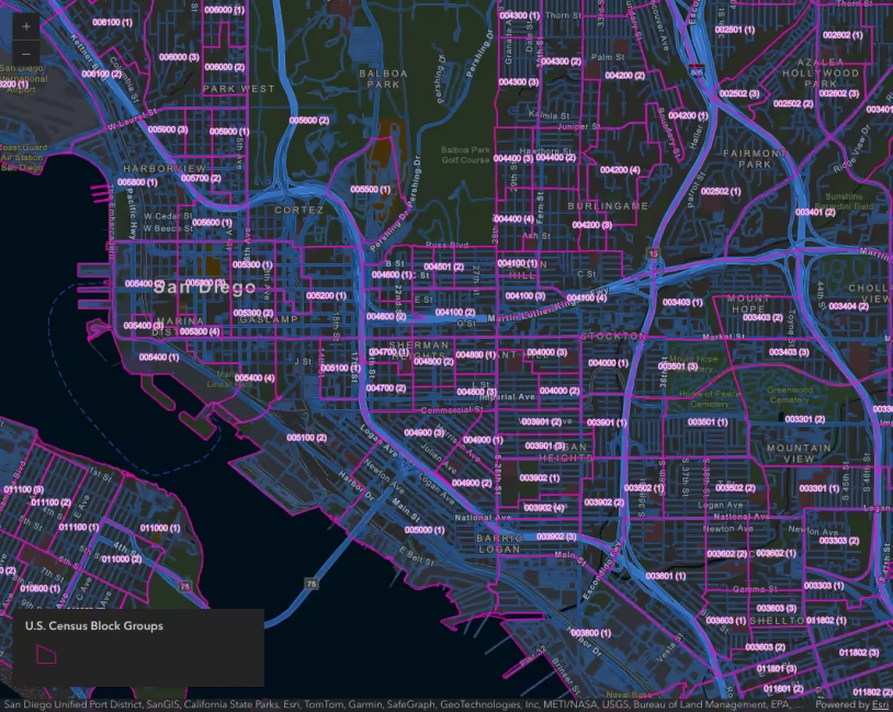
Hexbins
The following example demonstrates how to visualize earthquake points aggregated to hexbins. This layer was created using the Aggregate Points analysis tool in the ArcGIS Online Map Viewer. The output layer contains the total count of earthquakes intersecting each bin.
This layer is styled with a continuous color ramp using a color visual variable. Typically, you should not visualize total counts in polygons using color without some form of data normalization. However, it is permissible in this case because the areas of each hexagon are equal, effectively normalizing the data by area.
Earthquakes aggregated to 30-mile hexbins. The popup uses Arcade to display summary information about the earthquakes represented by each hexbin.
This map was configured in the ArcGIS Online map viewer. In addition to the hexbin layer generated by the Aggregate Points tool, it includes the earthquakes point layer with visibility controlled by scale. This allows us to use Arcade to summarize earthquake statistics in the popup.
For example, to show the size of the largest earthquake, you could write the following expression.
var earthquakes = Intersects(FeatureSetByName($map, "earthquake points"), $feature);Text( Max(earthquakes, "mag"), "#.#" );Then reference the expression in the popup content. This can be done in code, or directly in ArcGIS Online.
Setting a maxScale on the hexbin layer and an equivalent minScale on the point layer allows you to create a smooth transition as the user zooms to larger scales. When the user zooms past a certain scale, the point layer can be safely loaded without performance concerns. Depending on the resolution of the hexbins, it visually doesn’t make sense to view the bins at large scales.
47 collapsed lines
<html> <head> <meta charset="utf-8" /> <meta name="viewport" content="width=device-width, initial-scale=1, shrink-to-fit=no" /> <title>Hexbin aggregation</title>
<style> html, body, #viewDiv { height: 100%; margin: 0; } </style>
<link rel="stylesheet" href="https://js.arcgis.com/5.1/esri/themes/light/main.css" /> <!-- Load the ArcGIS Maps SDK for JavaScript from CDN --> <script type="module" src="https://js.arcgis.com/5.1/"></script>
<script type="module"> const [MapView, WebMap, Expand, Legend] = await $arcgis.import([ "@arcgis/core/views/MapView.js", "@arcgis/core/WebMap.js", "@arcgis/core/widgets/Expand.js", "@arcgis/core/widgets/Legend.js", ]);
const view = new MapView({ map: new WebMap({ portalItem: { // autocasts as new PortalItem() id: "4ac45bfebc8647b39efad59cdf0be15a", }, }), container: "viewDiv", });
view.ui.add( new Expand({ view, content: new Legend({ view }), }), "top-right", );
view.when(() => {
const earthquakeLayer = view.map.layers.find((layer) => layer.title === "earthquake points"); earthquakeLayer.minScale = 577790; earthquakeLayer.maxScale = 0;10 collapsed lines
earthquakeLayer.visible = true; }); </script> </head>
<body> <div id="viewDiv"></div> </body></html>Irregular polygons
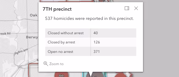
This example demonstrates how to summarize points within related irregular polygons. In this app, a point layer representing homicide locations is aggregated to a polygon layer representing police precincts in Chicago. Summarizing the data by precinct makes sense when comparing statistics by police precinct jurisdiction.
Because of differences in polygon shape and size, we should visualize the total count using graduated symbols (i.e. icons with a size visual variable). Using color would result in over-emphasizing large areas that may have fewer totals than smaller, more densely populated areas.
Total homicides reported (2008-2017) by police precinct in Chicago, U.S.A. The original homicide point layer was aggregated to a polygon layer representing police precincts.
During the point to polygon aggregation analysis, homicide counts were grouped by the status of the case (i.e. open, closed by arrest, or closed without arrest). These stats are persisted in the output table so they can be easily referenced in the popup.
Because the summary statistics are included as attributes in the table, you can also render based on any of the grouped statistics. For example, rather than showing the total count of all homicides, you can show the total count of unsolved homicides.
Unsolved homicides reported (2008-2017) by police precinct in Chicago, U.S.A. This app uses the same layer as the previous example, but now renders the data based off a subset of the data (unsolved cases vs. total cases).
Predominance
Using the Aggregate Points tool in ArcGIS Online, you can also create a field for the most common occurrence of a string value. This allows us to create a predominance map where size still indicates total count, but color represents the most common value of a particular category. The example below uses color to represent the predominant race or ethnicity of the victims in each precinct.
Open the popup of a precinct and click the “browse features” action. Click on one of the crimes in the list or browse with the arrows to view the crime’s popup and location on the map.
Total homicides reported (2008-2017) by police precinct in Chicago, U.S.A. The color of each icon indicates the predominant race or ethnicity of the victims in each precinct.
This style is configured with a UniqueValueRenderer and a size visual variable.
Browse features
By default, the clustering popup has a “Browse features” action that allows you to select individual features within a cluster to view their location and attribute information. You can implement the same behavior in a polygon layer representing aggregated point data.
In the example below, click any hexbin to explore individual features belonging to the bin.
Open the popup of a hexbin and click the “browse features” action. Click on one of the earthquakes in the list or browse with the arrows to view the earthquake’s popup and location on the map.
Earthquakes aggregated to 30-mile hexbins. Click the “browse features” action in any of the popups to view the location and information associated with specific earthquake events.
To implement this browsing experience, you must do the following:
Create a “browse features” action for the aggregate layer’s popup template.
55 collapsed lines
<html> <head> <meta charset="utf-8" /> <meta name="viewport" content="width=device-width, initial-scale=1, shrink-to-fit=no" /> <title>Hexbin aggregation</title>
<style> html, body, #viewDiv { height: 100%; margin: 0; } </style>
<link rel="stylesheet" href="https://js.arcgis.com/5.1/esri/themes/light/main.css" /> <!-- Load the ArcGIS Maps SDK for JavaScript from CDN --> <script type="module" src="https://js.arcgis.com/5.1/"></script>
<script type="module"> const [MapView, WebMap, Expand, Legend, reactiveUtils] = await $arcgis.import([ "@arcgis/core/views/MapView.js", "@arcgis/core/WebMap.js", "@arcgis/core/widgets/Expand.js", "@arcgis/core/widgets/Legend.js", "@arcgis/core/core/reactiveUtils.js", ]);
const view = new MapView({ map: new WebMap({ portalItem: { // autocasts as new PortalItem() id: "4ac45bfebc8647b39efad59cdf0be15a", }, }), constraints: { snapToZoom: false, minScale: 30000000, }, container: "viewDiv", });
await view.when();
const hexbinLayer = view.map.layers.find((layer) => layer.title === "Hexbins"); const earthquakeLayer = view.map.layers.find((layer) => layer.title === "earthquake points"); earthquakeLayer.minScale = 577790; earthquakeLayer.maxScale = 0; earthquakeLayer.visible = true;
let selectedFeatureHandle = null; let selectedFeature = null; let selectedAggregateFeature = null;
hexbinLayer.popupTemplate.actions = [ { title: "Browse features", id: "browse", icon: "table", }, ];93 collapsed lines
view.ui.add( new Expand({ view, content: new Legend({ view }), }), "top-right", );
reactiveUtils.on( () => view.popup?.viewModel, "trigger-action", (event) => { clear(); const id = event.action.id; if (id === "browse") { selectedAggregateFeature = view.popup.content.graphic; browseFeatures(selectedAggregateFeature); } }, );
// Clear view graphics and popup when cluster is no longer selected reactiveUtils.when(() => !view.popup?.visible, clear); reactiveUtils.watch( () => view.scale, (scale) => { if (scale < earthquakeLayer.minScale) { clear(); view.closePopup(); } }, );
async function browseFeatures(aggregateGraphic) {
const layer = view.map.layers.find((layer) => layer.title === "earthquake points"); const query = layer.createQuery(); query.returnGeometry = true; query.geometry = aggregateGraphic.geometry; const { features } = await layer.queryFeatures(query); view.popup.features = [aggregateGraphic].concat(features);
selectedFeatureHandle = reactiveUtils.watch( () => view.popup?.selectedFeature, async (feature) => { if (!feature || selectedAggregateFeature.getObjectId() === feature.getObjectId()) { return; } feature.symbol = { type: "simple-marker", color: "rgb(50,50,50)", size: 8, style: "x", outline: { color: "rgb(50,50,50)", width: 4, }, }; if (selectedFeature && view.graphics.includes(selectedFeature)) { view.graphics.remove(selectedFeature); selectedFeature = null; } if (selectedAggregateFeature.getObjectId() !== feature.getObjectId()) { view.graphics.add(feature); selectedFeature = feature; } }, );
}
function clear() { view.popup.features = view.popup.features.filter((feature) => feature == selectedAggregateFeature); view.graphics.removeAll(); if (selectedFeatureHandle) { selectedFeatureHandle.remove(); selectedFeatureHandle = null; selectedFeature = null; } } </script> </head>
<body> <div id="viewDiv"></div> </body></html>When browsing is activated by the user, execute a function to query features in the point layer that intersect the selected feature. Then add the fetched features to the view’s popup.
100 collapsed lines
<html> <head> <meta charset="utf-8" /> <meta name="viewport" content="width=device-width, initial-scale=1, shrink-to-fit=no" /> <title>Hexbin aggregation</title>
<style> html, body, #viewDiv { height: 100%; margin: 0; } </style>
<link rel="stylesheet" href="https://js.arcgis.com/5.1/esri/themes/light/main.css" /> <!-- Load the ArcGIS Maps SDK for JavaScript from CDN --> <script type="module" src="https://js.arcgis.com/5.1/"></script>
<script type="module"> const [MapView, WebMap, Expand, Legend, reactiveUtils] = await $arcgis.import([ "@arcgis/core/views/MapView.js", "@arcgis/core/WebMap.js", "@arcgis/core/widgets/Expand.js", "@arcgis/core/widgets/Legend.js", "@arcgis/core/core/reactiveUtils.js", ]);
const view = new MapView({ map: new WebMap({ portalItem: { // autocasts as new PortalItem() id: "4ac45bfebc8647b39efad59cdf0be15a", }, }), constraints: { snapToZoom: false, minScale: 30000000, }, container: "viewDiv", });
await view.when();
const hexbinLayer = view.map.layers.find((layer) => layer.title === "Hexbins"); const earthquakeLayer = view.map.layers.find((layer) => layer.title === "earthquake points"); earthquakeLayer.minScale = 577790; earthquakeLayer.maxScale = 0; earthquakeLayer.visible = true;
let selectedFeatureHandle = null; let selectedFeature = null; let selectedAggregateFeature = null;
hexbinLayer.popupTemplate.actions = [ { title: "Browse features", id: "browse", icon: "table", }, ];
view.ui.add( new Expand({ view, content: new Legend({ view }), }), "top-right", );
reactiveUtils.on( () => view.popup?.viewModel, "trigger-action", (event) => { clear(); const id = event.action.id; if (id === "browse") { selectedAggregateFeature = view.popup.content.graphic; browseFeatures(selectedAggregateFeature); } }, );
// Clear view graphics and popup when cluster is no longer selected reactiveUtils.when(() => !view.popup?.visible, clear); reactiveUtils.watch( () => view.scale, (scale) => { if (scale < earthquakeLayer.minScale) { clear(); view.closePopup(); } }, );
async function browseFeatures(aggregateGraphic) {
const layer = view.map.layers.find((layer) => layer.title === "earthquake points"); const query = layer.createQuery(); query.returnGeometry = true; query.geometry = aggregateGraphic.geometry; const { features } = await layer.queryFeatures(query); view.popup.features = [aggregateGraphic].concat(features);49 collapsed lines
selectedFeatureHandle = reactiveUtils.watch( () => view.popup?.selectedFeature, async (feature) => { if (!feature || selectedAggregateFeature.getObjectId() === feature.getObjectId()) { return; } feature.symbol = { type: "simple-marker", color: "rgb(50,50,50)", size: 8, style: "x", outline: { color: "rgb(50,50,50)", width: 4, }, }; if (selectedFeature && view.graphics.includes(selectedFeature)) { view.graphics.remove(selectedFeature); selectedFeature = null; } if (selectedAggregateFeature.getObjectId() !== feature.getObjectId()) { view.graphics.add(feature); selectedFeature = feature; } }, );
}
function clear() { view.popup.features = view.popup.features.filter((feature) => feature == selectedAggregateFeature); view.graphics.removeAll(); if (selectedFeatureHandle) { selectedFeatureHandle.remove(); selectedFeatureHandle = null; selectedFeature = null; } } </script> </head>
<body> <div id="viewDiv"></div> </body></html>When a new feature is selected, add it to the view and clear any previous graphics from the view.
109 collapsed lines
<html> <head> <meta charset="utf-8" /> <meta name="viewport" content="width=device-width, initial-scale=1, shrink-to-fit=no" /> <title>Hexbin aggregation</title>
<style> html, body, #viewDiv { height: 100%; margin: 0; } </style>
<link rel="stylesheet" href="https://js.arcgis.com/5.1/esri/themes/light/main.css" /> <!-- Load the ArcGIS Maps SDK for JavaScript from CDN --> <script type="module" src="https://js.arcgis.com/5.1/"></script>
<script type="module"> const [MapView, WebMap, Expand, Legend, reactiveUtils] = await $arcgis.import([ "@arcgis/core/views/MapView.js", "@arcgis/core/WebMap.js", "@arcgis/core/widgets/Expand.js", "@arcgis/core/widgets/Legend.js", "@arcgis/core/core/reactiveUtils.js", ]);
const view = new MapView({ map: new WebMap({ portalItem: { // autocasts as new PortalItem() id: "4ac45bfebc8647b39efad59cdf0be15a", }, }), constraints: { snapToZoom: false, minScale: 30000000, }, container: "viewDiv", });
await view.when();
const hexbinLayer = view.map.layers.find((layer) => layer.title === "Hexbins"); const earthquakeLayer = view.map.layers.find((layer) => layer.title === "earthquake points"); earthquakeLayer.minScale = 577790; earthquakeLayer.maxScale = 0; earthquakeLayer.visible = true;
let selectedFeatureHandle = null; let selectedFeature = null; let selectedAggregateFeature = null;
hexbinLayer.popupTemplate.actions = [ { title: "Browse features", id: "browse", icon: "table", }, ];
view.ui.add( new Expand({ view, content: new Legend({ view }), }), "top-right", );
reactiveUtils.on( () => view.popup?.viewModel, "trigger-action", (event) => { clear(); const id = event.action.id; if (id === "browse") { selectedAggregateFeature = view.popup.content.graphic; browseFeatures(selectedAggregateFeature); } }, );
// Clear view graphics and popup when cluster is no longer selected reactiveUtils.when(() => !view.popup?.visible, clear); reactiveUtils.watch( () => view.scale, (scale) => { if (scale < earthquakeLayer.minScale) { clear(); view.closePopup(); } }, );
async function browseFeatures(aggregateGraphic) {
const layer = view.map.layers.find((layer) => layer.title === "earthquake points"); const query = layer.createQuery(); query.returnGeometry = true; query.geometry = aggregateGraphic.geometry; const { features } = await layer.queryFeatures(query); view.popup.features = [aggregateGraphic].concat(features);
selectedFeatureHandle = reactiveUtils.watch( () => view.popup?.selectedFeature, async (feature) => { if (!feature || selectedAggregateFeature.getObjectId() === feature.getObjectId()) { return; } feature.symbol = { type: "simple-marker", color: "rgb(50,50,50)", size: 8, style: "x", outline: { color: "rgb(50,50,50)", width: 4, }, }; if (selectedFeature && view.graphics.includes(selectedFeature)) { view.graphics.remove(selectedFeature); selectedFeature = null; } if (selectedAggregateFeature.getObjectId() !== feature.getObjectId()) { view.graphics.add(feature); selectedFeature = feature; } }, );20 collapsed lines
}
function clear() { view.popup.features = view.popup.features.filter((feature) => feature == selectedAggregateFeature); view.graphics.removeAll(); if (selectedFeatureHandle) { selectedFeatureHandle.remove(); selectedFeatureHandle = null; selectedFeature = null; } } </script> </head>
<body> <div id="viewDiv"></div> </body></html>The same technique can also be applied to an aggregated layer of irregular polygons. Browse the features in a precinct by clicking the action in the popup and selecting one of the homicide locations.
Open the popup of a precinct and click the “browse features” action. Click on one of the crimes in the list or browse with the arrows to view the crime’s popup and location on the map.
Homicides aggregated to police precincts. Click the “browse features” action in any of the popups to view the location and information associated with specific earthquake events.
Related samples and resources
API support
The following table describes the geometry and view types that are suited well for each visualization technique.
| 2D | 3D | Points | Lines | Polygons | Mesh | Client-side | Server-side | |
|---|---|---|---|---|---|---|---|---|
| | | | | | | | | |
| | | | | | | | | |
| | | | | | | | | |
| | | | | | | | | |
| | | | | | | | | |
| | | | | | | | | |
| | | | ||||||
| | | | | | | | |
- Feature reduction selection not supported
- Only by feature reduction selection
- Only by scale-driven filter