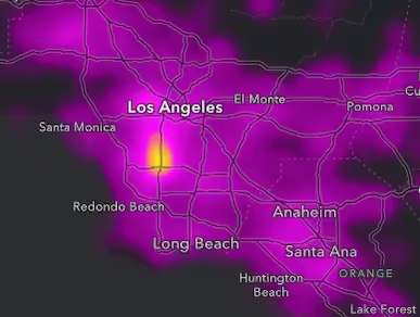
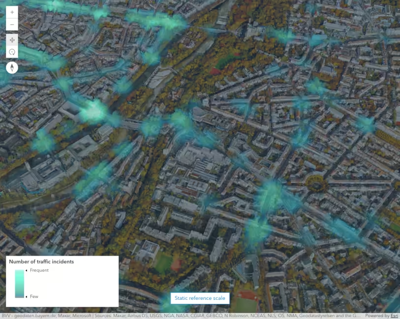
Fatal car crashes in 2017 represented as a continuous heatmap. Areas with higher concentrations of crashes are yellow.
What is a heatmap?
A Heatmap renders point features as a raster surface, emphasizing areas with a higher density of points along a continuous color ramp.
Why are heatmaps useful?
Heatmaps can be used as an alternative to clustering, opacity, and bloom to visualize overlapping point features. Unlike these alternative techniques for visualizing density, you can use a heatmap to weight the density of points based on a data value. This may reveal a different pattern than density calculated using location alone.
| Location-only heatmap | Data-weighted heatmap |
|---|---|
 |  |
How a heatmap works
Heatmaps are created by setting a HeatmapRenderer instance to the renderer property of the layer. The HeatmapRenderer has several key properties. The radius determines the area of influence surrounding a point. For example, if you set a radius of 10 pixels, each pixel within 10 pixels of a single point will be assigned a density value. The pixel directly on top of the point will have the highest density. Smaller density values are assigned to pixels surrounding the point inversely proportional to the distance from the point. Pixels on the screen that fall outside that 10-pixel radius of all points will have a density value of 0.
The density value of each pixel accumulates based on its proximity to multiple points. For example, a pixel within 10px of 10 points, will have a higher density value than pixels within 10x of only one point.
The colorStops in the renderer determine how to colorize pixels based on the ratio of a pixel’s density value to the maxDensity (i.e. pixel density / maxDensity). Pixels with a density value at or above the maxDensity have a density ratio of 1 and should be assigned the brightest color since these represent the hottest areas. The larger the maxDensity, the fewer hot spots will exist in the map.
Examples
Location heatmap
To create a heatmap, you must apply a HeatmapRenderer to a point layer. Set the renderer properties using the guidelines outlined above. Open this example in CodePen and adjust the radius and maxDensity to see how these properties impact the heatmap.
Density of car crashes that resulted in a fatality (2017). Yellow areas indicate the highest density of crash incidents.
36 collapsed lines
<html> <head> <meta charset="utf-8" /> <meta name="viewport" content="width=device-width, initial-scale=1, shrink-to-fit=no" />
<title>Fatal car crashes</title>
<style> html, body, #viewDiv { height: 100%; margin: 0; } </style>
<link rel="stylesheet" href="https://js.arcgis.com/5.1/esri/themes/dark/main.css" /> <!-- Load the ArcGIS Maps SDK for JavaScript from CDN --> <script type="module" src="https://js.arcgis.com/5.1/"></script>
<script type="module"> const [WebMap, FeatureLayer, MapView, Legend] = await $arcgis.import([ "@arcgis/core/WebMap.js", "@arcgis/core/layers/FeatureLayer.js", "@arcgis/core/views/MapView.js", "@arcgis/core/widgets/Legend.js", ]);
const url = "https://services1.arcgis.com/4yjifSiIG17X0gW4/arcgis/rest/services/FatalAccidents2017/FeatureServer";
const layer = new FeatureLayer({ title: "Fatal car accidents (2017)", url, });
const colors = [ "rgba(115, 0, 115, 0)", "#820082", "#910091", "#a000a0", "#af00af", "#c300c3", "#d700d7", "#eb00eb", "#ff00ff", "#ff58a0", "#ff896b", "#ffb935", "#ffea00", ];
layer.renderer = { type: "heatmap", colorStops: [ { color: colors[0], ratio: 0 }, { color: colors[1], ratio: 0.083 }, { color: colors[2], ratio: 0.166 }, { color: colors[3], ratio: 0.249 }, { color: colors[4], ratio: 0.332 }, { color: colors[5], ratio: 0.415 }, { color: colors[6], ratio: 0.498 }, { color: colors[7], ratio: 0.581 }, { color: colors[8], ratio: 0.664 }, { color: colors[9], ratio: 0.747 }, { color: colors[10], ratio: 0.83 }, { color: colors[11], ratio: 0.913 }, { color: colors[12], ratio: 1 }, ], radius: 18, maxDensity: 0.04625, minDensity: 0, };36 collapsed lines
const map = new WebMap({ basemap: { portalItem: { id: "466f3f43c231453c938c6776777b89e2", }, }, layers: [layer], });
const view = new MapView({ container: "viewDiv", center: [-117.79621, 33.91474], scale: 1155581, constraints: { snapToZoom: false, minScale: 4622324, maxScale: 1155500, }, map, });
view.ui.add( new Legend({ view, }), "top-right", ); </script> </head>
<body> <div id="viewDiv"></div> </body></html>Data-weighted heatmap
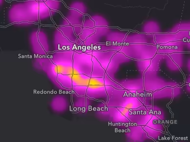
This example modifies the previous heatmap to weight the surface by a data variable. The crashes layer used in this example has an attribute that tallies the number of drunk drivers involved in the incident. We can visualize where more drunk drivers are involved in fatal accidents by weighting by that field.
When a field is specified, each pixel’s density is multiplied by the data value, so you need to adjust the maxDensity accordingly.
Density of car crashes involving drunk drivers that resulted in a fatality (2017). Yellow areas indicate the highest density of crash incidents.
36 collapsed lines
<html> <head> <meta charset="utf-8" /> <meta name="viewport" content="width=device-width, initial-scale=1, shrink-to-fit=no" />
<title>Fatal car crashes</title>
<style> html, body, #viewDiv { height: 100%; margin: 0; } </style>
<link rel="stylesheet" href="https://js.arcgis.com/5.1/esri/themes/dark/main.css" /> <!-- Load the ArcGIS Maps SDK for JavaScript from CDN --> <script type="module" src="https://js.arcgis.com/5.1/"></script>
<script type="module"> const [WebMap, FeatureLayer, MapView, Legend] = await $arcgis.import([ "@arcgis/core/WebMap.js", "@arcgis/core/layers/FeatureLayer.js", "@arcgis/core/views/MapView.js", "@arcgis/core/widgets/Legend.js", ]);
const url = "https://services1.arcgis.com/4yjifSiIG17X0gW4/arcgis/rest/services/FatalAccidents2017/FeatureServer";
const layer = new FeatureLayer({ title: "Fatal car accidents involving drinking (2017)", url, });
const colors = [ "rgba(115, 0, 115, 0)", "#820082", "#910091", "#a000a0", "#af00af", "#c300c3", "#d700d7", "#eb00eb", "#ff00ff", "#ff58a0", "#ff896b", "#ffb935", "#ffea00", ];
layer.renderer = { type: "heatmap",
field: "Number_of_Drinking_Drivers",
colorStops: [ { color: colors[0], ratio: 0 }, { color: colors[1], ratio: 0.083 }, { color: colors[2], ratio: 0.166 }, { color: colors[3], ratio: 0.249 }, { color: colors[4], ratio: 0.332 }, { color: colors[5], ratio: 0.415 }, { color: colors[6], ratio: 0.498 }, { color: colors[7], ratio: 0.581 }, { color: colors[8], ratio: 0.664 }, { color: colors[9], ratio: 0.747 }, { color: colors[10], ratio: 0.83 }, { color: colors[11], ratio: 0.913 }, { color: colors[12], ratio: 1 }, ], radius: 18,
maxDensity: 0.00875,
minDensity: 0, };36 collapsed lines
const map = new WebMap({ basemap: { portalItem: { id: "466f3f43c231453c938c6776777b89e2", }, }, layers: [layer], });
const view = new MapView({ container: "viewDiv", center: [-117.79621, 33.91474], scale: 1155581, constraints: { snapToZoom: false, minScale: 4622324, maxScale: 1155500, }, map, });
view.ui.add( new Legend({ view, }), "top-right", ); </script> </head>
<body> <div id="viewDiv"></div> </body></html>Scale-dependent Heatmap
Dynamic heatmaps are only visually appropriate at a few scale levels. As the user zooms out, the heatmap will always appear hotter. As the user zooms in, the heatmap will appear colder. To prevent the user from viewing a heatmap that is too hot, you can set a minScale on the layer or as a view constraint.
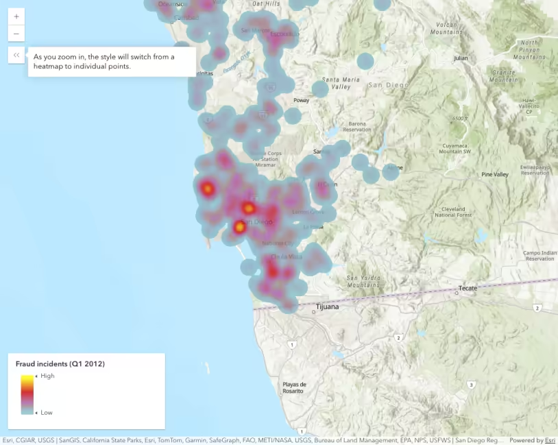
As the user zooms in, the heatmap becomes irrelevant. Therefore, you should set a watch on the view to toggle the layer’s heatmap to a simple renderer representing individual point locations.
As you zoom in, the style will switch from a heatmap to individual points.
Density of crimes classified as fraud in San Diego California. Zoom in and out on the map to view how the developer can restrict the user from seeing a heatmap that is too hot or too cold. As the user zooms in, the heatmap toggles off and displays the point locations as a simple renderer.
35 collapsed lines
<html> <head> <meta charset="utf-8" /> <meta name="viewport" content="width=device-width, initial-scale=1, shrink-to-fit=no" />
<title>Create a scale-dependent visualization | Sample | ArcGIS API for JavaScript 4.21</title>
<link rel="stylesheet" href="https://js.arcgis.com/5.1/esri/themes/light/main.css" /> <!-- Load the ArcGIS Maps SDK for JavaScript from CDN --> <script type="module" src="https://js.arcgis.com/5.1/"></script>
<style> html, body, #viewDiv { height: 100%; margin: 0; } </style>
<script type="module"> const [WebMap, MapView, Legend, reactiveUtils] = await $arcgis.import([ "@arcgis/core/WebMap.js", "@arcgis/core/views/MapView.js", "@arcgis/core/widgets/Legend.js", "@arcgis/core/core/reactiveUtils.js", ]);
const map = new WebMap({ portalItem: { id: "559f46c1162d4a09901438d92148e53a", }, });
const view = new MapView({ container: "viewDiv", map: map, constraints: { minScale: 1155582, snapToZoom: false, }, });48 collapsed lines
view.ui.add( new Legend({ view: view, }), "top-right", );
view.when().then(() => { // When the view is ready, clone the heatmap renderer // from the only layer in the web map
const layer = view.map.layers.getItemAt(0); const heatmapRenderer = layer.renderer.clone();
// The following simple renderer will render all points as simple // markers at certain scales
const simpleRenderer = { type: "simple", symbol: { type: "simple-marker", color: "#c80000", size: 5, }, };
// When the scale is larger than 1:72,224 (zoomed in passed that scale), // then switch from a heatmap renderer to a simple renderer. When zoomed // out beyond that scale, switch back to the heatmap renderer
reactiveUtils.watch( () => view.scale, () => { layer.renderer = view.scale <= 72224 ? simpleRenderer : heatmapRenderer; }, );
}); </script> </head>
<body> <div id="viewDiv"></div> </body></html>76 collapsed lines
<html> <head> <meta charset="utf-8" /> <meta name="viewport" content="width=device-width, initial-scale=1, shrink-to-fit=no" />
<title>Create a scale-dependent visualization | Sample | ArcGIS API for JavaScript 4.21</title>
<link rel="stylesheet" href="https://js.arcgis.com/5.1/esri/themes/light/main.css" /> <!-- Load the ArcGIS Maps SDK for JavaScript from CDN --> <script type="module" src="https://js.arcgis.com/5.1/"></script>
<style> html, body, #viewDiv { height: 100%; margin: 0; } </style>
<script type="module"> const [WebMap, MapView, Legend, reactiveUtils] = await $arcgis.import([ "@arcgis/core/WebMap.js", "@arcgis/core/views/MapView.js", "@arcgis/core/widgets/Legend.js", "@arcgis/core/core/reactiveUtils.js", ]);
const map = new WebMap({ portalItem: { id: "559f46c1162d4a09901438d92148e53a", }, });
const view = new MapView({ container: "viewDiv", map: map, constraints: { minScale: 1155582, snapToZoom: false, }, });
view.ui.add( new Legend({ view: view, }), "top-right", );
view.when().then(() => { // When the view is ready, clone the heatmap renderer // from the only layer in the web map
const layer = view.map.layers.getItemAt(0); const heatmapRenderer = layer.renderer.clone();
// The following simple renderer will render all points as simple // markers at certain scales
const simpleRenderer = { type: "simple", symbol: { type: "simple-marker", color: "#c80000", size: 5, }, };
// When the scale is larger than 1:72,224 (zoomed in passed that scale), // then switch from a heatmap renderer to a simple renderer. When zoomed // out beyond that scale, switch back to the heatmap renderer
reactiveUtils.watch( () => view.scale, () => { layer.renderer = view.scale <= 72224 ? simpleRenderer : heatmapRenderer; }, );9 collapsed lines
}); </script> </head>
<body> <div id="viewDiv"></div> </body></html>Static heatmaps
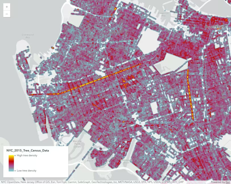
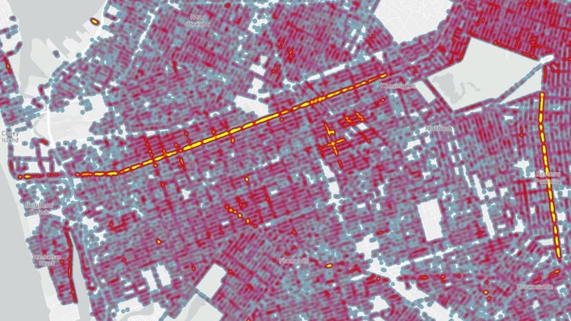
Static heatmaps allow you to persist the visual density’s of a heatmap from one scale across all scale levels. As the user zooms in and out, the heatmap will consistently show the same hot spots in the view.
As the user zooms in, the heatmap becomes irrelevant, so you may want to set a constraint on the MapView to prevent overzooming.
As you zoom in and out, the heatmap’s density will appear consistent across all scales.
Density of trees in New York City (2015). Zoom in and out to observe how a static heatmap may be a more attractive solution to highlighting areas of high density.
49 collapsed lines
<html> <head> <meta charset="utf-8" /> <meta name="viewport" content="width=device-width, initial-scale=1, shrink-to-fit=no" />
<title>NYC tree census</title>
<style> html, body, #viewDiv { height: 100%; margin: 0; } </style>
<link rel="stylesheet" href="https://js.arcgis.com/5.1/esri/themes/light/main.css" /> <!-- Load the ArcGIS Maps SDK for JavaScript from CDN --> <script type="module" src="https://js.arcgis.com/5.1/"></script>
<script type="module"> const [WebMap, FeatureLayer, MapView, Legend] = await $arcgis.import([ "@arcgis/core/WebMap.js", "@arcgis/core/layers/FeatureLayer.js", "@arcgis/core/views/MapView.js", "@arcgis/core/widgets/Legend.js", ]);
const renderer = { type: "heatmap", colorStops: [ { color: [133, 193, 200, 0], ratio: 0 }, { color: [133, 193, 200, 0], ratio: 0.01 }, { color: [133, 193, 200, 255], ratio: 0.01 }, { color: [133, 193, 200, 255], ratio: 0.01 }, { color: [144, 161, 190, 255], ratio: 0.0925 }, { color: [156, 129, 132, 255], ratio: 0.175 }, { color: [167, 97, 170, 255], ratio: 0.2575 }, { color: [175, 73, 128, 255], ratio: 0.34 }, { color: [184, 48, 85, 255], ratio: 0.4225 }, { color: [192, 24, 42, 255], ratio: 0.505 }, { color: [200, 0, 0, 255], ratio: 0.5875 }, { color: [211, 51, 0, 255], ratio: 0.67 }, { color: [222, 102, 0, 255], ratio: 0.7525 }, { color: [233, 153, 0, 255], ratio: 0.835 }, { color: [244, 204, 0, 255], ratio: 0.9175 }, { color: [255, 255, 0, 255], ratio: 1 }, ],
maxDensity: 0.319, minDensity: 0, // settings for heatmap apply only to this scale // so renderer will look consistent without // dynamically updating on zoom
referenceScale: 36111,
radius: 6, legendOptions: { minLabel: "Low tree density", maxLabel: "High tree density", }, };40 collapsed lines
const layer = new FeatureLayer({ portalItem: { id: "a38dd6ef1000447b94bda500084c14c7", }, popupTemplate: { title: "<i>{spc_latin}</i>", content: "<b>{spc_common}</b> in <b>{health}</b> condition located at {address}, {borough}.", }, renderer, blendMode: "multiply", });
const map = new WebMap({ layers: [layer], basemap: "gray-vector", });
const view = new MapView({ container: "viewDiv", center: [-73.95697002727704, 40.626402246806926], scale: 72223, rotation: 78, map, });
view.ui.add( new Legend({ view: view, }), "top-right", ); </script> </head>
<body> <div id="viewDiv"></div> </body></html>Faded heatmaps
Configuring a heatmap renderer with proper density values can be difficult, especially when the starting view scale is unknown. The heatmap smart mapping renderer creator helps generate a suggested heatmap given the current view scale and background color.
It also automatically fades colors from dense areas (full opacity) to sparse areas (high transparency). The fading of colors helps establish a fuzzy boundary, which is often more appropriate than a hard edge for heatmap visualizations.
Density of crimes in Chicago. Notice how this generated heatmap automatically fades colors so the boundaries become more fuzzy.
60 collapsed lines
<html> <head> <meta charset="utf-8" /> <meta name="viewport" content="width=device-width, initial-scale=1, shrink-to-fit=no" />
<title>Heatmap Renderer fade</title>
<style> html, body, #viewDiv { height: 100%; margin: 0; } </style>
<link rel="stylesheet" href="https://js.arcgis.com/5.1/esri/themes/light/main.css" /> <!-- Load the ArcGIS Maps SDK for JavaScript from CDN --> <script type="module" src="https://js.arcgis.com/5.1/"></script>
<script type="module"> const [WebMap, FeatureLayer, MapView, Legend, reactiveUtils, heatmapRendererCreator] = await $arcgis.import([ "@arcgis/core/WebMap.js", "@arcgis/core/layers/FeatureLayer.js", "@arcgis/core/views/MapView.js", "@arcgis/core/widgets/Legend.js", "@arcgis/core/core/reactiveUtils.js", "@arcgis/core/smartMapping/renderers/heatmap.js", ]);
const layer = new FeatureLayer({ title: "Crimes", portalItem: { id: "dba30168bab24b1eb12e9402e19ac3d9", }, opacity: 0.01, });
const map = new WebMap({ layers: [layer], basemap: "gray-vector", });
const view = new MapView({ container: "viewDiv", center: [-87.7051, 41.8393], scale: 263532, map, });
view.ui.add( new Legend({ view: view, }), "top-right", );
view.when(async () => { const layerView = await view.whenLayerView(layer);
const { renderer } = await heatmapRendererCreator.createRenderer({ layer, view }); renderer.referenceScale = view.scale; layer.renderer = renderer;14 collapsed lines
reactiveUtils .whenOnce(() => !layerView?.updating) .then(() => { layer.opacity = 1; }); }); </script> </head>
<body> <div id="viewDiv"></div> </body></html>Related samples and resources
Intro to heatmap
Create a scale-dependent visualization
Visualize points in a scene with a heatmap
Create a static heatmap
Next-Generation Heat Maps in Map Viewer: Better, faster, smoother, stronger
How to create heat maps that work at all scales
HeatmapRenderer
API support
The following table describes the geometry and view types that are suited well for each visualization technique.
| 2D | 3D | Points | Lines | Polygons | Mesh | Client-side | Server-side | |
|---|---|---|---|---|---|---|---|---|
| | | | | | | | | |
| | | | | | | | | |
| | | | | | | | | |
| | | | | | | | | |
| | | | | | | | | |
| | | | | | | | | |
| | | | ||||||
| | | | | | | | |
- Feature reduction selection not supported
- Only by feature reduction selection
- Only by scale-driven filter