This is the second part to a three part set of notebooks that process and analyze historic hurricane tracks. In the previous notebook we saw:
- downloading historic hurricane datasets using Python
- cleaning and merging hurricane observations using DASK
- aggregating point observations into hurricane tracks using ArcGIS GeoAnalytics server
In this notebook you will analyze the aggregated tracks to investigate the communities that are most affected by hurricanes, as well as as answer important questions about the prevalance of hurricanes, their seasonality, their density, and places where they make landfall.
Note: To run this sample, you need a few extra libraries in your conda environment. If you don't have the libraries, install them by running the following commands from cmd.exe or your shell.
pip install scipy
pip install seaborn
Import the libraries necessary for this notebook.
# import ArcGIS Libraries
from arcgis.gis import GIS
from arcgis.geometry import filters
from arcgis.geocoding import geocode
from arcgis.features.manage_data import overlay_layers
from arcgis.geoenrichment import enrich

# import Pandas for data exploration
import pandas as pd
import numpy as np
from scipy import stats

# import plotting libraries
import matplotlib.pyplot as plt
import seaborn as sns
%matplotlib inline

# import display tools
from pprint import pprint
from IPython.display import display

# import system libs
from sys import getsizeof

# Miscellaneous imports
import warnings
warnings.filterwarnings('ignore')
gis = GIS('https://pythonapi.playground.esri.com/portal', 'arcgis_python', 'amazing_arcgis_123')Access aggregated hurricane data
Below, we access the tracks aggregated using GeoAnalytics in the previous notebook.
hurricane_tracks_item = gis.content.search('title:hurricane_tracks_aggregated_ga', item_type="feature layer")[0]
hurricane_fl = hurricane_tracks_item.layers[0]
The GeoAnalytics step calculated summary statistics of all numeric fields. However, only a few of the columns are of interest to us.
pprint([f['name'] for f in hurricane_fl.properties.fields], compact=True, width=80)['objectid', 'serial_num', 'count', 'count_col_1', 'sum_col_1', 'min_col_1', 'max_col_1', 'mean_col_1', 'range_col_1', 'sd_col_1', 'var_col_1', 'count_season', 'sum_season', 'min_season', 'max_season', 'mean_season', 'range_season', 'sd_season', 'var_season', 'count_num', 'sum_num', 'min_num', 'max_num', 'mean_num', 'range_num', 'sd_num', 'var_num', 'count_basin', 'any_basin', 'count_sub_basin', 'any_sub_basin', 'count_name', 'any_name', 'count_iso_time', 'any_iso_time', 'count_nature', 'any_nature', 'count_center', 'any_center', 'count_track_type', 'any_track_type', 'count_current_basin', 'any_current_basin', 'count_latitude_merged', 'sum_latitude_merged', 'min_latitude_merged', 'max_latitude_merged', 'mean_latitude_merged', 'range_latitude_merged', 'sd_latitude_merged', 'var_latitude_merged', 'count_longitude_merged', 'sum_longitude_merged', 'min_longitude_merged', 'max_longitude_merged', 'mean_longitude_merged', 'range_longitude_merged', 'sd_longitude_merged', 'var_longitude_merged', 'count_wind_merged', 'sum_wind_merged', 'min_wind_merged', 'max_wind_merged', 'mean_wind_merged', 'range_wind_merged', 'sd_wind_merged', 'var_wind_merged', 'count_pressure_merged', 'sum_pressure_merged', 'min_pressure_merged', 'max_pressure_merged', 'mean_pressure_merged', 'range_pressure_merged', 'sd_pressure_merged', 'var_pressure_merged', 'count_grade_merged', 'sum_grade_merged', 'min_grade_merged', 'max_grade_merged', 'mean_grade_merged', 'range_grade_merged', 'sd_grade_merged', 'var_grade_merged', 'count_eye_dia_merged', 'sum_eye_dia_merged', 'min_eye_dia_merged', 'max_eye_dia_merged', 'mean_eye_dia_merged', 'range_eye_dia_merged', 'sd_eye_dia_merged', 'var_eye_dia_merged', 'track_duration', 'end_datetime', 'start_datetime']
Below we select the following fields for the rest of this analysis.
fields_to_query = ['objectid', 'count', 'min_season', 'any_basin', 'any_sub_basin',
                   'any_name', 'mean_latitude_merged', 'mean_longitude_merged',
                   'max_wind_merged', 'range_wind_merged', 'min_pressure_merged',
                   'range_pressure_merged', 'max_eye_dia_merged', 'track_duration',
                   'end_datetime', 'start_datetime']
Query hurricane tracks into a Spatially Enabled DataFrame
all_hurricanes_df = hurricane_fl.query(out_fields=','.join(fields_to_query), as_df=True)CPU times: user 1.12 s, sys: 318 ms, total: 1.43 s Wall time: 4.5 s
all_hurricanes_df.shape(12362, 17)
There are 12,362 hurricanes identified by GeoAnalytics aggregate tracks tool. To get an idea about this aggregated dataset, call the head() method.
all_hurricanes_df.head()| SHAPE | any_basin | any_name | any_sub_basin | count | end_datetime | max_eye_dia_merged | max_wind_merged | mean_latitude_merged | mean_longitude_merged | min_pressure_merged | min_season | objectid | range_pressure_merged | range_wind_merged | start_datetime | track_duration | |
|---|---|---|---|---|---|---|---|---|---|---|---|---|---|---|---|---|---|
| 0 | {"paths": [[[59.60000000000002, -17.6000000000... | SI | NOT NAMED | MM | 7.0 | 1854-02-10 18:00:00 | NaN | NaN | -19.318571 | 60.639286 | NaN | 1854.0 | 1 | NaN | NaN | 1854-02-08 06:00:00 | 1.296000e+08 |
| 1 | {"paths": [[[-23.5, 12.5], [-24.19999999999999... | NA | NOT NAMED | NA | 9.0 | 1859-08-26 12:00:00 | NaN | 45.0 | 14.000000 | -26.222222 | NaN | 1859.0 | 2 | NaN | 10.0 | 1859-08-24 12:00:00 | 1.728000e+08 |
| 2 | {"paths": [[[-23.19999999999999, 12.1000000000... | NA | UNNAMED | NA | 50.0 | 1853-09-12 18:00:00 | NaN | 130.0 | 26.982000 | -51.776000 | 924.0 | 1853.0 | 3 | 53.0 | 90.0 | 1853-08-30 00:00:00 | 1.058400e+09 |
| 3 | {"paths": [[[59.80000000000001, -15.5], [59.49... | SI | XXXX856017 | MM | 13.0 | 1856-04-05 18:00:00 | NaN | NaN | -20.185385 | 59.573077 | NaN | 1856.0 | 4 | NaN | NaN | 1856-04-02 18:00:00 | 2.592000e+08 |
| 4 | {"paths": [[[99.60000000000002, -11.5], [98.30... | SI | NOT NAMED | WA | 13.0 | 1861-03-15 18:00:00 | NaN | NaN | -12.940769 | 94.183846 | NaN | 1861.0 | 5 | NaN | NaN | 1861-03-12 18:00:00 | 2.592000e+08 |
To better analyze this data set, the date columns need to be changed to a format that Pandas understands better. This is accomplished by calling the to_datetime() method and passing the appropriate time columns.
all_hurricanes_df['start_datetime'] = pd.to_datetime(all_hurricanes_df['start_datetime'])
all_hurricanes_df['end_datetime'] = pd.to_datetime(all_hurricanes_df['end_datetime'])
all_hurricanes_df.index = all_hurricanes_df['start_datetime']
all_hurricanes_df.head()| SHAPE | any_basin | any_name | any_sub_basin | count | end_datetime | max_eye_dia_merged | max_wind_merged | mean_latitude_merged | mean_longitude_merged | min_pressure_merged | min_season | objectid | range_pressure_merged | range_wind_merged | start_datetime | track_duration | |
|---|---|---|---|---|---|---|---|---|---|---|---|---|---|---|---|---|---|
| start_datetime | |||||||||||||||||
| 1854-02-08 06:00:00 | {"paths": [[[59.60000000000002, -17.6000000000... | SI | NOT NAMED | MM | 7.0 | 1854-02-10 18:00:00 | NaN | NaN | -19.318571 | 60.639286 | NaN | 1854.0 | 1 | NaN | NaN | 1854-02-08 06:00:00 | 1.296000e+08 |
| 1859-08-24 12:00:00 | {"paths": [[[-23.5, 12.5], [-24.19999999999999... | NA | NOT NAMED | NA | 9.0 | 1859-08-26 12:00:00 | NaN | 45.0 | 14.000000 | -26.222222 | NaN | 1859.0 | 2 | NaN | 10.0 | 1859-08-24 12:00:00 | 1.728000e+08 |
| 1853-08-30 00:00:00 | {"paths": [[[-23.19999999999999, 12.1000000000... | NA | UNNAMED | NA | 50.0 | 1853-09-12 18:00:00 | NaN | 130.0 | 26.982000 | -51.776000 | 924.0 | 1853.0 | 3 | 53.0 | 90.0 | 1853-08-30 00:00:00 | 1.058400e+09 |
| 1856-04-02 18:00:00 | {"paths": [[[59.80000000000001, -15.5], [59.49... | SI | XXXX856017 | MM | 13.0 | 1856-04-05 18:00:00 | NaN | NaN | -20.185385 | 59.573077 | NaN | 1856.0 | 4 | NaN | NaN | 1856-04-02 18:00:00 | 2.592000e+08 |
| 1861-03-12 18:00:00 | {"paths": [[[99.60000000000002, -11.5], [98.30... | SI | NOT NAMED | WA | 13.0 | 1861-03-15 18:00:00 | NaN | NaN | -12.940769 | 94.183846 | NaN | 1861.0 | 5 | NaN | NaN | 1861-03-12 18:00:00 | 2.592000e+08 |
The track duration and length columns need to be projected to units (days, hours, miles) that are meaningful for analysis.
all_hurricanes_df['track_duration_hrs'] = all_hurricanes_df['track_duration'] / 3600000
all_hurricanes_df['track_duration_days'] = all_hurricanes_df['track_duration'] / (3600000*24)
Exploratory data analysis
In this section we perform exploratory analysis of the dataset and answer some interesting questions.
map1 = gis.map('USA')
map1
all_hurricanes_df.sample(n=500, random_state=2).spatial.plot(map1,
                                                             renderer_type='u',
                                                             col='any_basin',
                                                            cmap='prism')
True
The map above draws a set of 500 hurricanes chosen at random. You can visualize the Spatially Enabled DataFrame object with different types of renderers. In the example above a unique value renderer is applied on the basin column. You can switch the map to 3D mode and view the same on a globe.
map2 = gis.map()
map2.mode= '3D'
map2
all_hurricanes_df.sample(n=500, random_state=2).spatial.plot(map2,
                                                             renderer_type='u',
                                                             col='any_basin',
                                                            cmap='prism')
Does the number of hurricanes increase with time?
To understand if number of hurricanes have increased over time, we will plot a histogram of the MIN_Season column.
ax = sns.distplot(all_hurricanes_df['min_season'], kde=False, bins=50)
ax.set_title('Number of hurricanes recorded over time')
Text(0.5,1,'Number of hurricanes recorded over time')
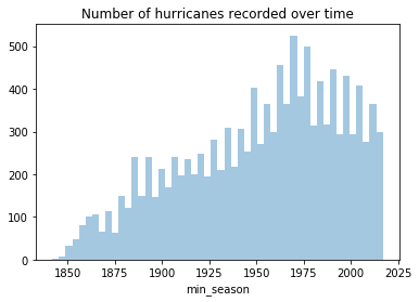
The number of hurricanes recorded increases steadily until 1970. This could be due to advances in geospatial technologies allowing scientists to better monitor hurricanes. However, after 1970 we notice a reduction in the number of hurricanes. This is in line with what scientists observe and predict.
How many hurricanes occure per basin and sub basin?
Climate scientists have organized global hurricanes into 7 basins and a number of sub basins. The snippet below groups the data by basin and sub basin, counts the occurrences, and plots the frequency in bar charts.
fig1, ax1 = plt.subplots(1,2, figsize=(12,5))

basin_ax = all_hurricanes_df['any_basin'].value_counts().plot(kind='bar', ax=ax1[0])
basin_ax.set_title('Number of hurricanes per basin')
basin_ax.set_xticklabels(['Western Pacific', 'South Indian', 'North Atlantic',
                          'Eastern Pacicifc', 'North Indian','Southern Pacific',
                          'South Atlantic'])

sub_basin_ax = all_hurricanes_df['any_sub_basin'].value_counts().plot(kind='bar', ax=ax1[1])
sub_basin_ax.set_title('Number of hurricanes per sub basin')
sub_basin_ax.set_xticklabels(['MM','North Atlantic','Bay of Bengal','Western Australia',
                             'Eastern Australia', 'Carribean Sea', 'Gulf of Mexico',
                             'Arabian Sea', 'Central Pacific'])
sub_basin_ax.tick_params()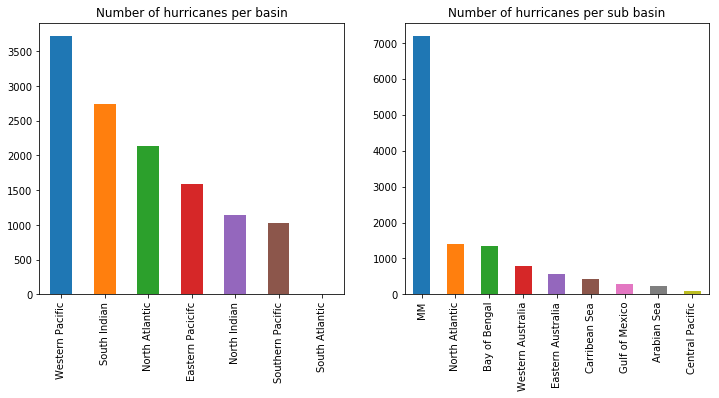
Thus, most hurricanes occur in the Western Pacific basin. This is the region that is east of China, Phillipines and rest of South East Asia. This is followed by the South Indian basin which spans from west of Australia to east of Southern Africa. The North Atlantic basin which is the source of hurricanes in the continental United States ranks as the third busiest hurricane basin.
Are certain hurricane names more popular?
Pandas provides a handy function called value_counts() to count unique occurrences. We use that below to count the number of times each hurricane name has been used. We then print the top 25 most frequently used names.
# Get the number of occurrences of top 25 hurricane names
all_hurricanes_df['any_name'].value_counts()[:25]
NOT NAMED 4099 UNNAMED 1408 06B 31 05B 30 04B 30 09B 30 07B 29 08B 29 10B 29 03B 28 01B 27 12B 26 11B 23 13B 23 02B 22 14B 17 SUBTROP:UNNAMED 16 IRMA 15 FLORENCE 15 02A 14 JUNE 13 ALICE 13 OLGA 13 SUSAN 13 FREDA 13 Name: any_name, dtype: int64
Names like FLORENCE, IRMA, OLGA.. appear to be more popular. Interestingly, all are of female gender. We can take this further to explore at what time periods have the name FLORENCE been used?
all_hurricanes_df[all_hurricanes_df['any_name']=='FLORENCE'].indexDatetimeIndex(['1953-09-23 12:00:00', '1954-09-10 12:00:00',
'1963-07-14 12:00:00', '1967-01-03 06:00:00',
'1964-09-05 18:00:00', '1965-09-08 00:00:00',
'1973-07-25 00:00:00', '1960-09-17 06:00:00',
'1994-11-02 00:00:00', '1969-09-02 00:00:00',
'2012-08-03 06:00:00', '1977-09-20 12:00:00',
'2000-09-10 18:00:00', '1988-09-07 06:00:00',
'2006-09-03 18:00:00'],
dtype='datetime64[ns]', name='start_datetime', freq=None)The name FLORENCE had been used consistently in since the 1950s, reaching a peak in popularity during the 60s.
Is there a seasonality in the occurrence of hurricanes?
Hurricanes happen when water temperatures (Sea Surface Temperature SST) are warm. Solar incidence is one of the key factors affecting SST and this typically happens during summer months. However, summer happens during different months in northern and southern hemispheres. To visualize this seasonality, we need to group our data by month as well as basin. The snippet below creates a multilevel index grouper in pandas.
# Create a grouper object
grouper = all_hurricanes_df.start_datetime.dt.month_name()

# use grouper along with basin name to create a multilevel groupby object
hurr_by_basin = all_hurricanes_df.groupby([grouper,'any_basin'], as_index=True)
hurr_by_basin_month = hurr_by_basin.count()[['count', 'min_pressure_merged']]
hurr_by_basin_month.head()| count | min_pressure_merged | ||
|---|---|---|---|
| start_datetime | any_basin | ||
| April | NA | 5 | 2 |
| NI | 41 | 5 | |
| SI | 242 | 85 | |
| SP | 97 | 74 | |
| WP | 83 | 56 |
Now, we turn the index into columns for further processing.
# turn index into columns
hurr_by_basin_month.reset_index(inplace=True)
hurr_by_basin_month.drop('min_pressure_merged', axis=1, inplace=True)
hurr_by_basin_month.columns = ['month', 'basin', 'count']
hurr_by_basin_month.head()| month | basin | count | |
|---|---|---|---|
| 0 | April | NA | 5 |
| 1 | April | NI | 41 |
| 2 | April | SI | 242 |
| 3 | April | SP | 97 |
| 4 | April | WP | 83 |
We add the month column back, but this time we will help Pandas understand how to sort months in the correct chronological order.
fig, ax = plt.subplots(1,1, figsize=(15,7))
month_order = ['January','February', 'March','April','May','June',
              'July','August','September','October','November','December']

sns.barplot(x='month', y='count', hue='basin', data=hurr_by_basin_month, ax=ax,
            order=month_order)
<matplotlib.axes._subplots.AxesSubplot at 0x1a2705d908>
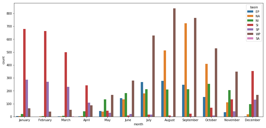
The bars in red represent the number of hurricanes in the Sounth Indian ocean, which spans from west of Australia to east of southern Africa. The brown bars are for the Western Pacific ocean, which spans east of China. The orange bars are for the North Atlantic ocean. The sinusoidal nature of these bars show the charateristic offset in summer between northern and southern hemispheres. The green bars represent North Indian hurricanes, which is dominated by the monsoon effect, and is seen to be prevalant for most part of the year.
What percent of hurricanes make landfall?
While exploring the hurricane data on maps, we noticed their geographic distribution and that they travel long distances over the oceans. Thus, do all hurricanes eventually make landfall? If not, what percent of them do? This is an important question to answer as the threat to human life decreases dramatically when a hurricane does not make a landfall.
We will answer this question by performing overlay analysis. For this, we need to intersect the hurricane tracks with world boundary dataset. We will make an anonymous connection to ArcGIS Online to look for a layer published by Esri in the Living Atlas.
agol_gis = GIS(set_active=False)world_boundaries_item = agol_gis.content.search('World Continents owner:esri_dm', 'feature layer', outside_org=True)[0]
world_boundaries_item
We will import the overlay_layers tool from the manage_data toolset to perform the overlay analysis.
boundary_fl = world_boundaries_item.layers[0]
from arcgis.features.manage_data import overlay_layers
The overlay operation below migth take 1~2 hours in a regular hosted notebook environment.
inland_tracks = overlay_layers(input_layer=hurricane_fl, overlay_layer = boundary_fl,
                               overlay_type='INTERSECT', output_type='INPUT',
                               output_name='hurricane_landfall_tracks', gis=gis)
CPU times: user 1.37 s, sys: 231 ms, total: 1.6 s Wall time: 22min 13s
As part of the intersect operation, the output type is specified as Input. Since the input layer is hurricane tracks (a line layer), the result will continue to be a line layer. We can draw this layer on a map to view those hurricanes that have made a landfall and traveled inland.
landfall_tracks_map = gis.map("USA")
landfall_tracks_map
landfall_tracks_map.add_layer(inland_tracks)We query the landfall tracks layer into a DataFrame. We will then plot a bar chart showing what percent of hurricanes in each basin make a landfall.
fields_to_query = ['min_season', 'any_basin','any_name', 'max_wind_merged',
                   'min_pressure_merged', 'track_duration','end_datetime',
                   'start_datetime', 'analysislength']

landfall_tracks_fl = inland_tracks.layers[0]
landfall_tracks_df = landfall_tracks_fl.query(out_fields=fields_to_query).df
landfall_tracks_df.head(3)| analysislength | any_basin | any_name | end_datetime | max_wind_merged | min_pressure_merged | min_season | objectid | start_datetime | track_duration | SHAPE | |
|---|---|---|---|---|---|---|---|---|---|---|---|
| 0 | 4.376642 | NA | NOT NAMED | -3663424800000 | 95.0 | 965.0 | 1853.0 | 1 | -3664699200000 | 1.317600e+09 | {'paths': [[[-74.47272727299998, 24], [-74.463... |
| 1 | 117.097286 | NA | UNNAMED | -3645172800000 | 70.0 | NaN | 1854.0 | 2 | -3645475200000 | 2.160000e+08 | {'paths': [[[-99.13749999999999, 26.5699999999... |
| 2 | 256.909588 | NA | UNNAMED | -3645172800000 | 70.0 | NaN | 1854.0 | 3 | -3645475200000 | 2.160000e+08 | {'paths': [[[-102.21739130399999, 27.686956522... |
fig1, ax1 = plt.subplots(1,1, figsize=(12,5))

basin_ax = all_hurricanes_df['any_basin'].value_counts().plot(kind='bar', ax=ax1)
basin_ax = landfall_tracks_df['any_basin'].value_counts().plot(kind='bar',
                                                               ax=ax1,
                                                               cmap='viridis',
                                                               alpha=0.5)
basin_ax.set_title('Number of hurricanes per basin that make landfall')
basin_ax.tick_params(axis='x', labelrotation=65)
basin_ax.set_xticklabels(['Western Pacific', 'South Indian', 'North Atlantic',
                          'Eastern Pacicifc', 'North Indian','Southern Pacific',
                          'South Atlantic'])
basin_ax.tick_params()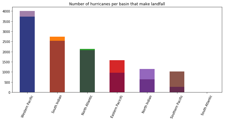
The bar chart above plots the number of hurricanes (per basin) that made landfall over another bar chart of the total number of hurricanes per basin. From the chart, most hurricanes in the Western Pacific, South Indian, North Atlantic ocean make landfall. Hurricanes in Southern Pacific ocean rarely make landfall. This helps us guage the severity of hurricanes in different geographic basins.
How far do hurricanes travel inland after landfall?
Hurricanes in general lose velocity and intensity after they make a landfall. Thus they can only travel a short distance inland. As a result of the overlay analysis, an analysislength column is created. We can plot the histogram of that column to understand how far hurricanes have traveled inland after landfall.
landfall_tracks_df['analysislength'].plot(kind='hist', bins=100,
                                          title='Histogram of distance traveled inland',
                                         figsize=(12,7), xlim=[-100,2500])
plt.xlabel('Distance in miles')
Text(0.5,0,'Distance in miles')
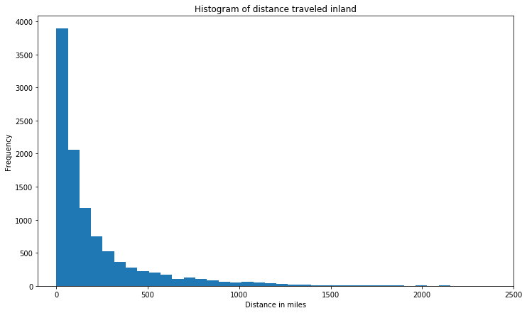
Thus, majority of hurricanes travel less than 500 miles after making a landfall. We can query which are the top 50 hurricanes that have traveled longest inland.
# filter the top 50 longest hurricanes (distance traveled inland)
top_50_longest = landfall_tracks_df.sort_values(by=['analysislength'], axis=0, ascending=False).head(50)
top_50_longest['any_basin'].value_counts().plot(kind='bar')
<matplotlib.axes._subplots.AxesSubplot at 0x1a2c808ef0>
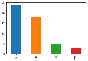
Southern Pacific basin, followed by South Indian basin contains the hurricanes that have traveled longest inland.
inland_map = gis.map()
inland_map
top_50_longest.spatial.plot(inland_map, renderer_type='u', col='any_basin',cmap='prism')True
Plotting this on the map, we notice hurricanes have traveled longest inland over the east coast of North America, China and Australia. Interestingly, Australia bears landfall of hurricanes from both South Indian and Western Pacific basins.
Where do hurricanes make landfall?
Of equal interest is finding where hurricanes make landfall. From experience we know certain regions are prone to hurricane damage more than the rest. Using spatial data science, we can empirically derive those regions that have statistically more hurricane landfalls compared to the rest.
For this, we will repeat the overlay analysis. However, this time, we will change the output_type to POINT. The tool will return the points along the coast lines where hurricanes make landfall.
landfall_item = overlay_layers(input_layer=hurricane_fl, overlay_layer = boundary_fl,
                               overlay_type='INTERSECT', output_type='POINT',
                               output_name='hurricane_landfall_locations', gis=gis)
CPU times: user 1.43 s, sys: 258 ms, total: 1.69 s Wall time: 24min 41s
landfall_points_fl = landfall_item.layers[0]landfall_map = gis.map()
landfall_map
landfall_map.add_layer(landfall_item)Perform density analysis on hurricane landfall locations
The map above shows hundreds of thousands of points spread around the world. Do all these places have equal probability of being hit by a hurricane? To answer this, we will perform density analysis. The calculate_density tool available under the analyze_patterns toolset is used for this.
from arcgis.features.analyze_patterns import calculate_density
landfall_density_item = calculate_density(input_layer=landfall_points_fl, radius=30,
                                          radius_units='Miles', area_units='SquareMiles',
                                          classification_type='NaturalBreaks', num_classes=7,
                                          output_name='landfall_density', gis=gis)
CPU times: user 80.9 ms, sys: 15.3 ms, total: 96.2 ms Wall time: 42.7 s
landfall_map = gis.map('Florida, USA')
landfall_map
landfall_map.add_layer(landfall_density_item)The map here computes the kernel density of landfall locations. It does this by summing the number of landfalls within a radius of 30 miles and dividing it by the area of this radius. Thus it spreads the number of landfalls over a smooth surface, then classifies this surface into 7 classes. By performing density anlaysis, we are able to wade through large clouds of landfall points and identify locations that have more landfalls compared to the rest of the world.
Let us visualize the density analysis results on a table and as a chart.
landfall_density_sdf = landfall_density_item.layers[0].query(as_df=True)
landfall_density_sdf.head()| SHAPE | analysisarea | class | objectid | value_max_per_squaremile | value_min_per_squaremile | |
|---|---|---|---|---|---|---|
| 0 | {"rings": [[[53.845677534778474, 81.0534260146... | 920.649527 | 2 | 1 | 0.010679 | 0.00267 |
| 1 | {"rings": [[[24.78192557105382, 79.98490572185... | 1896.053559 | 2 | 2 | 0.010679 | 0.00267 |
| 2 | {"rings": [[[15.16524293599764, 79.45064557546... | 162.088581 | 2 | 3 | 0.010679 | 0.00267 |
| 3 | {"rings": [[[12.600794233316094, 65.2393256814... | 183.094538 | 2 | 4 | 0.010679 | 0.00267 |
| 4 | {"rings": [[[-13.79165699844873, 64.5982135057... | 1672.631881 | 2 | 5 | 0.010679 | 0.00267 |
ax = landfall_density_sdf['class'].hist()
ax.set_title('Histogram of hurricane landfall densities')
Text(0.5,1,'Histogram of hurricane landfall densities')
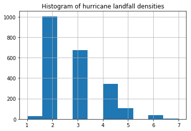
From the histogram above, we notice there are only a very few places that can be classified as having a high density of hurricane landfalls. Let us analyze these places a bit further.
high_density_landfalls = landfall_density_sdf[(landfall_density_sdf['class']==6) |
                                              (landfall_density_sdf['class']==7)]

high_density_landfalls.shape
(40, 6)
We have identified 40 sites worldwide that have a high density of hurricane landfalls based on the anlaysis of data spanning the last 169 years. Below, we plot them on a map.
high_density_landfall_map1 = gis.map('North Carolina')
high_density_landfall_map2 = gis.map('China')
display(high_density_landfall_map1)
display(high_density_landfall_map2)
high_density_landfalls.spatial.plot(map_widget=high_density_landfall_map1, line_width=0, outline_color=0)
high_density_landfalls.spatial.plot(map_widget=high_density_landfall_map2, line_width=0, outline_color=0)
True
The places that turn up are not much of a surprise. We notice the coast of Carolinas in the United States, the states of West Bengal, Orissa in India, several places along the East coast of China, southern tip of Japan, and most of the island of Philippines are the places that are most affected on a repeat basis.
What are the demographics of places with highest density of landfalls?
Now that we have found the places that have the highest desnity of landfalls, we are faced with the question, who lives there? What is the impact of repeat natural calamities on these places? We can answer those questions by geoenriching those polygons with demographic and socio-economic attributes.
Note: Geoenrichment costs ArcGIS Online credits and requires this functionality to be configured in your Organization
Below we use the enrich() function to add socio-economic columns to the landfall density DataFrame. For a data collection, we pick keyGlobalFacts which is available for most part of the world.
landfalls_enriched = enrich(high_density_landfalls, data_collections='keyGlobalFacts')
landfalls_enriched.head()| AVGHHSZ | HasData | ID | OBJECTID_0 | SHAPE | TOTFEMALES | TOTHH | TOTMALES | TOTPOP | aggregationMethod | analysisarea | apportionmentConfidence | class | objectid | populationToPolygonSizeRating | sourceCountry | value_max_per_squaremile | value_min_per_squaremile | |
|---|---|---|---|---|---|---|---|---|---|---|---|---|---|---|---|---|---|---|
| 0 | 2.49 | 1 | 0 | 1 | {"rings": [[[-75.76583397992073, 36.0687216884... | 3514 | 2815 | 3500 | 7014 | BlockApportionment:US.BlockGroups | 118.233701 | 2.576 | 7 | 170 | 2.191 | US | 0.226918 | 0.122803 |
| 1 | 2.44 | 1 | 1 | 2 | {"rings": [[[-76.19324209703427, 36.3892777762... | 23548 | 19172 | 23631 | 47179 | BlockApportionment:US.BlockGroups | 1165.144645 | 2.576 | 6 | 174 | 2.191 | US | 0.122803 | 0.067631 |
| 2 | 2.21 | 1 | 2 | 3 | {"rings": [[[-76.40694615559107, 34.8933493663... | 6210 | 5485 | 6521 | 12731 | BlockApportionment:US.BlockGroups | 731.245665 | 2.576 | 6 | 194 | 2.191 | US | 0.122803 | 0.067631 |
| 3 | 2.70 | 1 | 3 | 4 | {"rings": [[[130.2448784688346, 32.54260472224... | 11118 | 7816 | 9969 | 21087 | BlockApportionment:JP.Blocks | 106.236904 | 2.090 | 6 | 275 | 1.695 | JP | 0.122803 | 0.067631 |
| 4 | 2.39 | 1 | 4 | 5 | {"rings": [[[-80.57417529744856, 32.2220486344... | 27843 | 21425 | 28081 | 55924 | BlockApportionment:US.BlockGroups | 255.801403 | 2.576 | 6 | 280 | 2.191 | US | 0.122803 | 0.067631 |
The enrich() operation accepts the Spatially Enabled DataFrame, performs spatial aggregation and returns another DataFrame with socio-economic and demographic columns added to it. The data_collections parameter decides which additional columns get added.
Let us visualize the population that is affected by country. For this, we group by the sourceCountry column and sum up the results. The cell below plots the total number of men, women and households that live within the high density polygons.
fig, ax = plt.subplots(1,2, figsize=(15,5))
# plot bar chart 1
grouper1 = landfalls_enriched[['TOTFEMALES','TOTMALES','sourceCountry']].groupby(by='sourceCountry')
grouper1.sum().plot(kind='bar', stacked=True, ax=ax[0],
                    title='Population living within high density areas')

# plot bar chart 2
grouper2 = landfalls_enriched[['TOTHH','sourceCountry']].groupby(by='sourceCountry')
grouper2.sum().plot(kind='bar', ax=ax[1],
                    title='Total number of households within high density areas')

plt.tight_layout()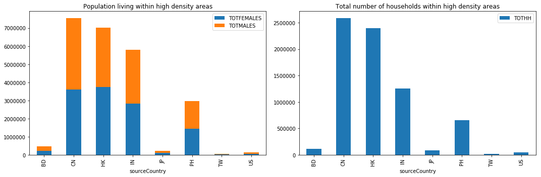
Hurricanes make landfalls on coasts, which invariably are places of dense population. By geo enriching the density maps, we are able to determine that the coasts of China (7 million), Hongkong (7M), India (6M) and Philippines (3M) are at high risk as they suffer repeat landfalls and also support large populations.
This information can be used by city planners to better zone the coasts and avoid development along hurricane prone areas.
Conclusion
In this notebook, we accessed the aggregated hurricane track data from Part 1 as Spatially Enabled DataFrame objects. We visualized these DataFrames both spatially and as charts to reveal interesting information about the global hurricane dataset.
We learned that global hurricanes are classified into 7 basins, with the most hurricanes occurring over Western Pacific. The North Atlantic basin, which affects the continental United States, ranks as third busiest basin. The number of hurricanes recorded worldwide has been steadily climbing as technology improves. However, after the 1970s, we notice a year-over-year reduction in the number of hurricanes. We analyze more of this phenomena in the next part of this study.
As for hurricane names, the top spot is a tie between Irma and Florence, with 15 occurrences for each so far. By turning this DataFrame into a timeseries, we were able to observe a sinusoidal seasonality. The peaks between hurricanes in northern and cyclones in southern hemisphere were offest by about 6 months, matching the time when summer occurs in these hemispheres. We also noticed that hurricanes over the North Indian basin occur throughout the year as they are influenced by a monsoon phenomena.
We then performed overlay analysis to understand where hurricanes make landfall and the path they take once they make landfall. We noticed that the majority of hurricanes make landfall. Once they make a landfall, the majority travel under 100 miles inland.
We extended the overlay analysis to calculate the exact points where landfall occurs. After performing a density analysis on the landfall locations, we found places along the coasts of the Carolinas in the United States, Orissa, West Bengal in India, several places along the east coast of China, southern tip of Japan and most of Phillippines are affected from a repeat landfall / historical perspective.
By geo-enriching the high density places, we were able to understand the number of people that live in these places. China tops the list with most people affected.
In the next notebook, we extend this analysis to answer the important question: Does the intensity of hurricanes increase over time?