import "@arcgis/common-components/components/arcgis-slider";- Inheritance:
- ArcgisSlider→
PublicLitElement
- Since
- ArcGIS Maps SDK for JavaScript 5.0
The Slider component is used to filter data or collect numeric input from users. It supports single or multiple thumbs, configured via the values property. The Slider can be displayed in horizontal or vertical layout, supports snapping to defined steps, configurable value precision, and custom labelFormatter. It also includes keyboard interaction, optional editable labels, and customizable popover content.
The slider component can be set up with the arcgis-ticks component. See the example below:
<arcgis-slider min="0" max="100" show-range-labels value-labels-display="always" steps="1" value-labels-placement="start"> <arcgis-ticks interactive slot="content-end" style="flex:1;" min="0" max="100" mode="count" values="11" show-labels> </arcgis-ticks></arcgis-slider>Which slider should you use: arcgis-slider or calcite-slider?
In general, use calcite-slider over
arcgis-slider. It covers common slider use cases and works well in most scenarios.Use
arcgis-slideronly when you need functionality thatcalcite-sliderdoes not provide, such as:
- layout:
arcgis-slidersupportslayout="vertical".- Custom range display:
arcgis-slidersupports fullRangeMin and fullRangeMax for displaying a wider range than the interactive range.- More than two values:
arcgis-slidersupports an arbitrary number of slider values, beyond single-value or range (two-value) sliders.- Slot support: Use the
content-start,content-end, andpopoverslots to render custom content before the track, after the track, or inside the popover.
Demos
Properties
| Property | Attribute | Type |
|---|---|---|
activeValue readonly | | |
allow-values-overlap | ||
auto-destroy-disabled | ||
disabled reflected | disabled | |
fill-placement | "end" | "none" | "start" | |
fullRangeMax reflected | full-range-max | |
fullRangeMin reflected | full-range-min | |
| ||
layout reflected | layout | "horizontal" | "vertical" |
max reflected | max | |
| ||
min reflected | min | |
mirrored reflected | mirrored | |
popover-label | Popover["label"] | |
popoverPlacement reflected | popover-placement | "end" | "start" |
precision reflected | precision | |
range-labels-editing-enabled | ||
rangeLabelsPlacement reflected | range-labels-placement | "center" | "end" |
segments-dragging-disabled | ||
showRangeLabels reflected | show-range-labels | |
steps | ||
valueLabelsDisplay reflected | value-labels-display | "always" | "auto" | "hidden" |
value-labels-editing-enabled | ||
valueLabelsPlacement reflected | value-labels-placement | "end" | "start" |
values | number[] |
activeValue
The active value of the slider, based on which thumb or range (segment) is active. This returns the stored value for the active thumb, so it may reflect the thumb’s last set position.
It returns
undefinedwhen no value is active- a
numberwhen a single value is active "all"when the range (segment) is active
Listen to @arcgisActiveValueChange to be notified when a value becomes active or inactive.
- See also
allowValuesOverlap
- Type
- boolean
When true, allows multiple thumbs to overlap by sharing the same value.
When false, thumbs are prevented from overlapping.
- Attribute
- allow-values-overlap
- Default value
- false
autoDestroyDisabled
- Type
- boolean
If true, the component will not be destroyed automatically when it is disconnected from the document. This is useful when you want to move the component to a different place on the page, or temporarily hide it. If this is set, make sure to call the destroy() method when you are done to prevent memory leaks.
- Attribute
- auto-destroy-disabled
- Default value
- false
disabled
- Type
- boolean
Indicates whether the slider is disabled.
- Attribute
- disabled
- Default value
- false
fullRangeMax
Sets the maximum value of the slider display full range.
When specified, the slider track is scaled from fullRangeMin to fullRangeMax, while
the thumbs remain constrained to the interactive range defined by min and max.
The fullRangeMax must be greater than or equal to max property of the slider.
- See also
- Attribute
- full-range-max
Example
<!-- Slider with a full range from 0 to 100, while only allowing thumb values between 25 and 75. --><arcgis-slider full-range-min="0" full-range-max="100" min="25" max="75" values="50"></arcgis-slider> fullRangeMin
Sets the minimum value of the slider display full range.
When specified, the slider track is scaled from fullRangeMin to fullRangeMax, while
the thumbs remain constrained to the range defined by min and max.
The fullRangeMin must be less than or equal to min property of the slider.
- See also
- Attribute
- full-range-min
Example
<!-- Slider with a full range from 0 to 100, while only allowing thumb values between 25 and 75. --><arcgis-slider full-range-min="0" full-range-max="100" min="25" max="75" values="50"></arcgis-slider> labelFormatter
- Type
- (value: number, type: "max" | "min" | "value", defaultFormatter: (value: number) => string) => string | null | undefined
Allows customizing how slider labels are formatted for min, max, and thumb values.
The formatted value is used for the visible labels and for the thumb’s accessible value text via aria-valuetext.
Return null or undefined to use the default formatting.
Example
// Format labels to use "K" for thousands and "M" for millions// and use "start" and "end" for min and max labels respectively.slider.labelFormatter = (value, type, defaultFormatter) => {  if (type === "min") return "start";  if (type === "max") return "end";  if (type !== "value") return defaultFormatter(value);
  const abs = Math.abs(value);  if (abs >= 1_000_000) {    const num = (value / 1_000_000).toLocaleString(undefined, { maximumSignificantDigits: 3 });    return `${num} M`;  }
if (abs >= 1_000) { const num = (value / 1_000).toLocaleString(undefined, { maximumSignificantDigits: 3 }); return `${num} K`; } return defaultFormatter(value);}; max
- Type
- number
The maximum value for the slider thumbs. Thumbs will not move past this value.
To display the max label on the slider, set showRangeLabels to true.
To allow the end user to modify the max value, set rangeLabelsEditingEnabled to true.
- Attribute
- max
min
- Type
- number
The minimum value for the slider thumbs. Thumbs will not move past this value.
To display the min label on the slider, set showRangeLabels to true.
To allow the end user to modify the min value, set rangeLabelsEditingEnabled to true.
- Attribute
- min
popoverPlacement
- Type
- "end" | "start"
Determines which side of the track the popover is placed on.
The popover is the floating container that displays the content from the popover slot.
"start": Positions the popover above a horizontal slider or to the left of a vertical slider."end": Positions the popover below a horizontal slider or to the right of a vertical slider.
- Attribute
- popover-placement
- Default value
- "start"
Example
const slider = document.querySelector("arcgis-slider");slider.popoverPlacement = "end";
// Example: Dynamic popover content based on slider valueconst popover = document.getElementById("popover");const unitCost = 12.5;const numberFormatter = new Intl.NumberFormat();const usd = new Intl.NumberFormat(undefined, { style: "currency", currency: "USD" });
const renderPopover = () => {  const value = Number(slider.values?.[0] ?? 0); // 0-100  const annualCost = (value / 100) * 800 * 365 * unitCost;  popover.textContent = `Est. annual cost: ${usd.format(annualCost)} (at ${numberFormatter.format(value)}%)`;  slider.popoverLabel = `Cost estimate ${usd.format(annualCost)} at ${numberFormatter.format(value)} percent`;};
slider.addEventListener("arcgisInput", renderPopover);slider.addEventListener("arcgisChange", renderPopover);renderPopover();
precision
- Type
- number
Defines how slider thumb values should be rounded. This number indicates the number of decimal places slider thumb values should round to when they have been moved.
This value also indicates the precision of thumb labels when the data range
is less than 10 (i.e. (max - min) < 10).
When the data range is larger than 10, labels display with a precision of
no more than two decimal places, though actual slider thumb values will maintain the
precision specified in this property.
For example, given the default precision of 4, and the following slider configuration,
The labels of the thumbs will display two decimal places, but the precision of the actual
thumb values will not be lost even when the user slides or moves the thumb.
Keep in mind this property rounds thumb values and shouldn't be used exclusively
for formatting purposes. To format thumb labels, use the labelFormatter
property.
- Attribute
- precision
- Default value
- 4
Example
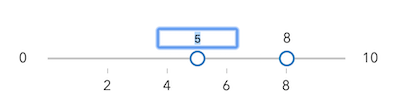
<!-- thumb label will display 50.43 --><!-- thumb value will maintain precision, so value will remain at 50.4331 --><arcgis-slider min="0" max="100" values="50.4331" precision="4"></arcgis-slider> segmentsDraggingDisabled
- Type
- boolean
Indicates if the user can drag the segment between thumbs to update thumb positions.
- Attribute
- segments-dragging-disabled
- Default value
- false
steps
Sets steps, or intervals, on the slider that restrict user input to specific values. If an array of numbers is passed to this property, the slider thumbs may only be moved to the positions specified in the array.
If a single number is set, then steps are set along the entire
slider range at an interval of the provided value. In this scenario,
the user may only slide the thumbs to values at the provided interval.
For example, if a value of 0.5 is set here, and the slider
min is 0 and the slider max is 10, then the user will
only be able to update the thumbs to values of 0, 0.5, 1.0, 1.5, 2.0, etc.
- Attribute
- steps
Examples
<!-- set steps at an interval of 0.5. So the --><!-- slider thumb snaps at values of 0.5, 1.0, 1.5, etc. --><arcgis-slider min="0" max="10" steps="0.5" values="5"></arcgis-slider><!-- Set steps at specific slider positions --><arcgis-slider min="0" max="100" steps="5, 10, 15, 20, 25, 30, 35, 40" values="15, 30"></arcgis-slider> valueLabelsDisplay
- Type
- "always" | "auto" | "hidden"
Controls when thumb value labels are displayed.
This property can be set to one of the following values:
"always": Always show the labels."auto": Show the labels only when the thumb representing a value is dragged."hidden": Never show the labels.
- Attribute
- value-labels-display
- Default value
- "hidden"
valueLabelsEditingEnabled
- Type
- boolean
Indicates whether to enable editing input values via keyboard input when the user clicks a thumb value label. This allows the user to move the slider thumb to precise values without sliding the thumbs.
- Attribute
- value-labels-editing-enabled
- Default value
- false
values
- Type
- number[]
An array of numbers representing absolute thumb positions on the slider.
- Attribute
- values
Methods
| Method | Signature |
|---|---|
componentOnReady inherited | componentOnReady(): Promise<this> |
destroy(): Promise<void> |
componentOnReady
- Signature
-
componentOnReady (): Promise<this>
Creates a promise that resolves once the component is fully loaded.
- Returns
- Promise<this>
Example
const arcgisSlider = document.querySelector("arcgis-slider");document.body.append(arcgisSlider);await arcgisSlider.componentOnReady();console.log("arcgis-slider is ready to go!");Events
arcgisActiveValueChange
arcgisActiveValueChange: CustomEvent<void> Fires when the activeValue changes as a thumb or the range gains or loses focus. This event does not fire when values change. Use @arcgisInput for continuous updates or @arcgisChange when the interaction is committed.
- See also
Example
// Display the active value status of the slider in a div elementconst slider = document.querySelector("arcgis-slider");const status = document.getElementById("slider-status");
const renderActive = () => {  const active = slider.activeValue;  // active is: undefined (none), number (thumb value), or "all" (range segment)  status.textContent =    active === "all"      ? "Editing range"      : active == null        ? "No active thumb"        : `Editing value: ${active}`;};
slider.addEventListener("arcgisActiveValueChange", renderActive);// Pair with these when you need value updates:slider.addEventListener("arcgisInput", () => console.log("values", slider.values));slider.addEventListener("arcgisChange", () => console.log("committed", slider.values));
renderActive();
arcgisChange
arcgisChange: CustomEvent<void> Fires when the thumb or range is released on the component.
Use @arcgisInput for continuous updates during a drag.
Example
const slider = document.querySelector("arcgis-slider");slider.popoverPlacement = "end";
// Example: Dynamic popover content based on slider valueconst popover = document.getElementById("popover");const unitCost = 12.5;const numberFormatter = new Intl.NumberFormat();const usd = new Intl.NumberFormat(undefined, { style: "currency", currency: "USD" });
const renderPopover = () => {  const value = Number(slider.values?.[0] ?? 0); // 0-100  const annualCost = (value / 100) * 800 * 365 * unitCost;  popover.textContent = `Est. annual cost: ${usd.format(annualCost)} (at ${numberFormatter.format(value)}%)`;  slider.popoverLabel = `Cost estimate ${usd.format(annualCost)} at ${numberFormatter.format(value)} percent`;};
slider.addEventListener("arcgisChange", renderPopover);renderPopover();
arcgisInput
arcgisInput: CustomEvent<void> Fires continuously while the thumb or range is being dragged. This event can fire frequently; consider debouncing or throttling expensive work.
Example
import FeatureEffect from "@arcgis/core/layers/support/FeatureEffect";import FeatureFilter from "@arcgis/core/layers/support/FeatureFilter";
slider.addEventListener("arcgisInput", () => {  const value = slider.values[0] ?? 0;  layer.featureEffect = new FeatureEffect({     filter: new FeatureFilter({       where: `FIELD <= ${value}`,     }),    includedEffect: "bloom(1.4, 0.2px, 0.1)",    excludedEffect: "opacity(20%) grayscale(100%)",  });});
arcgisRangeChange
arcgisRangeChange: CustomEvent<void> Fires when the slider's min and max range changes. This occurs when the user edits the min or max range labels (when enabled).
Example
// Example: Keep a "budget" value inside the editable min/max rangeconst slider = document.querySelector("arcgis-slider");
const clamp = (val, min, max) => Math.min(max, Math.max(min, val));
const render = () => {  rangeText.textContent = `Allowed: ${slider.min}–${slider.max}`;
  // If your UI stores a single value, keep it inside the new range.  const current = Number(slider.values?.[0] ?? slider.min);  const next = clamp(current, slider.min, slider.max);
  if (next !== current) {    slider.values = [next];  }
  valueText.textContent = `Selected: ${next}`;};
slider.addEventListener("arcgisRangeChange", render);render();
Slots
| Name | Description |
|---|---|
| A slot for elements before the track. | |
| A slot for elements after the track. | |
| A slot for custom content to be rendered in the popover. |