Census tracts styled with a dot density renderer to show population density by race and ethnicity
What is a dot density style?
The dot density style visualizes the density of a population, or other count, in a polygon data layer by randomly drawing dots within polygon boundaries. Each dot represents a constant numeric value of an attribute or a subset of attributes.
For example, when visualizing population density where each dot represents 100 people, a polygon with a population of 100,000 people would contain 1,000 dots randomly drawn within the polygon.
Unlike choropleth maps
How a dot density style works
The dot density style is configured with a dot density renderer. A dot density renderer requires the following:
- A list of attributes (minimum of one attribute), matching a data value returned from a field or Arcade expression with a color.
- A
dotValue, or the value each dot will represent for each attribute. - Optionally (but encouraged), a
referenceScalereferring to the view scale.
Examples
Population density
The following example visualizes population density in southern California.
- Set the
dotValueto a value that makes sense for the scale (like 100). - Set the
referenceScaleso thedotValuecan adjust as the user zooms in and out. - Indicate the unit of measurement in the
legendOptions. In this case it ispeople. - In the
attributesproperty, reference the field name containing the number of people in each feature. - Set a color used to render the dots.
59 collapsed lines
<!doctype html><html> <head> <meta charset="utf-8" /> <meta name="viewport" content="width=device-width, initial-scale=1, shrink-to-fit=no" />
<title>Esri Developer Guide: Population density</title>
<link rel="stylesheet" href="https://js.arcgis.com/5.1/esri/themes/dark/main.css" />
<style> html, body, #viewDiv { height: 100%; margin: 0; } </style>
<!-- Load the ArcGIS Maps SDK for JavaScript from CDN --> <script type="module" src="https://js.arcgis.com/5.1/"></script>
<script type="module"> const [WebMap, MapView, FeatureLayer, DotDensityRenderer, Legend, Bookmarks, Expand] = await $arcgis.import([ "@arcgis/core/WebMap.js", "@arcgis/core/views/MapView.js", "@arcgis/core/layers/FeatureLayer.js", "@arcgis/core/renderers/DotDensityRenderer.js", "@arcgis/core/widgets/Legend.js", "@arcgis/core/widgets/Bookmarks.js", "@arcgis/core/widgets/Expand.js", ]);
const map = new WebMap({ portalItem: { id: "56b5bd522c52409c90d902285732e9f1", }, });
const view = new MapView({ container: "viewDiv", map: map, popup: { dockEnabled: true, dockOptions: { position: "bottom-right", breakpoint: false, }, }, constraints: { maxScale: 35000, snapToZoom: false, }, }); view.highlights.items[0].fillOpacity = 0; view.highlights.items[0].color = [50, 50, 50];
view.when().then(function () {
const dotDensityRenderer = new DotDensityRenderer({ dotValue: 100, outline: null, referenceScale: 577790, legendOptions: { unit: "people", }, attributes: [ { field: "B03002_001E", color: "#e8ca0d", label: "Places where people live", }, ], });59 collapsed lines
// Add renderer to the layer and define a popup template const url = "https://services.arcgis.com/P3ePLMYs2RVChkJx/arcgis/rest/services/ACS_Population_by_Race_and_Hispanic_Origin_Boundaries/FeatureServer/2"; const layer = new FeatureLayer({ url: url, minScale: 20000000, maxScale: 35000, title: "Current Population Estimates (ACS)", popupTemplate: { title: "{County}, {State}", content: [ { type: "fields", fieldInfos: [ { fieldName: "B03002_001E", label: "Total population", fieldFormat: { type: "number", minimumFractionDigits: 0, maximumFractionDigits: 0, useGrouping: "always", }, }, ], }, ], }, renderer: dotDensityRenderer, });
map.add(layer);
view.ui.add( [ new Expand({ view: view, content: new Legend({ view: view }), group: "top-right", expanded: true, }), new Expand({ view: view, content: new Bookmarks({ view: view }), group: "top-right", }), ], "top-right", ); }); </script> </head>
<body> <div id="viewDiv"></div> </body></html>Population density by category
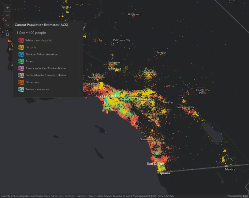
You can specify multiple attributes to visualize subcategories of the data. For example, we can visualize the same layer above, but categorize each dot by race/ethnicity. So each dot of a different color represents 100 people of the respective category (e.g. 1 red dot represents 100 white (non-Hispanic) people, each blue dot represents 100 African American people, each yellow dot represents 100 Hispanic people, etc).
Pan and zoom the map to explore population density by race and ethnicity.
70 collapsed lines
<!doctype html><html> <head> <meta charset="utf-8" /> <meta name="viewport" content="width=device-width, initial-scale=1, shrink-to-fit=no" />
<title>Esri Developer Guide: Population density by race and ethnicity</title>
<link rel="stylesheet" href="https://js.arcgis.com/5.1/esri/themes/dark/main.css" />
<style> html, body, #viewDiv { height: 100%; margin: 0; } </style>
<!-- Load the ArcGIS Maps SDK for JavaScript from CDN --> <script type="module" src="https://js.arcgis.com/5.1/"></script>
<script type="module"> const [WebMap, MapView, FeatureLayer, DotDensityRenderer, Legend, Bookmarks, Expand] = await $arcgis.import([ "@arcgis/core/WebMap.js", "@arcgis/core/views/MapView.js", "@arcgis/core/layers/FeatureLayer.js", "@arcgis/core/renderers/DotDensityRenderer.js", "@arcgis/core/widgets/Legend.js", "@arcgis/core/widgets/Bookmarks.js", "@arcgis/core/widgets/Expand.js", ]);
const map = new WebMap({ portalItem: { id: "56b5bd522c52409c90d902285732e9f1", }, });
const view = new MapView({ container: "viewDiv", map: map, popup: { dockEnabled: true, dockOptions: { position: "bottom-right", breakpoint: false, }, }, constraints: { maxScale: 35000, snapToZoom: false, }, }); view.highlights.items[0].fillOpacity = 0; view.highlights.items[0].color = [50, 50, 50];
view.when().then(function () {
const dotDensityRenderer = new DotDensityRenderer({ dotValue: 100, outline: null, referenceScale: 577790, // 1:577,790 view scale legendOptions: { unit: "people", }, });
dotDensityRenderer.attributes = [ { field: "B03002_003E", color: "#f23c3f", label: "White (non-Hispanic)", }, { field: "B03002_012E", color: "#e8ca0d", label: "Hispanic", }, { field: "B03002_004E", color: "#00b6f1", label: "Black or African American", }, { field: "B03002_006E", color: "#32ef94", label: "Asian", }, { field: "B03002_005E", color: "#ff7fe9", label: "American Indian/Alaskan Native", }, { field: "B03002_007E", color: "#e2c4a5", label: "Pacific Islander/Hawaiian Native", }, { field: "B03002_008E", color: "#ff6a00", label: "Other race", }, { field: "B03002_009E", color: "#96f7ef", label: "Two or more races", }, ];129 collapsed lines
// Add renderer to the layer and define a popup template const url = "https://services.arcgis.com/P3ePLMYs2RVChkJx/arcgis/rest/services/ACS_Population_by_Race_and_Hispanic_Origin_Boundaries/FeatureServer/2"; const layer = new FeatureLayer({ url: url, minScale: 20000000, maxScale: 35000, title: "Current Population Estimates (ACS)", popupTemplate: { title: "{County}, {State}", content: [ { type: "fields", fieldInfos: [ { fieldName: "B03002_003E", label: "White (non-Hispanic)", fieldFormat: { type: "number", minimumFractionDigits: 0, maximumFractionDigits: 0, useGrouping: "always", }, }, { fieldName: "B03002_012E", label: "Hispanic", fieldFormat: { type: "number", minimumFractionDigits: 0, maximumFractionDigits: 0, useGrouping: "always", }, }, { fieldName: "B03002_004E", label: "Black or African American", fieldFormat: { type: "number", minimumFractionDigits: 0, maximumFractionDigits: 0, useGrouping: "always", }, }, { fieldName: "B03002_006E", label: "Asian", fieldFormat: { type: "number", minimumFractionDigits: 0, maximumFractionDigits: 0, useGrouping: "always", }, }, { fieldName: "B03002_005E", label: "American Indian/Alaskan Native", fieldFormat: { type: "number", minimumFractionDigits: 0, maximumFractionDigits: 0, useGrouping: "always", }, }, { fieldName: "B03002_007E", label: "Pacific Islander/Hawaiian Native", fieldFormat: { type: "number", minimumFractionDigits: 0, maximumFractionDigits: 0, useGrouping: "always", }, }, { fieldName: "B03002_008E", label: "Other race", fieldFormat: { type: "number", minimumFractionDigits: 0, maximumFractionDigits: 0, useGrouping: "always", }, }, { fieldName: "B03002_009E", label: "Two or more races", fieldFormat: { type: "number", minimumFractionDigits: 0, maximumFractionDigits: 0, useGrouping: "always", }, }, ], }, ], }, renderer: dotDensityRenderer, });
map.add(layer);
view.ui.add( [ new Expand({ view: view, content: new Legend({ view: view }), group: "top-right", expanded: true, }), new Expand({ view: view, content: new Bookmarks({ view: view }), group: "top-right", }), ], "top-right", ); }); </script> </head>
<body> <div id="viewDiv"></div> </body></html>Best practices
The following practices should be followed when creating a dot density visualization.
View scale
This implementation of dot density allows you to linearly scale the dot value based on the view scale. As you zoom in and out of the initial view, the relative density of points remains the same across scales. Always set a referenceScale to make the visualization work across many scale levels.
In addition to setting a referenceScale, you should typically set a minScale on the layer. Dot density visualizations are difficult to read when dots are no longer distinguishable, either because they coalesce or because they are too dispersed.
Setting a maxScale on the layer is also important because dot density maps tend to become unreadable at larger scales. Users may start seeing patterns in the random distribution of dots that do not exist in reality. They may also mistakenly interpret the location of each dot as an actual point feature. Users are particularly susceptible to this when the dotValue is set to 1. As an example, dot density visualizations on county datasets should only be viewed at the state or regional level.
View spatial reference
You should use equal area spatial references whenever possible, particularly when building dot density visualizations that span global extents. Using heavily distorted spatial references with a dot density renderer is acceptable as long as you restrict the user from comparing the densities of features within the same view at large scales. Try not to compare features across multiple views when equal area projections cannot be used, since significant differences in area distortion may cause the user to misinterpret feature density in heavily distorted areas.
Attributes
Use the attributes property to specify one or more data values. When multiple attributes are specified, the group of attributes should make logical sense when visualized together, and generally should belong to a parent group. For example, you could map the density of pets, or the density of different kinds of pets, such as dogs or cats. However, it doesn’t make sense to map the density of cats and the density of crops within the same renderer.
Use pop-ups
Related samples and resources
Dot density
Generate a dot density visualization
Dot density for the web
Interactive dot density maps for the web

Visualizing growth with dot density
Visualizing change with dot density
API support
| 2D | 3D | Arcade | Points | Lines | Polygons | Mesh | |
|---|---|---|---|---|---|---|---|
| | | | | | | | |
| | | | | | | | |
| | | | | | | ||
| | | | | | | | |
| | | | | | | | |
| | | | | | | | |
| | | | | | | | |
| | | | | | | | |
| | | | | | | | |
| | | |
- Color only
- Size variable creators only supported for points
- Size variable creators not supported in 3D