What is a chart style?
A chart style visualizes two or more numeric attributes as a chart for each feature in a layer. You can use this style to visualize any variable with sub-categories such as the following:
- Votes earned per candidate in an election
- Languages spoken in the home
- Race and ethnicity
How chart styles work
The pie chart style is configured with a PieChartRenderer. Currently, this is the only chart-based renderer available. A pie chart renderer requires a list of attributes (minimum of two) that match a color with a data value returned from a field or Arcade expression.
31 collapsed lines
<!doctype html><html> <head> <meta charset="utf-8" /> <meta name="viewport" content="width=device-width, initial-scale=1, shrink-to-fit=no" />
<title>Esri Developer Guide: Donut chart with size</title>
<link rel="stylesheet" href="https://js.arcgis.com/5.1/esri/themes/light/main.css" /> <!-- Load the ArcGIS Maps SDK for JavaScript from CDN --> <script type="module" src="https://js.arcgis.com/5.1/"></script>
<style> html, body, #viewDiv { height: 100%; margin: 0; } </style>
<script type="module"> const [WebMap, MapView, FeatureLayer, Legend, Expand] = await $arcgis.import([ "@arcgis/core/WebMap.js", "@arcgis/core/views/MapView.js", "@arcgis/core/layers/FeatureLayer.js", "@arcgis/core/widgets/Legend.js", "@arcgis/core/widgets/Expand.js", ]);
const colors = ["#00b6f1", "#d9bf0d", "#c44245", "#6a28c7"]; const renderer = { type: "pie-chart", othersCategory: { threshold: 0.05, color: "gray", }, attributes: [ { field: "GRADDEG_CY", label: "Master's degree or higher", color: colors[0], }, { valueExpression: "$feature.ASSCDEG_CY + $feature.BACHDEG_CY", label: "Undergraduate degree", color: colors[1], }, { valueExpression: "$feature.HSGRAD_CY + $feature.GED_CY + $feature.SMCOLL_CY", label: "High school degree", color: colors[2], }, { valueExpression: "$feature.NOHS_CY + $feature.SOMEHS_CY", label: "No high school", color: colors[3], }, ], size: 18, };57 collapsed lines
const layer = new FeatureLayer({ title: "Educational attainment", portalItem: { id: "1cbb0faa0f1f424bbe213bfae9319309", }, renderer, popupTemplate: { title: "{COUNTY}, {STATE}", content: "{expression/percent-educated} of the adults in this tract have a college degree.", expressionInfos: [ { name: "percent-educated", title: "Percent college educated", expression: ` var collegeEducated = $feature.GRADDEG_CY + $feature.BACHDEG_CY + $feature.ASSCDEG_CY; return ROUND(((collegeEducated/$feature.EDUCBASECY)*100),2)+ '%'`, }, ], }, });
const map = new WebMap({ portalItem: { id: "9cf503b654144873a8e33f996f91ba1d", }, layers: [layer], });
const view = new MapView({ container: "viewDiv", map: map, scale: 120000, center: [-112.0247, 33.4734], constraints: { snapToZoom: false, }, });
view.ui.add( new Expand({ content: new Legend({ view: view, }), view: view, expanded: false, }), "top-right", ); </script> </head>
<body> <div id="viewDiv"></div> </body></html>The resulting renderer will use the color of each attribute to create a slice proportional to the value returned from the field or expression. The othersCategory defines a color used to shade wedges smaller than a given threshold. This helps consolidate small wedges that are otherwise too small to read.
Examples
Pie charts
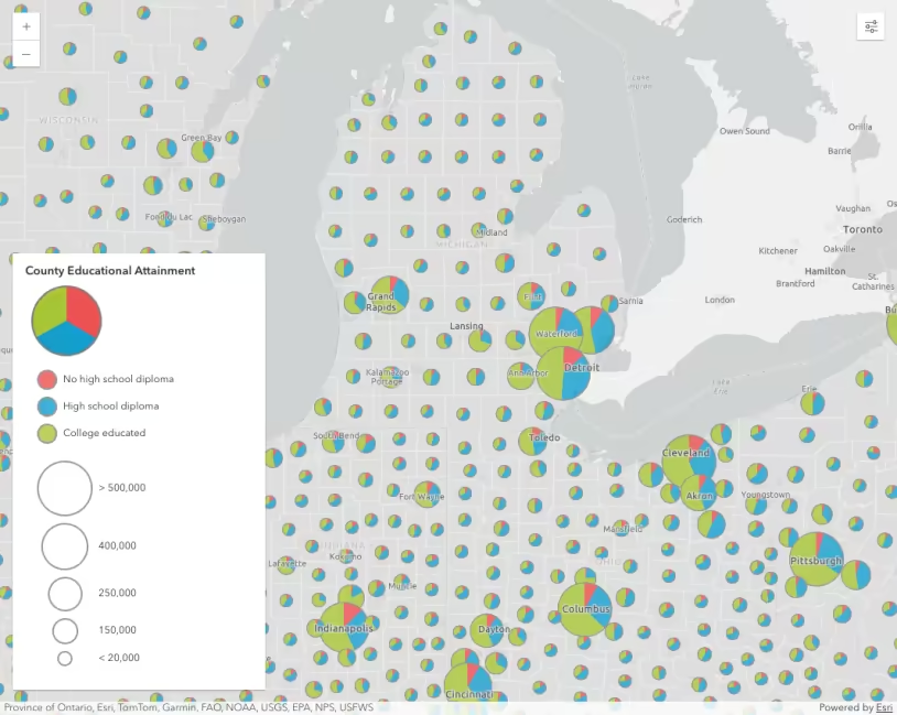
The following example demonstrates how to create a pie chart style where all charts have a consistent size for each feature. Generally, you should try to avoid creating charts that overlap. The size used in this example works well for the starting view scale, but is less successful at other scales. You should make larger charts as you zoom in to large scales and smaller charts as you zoom to small scales.
31 collapsed lines
<!doctype html><html> <head> <meta charset="utf-8" /> <meta name="viewport" content="width=device-width, initial-scale=1, shrink-to-fit=no" />
<title>Esri Developer Guide: Donut chart with size</title>
<link rel="stylesheet" href="https://js.arcgis.com/5.1/esri/themes/light/main.css" /> <!-- Load the ArcGIS Maps SDK for JavaScript from CDN --> <script type="module" src="https://js.arcgis.com/5.1/"></script>
<style> html, body, #viewDiv { height: 100%; margin: 0; } </style>
<script type="module"> const [WebMap, MapView, FeatureLayer, Legend, Expand] = await $arcgis.import([ "@arcgis/core/WebMap.js", "@arcgis/core/views/MapView.js", "@arcgis/core/layers/FeatureLayer.js", "@arcgis/core/widgets/Legend.js", "@arcgis/core/widgets/Expand.js", ]);
const colors = ["#00b6f1", "#d9bf0d", "#c44245", "#6a28c7"]; const renderer = { type: "pie-chart", othersCategory: { threshold: 0.05, color: "gray", }, attributes: [ { field: "GRADDEG_CY", label: "Master's degree or higher", color: colors[0], }, { valueExpression: "$feature.ASSCDEG_CY + $feature.BACHDEG_CY", label: "Undergraduate degree", color: colors[1], }, { valueExpression: "$feature.HSGRAD_CY + $feature.GED_CY + $feature.SMCOLL_CY", label: "High school degree", color: colors[2], }, { valueExpression: "$feature.NOHS_CY + $feature.SOMEHS_CY", label: "No high school", color: colors[3], }, ], size: 18, };57 collapsed lines
const layer = new FeatureLayer({ title: "Educational attainment", portalItem: { id: "1cbb0faa0f1f424bbe213bfae9319309", }, renderer, popupTemplate: { title: "{COUNTY}, {STATE}", content: "{expression/percent-educated} of the adults in this tract have a college degree.", expressionInfos: [ { name: "percent-educated", title: "Percent college educated", expression: ` var collegeEducated = $feature.GRADDEG_CY + $feature.BACHDEG_CY + $feature.ASSCDEG_CY; return ROUND(((collegeEducated/$feature.EDUCBASECY)*100),2)+ '%'`, }, ], }, });
const map = new WebMap({ portalItem: { id: "9cf503b654144873a8e33f996f91ba1d", }, layers: [layer], });
const view = new MapView({ container: "viewDiv", map: map, scale: 120000, center: [-112.0247, 33.4734], constraints: { snapToZoom: false, }, });
view.ui.add( new Expand({ content: new Legend({ view: view, }), view: view, expanded: false, }), "top-right", ); </script> </head>
<body> <div id="viewDiv"></div> </body></html>Pie charts with size
Varying pie chart sizes by the total or sum of all categories helps provide meaningful perspective to the map. Some patterns that emerge in pie chart styles may not be important if they represent very small populations. On the other hand, areas with large populations become more prominent when properly sized.
To vary pie charts by size, create a size variable using an Arcade expression that returns the sum of all categories considered in the pie chart’s attributes.
65 collapsed lines
<!doctype html><html> <head> <meta charset="utf-8" /> <meta name="viewport" content="width=device-width, initial-scale=1, shrink-to-fit=no" />
<title>Esri Developer Guide: Donut chart with size</title>
<link rel="stylesheet" href="https://js.arcgis.com/5.1/esri/themes/light/main.css" /> <!-- Load the ArcGIS Maps SDK for JavaScript from CDN --> <script type="module" src="https://js.arcgis.com/5.1/"></script>
<style> html, body, #viewDiv { height: 100%; margin: 0; } </style>
<script type="module"> const [WebMap, MapView, FeatureLayer, Legend, Expand] = await $arcgis.import([ "@arcgis/core/WebMap.js", "@arcgis/core/views/MapView.js", "@arcgis/core/layers/FeatureLayer.js", "@arcgis/core/widgets/Legend.js", "@arcgis/core/widgets/Expand.js", ]);
const colors = ["#00b6f1", "#d9bf0d", "#c44245", "#6a28c7"]; const renderer = { type: "pie-chart", othersCategory: { threshold: 0.05, color: "gray", }, attributes: [ { field: "GRADDEG_CY", label: "Master's degree or higher", color: colors[0], }, { valueExpression: "$feature.ASSCDEG_CY + $feature.BACHDEG_CY", label: "Undergraduate degree", color: colors[1], }, { valueExpression: "$feature.HSGRAD_CY + $feature.GED_CY + $feature.SMCOLL_CY", label: "High school degree", color: colors[2], }, { valueExpression: "$feature.NOHS_CY + $feature.SOMEHS_CY", label: "No high school", color: colors[3], }, ], size: 18, };
renderer.visualVariables = [ { type: "size", valueExpression: ` var all = [ $feature.NOHS_CY, $feature.SOMEHS_CY, $feature.HSGRAD_CY, $feature.GED_CY, $feature.SMCOLL_CY, $feature.ASSCDEG_CY, $feature.BACHDEG_CY, $feature.GRADDEG_CY ]; var total = Sum(all); return total; `, valueExpressionTitle: "Population 25+", minSize: "2px", maxSize: "48px", minDataValue: 1000, maxDataValue: 15000, }, ];57 collapsed lines
const layer = new FeatureLayer({ title: "Educational attainment", portalItem: { id: "1cbb0faa0f1f424bbe213bfae9319309", }, renderer, popupTemplate: { title: "{COUNTY}, {STATE}", content: "{expression/percent-educated} of the adults in this tract have a college degree.", expressionInfos: [ { name: "percent-educated", title: "Percent college educated", expression: ` var collegeEducated = $feature.GRADDEG_CY + $feature.BACHDEG_CY + $feature.ASSCDEG_CY; return ROUND(((collegeEducated/$feature.EDUCBASECY)*100),2)+ '%'`, }, ], }, });
const map = new WebMap({ portalItem: { id: "9cf503b654144873a8e33f996f91ba1d", }, layers: [layer], });
const view = new MapView({ container: "viewDiv", map: map, scale: 778263, center: [-112.0247, 33.4734], constraints: { snapToZoom: false, }, });
view.ui.add( new Expand({ content: new Legend({ view: view, }), view: view, expanded: false, }), "top-right", ); </script> </head>
<body> <div id="viewDiv"></div> </body></html>Donut charts
Some people prefer to represent pie charts in a donut shape. This is easily configured by setting the holePercentage property of the PieChartRenderer. A value of zero indicates no hole (i.e. a pie), and any value greater than zero creates a hole by a fixed percentage of the pie. For example, a holePercentage of 0.5 removes 50% of the pie.
This can make pie charts look more modern and provide a space to place a number label if desired.
31 collapsed lines
<!doctype html><html> <head> <meta charset="utf-8" /> <meta name="viewport" content="width=device-width, initial-scale=1, shrink-to-fit=no" />
<title>Esri Developer Guide: Donut chart with size</title>
<link rel="stylesheet" href="https://js.arcgis.com/5.1/esri/themes/light/main.css" /> <!-- Load the ArcGIS Maps SDK for JavaScript from CDN --> <script type="module" src="https://js.arcgis.com/5.1/"></script>
<style> html, body, #viewDiv { height: 100%; margin: 0; } </style>
<script type="module"> const [WebMap, MapView, FeatureLayer, Legend, Expand] = await $arcgis.import([ "@arcgis/core/WebMap.js", "@arcgis/core/views/MapView.js", "@arcgis/core/layers/FeatureLayer.js", "@arcgis/core/widgets/Legend.js", "@arcgis/core/widgets/Expand.js", ]);
const colors = ["#00b6f1", "#d9bf0d", "#c44245", "#6a28c7"]; const renderer = { type: "pie-chart",
holePercentage: 0.5,
othersCategory: { threshold: 0.05, color: "gray", }, attributes: [ { field: "GRADDEG_CY", label: "Master's degree or higher", color: colors[0], }, { valueExpression: "$feature.ASSCDEG_CY + $feature.BACHDEG_CY", label: "Undergraduate degree", color: colors[1], }, { valueExpression: "$feature.HSGRAD_CY + $feature.GED_CY + $feature.SMCOLL_CY", label: "High school degree", color: colors[2], }, { valueExpression: "$feature.NOHS_CY + $feature.SOMEHS_CY", label: "No high school", color: colors[3], }, ], size: 18, };79 collapsed lines
renderer.visualVariables = [ { type: "size", valueExpression: ` var all = [ $feature.NOHS_CY, $feature.SOMEHS_CY, $feature.HSGRAD_CY, $feature.GED_CY, $feature.SMCOLL_CY, $feature.ASSCDEG_CY, $feature.BACHDEG_CY, $feature.GRADDEG_CY ]; var total = Sum(all); return total; `, valueExpressionTitle: "Population 25+", minSize: "2px", maxSize: "48px", minDataValue: 1000, maxDataValue: 15000, }, ];
const layer = new FeatureLayer({ title: "Educational attainment", portalItem: { id: "1cbb0faa0f1f424bbe213bfae9319309", }, renderer, popupTemplate: { title: "{COUNTY}, {STATE}", content: "{expression/percent-educated} of the adults in this tract have a college degree.", expressionInfos: [ { name: "percent-educated", title: "Percent college educated", expression: ` var collegeEducated = $feature.GRADDEG_CY + $feature.BACHDEG_CY + $feature.ASSCDEG_CY; return ROUND(((collegeEducated/$feature.EDUCBASECY)*100),2)+ '%'`, }, ], }, });
const map = new WebMap({ portalItem: { id: "9cf503b654144873a8e33f996f91ba1d", }, layers: [layer], });
const view = new MapView({ container: "viewDiv", map: map, scale: 778263, center: [-112.0247, 33.4734], constraints: { snapToZoom: false, }, });
view.ui.add( new Expand({ content: new Legend({ view: view, }), view: view, expanded: false, }), "top-right", ); </script> </head>
<body> <div id="viewDiv"></div> </body></html>Related samples and resources
API support
| 2D | 3D | Arcade | Points | Lines | Polygons | Mesh | |
|---|---|---|---|---|---|---|---|
| | | | | | | | |
| | | | | | | | |
| | | | | | | ||
| | | | | | | | |
| | | | | | | | |
| | | | | | | | |
| | | | | | | | |
| | | | | | | | |
| | | | | | | | |
| | | |
- Color only
- Size variable creators only supported for points
- Size variable creators not supported in 3D