Version 1.0 of Calcite Design System has arrived! Calcite uses design-friendly web components to assist in the production of high quality mapping or UI (user interface) applications.
Consistent component API
Updates have been made across components to make a consistent and predictable API.
Calcite is a broad collaboration between design and development, which resulted in some differences in implementation between components. As we transitioned to the production release offered to the developer community, we defined strict rules for component implementation and programming patterns so developers can rely on a standard API across components. As a result, developers that built apps with the beta releases will likely have to update their code to match the latest component API. Consistency updates span the following areas:
- Naming, events, and property patterns
- Focus and blur events
- Options and methods for floating elements
- Disabled and readonly properties
For instance, to set the color on a component use the kind property in a Button, Alert, FAB, and other components.
<calcite-button kind="danger">A dangerous button</calcite-button>For more details, visit the full list of breaking changes.
Visual Studio IntelliSense
Calcite now supports IntelliSense in Visual Studio Code. You can quickly add components and their attributes or properties while writing your app. There is also accompanying documentation to help you along the way.
To setup IntelliSense, add the following to the .vscode/settings.json file in your project:
"html.customData": [
"./node_modules/@esri/calcite-components/dist/extras/vscode-data.json"
]Component sample playground
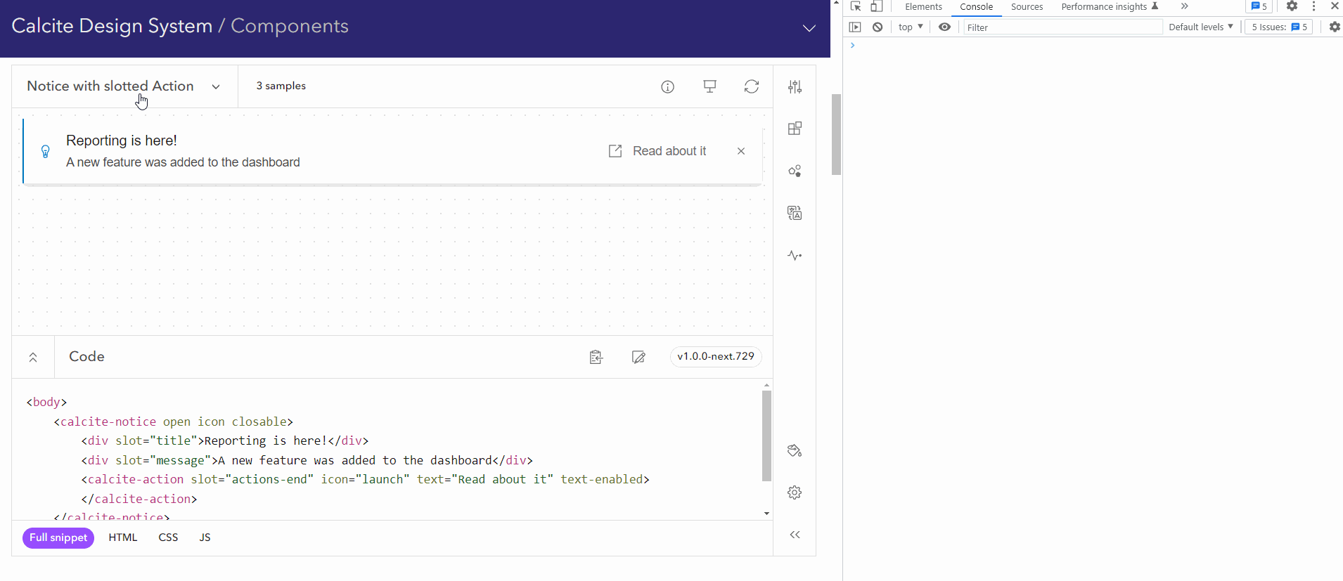
Each component page contains an interactive sample, which allows you to explore and interact with components. New to 1.0, we've added additional component configurations, including:
- Display previews and toggle the visibility of slots
- Modify CSS variables
- Interact with component events
- Update translations to a language and modify their values
- Explore theming and branding colors
- Examine HTML, CSS, and JavaScript code
- Explore multiple recommended patterns with variants
Accessibility
Calcite leverages the W3C Accessibility Standards to ensure the applications and experiences you create are usable by a wide range of audiences. We've added additional accessibility enhancements and resources to support you in developing accessible web applications.
Prefers reduced motion
The prefers-reduced-motion CSS media feature is used to detect if the user has requested that the system minimize the amount of non-essential motion it uses. The media feature has been integrated across Calcite, accommodating users that have enabled reduced motion.
High contrast mode
Windows high contrast mode is an accessibility feature that modifies the look of website and Windows applications by styling elements with user-defined colors. The result increases readability by reducing visual noise and allowing users to control the website’s contrast.
Calcite now offers high contrast for many of its components to support users in high contrast mode.
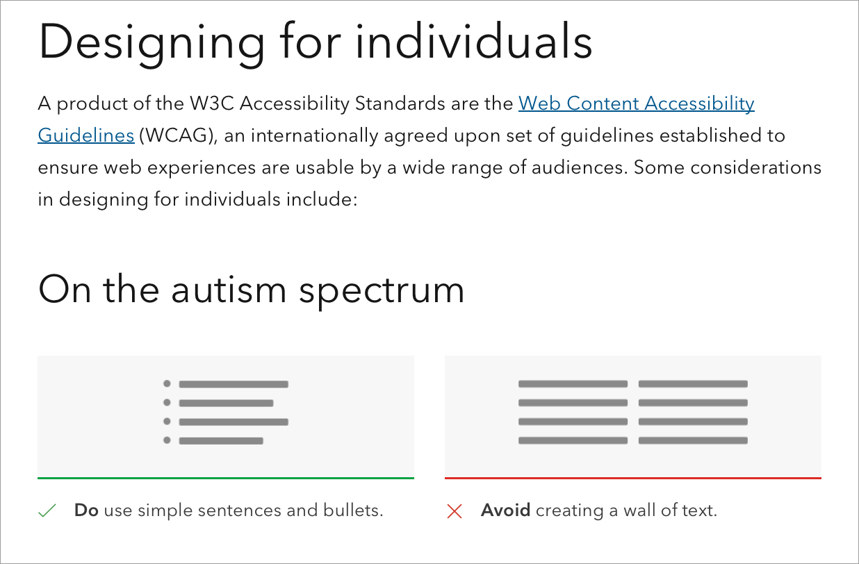
Designing for individuals
While Calcite is created with accessibility in mind, there are additional steps you can take to ensure a diverse audience can navigate, understand, and use the solutions you build.
Consult the new designing for individuals and accessibility checklist considerations throughout the development lifecycle of your application to ensure experiences are usable by a wide range of audiences.
Localization
Calcite supports localization, meaning the UI content can be adapted to a specific language and culture. Support includes changing the display language, regional formatting, utilizing numbering systems, and right-to-left (RTL) bidirectional content. With this release, components now have built-in translations for Calcite supported languages, among other localization-related enhancements, which are described below.
You can learn more in the new guide on Localization documentation standards.
Built in translations and regional formatting
If you set the lang in your application, Calcite's component strings will translate to a Calcite supported language. Additionally, some components such as Input Date Picker contain specific localization for desired language and country formats.
<!-- Sets the component's lang to English -->
<!-- Dates are formatted MM/DD/YYYY -->
<calcite-input-date-picker lang="en"></calcite-input-date-picker>
<!-- Sets the component's lang to English - Canada -->
<!-- Dates are formatted YYYY-MM-DD -->
<calcite-input-date-picker lang="en-CA"></calcite-input-date-picker>
<!-- Sets the component's lang to English - UK -->
<!-- Dates are formatted DD/MM/YYYY -->
<calcite-input-date-picker lang="en-GB"></calcite-input-date-picker>Numbering system
A numbering system defines the numerals used for conveying digits, which differ by language or region.
You can change certain component's numerals by setting the numbering property to a standard Unicode numeral system supported by Calcite. In general, the default numbering system is determined based on the browser's language settings. However, the default numbering system for Arabic languages is set to Latin to resolve browser inconsistencies, but can be overridden if necessary.
<calcite-input numbering-system="arab" lang="ar" dir="rtl" type="number" value="10"></calcite-input>Group separator
Number values can be displayed with a group separator, corresponding to the language and country format, by setting the group property on the Input, Input number, Pagination, and Slider components.
<calcite-input group-separator type="number" value="10000"></calcite-input>Right-to-left (RTL)
Calcite also provides bidirectional support for languages such as Arabic and Hebrew. To change the direction, set the dir attribute to rtl on the component, or in the <html or <body tag before the component.
<calcite-color-picker dir="rtl"></calcite-color-picker><html dir="rtl"></html>Mirroring icons
Some components contain icons, which can be mirrored using the flip-rtl property when building an app in rtl. Not all icons should be mirrored, such as those used for logos and branding, or clocks and circular directions of time.
<!-- Flip the Icon's element direction with flipRtl -->
<calcite-icon flip-rtl icon="arrow-bold-left"></calcite-icon>
<!-- Components with one icon pass iconFlipRtl as a boolean -->
<calcite-chip icon-flip-rtl icon="arrow-bold-left"></calcite-chip>
<!-- Components with multiple icons pass a string value to iconFlipRtl to flip one or both icons -->
<calcite-button icon-start="arrow-bold-left" icon-flip-rtl="start" icon-end="app-update" label="Return"></calcite-button>Colors and theming
With 1.0 we've updated our theming class names, which can be toggled in your app using their corresponding CSS classes: calcite-mode-light and calcite-mode-dark. There is also a calcite-mode-auto class which defers to the browser's prefers-color-scheme CSS media query to decide whether the light or dark mode will be used.
Setting the mode class on an element changes all of its child nodes as well. Therefore, to switch the entire application from light to dark, you can do the following:
<body class="calcite-mode-dark">
<!-- Your application content -->
</body>Additionally, we've added theming to the component sample playground so you can explore theming and branding colors to fit your UI.
In the below example application, we've added custom branding to fit the UI for both modes.
body {
--calcite-ui-brand: purple;
--calcite-ui-brand-hover: rgb(94, 0, 94);
--calcite-ui-brand-press: rgb(87, 0, 87);
}
body.calcite-dark-mode {
--calcite-ui-brand: rgb(125, 0, 209);
--calcite-ui-brand-hover: rgb(121, 0, 205);
--calcite-ui-brand-press: rgb(141, 0, 225);
}
Calcite Resources in Figma Community
You can now access Figma web UI kit, styles, and UI icons on Esri's Figma Community and stay up-to-date on the latest Calcite Figma resources, which will be updated regularly with each major Calcite release. You can also use the Figma Community to ask questions and provide suggestions related to Calcite's Figma resources.
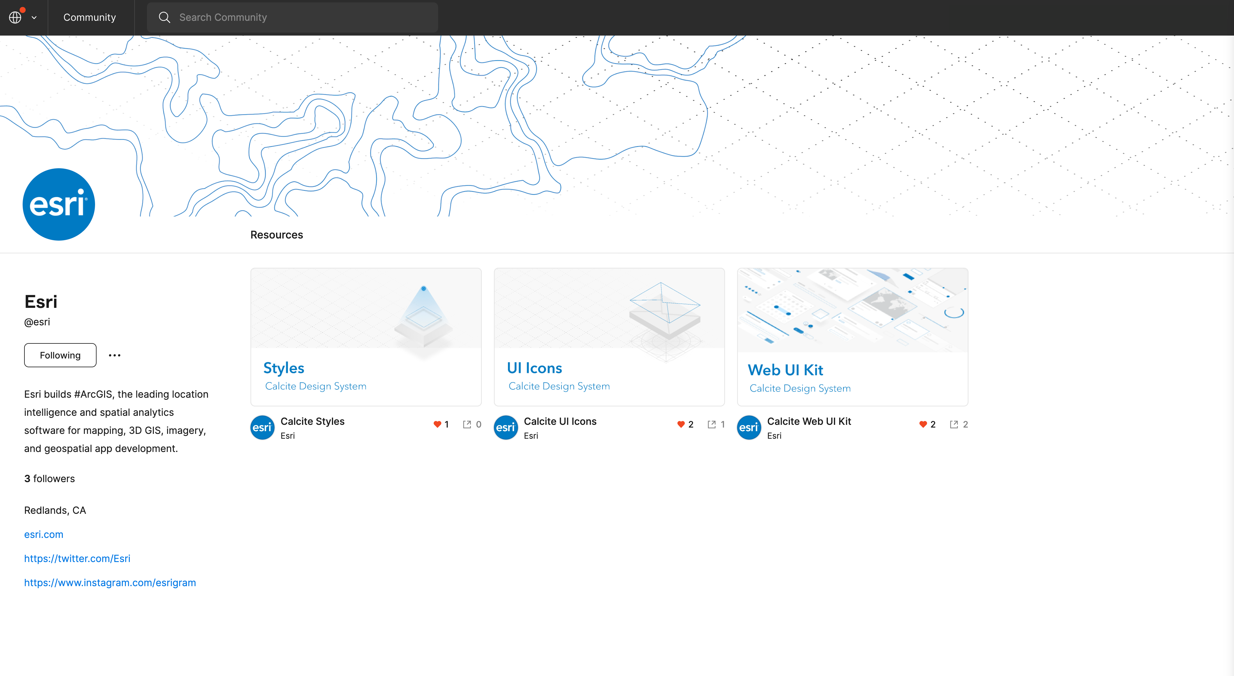
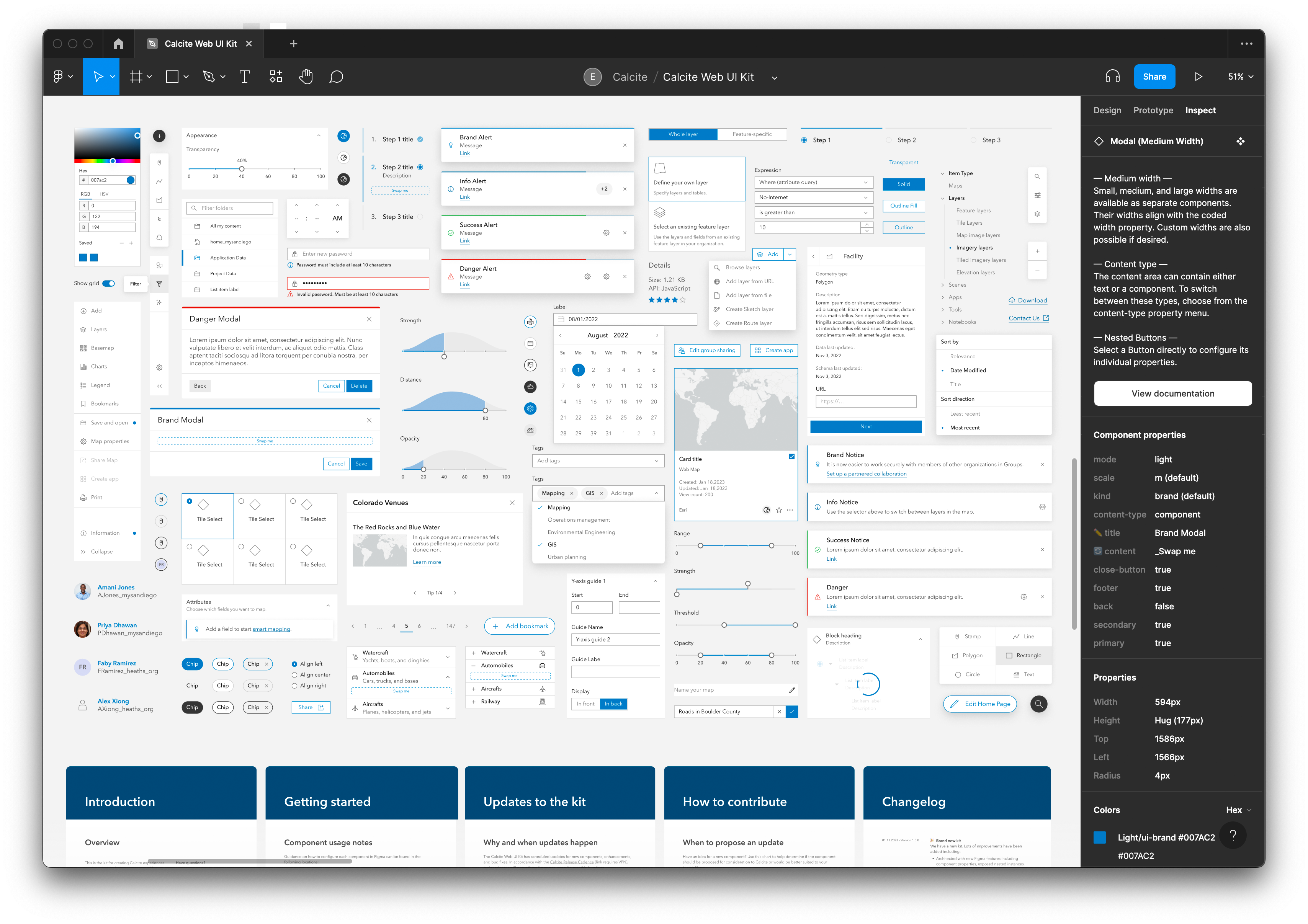
Figma UI Kit
We are introducing a new Figma UI kit that designers and developers can use to design applications with Calcite. You can design your UI inside Figma and have confidence that your design will align with a web app built with Calcite's components. The new UI kit will pair its releases to future Calcite releases and offers the following improvements over the beta version:
- Provides component usage guidance
- Includes sticker sheets and examples of component configurations
- Supports theming with light and dark modes
- An improved auto layout
- Architected with component properties, nested instances, and preferred instances
- Defined frame architecture and naming conventions
Additional Resources
Unfamiliar with web components? Learn more about web concepts and how to get started with Calcite. The builds for version 1.0 will be available through the ArcGIS CDN and NPM package.
You can also reach out to Technical Support, or visit Esri Community to ask questions, share ideas, and collaborate with others.
Framework integration
Components easily integrate with JavaScript frameworks and build tools. The Calcite Components Example Repository can help get you started, where each example contains framework specific information.