Updates since 3.2
Initiatives
- Swatch and Swatch Group components
- Component design tokens
- Expanded and collapsed events
- List drag-and-drop improvements
- Block enhancements
- Design system consistencies
- Built-in labels in forms
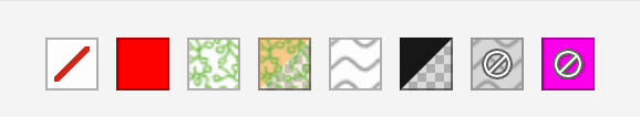
Swatch and Swatch Group components
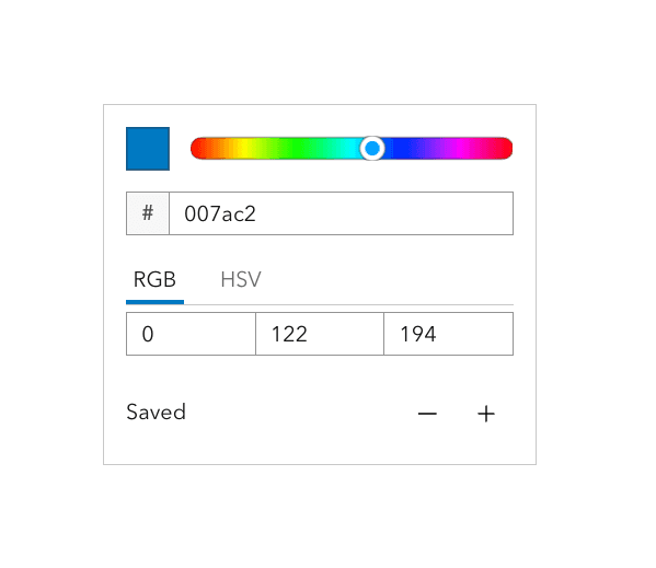
Introducing Calcite's two newest components, Swatch and Swatch Group. These components are designed for selection workflows across a variety of contexts. Swatch Group includes accessible selection affordance with keyboard navigation, along with clear active, selected, and disabled states. Swatch supports image and pattern fills in addition to solid colors, while hover and focus states have been refined for additional usability.
The new Swatch components now reside inherently within the Color Picker component for consistency.
single-select mode.
Component design tokens
Design tokens are named values across the design system, making it easier to keep interfaces consistent, accessible, and apply custom theming via CSS properties. Design tokens store a single source of truth through visual stylings such as colors, spacing, typography, and shadows.
Component tokens allow for the customization at the component level. For instance, adjusting a component's background color, border radius, or spacing. Explore design token usage to learn more about using design tokens in various use cases.
Component tokens are now available across the design system for more customization opportunities, where new tokens have been added to Color Picker, Dialog, Popover, Table, and many others. For a full list of new component tokens, visit the changes since 3.2 section.

<style>
#themed {
--calcite-color-picker-background-color: #fff5fb;
--calcite-color-picker-border-color: #eda1c6;
--calcite-color-picker-corner-radius: 12px;
}
</style>
<calcite-color-picker id="themed" alpha-channel scale="m"></calcite-color-picker>Expanded and collapsed events
Several interactive components including Accordion Item, Action Bar, Block, and List Item now emit expanded and collapsed events. These lifecycle events make it easier to observe and react to UI state changes, coordinate animations, manage focus, and synchronize application state across components.

calciteActionBarCollapse and calciteActionBarExpand events.
const actionBarElement = document.getElementById("action-bar");
const labelElement = document.getElementById("example-label");
actionBarElement.addEventListener("calciteActionBarExpand", (event) => {
labelElement.innerText = "Action Bar - Expanded"
});
actionBarElement.addEventListener("calciteActionBarCollapse", (event) => {
labelElement.innerText = "Action Bar - Collapsed";
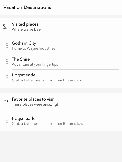
});List drag-and-drop improvements
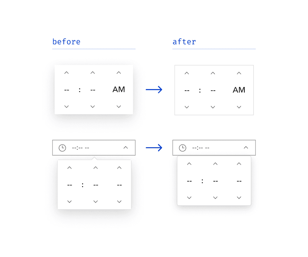
List has been improved with several refinements to make drag-and-drop interactions more intuitive and reliable. When starting a drag event on a List Item, the open drag handle menus now close automatically, preventing them from lingering or appearing misaligned during the operation. This ensures a seamless dragging experience and avoids confusing visual overlaps.
In addition, List now supports a new cloning behavior that allows List Items to be duplicated into a target List while remaining in the source List. This behavior can be enabled when the drag property is true and by setting the source List's can property to "clone". To communicate this functionality, the drag handle menu reflects the new behavior with the label “Add to” instead of “Move to”.
By default, drag-and-drop remains in “move” mode. Cloning is only enabled when explicitly configured.
dragEnabled and canPull is set to "clone".
<calcite-panel heading="Vacation Destinations">
<calcite-block expanded heading="Visited places" description="Where we've been" icon-start="tour">
<calcite-list id="visited-places" drag-enabled group="places-group" label="Visited places">
<calcite-list-item label="Gotham City" description="Home to Wayne Industries" value="gotham-city">
</calcite-list-item>
<calcite-list-item label="The Shire" description="Adventure at your fingertips" value="the-shire">
</calcite-list-item>
<calcite-list-item label="Hogsmeade" description="Grab a butterbeer at the Three Broomsticks" value="hogsmeade">
</calcite-list-item>
</calcite-list>
</calcite-block>
<calcite-block expanded heading="Favorite places to visit" description="Where we'd like to go" icon-start="heart">
<calcite-list drag-enabled group="places-group" label="Favorite places">
<calcite-list-item label="Hogsmeade" description="Grab a butterbeer at the Three Broomsticks" value="hogsmeade">
</calcite-list-item>
</calcite-list>
</calcite-block>
</calcite-panel>
<script>
const visitedPlacesList = document.getElementById("visited-places");
// Stop items from the "visited places" List from being "moved to" or "cloned" to another List
visitedPlacesList.canPut = () => false;
// Allow items from all other Lists to be "added to" or "cloned" to the "visited places" List
visitedPlacesList.canPull = () => "clone";
</script>Block enhancements
Block now includes the scale property with values of "s", "m", and "l" to support a wider range of layout needs. The medium, or "m", scale matches the sizing used in 3.2 and earlier versions. In addition, Block Section has been updated with consistent top padding for slotted content, in alignment with Block and improving the overall visual balance when using labels or form controls.

Design system consistencies
The Label component’s layout property has been updated to replace the "default" value with "block", providing a clearer and more meaningful definition. The "default" value is now deprecated and will be removed in an upcoming breaking change release.
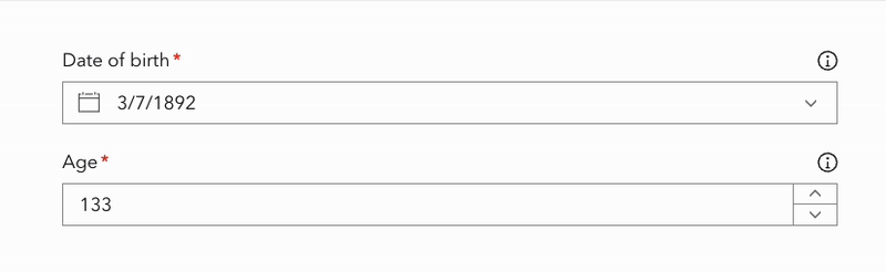
Built-in labels in forms
Form components now support built-in labels with new affordances to improve clarity and accessibility, including:
- A required indicator dot is displayed when the
requiredproperty istrue. - On mouse hover, a tooltip provides additional context on the indicator dot, ensuring that the required state is communicated.
- A
"label-content"slot, which allows configuration of icons directly within the Label. - Enhanced accessibility support with the
aria-requiredattribute, ensuring required fields are announced to assistive technologies, such as screen readers.
<form>
<calcite-input-date-picker scale="m" value="1892-03-07" label-text="Date of birth" required>
<calcite-icon slot="label-content" icon="information" scale="s"></calcite-icon>
</calcite-input-date-picker>
<calcite-input-number placeholder="Enter your age" scale="m" value="133" step="1" label-text="Age" required>
<calcite-icon slot="label-content" icon="information" scale="s"></calcite-icon>
</calcite-input-number>
</form>Feature enhancements
- Accordion Item content slots
- Accordion Item's
headingpropertyLevel - Time Picker shadow
- Foreground.highlight token
- Color Picker's
fieldpropertyDisabled - Slider UI/UX drag improvements
- Autocomplete Item's
calciteeventAutocomplete Item Select - Action's
typeproperty - Date Picker's one month view
- Combobox no results filtering
Accordion Item content slots
Accordion Item now supports two new locations for adding content to the header with the content-start and content-end slots. These place content on the left and right sides of the heading and description text, offering more configuration possibilities and can be useful when displaying custom icons.

content-start and content-end slots for more customization.
Accordion Item's heading property
The Accordion Item component now includes a heading property, allowing the heading property to be rendered as a specific heading level (1-6). The new property is useful for ensuring proper document structure and accessibility, without affecting visual styling.
<calcite-accordion>
<calcite-accordion-item heading="Frequently Asked Questions" heading-level="2">
<div>
<h3>What is a Design System?</h3>
<p>...</p>
</div>
</calcite-accordion-item>
</calcite-accordion>Time Picker shadow
Time Picker has been updated to align with Color Picker and Date Picker, removing a redundant shadow and adding a border with rounded corners to increase visual consistency.
Foreground.highlight token
The foreground.current color token has been deprecated, and foreground.highlight has been added in its place to improve naming clarity and better reflect the token's purpose. Additionally, the light and dark mode values have been adjusted to enhance selection state visibility.


foreground.highlight token has been added in place of foreground.current, along with updated color values.
Color Picker's field property
Color Picker now includes a field property that allows the disabling of the upper color graph portion of the component. This is useful when space is limited or if the graph input method is not needed.
<calcite-color-picker field-disabled></calcite-color-picker>
field property.
Slider UI/UX drag improvements
Slider has been enhanced to improve the drag experience. The handles will now respond more intuitively when at the ends of the track or stacked on top of each other, creating smoother and more predictable interactions.
Autocomplete Item's calcite event
Autocomplete Item now emits a calcite event when selected via click or keyboard interaction. This provides more flexibility for handling item selection, particularly in scenarios when more item context is needed.
calcite event provides access to all the Autocomplete Item information.
Action's type property
Action now includes a type property that supports HTML button types, providing more options and ensuring proper behavior in forms.
<form>
<calcite-action type="submit" icon="check" text="Submit Form" text-enabled></calcite-action>
<calcite-action type="reset" icon="undo" text="Reset Form" text-enabled></calcite-action>
</form>Date Picker's one month view
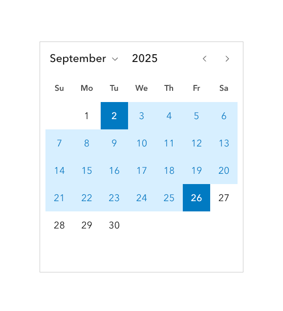
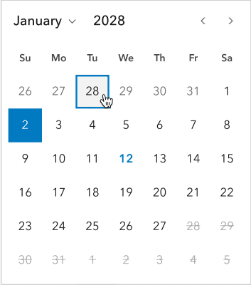
Date Picker and Input Date Picker now include a calendars property, which when configured in range mode, displays the component as one or two months. By default, the component displays a two month view, with a value of 2, while a value of 1 will display a single month view. The single month view provides a more compact option for mobile or limited space scenarios, while still supporting proper date range selection.
<calcite-date-picker range calendars="1"></calcite-date-picker>
Combobox no results filtering
Combobox has been enhanced to improve user feedback and actions when no matching items are found during filtering. In this case, the component will now display a message below the input field, which varies based on the allow-custom-values property.
If allow-custom-values is false, the message states "No Matches", giving clear feedback that no items matched the user's input.

If allow-custom-values is true, the message "Add [search term]" is rendered, communicating to the user that their input can be added as a custom value. Clicking the message, pressing enter, or blurring the input will submit the custom value.

In both cases, the messages can be customized with the message property, which accepts the no and add object properties respectively. For more information on localization options, refer to Calcite's languages.
Accessibility and internationalization
- Input Time Picker
label - Announce Input Date Picker input context
- Date Picker's improved color contrast
- More support with
iconandiconpropertiesFlip RTL - Autocomplete's status messages
setobject property supportFocus() - Prevent Modal's return focus when removing from DOM
- Bosnian locale mapping
- Support German translations for List sorting
Input Time Picker label
The Input Time Picker component includes a new label attribute, providing information to assistive technologies. The attribute offers additional context about the component, making it more accessible to a broader range of audiences.
<calcite-input-time-picker label="2025 5k fall leaf run start time"></calcite-input-time-picker>Announce Input Date Picker input context
Input Date Picker offers additional context when configured in range mode, where the component's start and end date context is provided to assistive technologies when each input is in focus.
The content can also be customized with the message property, which accepts start and end object properties to fit use cases. For more information on localization options, refer to Calcite's languages.
Date Picker's improved color contrast
The Date Picker component has improved the color contrast for its next and previous months and days. Now, when interacting with the component its interactive states provide more contrast, enhancing its usability and accessibility to more audiences.
More support with icon and icon properties
The Dialog, Flow Item, and Panel components now offer icon and icon properties, providing consistency in design and with other components such as Block and Accordion. The icon property ensures icons are scalable and have a consistent look and feel with other components.
Icons can also be mirrored for right-to-left (RTL) bidirectional support with the icon property, such as left and right icons used for navigation. However, not all icons should be mirrored (e.g., logos). Learn more on how to mirror icons in RTL.
<body dir="rtl">
<calcite-dialog open heading="Return to main menu" icon="caret-left" icon-flip-rtl>
...
</calcite-dialog>
</body>Autocomplete's status messages
Autocomplete now announces dynamic search results to assistive technologies, providing context as the user interacts with the component. As the user enters text into the component and results are displayed visually, the results are also announced to assistive technologies, such as screen readers.
set object property support
The set method now offers a prevent object property, allowing focus to be shifted to a component, while not scrolling the browser to the newly-focused component. The default value of prevent is false, meaning the browser will scroll the component into view after focusing, and when prevent is set to true, browser scrolling does not occur.
const noScrollCarouselEl = document.getElementById("no-scroll-carousel");
noScrollCarouselEl.setFocus({ preventScroll: true });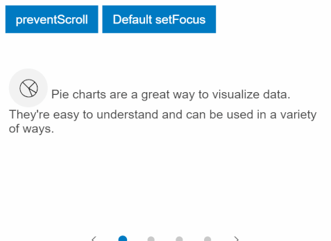
Prevent Modal's return focus when removing from DOM
When the Dialog, Popover and Sheet components are removed from the DOM and focus trapping is enabled, the component's returned focus can be removed by setting the focus property's return object property to false.
const removableDialogEl = document.getElementById("removable-dialog");
removableDialogEl.focusTrapOptions = {
returnFocusOnDeactivate: false
};Bosnian locale mapping
The Bosnian or "bs" locale is now mapped to "sr- instead of the previous mapping of "bs-. The update now uses the Latin alphabet for dates and months instead of the Cyrillic alphabet. Learn more about Calcite's supported numbering systems.
Support German translations for List sorting
When List has dragging enabled via the drag property it now provides distinct German translations when sorting to the component's top, bottom, up, and down.
<calcite-list lang="de" label="Park features" drag-enabled>
...
</calcite-list>Changes since 3.2
A full list of changes since 3.2 include:
Features
- accordion-item: Add content-start and content-end slots (#12849) (67a9509)
- accordion-item: Add headingLevel property (#12240) (5f02b5c)
- accordion-item: Add title to expand icon (#12657) (e691a3a)
- action: Add type property (#12624) (c9dd7d9)
- action: Make actions fill full width of parent (#12047) (7b9dfd7)
- Add focus options support (#12555) (58148cc)
- Add internal label across form components (#12499) (6b38dd8)
- autocomplete-item: Add
calciteevent (#12655) (61dcbfa)Autocomplete Item Select - block, block-section, block-group: Add scale property (#12382) (28b9da8)
- block: Add --calcite-block-content-space css token (#12704) (7f1167a)
- button: Add css property for shadow (#12603) (12bfdae)
- carousel: Add component tokens (#12474) (385a83b)
- checkbox: Enhance component's interactivity states (#12207) (f00e45b)
- color-picker: Add component tokens (#12862) (5dffbf3)
- color-picker: Support hiding color-field (#12484) (c4e42b6)
- combobox: Add
--calcite-combobox-divider-color(#12223) (9d5b55d) - combobox: Provide context when filtering and there are no matching results (#12525) (e1b32b9)
- combobox: Single-persist mode ignores clearDisabled (#12757) (ce36c6c)
- date-picker, input-date-picker: Add
calendarsproperty to support one month view in range (#12479) (f5357c6) - dialog, modal, popover, sheet: Add
settoReturn Focus focus(#12513) (50a371a)Trap Options - dialog, panel, flow-item: Add
iconandiconproperties (#12176) (e03222c)Flip Rtl - dialog: Add component tokens (#12553) (0088f2e)
- Emit
expanded/collapsedend-state events for expandable components (#12580) (e0e686b) - input-date-picker: Add component tokens (#11734) (a3c152a)
- input-number, input-text: Add center alignment (#12695) (6e0739b)
- input-text: Add component tokens (#12242) (9edff0c)
- input-time-picker: Add component tokens (#12874) (5134270)
- input: Add title to clear button (#12807) (6b160c0)
- label: Add new layout "block" (#12552) (66c4b7b)
- list, block-group, sort-handle: Add sortDisabled property to prevent reordering (#12615) (2a41b0f)
- list, block-group, sort-handle: Add support for cloning dragged items (#12628) (2f0246a)
- Make version console message easier to disable (#12194) (b2f8ddf)
- panel: Add
collapseas public property (#12813) (9675814)Direction - popover: Add token for specifying the max width (#12516) (bb8dac9)
- radio-button: Enhance component's interactivity states (#12169) (5999bac)
- select: Add component tokens (#12812) (25de1ca)
- split-button: Add component tokens (#12756) (82f107e)
- stepper-item: Improve single selection icon color (#12436) (c2c6037)
- swatch, swatch-group: Add new components (#12584) (6d6d3d1)
- swatch: Use label for visual title (#12841) (7dbbc91)
- table, table-row, table-header, table-cell: Add component tokens (#11770) (8a0168c)
- time-picker: Apply consistent styling for floating elements (#12467) (c1d13ba)
- time-picker: Apply rounded corners inside popover (#12502) (3ad12dd)
- tokens: Add missing line height tokens (#12798) (3bf135d)
- tooltip: Add css custom property for setting max size (#12865) (83911fc)
Bug Fixes
- accordion-item: Fix font size for headingLevel property (#12269) (448880d)
- action-menu: Ensure children are ready before setting a11y attributes (#12533) (1f83000)
- action: Fix applied tokens when active (#12686) (d58901e)
- autocomplete: Announce result to screen readers using aria-live attribute (#12443) (0988e98)
- block: Allow customizing heading text color when expanded & deprecate tokens (#12777) (98b4348)
- block: Icon-end aligns with header container when collapsible is false (#12784) (4565b90)
- block: No longer renders an empty header (#12801) (9904507)
- card: Ensure
setfocuses card when it contains nested interactive children (#12724) (2fbcd99)Focus - chip: Adjust interactivity states enhancements (#12329) (608c006)
- color-picker: Adjust component spacing (#12767) (4325d8b)
- color-picker: Ensure channel values are rounded (#12239) (ba4e470)
- combobox: Adjust padding for no-matches context (#12781) (e309828)
- date-picker: Honor
min&As Date maxwhen set (#12706) (de8afed)As Date - date-picker: Improve color contrast for days (#12705) (0930c30)
- dialog, flow-item, panel: Fix
iconnot working in RTL contexts (#12668) (b2c22c9)Flip Rtl - dialog: Ensure beforeClose is called once and fix animation on dialog (#12152) (0898b7c)
- dialog: Fix for corner radius token (#12859) (ee05c4d)
- dialog: Restrict resizing once minimum size has been reached (#12175) (cd03d14)
- Emit
beforeandOpen beforeimmediately on toggle (#11965) (5955929)Close - Ensure initial transitions are applied consistently (#12392) (a82aeb2)
- Ensure transition-duration is used in Tailwind utils (#12167) (fc842ee)
- input-date-picker: Announces the purpose of each input in the range mode (#12238) (c64169e)
- input-date-picker: No longer close when non-interactive areas are clicked in Safari (#12139) (69016b1)
- input-date-picker: Update start & end date correctly when
proximity-selection-disabledis true (#12681) (67336ab) - input-number: Add token to customize icon color (#12414) (63c68b8)
- input-time-picker: Add label property (#12276) (2e06dd1)
- input-time-picker: Apply aria-label and aria-controls attributes correctly to support NVDA and JAWS (#12312) (ffd0cd7)
- input-time-picker: Ensure programmatic value setting updates input display (#12233) (fd69e89)
- input-time-zone: Display 'city, country' when control closed and value set programatically (#12252) (684062e)
- input, input-number, input-text: Ensure overlay does not obscure input icon (#12716) (926826f)
- input, input-number, input-text: Stretch the height of slot container to match with component (#12339) (3d24364)
- input: Do not obscure picker button with type=datetime-local (#12081) (db4bd12)
- link: Emit click event on enter key when the component doesn't have href defined (#12191) (409915c)
- list, block-group: Emit calciteListOrderChange on destination when adding or moving from the menu (#12799) (916f081)
- list, block-group: Fix canPull when cloning and "Add to" menu on block-group (#12741) (78b15e2)
- list, block-group: Sort handle menu should respond to new lists or label changes (#12848) (df453bb)
- list, block-group: Update menu item labels and call
can/Put canto filter items before opening a sort handle menu (#12487) (9c9ff9c)Pull - list, block-group: Update sort handle move items before dropdown menu is opened (#12722) (298a7f1)
- list: Added scrim for empty list (#12595) (7a5cc96)
- list: Fix visual artifacts when you initiate a drag operation with the drag handle menu open (#12611) (b317e50)
- list: Prevent drag flickering while sorting (#12631) (accef27)
- list: Reorder options not shown in nested list drag menus (#12186) (08bfe98)
- Map
bslocale tosr-(#12566) (298a7ba)Latn- CS - pagination: Prevent invalid start-item (#12557) (494e33f)
- panel: Alert slot should not take up any height (#12802) (c51b968)
- panel: Prevent child panels from closing parent panels (#12646) (15da3ce)
- popover, tooltip: Do not close when a click was initiated inside the component (#12543) (a35e96a)
- popover, tooltip: Open when there is selected text on the page (#12597) (4274d65)
- radio-button: Fix navigation with disabled buttons (#12514) (d1b1ccb)
- segmented-control: Avoid changing focus from programmatic item selection (#12181) (e3be05e)
- select: Fix error thrown when component is removed before initialization (#12630) (ec661db)
- sheet, shell: Fix resize handle in RTL direction (#12205) (cc58fc4)
- semantic-tokens: Add
--calcite-color-surface-highlightand update referenced core tokens ([#10756] (https://github.com/Esri/calcite-design-system/issues/10756)) ([6fdc92] (https://github.com/Esri/calcite-design-system/commit/6fdc9d2d9ea43c87ae1fded32895145647dfc389)) - shell-center-row: Fix rendering tied to named-slot content (#10451) (5b15a02)
- shell-panel: Allow content to extend the full height of the panel (#12860) (52bed19)
- shell-panel: Restore resized size after expanding (#12691) (0779250)
- slider: Allow range handle dragging in either direction when both handles share the same position (#12527) (d9c7bfa)
- slider: Remove fill color when dragged handle is released and no longer has focus (#12511) (5db048f)
- stepper-item: Remove margin when slotted content is empty (#12298) (6b1d099)
- stepper: Disallow navigation to disabled items (#12217) (cbe160f)
- swatch: Ensure corner radius css property is correctly applied (#12855) (50405aa)
- title: Apply alignment on slotted content (#12451) (93b470a)
- tokens: Restore
--calcite-color-focus(#11960) (0432a20)
Deprecations
- combobox: Remove
--calcite-combobox-item-border-color(9d5b55d) - label: Deprecate
"default"layout value. (66c4b7b) - semantic-tokens: Deprecate
--calcite-color-foreground-current(#10756) (6fdc92)
Compatibility
The 4.33 release of the ArcGIS Maps SDK for JavaScript supports Calcite version 3.2.1. In your application, we recommend using the same version or any minor version greater than ^3.2.1.
If you are using version 4.32 it is recommended to use Calcite's 3.0.3, or any minor version greater than ^3.0.3.