import Attachments from "@arcgis/core/widgets/Attachments.js";const Attachments = await $arcgis.import("@arcgis/core/widgets/Attachments.js");- Since
- ArcGIS Maps SDK for JavaScript 4.15
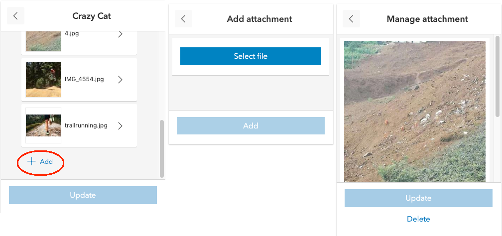
This widget allows users to view and edit attachments associated with a feature and is considered a standalone experience that can be utilized in widgets such Popup and Editor. When viewing attachments, the attachment's thumbnail, file format, and size are displayed. The Popup widget uses this widget's functionality to display attachments. Whereas the Editor widget has the functionality to edit attachments automatically configured within it.
If the associated feature layer(s) contains an attachment capability,
the widget will recognize it as such. And based on the functionality needed, will display the attachment for viewing
or editing.
If needing to edit attachments, the feature layer must first be enabled for editing. The ability to create, update, and delete attachments will display based on the feature layer's editing permissions.
Known Limitations
Editing attachments is currently available using the Editor widget.
The following image displays the various displays of the attachment widget.
Constructors
Constructor
Parameters
| Parameter | Type | Description | Required |
|---|---|---|---|
| properties | | |
Properties
| Property | Type | Class |
|---|---|---|
| | ||
| | ||
| | ||
container inherited | HTMLElement | null | undefined | |
declaredClass readonly inherited | ||
destroyed readonly inherited | ||
| | ||
error readonly | | |
| | ||
Icon["icon"] | | |
id inherited | ||
label inherited | ||
submitting readonly | | |
| | ||
visible inherited | ||
| |
capabilities
- Since
- ArcGIS Maps SDK for JavaScript 4.27
The capabilities needed for the attachments widget.
container
- Type
- HTMLElement | null | undefined
The ID or node representing the DOM element containing the widget. This property can only be set once. The following examples are all valid use case when working with widgets.
Examples
// Create the HTML div element programmatically at runtime and set to the widget's containerconst basemapGallery = new BasemapGallery({  view: view,  container: document.createElement("div")});
// Add the widget to the top-right corner of the viewview.ui.add(basemapGallery, {  position: "top-right"});
// Specify an already-defined HTML div element in the widget's container
const basemapGallery = new BasemapGallery({ view: view, container: basemapGalleryDiv});
// Add the widget to the top-right corner of the viewview.ui.add(basemapGallery, { position: "top-right"});
// HTML markup<body> <div id="viewDiv"></div> <div id="basemapGalleryDiv"></div></body>// Specify the widget while adding to the view's UIconst basemapGallery = new BasemapGallery({ view: view});
// Add the widget to the top-right corner of the viewview.ui.add(basemapGallery, { position: "top-right"}); displayType
- Type
- AttachmentsDisplay
String indicating how to display the attachments.
| Value | Description |
|---|---|
| auto | Default value. If a feature layer's capabilities supports resizing attachments, the popup will display attachments in preview mode. |
| preview | Shows a thumbnail image of the attachment. |
| list | Shows a list of attachment links. |
- Default value
- "auto"
icon
- Type
- Icon["icon"]
- Since
- ArcGIS Maps SDK for JavaScript 4.27
Icon which represents the widget. It is typically used when the widget is controlled by another one (e.g. in the Expand widget).
- Default value
- "attachment"
submitting
- Type
- boolean
- Since
- ArcGIS Maps SDK for JavaScript 4.27
Indicates whether there is currently an attachment being added, updated or deleted.
- Default value
- false
viewModel
- Type
- AttachmentsViewModel
The view model for this widget. This is a class that contains all the logic (properties and methods) that controls this widget's behavior. See the AttachmentsViewModel class to access all properties and methods on the widget.
visible
- Type
- boolean
Indicates whether the widget is visible.
If false, the widget will no longer be rendered in the web document. This may affect the layout of other elements or widgets in the document. For example, if this widget is
the first of three widgets associated to the upper right hand corner of the DefaultUI, then the other widgets will reposition when this widget is made invisible.
For more information, refer to the css display value of "none".
- Default value
- true
Example
// Hides the widget in the viewwidget.visible = false; visibleElements
- Type
- VisibleElements
- Since
- ArcGIS Maps SDK for JavaScript 4.27
The visible elements that are displayed within the widget. This property provides the ability to turn individual elements of the widget's display on/off.
Methods
| Method | Signature | Class |
|---|---|---|
classes inherited | classes(...classNames: ((string | null | undefined) | ((string[] | Record<string, boolean>) | null | undefined) | false | null | undefined)[]): string | |
destroy inherited | destroy(): void | |
emit inherited | emit<Type extends EventNames<this>>(type: Type, event?: this["@eventTypes"][Type]): boolean | |
hasEventListener inherited | hasEventListener<Type extends EventNames<this>>(type: Type): boolean | |
isFulfilled inherited | isFulfilled(): boolean | |
isRejected inherited | isRejected(): boolean | |
isResolved inherited | isResolved(): boolean | |
on inherited | on<Type extends EventNames<this>>(type: Type, listener: EventedCallback<this["@eventTypes"][Type]>): ResourceHandle | |
postInitialize inherited | postInitialize(): void | |
render inherited | render(): any | null | |
renderNow inherited | renderNow(): void | |
scheduleRender inherited | scheduleRender(): void | |
when inherited | when<TResult1 = this, TResult2 = never>(onFulfilled?: OnFulfilledCallback<this, TResult1> | null | undefined, onRejected?: OnRejectedCallback<TResult2> | null | undefined): Promise<TResult1 | TResult2> |
classes
- Signature
-
classes (...classNames: ((string | null | undefined) | ((string[] | Record<string, boolean>) | null | undefined) | false | null | undefined)[]): string
A utility method used for building the value for a widget's class property.
This aids in simplifying css class setup.
Parameters
- Returns
- string
The computed class name.
Example
// .tsx syntax showing how to set css classes while rendering the widget
render() {  const dynamicClasses = {    [css.flip]: this.flip,    [css.primary]: this.primary  };
return ( <div class={classes(css.root, css.mixin, dynamicClasses)} /> );} emit
- Signature
-
emit <Type extends EventNames<this>>(type: Type, event?: this["@eventTypes"][Type]): boolean
- Type parameters
- <Type extends EventNames<this>>
Emits an event on the instance. This method should only be used when creating subclasses of this class.
hasEventListener
- Signature
-
hasEventListener <Type extends EventNames<this>>(type: Type): boolean
- Type parameters
- <Type extends EventNames<this>>
Indicates whether there is an event listener on the instance that matches the provided event name.
Parameters
| Parameter | Type | Description | Required |
|---|---|---|---|
| type | Type | The name of the event. | |
- Returns
- boolean
Returns true if the class supports the input event.
isFulfilled
- Signature
-
isFulfilled (): boolean
isFulfilled() may be used to verify if creating an instance of the class is fulfilled (either resolved or rejected).
If it is fulfilled, true will be returned.
- Returns
- boolean
Indicates whether creating an instance of the class has been fulfilled (either resolved or rejected).
isRejected
- Signature
-
isRejected (): boolean
isRejected() may be used to verify if creating an instance of the class is rejected.
If it is rejected, true will be returned.
- Returns
- boolean
Indicates whether creating an instance of the class has been rejected.
isResolved
- Signature
-
isResolved (): boolean
isResolved() may be used to verify if creating an instance of the class is resolved.
If it is resolved, true will be returned.
- Returns
- boolean
Indicates whether creating an instance of the class has been resolved.
on
- Signature
-
on <Type extends EventNames<this>>(type: Type, listener: EventedCallback<this["@eventTypes"][Type]>): ResourceHandle
- Type parameters
- <Type extends EventNames<this>>
Registers an event handler on the instance. Call this method to hook an event with a listener.
Parameters
| Parameter | Type | Description | Required |
|---|---|---|---|
| type | Type | An event or an array of events to listen for. | |
| listener | EventedCallback<this["@eventTypes"][Type]> | The function to call when the event fires. | |
- Returns
- ResourceHandle
Returns an event handler with a
remove()method that should be called to stop listening for the event(s).Property Type Description remove Function When called, removes the listener from the event.
Example
view.on("click", function(event){ // event is the event handle returned after the event fires. console.log(event.mapPoint);}); when
- Signature
-
when <TResult1 = this, TResult2 = never>(onFulfilled?: OnFulfilledCallback<this, TResult1> | null | undefined, onRejected?: OnRejectedCallback<TResult2> | null | undefined): Promise<TResult1 | TResult2>
when() may be leveraged once an instance of the class is created. This method takes two input parameters: an onFulfilled function and an onRejected function.
The onFulfilled executes when the instance of the class loads. The
onRejected executes if the instance of the class fails to load.
Parameters
| Parameter | Type | Description | Required |
|---|---|---|---|
| onFulfilled | OnFulfilledCallback<this, TResult1> | null | undefined | The function to call when the promise resolves. | |
| onRejected | The function to execute when the promise fails. | |
- Returns
- Promise<TResult1 | TResult2>
Returns a new promise for the result of
onFulfilledthat may be used to chain additional functions.
Example
// Although this example uses MapView, any class instance that is a promise may use when() in the same waylet view = new MapView();view.when(function(){ // This function will execute once the promise is resolved}, function(error){ // This function will execute if the promise is rejected due to an error});