import CatalogLayerList from "@arcgis/core/widgets/CatalogLayerList.js";const CatalogLayerList = await $arcgis.import("@arcgis/core/widgets/CatalogLayerList.js");- Since
- ArcGIS Maps SDK for JavaScript 4.30
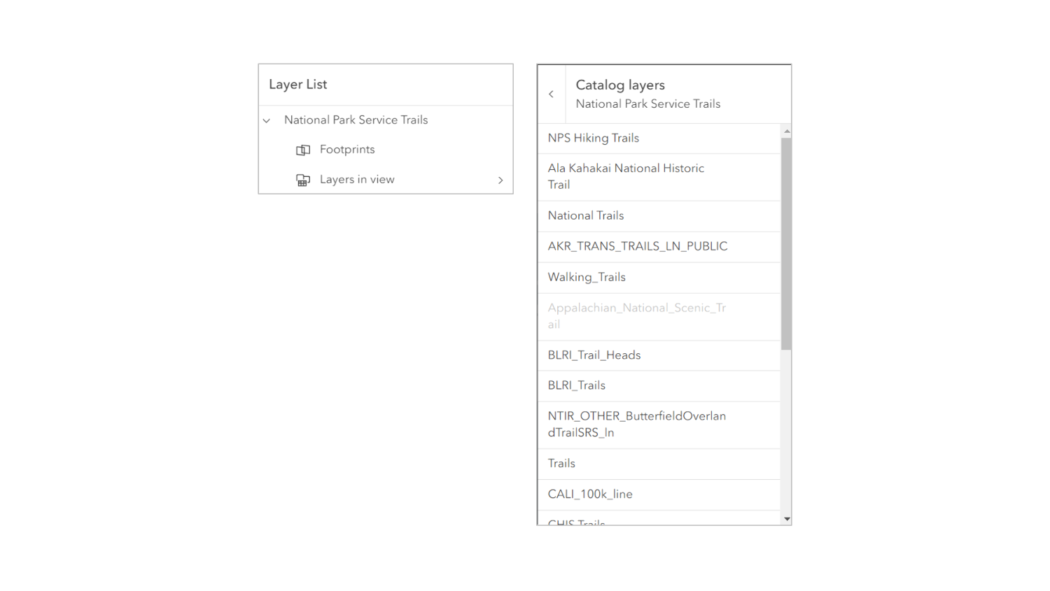
The CatalogLayerList widget provides a way to display and interact with CatalogLayers. The widget displays a list of layers in the CatalogLayer.dynamicGroupLayer and allows you to toggle their visibility.
The ListItem API provides access to each layer's properties, allows the developer to configure actions related to the layer, and allows the developer to add content to the item related to the layer.
Example
const catalogLayerList = new CatalogLayerList({  catalogLayer,  view});
view.ui.add(catalogLayerList, "top-right");
Constructors
Constructor
Parameters
| Parameter | Type | Description | Required |
|---|---|---|---|
| properties | | |
Example
// typical usageconst catalogLayerList = new CatalogLayerList({  catalogLayer,  view});
view.ui.add(catalogLayerList, "top-right");
Properties
| Property | Type | Class |
|---|---|---|
| | ||
| | ||
| | ||
container inherited | HTMLElement | null | undefined | |
declaredClass readonly inherited | ||
destroyed readonly inherited | ||
| | ||
| | ||
| | ||
| | ||
Icon["icon"] | | |
id inherited | ||
| | ||
| | ||
| | ||
| | ||
"multiple" | "none" | "single" | "single-persist" | | |
uid readonly inherited | ||
| | ||
| | ||
| | ||
visible inherited | ||
| |
catalogItems
- Type
- Collection<ListItem>
The collection of ListItems representing the CatalogLayer.dynamicGroupLayer.
- See also
catalogLayer
- Type
- CatalogLayer | null | undefined
The CatalogLayer to display in the widget.
Example
catalogLayerList.catalogLayer = new CatalogLayer({ url }); collapsed
- Type
- boolean
Indicates whether the widget is collapsed. When collapsed, only the collapse button and the heading are displayed.
- See also
- Default value
- false
Example
catalogLayerList.collapsed = true; container
- Type
- HTMLElement | null | undefined
The ID or node representing the DOM element containing the widget. This property can only be set once. The following examples are all valid use case when working with widgets.
Examples
// Create the HTML div element programmatically at runtime and set to the widget's containerconst basemapGallery = new BasemapGallery({  view: view,  container: document.createElement("div")});
// Add the widget to the top-right corner of the viewview.ui.add(basemapGallery, {  position: "top-right"});
// Specify an already-defined HTML div element in the widget's container
const basemapGallery = new BasemapGallery({ view: view, container: basemapGalleryDiv});
// Add the widget to the top-right corner of the viewview.ui.add(basemapGallery, { position: "top-right"});
// HTML markup<body> <div id="viewDiv"></div> <div id="basemapGalleryDiv"></div></body>// Specify the widget while adding to the view's UIconst basemapGallery = new BasemapGallery({ view: view});
// Add the widget to the top-right corner of the viewview.ui.add(basemapGallery, { position: "top-right"}); filterPlaceholder
- Type
- string
Placeholder text used in the filter input if visibleElements.filter is true.
- See also
- Default value
- ""
Example
catalogLayerList.filterPlaceholder = "Filter layers"; filterPredicate
- Type
- FilterPredicate | null | undefined
- Since
- ArcGIS Maps SDK for JavaScript 4.32
Specifies a function to handle filtering list items.
Example
layerList.filterPredicate = (item) => item.title.toLowerCase().includes("streets"); filterText
- Type
- string
The value of the filter input if visibleElements.filter is true.
- See also
- Default value
- ""
Example
reactiveUtils.watch( () => catalogLayerList.filterText, (filterText) => console.log(filterText)); headingLevel
- Type
- HeadingLevel
Indicates the heading level to use for the heading of the widget.
By default, the heading is rendered as a level 2 heading (e.g., <h2>Catalog Layer List</h2>).
Depending on the widget's placement in your app, you may need to adjust this heading for proper semantics.
This is important for meeting accessibility standards.
- See also
- Default value
- 2
Example
catalogLayerList.headingLevel = 3; icon
- Type
- Icon["icon"]
Icon which represents the widget. It is typically used when the widget is controlled by another one (e.g. in the Expand widget).
- Default value
- "catalog-dataset"
listItemCreatedFunction
- Type
- ListItemModifier | null | undefined
A function that executes each time a ListItem is created. Use this function to add actions and panels to list items, and to override the default settings of a list item. Actions can be added to list items using the ListItem.actionsSections.
Example
// Create a new CatalogLayerList with a listItemCreatedFunction// that adds an "add-layer" action to each catalog layer list itemconst catalogLayerList = new CatalogLayerList({ catalogLayer, listItemCreatedFunction: (event) => {   const { item } = event;   const { layer } = item;
   if (isLayerFromCatalog(layer)) {     item.actionsSections = [       [         {           title: "Add layer to map",           icon: "add-layer",           id: "add-layer"         }       ]     ];   } }, view});
// Listen for the trigger-action event on the CatalogLayerListViewModel// and add layers from the catalog to the map when the "add-layer" action is triggered.// To correctly add a layer to the map, you must create a footprint from the layer// and then create a new layer from the footprint.catalogLayerList.on("trigger-action", async (event) => {  const { id } = event.action;  const { layer } = event.item;
  if (id === "add-layer") {    const parentCatalogLayer = catalogUtils.getCatalogLayerForLayer(layer);    const footprint = parentCatalogLayer.createFootprintFromLayer(layer);    const layerFromFootprint = await parentCatalogLayer.createLayerFromFootprint(footprint);    map.add(layerFromFootprint);  }});
minFilterItems
- Type
- number
The minimum number of list items required to display the visibleElements.filter input box.
- See also
- Default value
- 10
Example
layerList.visibleElements.filter = true;layerList.minFilterItems = 5; selectedItems
- Type
- Collection<ListItem>
A collection of selected ListItems representing catalogItems selected by the user.
- See also
selectionMode
- Type
- "multiple" | "none" | "single" | "single-persist"
Specifies the selection mode. Selected items are available in the selectedItems property.
| Value | Description |
|---|---|
| multiple | Allows any number of items to be selected at once. This is useful when you want to apply an operation to multiple items at the same time. |
| none | Disables selection. Use this when you want to prevent selecting items. |
| single | Allows only one item to be selected at a time. If another item is selected, the previous selection is cleared. This is useful when you want to ensure that a maximum of one item is selected at a time. |
| single-persist | Allows only one item to be selected at a time and prevents de-selection. Once an item is selected, it remains selected until another item is selected. This is useful when you want to ensure that there is always exactly one selected item. |
- See also
- Default value
- "none"
Example
catalogLayerList.selectionMode = "multiple"; uid
- Type
- string
- Since
- ArcGIS Maps SDK for JavaScript 4.33
An automatically generated unique identifier assigned to the instance. The unique id is generated each time the application is loaded.
view
- Type
- MapViewOrSceneView | null | undefined
viewModel
The view model for this widget. This is a class that contains all the logic (properties and methods) that controls this widget's behavior. See the CatalogLayerListViewModel class to access all properties and methods on the widget.
visibilityAppearance
- Type
- VisibilityAppearance
Determines the icons used to indicate visibility.
| Value | Description | Example |
|---|---|---|
| default | Displays view icons on the far side. Icons are hidden except on hover or if they have keyboard focus. See view-visible and view-hide calcite icons. | 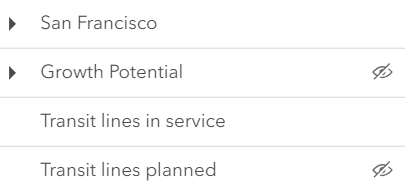 |
| checkbox | Displays checkbox icons on the near side. See check-square-f and square calcite icons. | 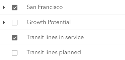 |
- Default value
- "default"
Example
catalogLayerList.visibilityAppearance = "checkbox"; visible
- Type
- boolean
Indicates whether the widget is visible.
If false, the widget will no longer be rendered in the web document. This may affect the layout of other elements or widgets in the document. For example, if this widget is
the first of three widgets associated to the upper right hand corner of the DefaultUI, then the other widgets will reposition when this widget is made invisible.
For more information, refer to the css display value of "none".
- Default value
- true
Example
// Hides the widget in the viewwidget.visible = false; visibleElements
The visible elements that are displayed within the widget. This property provides the ability to turn individual elements of the widget's display on/off.
- Default value
- null
Example
catalogLayerList.visibleElements = { closeButton: false, collapseButton: true, errors: true, filter: true, heading: true, statusIndicators: true};Methods
| Method | Signature | Class |
|---|---|---|
classes inherited | classes(...classNames: ((string | null | undefined) | ((string[] | Record<string, boolean>) | null | undefined) | false | null | undefined)[]): string | |
destroy inherited | destroy(): void | |
emit inherited | emit<Type extends EventNames<this>>(type: Type, event?: this["@eventTypes"][Type]): boolean | |
hasEventListener inherited | hasEventListener<Type extends EventNames<this>>(type: Type): boolean | |
isFulfilled inherited | isFulfilled(): boolean | |
isRejected inherited | isRejected(): boolean | |
isResolved inherited | isResolved(): boolean | |
on inherited | on<Type extends EventNames<this>>(type: Type, listener: EventedCallback<this["@eventTypes"][Type]>): ResourceHandle | |
postInitialize inherited | postInitialize(): void | |
render inherited | render(): any | null | |
renderNow inherited | renderNow(): void | |
scheduleRender inherited | scheduleRender(): void | |
triggerAction(action: Action, item: ListItem): void | | |
when inherited | when<TResult1 = this, TResult2 = never>(onFulfilled?: OnFulfilledCallback<this, TResult1> | null | undefined, onRejected?: OnRejectedCallback<TResult2> | null | undefined): Promise<TResult1 | TResult2> |
classes
- Signature
-
classes (...classNames: ((string | null | undefined) | ((string[] | Record<string, boolean>) | null | undefined) | false | null | undefined)[]): string
A utility method used for building the value for a widget's class property.
This aids in simplifying css class setup.
Parameters
- Returns
- string
The computed class name.
Example
// .tsx syntax showing how to set css classes while rendering the widget
render() {  const dynamicClasses = {    [css.flip]: this.flip,    [css.primary]: this.primary  };
return ( <div class={classes(css.root, css.mixin, dynamicClasses)} /> );} emit
- Signature
-
emit <Type extends EventNames<this>>(type: Type, event?: this["@eventTypes"][Type]): boolean
- Type parameters
- <Type extends EventNames<this>>
Emits an event on the instance. This method should only be used when creating subclasses of this class.
hasEventListener
- Signature
-
hasEventListener <Type extends EventNames<this>>(type: Type): boolean
- Type parameters
- <Type extends EventNames<this>>
Indicates whether there is an event listener on the instance that matches the provided event name.
Parameters
| Parameter | Type | Description | Required |
|---|---|---|---|
| type | Type | The name of the event. | |
- Returns
- boolean
Returns true if the class supports the input event.
isFulfilled
- Signature
-
isFulfilled (): boolean
isFulfilled() may be used to verify if creating an instance of the class is fulfilled (either resolved or rejected).
If it is fulfilled, true will be returned.
- Returns
- boolean
Indicates whether creating an instance of the class has been fulfilled (either resolved or rejected).
isRejected
- Signature
-
isRejected (): boolean
isRejected() may be used to verify if creating an instance of the class is rejected.
If it is rejected, true will be returned.
- Returns
- boolean
Indicates whether creating an instance of the class has been rejected.
isResolved
- Signature
-
isResolved (): boolean
isResolved() may be used to verify if creating an instance of the class is resolved.
If it is resolved, true will be returned.
- Returns
- boolean
Indicates whether creating an instance of the class has been resolved.
on
- Signature
-
on <Type extends EventNames<this>>(type: Type, listener: EventedCallback<this["@eventTypes"][Type]>): ResourceHandle
- Type parameters
- <Type extends EventNames<this>>
Registers an event handler on the instance. Call this method to hook an event with a listener.
Parameters
| Parameter | Type | Description | Required |
|---|---|---|---|
| type | Type | An event or an array of events to listen for. | |
| listener | EventedCallback<this["@eventTypes"][Type]> | The function to call when the event fires. | |
- Returns
- ResourceHandle
Returns an event handler with a
remove()method that should be called to stop listening for the event(s).Property Type Description remove Function When called, removes the listener from the event.
Example
view.on("click", function(event){ // event is the event handle returned after the event fires. console.log(event.mapPoint);}); triggerAction
- Signature
-
triggerAction (action: Action, item: ListItem): void
Triggers the @trigger-action event and executes the given action or action toggle.
when
- Signature
-
when <TResult1 = this, TResult2 = never>(onFulfilled?: OnFulfilledCallback<this, TResult1> | null | undefined, onRejected?: OnRejectedCallback<TResult2> | null | undefined): Promise<TResult1 | TResult2>
when() may be leveraged once an instance of the class is created. This method takes two input parameters: an onFulfilled function and an onRejected function.
The onFulfilled executes when the instance of the class loads. The
onRejected executes if the instance of the class fails to load.
Parameters
| Parameter | Type | Description | Required |
|---|---|---|---|
| onFulfilled | OnFulfilledCallback<this, TResult1> | null | undefined | The function to call when the promise resolves. | |
| onRejected | The function to execute when the promise fails. | |
- Returns
- Promise<TResult1 | TResult2>
Returns a new promise for the result of
onFulfilledthat may be used to chain additional functions.
Example
// Although this example uses MapView, any class instance that is a promise may use when() in the same waylet view = new MapView();view.when(function(){ // This function will execute once the promise is resolved}, function(error){ // This function will execute if the promise is rejected due to an error});Events
| Name | Type |
|---|---|
trigger-action inherited |
trigger-action
trigger-action: CustomEvent<LayerListViewModelTriggerActionEvent> Emitted when the user clicks an action or action toggle in a layer list. Use this event to run custom logic when a specific action is triggered.