import FeatureTemplates from "@arcgis/core/widgets/FeatureTemplates.js";const FeatureTemplates = await $arcgis.import("@arcgis/core/widgets/FeatureTemplates.js");- Since
- ArcGIS Maps SDK for JavaScript 4.10
The FeatureTemplates widget is part of the overall editing workflow. Its main purpose is to display FeatureLayer.templates from one or more feature layers. In addition to displaying feature layer templates, it is also possible to filter and group templates for an easier editing experience. The widget listens for an end user to select a specific template in the widget. Its @select event is fired and the resulting template information is returned. This widget can be used in conjunction with FeatureLayer.applyEdits() to enable an end user to update one of its feature layers.
Example
const templates = new FeatureTemplates({ container: "templatesDiv", layers: layers});Constructors
Constructor
Parameters
| Parameter | Type | Description | Required |
|---|---|---|---|
| properties | | |
Example
// Typical usageconst templates = new FeatureTemplates({ container: "templatesDiv", layers: layers});Properties
| Property | Type | Class |
|---|---|---|
container inherited | HTMLElement | null | undefined | |
declaredClass readonly inherited | ||
destroyed readonly inherited | ||
| | ||
| | ||
| | ||
| | ||
GroupByType | null | undefined | | |
| | ||
Icon["icon"] | | |
id inherited | ||
| | ||
FeatureTemplatesViewModel["layers"] | | |
| | ||
| | ||
visible inherited | ||
| |
container
- Type
- HTMLElement | null | undefined
The ID or node representing the DOM element containing the widget. This property can only be set once. The following examples are all valid use case when working with widgets.
Examples
// Create the HTML div element programmatically at runtime and set to the widget's containerconst basemapGallery = new BasemapGallery({  view: view,  container: document.createElement("div")});
// Add the widget to the top-right corner of the viewview.ui.add(basemapGallery, {  position: "top-right"});
// Specify an already-defined HTML div element in the widget's container
const basemapGallery = new BasemapGallery({ view: view, container: basemapGalleryDiv});
// Add the widget to the top-right corner of the viewview.ui.add(basemapGallery, { position: "top-right"});
// HTML markup<body> <div id="viewDiv"></div> <div id="basemapGalleryDiv"></div></body>// Specify the widget while adding to the view's UIconst basemapGallery = new BasemapGallery({ view: view});
// Add the widget to the top-right corner of the viewview.ui.add(basemapGallery, { position: "top-right"}); disabled
- Type
- boolean
- Since
- ArcGIS Maps SDK for JavaScript 4.28
Used to disable the widget user interface. This does not prevent the widget or view model from functioning programmatically. Methods invoked programmatically still work as expected.
- Default value
- false
enableListScroll
- Type
- boolean
- Since
- ArcGIS Maps SDK for JavaScript 4.28
Indicates whether the list of available feature template items should scroll within its containing element.
- Default value
- true
filterFunction
function can be defined to help filter template items within the widget. A custom function can be used to aid when searching for templates. It takes a function which passes in an object containing a name property of the template item.

Example
// Filter and display templates only if their labels contain the word `Street`function myFilterFunction(filter) {  let containsName = filter.label.includes("Street");  return containsName;}
// Create the FeatureTemplates widgettemplates = new FeatureTemplates({ container: "templatesDiv", visibleElements: { filter: false, // disable the default filter UI }, layers: [featureLayer], // in this example, one layer is used filterFunction: myFilterFunction}); groupBy
- Type
- GroupByType | null | undefined
It is possible to group template items. This can aid in managing various template items and how they display within the widget. The values are discussed below.
| Type | Description | Example |
|---|---|---|
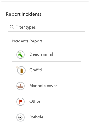
| layer | This is the default grouping. Groups template items by layers. | 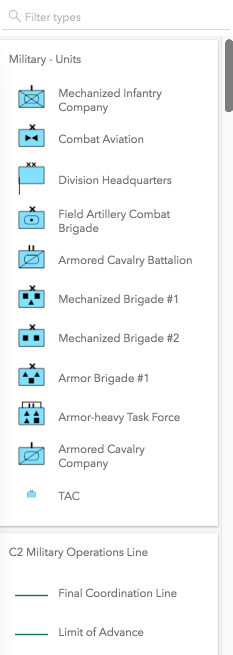 |
| geometry | Groups template items by geometry type. | 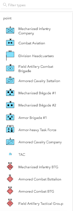 |
| none | The widget displays everything in one list with no grouping. | 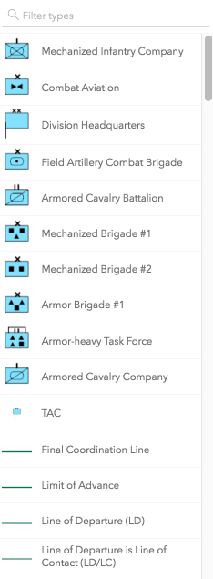 |
| GroupByFunction | Custom function that takes an object containing a FeatureTemplate and FeatureLayer. | 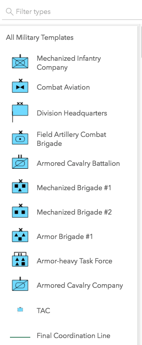 |
- Default value
- "layer"
Example
// This example shows using a function to check if// the layer title contains the word 'military'. If so,// return a group of items called "All Military Templates"function customGroup(grouping) {  // Consolidate all military layers  if (grouping.layer.title.toLowerCase().indexOf("military") > -1) {    return "All Military Templates"  }// Otherwise, group by layer title  return grouping.layer.title;}
// Create the FeatureTemplates widgettemplates = new FeatureTemplates({  container: "templatesDiv",  layers: layers,  groupBy: customGroup});
headingLevel
- Type
- HeadingLevel
- Since
- ArcGIS Maps SDK for JavaScript 4.20
Indicates the heading level to use for the labels of grouped feature templates.
By default, the group label is rendered
as a level 4 heading (e.g. <h4>Group label</h4>). Depending on the widget's placement
in your app, you may need to adjust this heading for proper semantics. This is
important for meeting accessibility standards.
- See also
- Default value
- 4
Example
// Group label will render as an <h3>featureTemplates.headingLevel = 3; icon
- Type
- Icon["icon"]
- Since
- ArcGIS Maps SDK for JavaScript 4.27
Icon displayed in the widget's button.
- Default value
- "list-rectangle"
layers
- Type
- FeatureTemplatesViewModel["layers"]
An array of FeatureLayers to display within the widget. The order in which these layers are set in the array dictates how they display within the widget.
The widget is designed to only display layers that are enabled for editing. It will not display layers that are enabled to only edit attributes.
Example
// The layers to display within the widgetlet militaryUnits = new FeatureLayer({  url: "http://sampleserver6.arcgisonline.com/arcgis/rest/services/Military/FeatureServer/2"});
let militaryHostile = new FeatureLayer({  url: "http://sampleserver6.arcgisonline.com/arcgis/rest/services/Military/FeatureServer/6"});
let layers = [militaryUnits, militaryHostile];
// Create FeatureTemplates widgettemplates = new FeatureTemplates({ container: "templatesDiv", layers: layers}); viewModel
The view model for this widget. This is a class that contains all the logic (properties and methods) that controls this widget's behavior. See the FeatureTemplatesViewModel class to access all properties and methods on the widget.
visible
- Type
- boolean
Indicates whether the widget is visible.
If false, the widget will no longer be rendered in the web document. This may affect the layout of other elements or widgets in the document. For example, if this widget is
the first of three widgets associated to the upper right hand corner of the DefaultUI, then the other widgets will reposition when this widget is made invisible.
For more information, refer to the css display value of "none".
- Default value
- true
Example
// Hides the widget in the viewwidget.visible = false; visibleElements
- Type
- VisibleElements
- Since
- ArcGIS Maps SDK for JavaScript 4.15
The visible elements that are displayed within the widget. This property provides the ability to turn individual elements of the widget's display on/off.

Example
featureTemplates.visibleElements = { filter: false};Methods
| Method | Signature | Class |
|---|---|---|
classes inherited | classes(...classNames: ((string | null | undefined) | ((string[] | Record<string, boolean>) | null | undefined) | false | null | undefined)[]): string | |
destroy inherited | destroy(): void | |
emit inherited | emit<Type extends EventNames<this>>(type: Type, event?: this["@eventTypes"][Type]): boolean | |
hasEventListener inherited | hasEventListener<Type extends EventNames<this>>(type: Type): boolean | |
isFulfilled inherited | isFulfilled(): boolean | |
isRejected inherited | isRejected(): boolean | |
isResolved inherited | isResolved(): boolean | |
on inherited | on<Type extends EventNames<this>>(type: Type, listener: EventedCallback<this["@eventTypes"][Type]>): ResourceHandle | |
postInitialize inherited | postInitialize(): void | |
render inherited | render(): any | null | |
renderNow inherited | renderNow(): void | |
scheduleRender inherited | scheduleRender(): void | |
select(item: TemplateItem | null | undefined): void | | |
when inherited | when<TResult1 = this, TResult2 = never>(onFulfilled?: OnFulfilledCallback<this, TResult1> | null | undefined, onRejected?: OnRejectedCallback<TResult2> | null | undefined): Promise<TResult1 | TResult2> |
classes
- Signature
-
classes (...classNames: ((string | null | undefined) | ((string[] | Record<string, boolean>) | null | undefined) | false | null | undefined)[]): string
A utility method used for building the value for a widget's class property.
This aids in simplifying css class setup.
Parameters
- Returns
- string
The computed class name.
Example
// .tsx syntax showing how to set css classes while rendering the widget
render() {  const dynamicClasses = {    [css.flip]: this.flip,    [css.primary]: this.primary  };
return ( <div class={classes(css.root, css.mixin, dynamicClasses)} /> );} emit
- Signature
-
emit <Type extends EventNames<this>>(type: Type, event?: this["@eventTypes"][Type]): boolean
- Type parameters
- <Type extends EventNames<this>>
Emits an event on the instance. This method should only be used when creating subclasses of this class.
hasEventListener
- Signature
-
hasEventListener <Type extends EventNames<this>>(type: Type): boolean
- Type parameters
- <Type extends EventNames<this>>
Indicates whether there is an event listener on the instance that matches the provided event name.
Parameters
| Parameter | Type | Description | Required |
|---|---|---|---|
| type | Type | The name of the event. | |
- Returns
- boolean
Returns true if the class supports the input event.
isFulfilled
- Signature
-
isFulfilled (): boolean
isFulfilled() may be used to verify if creating an instance of the class is fulfilled (either resolved or rejected).
If it is fulfilled, true will be returned.
- Returns
- boolean
Indicates whether creating an instance of the class has been fulfilled (either resolved or rejected).
isRejected
- Signature
-
isRejected (): boolean
isRejected() may be used to verify if creating an instance of the class is rejected.
If it is rejected, true will be returned.
- Returns
- boolean
Indicates whether creating an instance of the class has been rejected.
isResolved
- Signature
-
isResolved (): boolean
isResolved() may be used to verify if creating an instance of the class is resolved.
If it is resolved, true will be returned.
- Returns
- boolean
Indicates whether creating an instance of the class has been resolved.
on
- Signature
-
on <Type extends EventNames<this>>(type: Type, listener: EventedCallback<this["@eventTypes"][Type]>): ResourceHandle
- Type parameters
- <Type extends EventNames<this>>
Registers an event handler on the instance. Call this method to hook an event with a listener.
Parameters
| Parameter | Type | Description | Required |
|---|---|---|---|
| type | Type | An event or an array of events to listen for. | |
| listener | EventedCallback<this["@eventTypes"][Type]> | The function to call when the event fires. | |
- Returns
- ResourceHandle
Returns an event handler with a
remove()method that should be called to stop listening for the event(s).Property Type Description remove Function When called, removes the listener from the event.
Example
view.on("click", function(event){ // event is the event handle returned after the event fires. console.log(event.mapPoint);}); select
- Signature
-
select (item: TemplateItem | null | undefined): void
Selects the template item to use.
- See also
Parameters
| Parameter | Type | Description | Required |
|---|---|---|---|
| item | The template item to select. | |
- Returns
- void
when
- Signature
-
when <TResult1 = this, TResult2 = never>(onFulfilled?: OnFulfilledCallback<this, TResult1> | null | undefined, onRejected?: OnRejectedCallback<TResult2> | null | undefined): Promise<TResult1 | TResult2>
when() may be leveraged once an instance of the class is created. This method takes two input parameters: an onFulfilled function and an onRejected function.
The onFulfilled executes when the instance of the class loads. The
onRejected executes if the instance of the class fails to load.
Parameters
| Parameter | Type | Description | Required |
|---|---|---|---|
| onFulfilled | OnFulfilledCallback<this, TResult1> | null | undefined | The function to call when the promise resolves. | |
| onRejected | The function to execute when the promise fails. | |
- Returns
- Promise<TResult1 | TResult2>
Returns a new promise for the result of
onFulfilledthat may be used to chain additional functions.
Example
// Although this example uses MapView, any class instance that is a promise may use when() in the same waylet view = new MapView();view.when(function(){ // This function will execute once the promise is resolved}, function(error){ // This function will execute if the promise is rejected due to an error});Events
| Name | Type |
|---|---|
select inherited |
select
select: CustomEvent<SelectEvent> Fires when a template item is selected. This occurs when the select() method is called.
Example
// Listen for when a template item is selectedtemplates.on("select", function(evtTemplate) {  // Access the selected template item's attributes  attributes = evtTemplate.template.prototype.attributes;
  // Create a new feature with the selected template at cursor location  const handler = view.on("click", function(event) {    handler.remove(); // remove click event handler.    event.stopPropagation(); // Stop click event propagation
    if (event.mapPoint) {      // Create a new feature with the selected template item.      editFeature = new Graphic({        geometry: event.mapPoint,          attributes: {            "IncidentType": attributes.IncidentType          }      });
      // Setup the applyEdits parameter with adds.      const edits = {        addFeatures: [editFeature]      };      featureLayer.applyEdits(params).then(function(editsResult) {        if (editsResult.addFeatureResults.length > 0) {          console.log("Created a new feature.")        }      });    }  });});