import FeaturesVisibleElements from "@arcgis/core/widgets/Features/FeaturesVisibleElements.js";const FeaturesVisibleElements = await $arcgis.import("@arcgis/core/widgets/Features/FeaturesVisibleElements.js");- Inheritance:
- FeaturesVisibleElements→
Accessor
- Since
- ArcGIS Maps SDK for JavaScript 5.0
The visible elements that are displayed within the widget.
This provides the ability to turn individual elements of the widget's display on/off.
Disabling all visibleElements on the Features widget allows the look and feel of the Feature widget, while supporting related record browsing and clustering.
Constructors
Constructor
Parameters
| Parameter | Type | Description | Required |
|---|---|---|---|
| properties | | |
Properties
| Property | Type | Class |
|---|---|---|
| | ||
| | ||
| | ||
declaredClass readonly inherited | ||
| | ||
| | ||
| | ||
| | ||
| | ||
| |
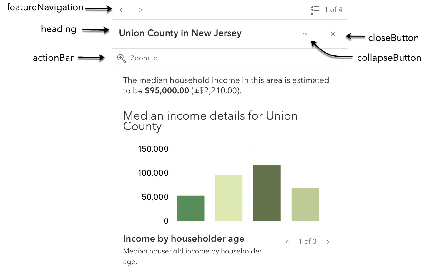
actionBar
- Type
- boolean
Indicates whether to display the action bar that holds the feature's FeaturesViewModel.actions will be displayed.
- Default value
- true
closeButton
- Type
- boolean
Indicates whether to display a close button on the widget dialog.
- Default value
- true
collapseButton
- Type
- boolean
Indicates whether to display the collapse button on the widget dialog.
- Default value
- false
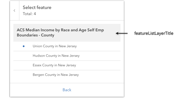
featureListLayerTitle
- Type
- boolean
Indicates whether to display the group heading for a list of multiple features.
- Default value
- true
featureMenuHeading
- Type
- boolean
Indicates whether to display a heading and description on the widget feature menu list.
- Default value
- true
featureNavigation
- Type
- boolean
Indicates whether pagination for feature navigation will be displayed. This allows the user to scroll through various selected features using pagination arrows.
- Default value
- true
flow
- Type
- boolean
Determines whether the widget should be shown within its built-in flow component or if the flow component should be excluded.
The widget will be displayed within its original flow component if set to true.
The flow component will be omitted from the widget if set to false.
To place the widget into an existing Calcite flow component, set this property to false.
- Default value
- true
spinner
- Type
- boolean
Indicates whether to display the widget's loading spinner.
- Default value
- true