import PopupVisibleElements from "@arcgis/core/widgets/Popup/PopupVisibleElements.js";const PopupVisibleElements = await $arcgis.import("@arcgis/core/widgets/Popup/PopupVisibleElements.js");- Inheritance:
- PopupVisibleElements→
Accessor
- Since
- ArcGIS Maps SDK for JavaScript 5.0
The visible elements that are displayed within the widget. This provides the ability to turn individual elements of the widget's display on/off.
Constructors
Constructor
Constructor
Parameters
| Parameter | Type | Description | Required |
|---|---|---|---|
| properties | | |
See the properties table for a list of all the
properties that may be passed into the constructor.
Properties
Any properties can be set, retrieved or listened to. See the
Watch for changes
topic.
| Property | Type | Class |
|---|---|---|
| | ||
| | ||
| | ||
declaredClass readonly inherited | ||
| | ||
| | ||
| | ||
| | ||
| |
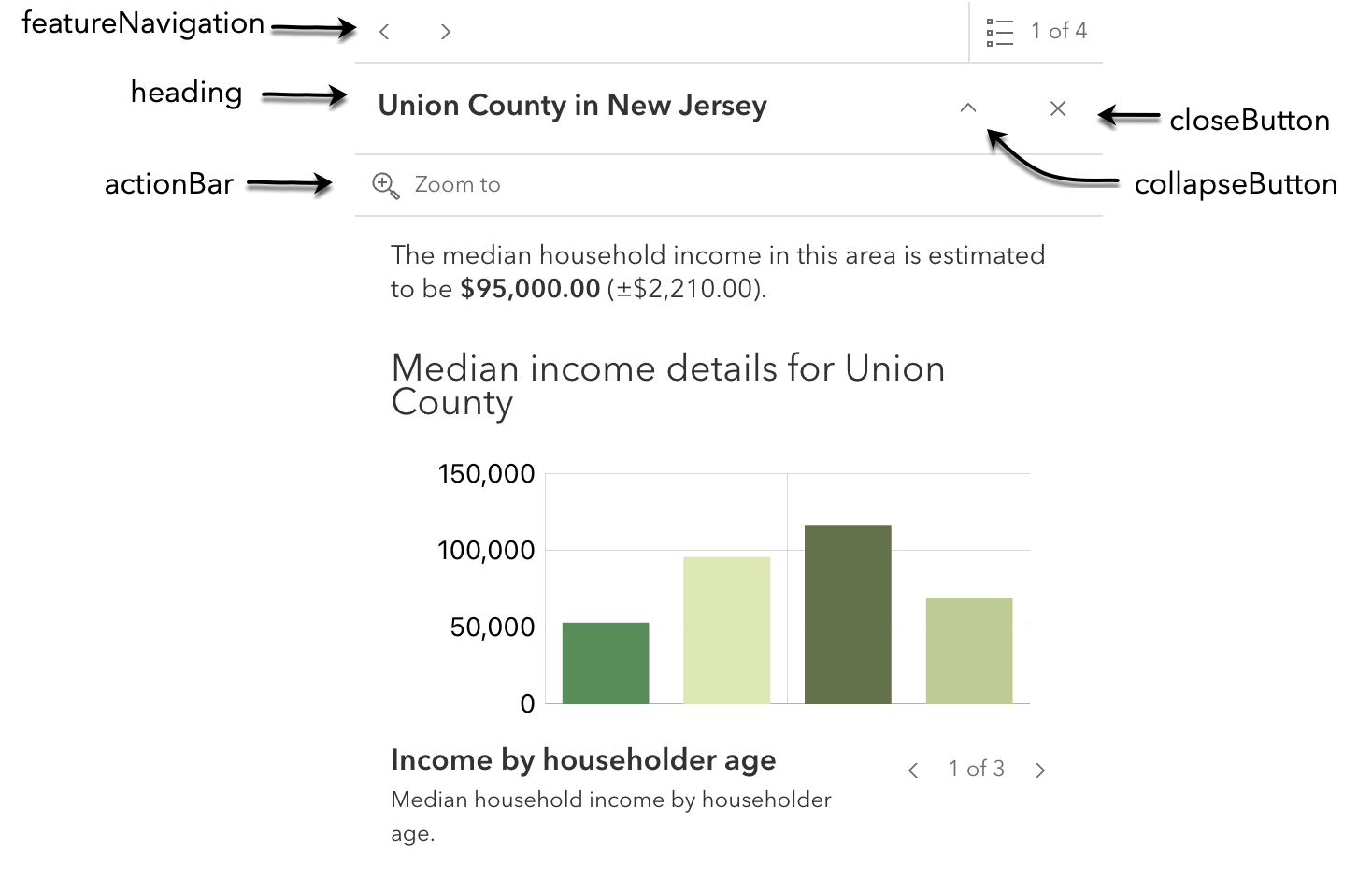
actionBar
Property
- Type
- boolean
Indicates whether to display the action bar that holds the feature's Popup.actions.
- Default value
- true
closeButton
Property
- Type
- boolean
Indicates whether to display a close button on the widget dialog.
- Default value
- true
collapseButton
Property
- Type
- boolean
Indicates whether to display the collapse button on the widget dialog.
- Default value
- true
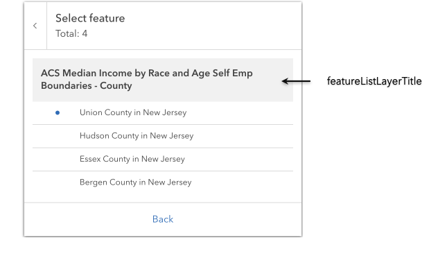
featureListLayerTitle
Property
- Type
- boolean
Indicates whether to display the group heading for a list of multiple features.
- Default value
- true
featureMenuHeading
Property
- Type
- boolean
Indicates whether to display a heading and description on the widget feature menu list.
- Default value
- true
featureNavigation
Property
- Type
- boolean
Indicates whether pagination for feature navigation will be displayed. This allows the user to scroll through various selected features using pagination arrows.
- Default value
- true
spinner
Property
- Type
- boolean
Indicates whether to display the widget's loading spinner.
- Default value
- true