import ScaleRangeSlider from "@arcgis/core/widgets/ScaleRangeSlider.js";const ScaleRangeSlider = await $arcgis.import("@arcgis/core/widgets/ScaleRangeSlider.js");- Since
- ArcGIS Maps SDK for JavaScript 4.13
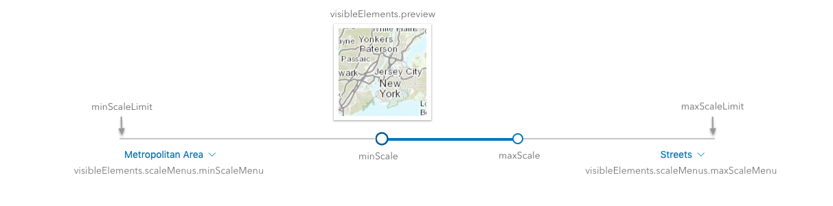
The ScaleRangeSlider widget allows the user to set a minimum and maximum scale based on named scale ranges. When a layer is provided to the widget, the minScale and maxScale are set to the scale range of the layer.
The user can update the scale range by dragging thumbs across the slider to update the minScale and maxScale.
The user can also change the minScale and maxScale by using the dropdowns underneath the minScaleLimit
and maxScaleLimit. The thumbnail shows a preview of the scale based on the region specified.
Example
const scaleRangeSlider = new ScaleRangeSlider({  view: view,  layer: featureLayer,  // scale range of this layer sets initial minScale and maxScale  region: "MX",  // preview thumbnail will be of Mexico});view.ui.add(scaleRangeSlider, "bottom-left");
// to update the featureLayer min/max scale based on the sliderreactiveUtils.watch(  () => [scaleRangeSlider.minScale, scaleRangeSlider.maxScale],  ([minScale, maxScale]) => {    featureLayer.minScale = minScale;    featureLayer.maxScale = maxScale;  });
Constructors
Constructor
Parameters
| Parameter | Type | Description | Required |
|---|---|---|---|
| properties | | |
Properties
| Property | Type | Class |
|---|---|---|
container inherited | HTMLElement | null | undefined | |
declaredClass readonly inherited | ||
destroyed readonly inherited | ||
| | ||
Icon["icon"] | | |
id inherited | ||
| | ||
| | ||
| | ||
| | ||
| | ||
| | ||
"range" | "max-scale-only" | "min-scale-only" | | |
| | ||
| | ||
| | ||
| | ||
visible inherited | ||
| |
container
- Type
- HTMLElement | null | undefined
The ID or node representing the DOM element containing the widget. This property can only be set once. The following examples are all valid use case when working with widgets.
Examples
// Create the HTML div element programmatically at runtime and set to the widget's containerconst basemapGallery = new BasemapGallery({  view: view,  container: document.createElement("div")});
// Add the widget to the top-right corner of the viewview.ui.add(basemapGallery, {  position: "top-right"});
// Specify an already-defined HTML div element in the widget's container
const basemapGallery = new BasemapGallery({ view: view, container: basemapGalleryDiv});
// Add the widget to the top-right corner of the viewview.ui.add(basemapGallery, { position: "top-right"});
// HTML markup<body> <div id="viewDiv"></div> <div id="basemapGalleryDiv"></div></body>// Specify the widget while adding to the view's UIconst basemapGallery = new BasemapGallery({ view: view});
// Add the widget to the top-right corner of the viewview.ui.add(basemapGallery, { position: "top-right"}); disabled
- Type
- boolean
When true, sets the widget to a disabled state so the user cannot interact with it.
- Default value
- false
icon
- Type
- Icon["icon"]
- Since
- ArcGIS Maps SDK for JavaScript 4.27
Icon displayed in the widget's button.
- Default value
- "actual-size"
layer
When provided, the initial minScale and maxScale values will match the layer's.
When a tiled layer is used, the slider will be restricted from moving the slider thumbs past the lods of the layer's tiling scheme.
Since version 4.28, when a MapImageLayer is used, the slider will be restricted from moving past the min/max scale defined on the map service.
The unavailable range will be designated with a dashed line.
maxScale
- Type
- number
The maximum scale of the active scale range. When the maxScale reaches the maxScaleLimit, the maxScale value becomes 0 and there is no maximum scale set.
minScale
- Type
- number
The minimum scale of the active scale range. When the minScale reaches the minScaleLimit, the minScale value becomes 0 and there is no minimum scale.
region
- Type
- SupportedRegion
The region that the scale thumbnails will focus on. Each region comes from the ISO 3166-1 alpha-2 code. See SupportedRegion for the list of regions that are currently supported.
- Default value
- "US"
showWorldValue
- Type
- boolean
- Since
- ArcGIS Maps SDK for JavaScript 4.34
Indicates whether the world scale value is shown in the scale menu.
- Default value
- false
view
- Type
- MapViewOrSceneView | null | undefined
viewModel
The view model for this widget. This is a class that contains all the logic (properties and methods) that controls this widget's behavior. See the ScaleRangeSliderViewModel class to access all properties and methods on the widget.
visible
- Type
- boolean
Indicates whether the widget is visible.
If false, the widget will no longer be rendered in the web document. This may affect the layout of other elements or widgets in the document. For example, if this widget is
the first of three widgets associated to the upper right hand corner of the DefaultUI, then the other widgets will reposition when this widget is made invisible.
For more information, refer to the css display value of "none".
- Default value
- true
Example
// Hides the widget in the viewwidget.visible = false; visibleElements
- Type
- VisibleElements
The visible elements that are displayed within the widget. This property provides the ability to turn individual elements of the widget's display on/off.
Example
scaleRangeSlider.visibleElements = { preview: false // thumbnail preview of map will not be displayed}Methods
| Method | Signature | Class |
|---|---|---|
classes inherited | classes(...classNames: ((string | null | undefined) | ((string[] | Record<string, boolean>) | null | undefined) | false | null | undefined)[]): string | |
destroy inherited | destroy(): void | |
emit inherited | emit<Type extends EventNames<this>>(type: Type, event?: this["@eventTypes"][Type]): boolean | |
hasEventListener inherited | hasEventListener<Type extends EventNames<this>>(type: Type): boolean | |
isFulfilled inherited | isFulfilled(): boolean | |
isRejected inherited | isRejected(): boolean | |
isResolved inherited | isResolved(): boolean | |
on inherited | on<Type extends EventNames<this>>(type: Type, listener: EventedCallback<this["@eventTypes"][Type]>): ResourceHandle | |
postInitialize inherited | postInitialize(): void | |
render inherited | render(): any | null | |
renderNow inherited | renderNow(): void | |
scheduleRender inherited | scheduleRender(): void | |
when inherited | when<TResult1 = this, TResult2 = never>(onFulfilled?: OnFulfilledCallback<this, TResult1> | null | undefined, onRejected?: OnRejectedCallback<TResult2> | null | undefined): Promise<TResult1 | TResult2> |
classes
- Signature
-
classes (...classNames: ((string | null | undefined) | ((string[] | Record<string, boolean>) | null | undefined) | false | null | undefined)[]): string
A utility method used for building the value for a widget's class property.
This aids in simplifying css class setup.
Parameters
- Returns
- string
The computed class name.
Example
// .tsx syntax showing how to set css classes while rendering the widget
render() {  const dynamicClasses = {    [css.flip]: this.flip,    [css.primary]: this.primary  };
return ( <div class={classes(css.root, css.mixin, dynamicClasses)} /> );} emit
- Signature
-
emit <Type extends EventNames<this>>(type: Type, event?: this["@eventTypes"][Type]): boolean
- Type parameters
- <Type extends EventNames<this>>
Emits an event on the instance. This method should only be used when creating subclasses of this class.
hasEventListener
- Signature
-
hasEventListener <Type extends EventNames<this>>(type: Type): boolean
- Type parameters
- <Type extends EventNames<this>>
Indicates whether there is an event listener on the instance that matches the provided event name.
Parameters
| Parameter | Type | Description | Required |
|---|---|---|---|
| type | Type | The name of the event. | |
- Returns
- boolean
Returns true if the class supports the input event.
isFulfilled
- Signature
-
isFulfilled (): boolean
isFulfilled() may be used to verify if creating an instance of the class is fulfilled (either resolved or rejected).
If it is fulfilled, true will be returned.
- Returns
- boolean
Indicates whether creating an instance of the class has been fulfilled (either resolved or rejected).
isRejected
- Signature
-
isRejected (): boolean
isRejected() may be used to verify if creating an instance of the class is rejected.
If it is rejected, true will be returned.
- Returns
- boolean
Indicates whether creating an instance of the class has been rejected.
isResolved
- Signature
-
isResolved (): boolean
isResolved() may be used to verify if creating an instance of the class is resolved.
If it is resolved, true will be returned.
- Returns
- boolean
Indicates whether creating an instance of the class has been resolved.
on
- Signature
-
on <Type extends EventNames<this>>(type: Type, listener: EventedCallback<this["@eventTypes"][Type]>): ResourceHandle
- Type parameters
- <Type extends EventNames<this>>
Registers an event handler on the instance. Call this method to hook an event with a listener.
Parameters
| Parameter | Type | Description | Required |
|---|---|---|---|
| type | Type | An event or an array of events to listen for. | |
| listener | EventedCallback<this["@eventTypes"][Type]> | The function to call when the event fires. | |
- Returns
- ResourceHandle
Returns an event handler with a
remove()method that should be called to stop listening for the event(s).Property Type Description remove Function When called, removes the listener from the event.
Example
view.on("click", function(event){ // event is the event handle returned after the event fires. console.log(event.mapPoint);}); when
- Signature
-
when <TResult1 = this, TResult2 = never>(onFulfilled?: OnFulfilledCallback<this, TResult1> | null | undefined, onRejected?: OnRejectedCallback<TResult2> | null | undefined): Promise<TResult1 | TResult2>
when() may be leveraged once an instance of the class is created. This method takes two input parameters: an onFulfilled function and an onRejected function.
The onFulfilled executes when the instance of the class loads. The
onRejected executes if the instance of the class fails to load.
Parameters
| Parameter | Type | Description | Required |
|---|---|---|---|
| onFulfilled | OnFulfilledCallback<this, TResult1> | null | undefined | The function to call when the promise resolves. | |
| onRejected | The function to execute when the promise fails. | |
- Returns
- Promise<TResult1 | TResult2>
Returns a new promise for the result of
onFulfilledthat may be used to chain additional functions.
Example
// Although this example uses MapView, any class instance that is a promise may use when() in the same waylet view = new MapView();view.when(function(){ // This function will execute once the promise is resolved}, function(error){ // This function will execute if the promise is rejected due to an error});Type definitions
VisibleElements
The visible elements that are displayed within the widget. This provides the ability to turn individual elements of the widget's display on/off.
scaleMenus
- Type
- boolean | VisibleElementsScaleMenus | undefined
- Since
- ArcGIS Maps SDK for JavaScript 4.24
Indicates whether the scale dropdown menus are visible.