import ValuePicker from "@arcgis/core/widgets/ValuePicker.js";const ValuePicker = await $arcgis.import("@arcgis/core/widgets/ValuePicker.js");- Inheritance:
- ValuePicker→
Widget<ValuePickerProperties>→ Accessor
- Since
- ArcGIS Maps SDK for JavaScript 4.27
ValuePicker is a widget that allows users to step or play through a list of values. ValuePicker widget can be configured with an optional collection, label, combobox or slider control to help users navigate values.
Similar to a media player, values can be interactively stepped through using the next and previous buttons.
ValuePicker can also be set to automatically progress (play) through an ordered
list of items at a preset interval.
Configuring ValuePicker
ValuePicker can be configured in variety of ways, depending on your use case. The following are the five possible configurations of the ValuePicker widget.
1. Configuring ValuePicker without data
It is important to note that the ValuePicker widget is not associated with a View nor does it
necessarily require data. In the example below, the ValuePicker is added to the view's
ui property without any assigned data.
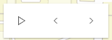
const valuePicker = new ValuePicker();view.ui.add(valuePicker, "top-right");Since the widget is not associated with any data, it is necessary to listen and respond to widget events generated by the widget. This could be useful when data is not static like positional changes for bus features currently in service, for example.
valuePicker.on("play", () => { console.log("user clicks play"); })valuePicker.on("pause", () => { console.log("user clicks pause"); })valuePicker.on("previous", () => { console.log("user clicks previous"); })valuePicker.on("next", () => { console.log("user clicks next"); })
2. Using the label component to present items
Consider using the label component to step through a fixed list of predefined values like land use zones. In the following snippet a ValuePicker is added to the View UI containing three coded land use zones.
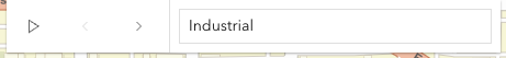
const labelComponent = {  type: "label",  items: [    { value: "ind", label: "Industrial" },    { value: "res", label: "Residential" },    { value: "com", label: "Commercial" }  ]};
const valuePicker = new ValuePicker({  component: labelComponent,  values: ["ind"]});view.ui.add(valuePicker, "top-right");
The user's interaction can be handled by monitoring the values property.
reactiveUtils.watch( () => valuePicker.values, (values) => console.log(`The land use zone code is: ${values[0]}`));
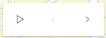
3. Using an arbitrary collection component to present predefined list
It may be required to step through a fixed collection of items like extents,
bookmarks, or basemaps. If only the play,
next and previous buttons are required then the collection component may be used. The collection component
consists of the same user interface as option 1 above with the distinction that the current item is accessible and
tracked.
In the following example, a ValuePicker is created and added with a collection of three items. ValuePicker is initialized with starting value of "hybrid". Since "hybrid" is the first item in the collection only the next button will be enabled.
const valuePicker = new ValuePicker({ component: { // autocasts ValuePickerCollection when type is "collection". type: "collection", collection: ["hybrid", "oceans", "osm"] }, values: ["hybrid"]});view.ui.add(valuePicker, "top-right");As the user clicks the next, previous, and play buttons the values property will update. This property can be monitored as demonstrated below.
reactiveUtils.watch( () => valuePicker.values, (values) => console.log(`The current basemap is: ${values[0]}`));
4. Using the combobox component to present selectable items
Consider using the combobox component when a searchable dropdown list is required. In the following snippet the ValuePicker widget is added to the View UI containing three coded land use zones.
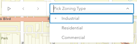
const valuePicker = new ValuePicker({ component: { // autocasts ValuePickerCombobox when type is "combobox". type: "combobox", placeholder: "Pick Zoning Type", items: [ { value: "ind", label: "Industrial" }, { value: "res", label: "Residential" }, { value: "com", label: "Commercial" } ] }, values: ["res"]});view.ui.add(valuePicker, "top-right");As demonstrated in option 3 above, the user's interaction can be handled by monitoring the values property.
reactiveUtils.watch( () => valuePicker.values, (values) => console.log(`The land use zone code is: ${values[0]}`));
5. Using the slider component to navigate numeric values
The slider component, as the name suggests, appends a slider to end of the ValuePicker widget. The slider is ideal for users that need to select a value within a fixed numeric range. For example, the snippet below presents a ValuePicker with a slider for picking a layer's opacity. The starting value is 50%.
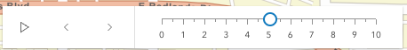
const valuePicker = new ValuePicker({ component: { // autocasts ValuePickerSlider when type is "slider". type: "slider", min: 0, // Start value max: 100, // End value steps: [0, 10, 20, 30, 40, 50, 60, 70, 80, 90, 100], // Thumb snapping locations minorTicks: [5, 15, 25, 35, 45, 55, 65, 75, 85, 95], // Short tick lines majorTicks: [0, 10, 20, 30, 40, 50, 60, 70, 80, 90, 100], // Long tick lines labels: [0, 20, 40, 60, 80, 100], // Long ticks with text labelFormatFunction: (value) => `${value}%` // Label definition }, values: [50] // "current value"});view.ui.add(valuePicker, "top-right");Note that ValuePickerSlider.steps (positions the slider thumb snaps to), ValuePickerSlider.minorTicks, ValuePickerSlider.majorTicks and ValuePickerSlider.labels are independent of each other and optional.
The following code will watch for changes and apply the user's modification to a feature layer.
reactiveUtils.watch( () => valuePicker.values, (values) => { featureLayer.opacity = values[0] / 100; });
ValuePicker Orientation
By default ValuePicker is oriented horizontally. ValuePicker (with the exception of combobox and label components) can be oriented vertically. The following snippet demonstrates how to orient a collection based ValuePicker vertically.
const valuePicker2 = new ValuePicker({ layout: "vertical", // default is "horizontal" component: { type: "collection", collection: ["hybrid", "oceans", "osm"] }, values: ["hybrid"] // Set the initial value to "hybrid"});Constructors
Constructor
Parameters
| Parameter | Type | Description | Required |
|---|---|---|---|
| properties | | |
Properties
| Property | Type | Class |
|---|---|---|
canNext readonly | | |
canPlay readonly | | |
canPrevious readonly | | |
| | ||
| | ||
container inherited | HTMLElement | null | undefined | |
declaredClass readonly inherited | ||
destroyed readonly inherited | ||
| | ||
Icon["icon"] | | |
id inherited | ||
label inherited | ||
| | ||
| | ||
| | ||
| | ||
visible inherited | ||
| |
canNext
- Type
- boolean
Returns true if the ValuePicker can be advanced to the next position.
Example
// Create a new ValuePicker and then test if canNext is true before advancing.const valuePicker = new ValuePicker({  values: ["hybrid"],  component: {    type: "collection",    collection: ["hybrid", "oceans", "osm"]  }});
if (valuePicker.canNext) {  valuePicker.next();} else {  console.log("Already at the end of the collection. Please press the 'previous' button instead.");}
canPlay
- Type
- boolean
Returns true if the ValuePicker can be played.
Example
// Create a new ValuePicker and then check canPlay before playing.const valuePicker = new ValuePicker({  values: ["hybrid"],  component: {    type: "collection",    collection: ["hybrid", "oceans", "osm"]  }});
if (valuePicker.canPlay) {  valuePicker.play();} else {  console.log("Cannot play this collection.");}
canPrevious
- Type
- boolean
Returns true if the ValuePicker can moved to the previous item.
Example
// Create a new ValuePicker and then test if canPrevious is true before selecting the preceding item.const valuePicker = new ValuePicker({  values: ["hybrid"],  component: {    type: "collection",    collection: ["hybrid", "oceans", "osm"]  }});
if (valuePicker.canPrevious) {  valuePicker.previous();} else {  console.log("Already at the beginning of the collection. Please press the 'next' button instead.");}
caption
An optional caption that appears on the ValuePicker widget to give context for the user. This is particularly useful when an application is using more than one ValuePicker widget.
Example
// Disable the ValuePicker when the user picks "shutdown".const valuePicker = new ValuePicker({ component: new ValuePickerCombobox({ collection: ["Newton", "Einstein"] }, caption: "Scientist"}); component
- Type
- ValuePickerComponent | null | undefined
An optional component for presenting and managing data. This property can be assigned one of the following: ValuePickerCollection ValuePickerCombobox, ValuePickerLabel, or ValuePickerSlider.
If this property is not set then the play, next and previous buttons will always be enabled. In this case, listen to the widget events, for example, @previous and @next, when the user interacts with the widget.
Example
// Add a ValuePicker with a slider ranging from 0 to 10.const steps = [0, 1, 2, 3, 4, 5, 6, 7, 8, 9, 10];const valuePicker = new ValuePicker({ component: { type: "slider", min: 0, max: 10, steps, labels: steps, labelFormatFunction: (value) => `${value} km` }, values: [0]}); container
- Type
- HTMLElement | null | undefined
The ID or node representing the DOM element containing the widget. This property can only be set once. The following examples are all valid use case when working with widgets.
Examples
// Create the HTML div element programmatically at runtime and set to the widget's containerconst basemapGallery = new BasemapGallery({  view: view,  container: document.createElement("div")});
// Add the widget to the top-right corner of the viewview.ui.add(basemapGallery, {  position: "top-right"});
// Specify an already-defined HTML div element in the widget's container
const basemapGallery = new BasemapGallery({ view: view, container: basemapGalleryDiv});
// Add the widget to the top-right corner of the viewview.ui.add(basemapGallery, { position: "top-right"});
// HTML markup<body> <div id="viewDiv"></div> <div id="basemapGalleryDiv"></div></body>// Specify the widget while adding to the view's UIconst basemapGallery = new BasemapGallery({ view: view});
// Add the widget to the top-right corner of the viewview.ui.add(basemapGallery, { position: "top-right"}); disabled
- Type
- boolean
When true, sets the widget to a disabled state so the user cannot interact with it.
- Default value
- false
Example
// Disable the ValuePicker when the user picks "shutdown".const valuePicker = new ValuePicker({  component: new ValuePickerCombobox({    collection: ["activate", "shutdown"]  },  values: ["activate"]});
reactiveUtils.when(  () => valuePicker.values?.[0] === "shutdown",  () => {    valuePicker.disabled = true;  });
icon
- Type
- Icon["icon"]
Icon which represents the widget. It is typically used when the widget is controlled by another one (e.g. in the Expand widget).
- Default value
- "list-rectangle"
layout
- Type
- Layout
Indicates if the widget should be orientated horizontally (default) or vertically.
Please note that ValuePickerCombobox and ValuePickerLabel do not support vertical layout.
- Default value
- "horizontal"
Example
// Display a ValuePicker vertically with a slider component.const valuePicker = new ValuePicker({ component: new ValuePickerSlider({ min: 0, max: 10 }, values: [0], layout: "vertical"}); loop
- Type
- boolean
If true, playback will restart when it reaches the end.
- Default value
- false
Example
// Add a ValuePicker with looping enabled and start playing.const valuePicker = new ValuePicker({ component: new ValuePickerSlider({ min: 0, max: 10 }, values: [0], loop: true});valuePicker.play(); playRate
- Type
- number
The pause, in milliseconds between playback advancement.
- Default value
- 1000
Example
// Add a playing ValuePicker that only passes 100 milliseconds at each step.// The slider's thumb will start at 0 and move to 10 in exactly one second.const steps = [0, 1, 2, 3, 4, 5, 6, 7, 8, 9, 10];const valuePicker = new ValuePicker({ component: new ValuePickerSlider({ min: 0, max: 10, steps }, values: [0], playRate: 100});valuePicker.play(); values
The current value of the ValuePicker. The type for this property depends on which component is being used. For example, a slider component will return an array of numbers.
If the component is not set then this property will return null. Similarly this property can be null
if the widget is created without an initial value.
Once a component and an initial value has been assigned this property will return an array
containing a value.
Example
reactiveUtils.watch(  () => valuePicker.values,  (v) => updateRenderer("StdZ", v[0]));
function updateRenderer(dimensionName, sliderData) {  const dimInfo = [];
  dimInfo.push(    new DimensionalDefinition({      dimensionName: "StdZ",      values: [sliderData]    })  );
  // TIME: only show temperatures for the week of April 7, 2014  dimInfo.push(    new DimensionalDefinition({      dimensionName: "StdTime", // time temp was recorded      values: [1396828800000], // Week of April 7, 2014    })  );
  const mosaicRule = new MosaicRule({    multidimensionalDefinition: dimInfo  });  layer.mosaicRule = mosaicRule;}
visible
- Type
- boolean
Indicates whether the widget is visible.
If false, the widget will no longer be rendered in the web document. This may affect the layout of other elements or widgets in the document. For example, if this widget is
the first of three widgets associated to the upper right hand corner of the DefaultUI, then the other widgets will reposition when this widget is made invisible.
For more information, refer to the css display value of "none".
- Default value
- true
Example
// Hides the widget in the viewwidget.visible = false; visibleElements
This property provides the ability to display or hide the individual elements of the widget.
Example
// Create a ValuePicker widget with a slider and the Play button hidden.const valuePicker = new ValuePicker({ layout: "horizontal", component: { type: "slider", min: 0, max: 100 }, visibleElements: { nextButton: true, playButton: false, previousButton: true }};Methods
| Method | Signature | Class |
|---|---|---|
classes inherited | classes(...classNames: ((string | null | undefined) | ((string[] | Record<string, boolean>) | null | undefined) | false | null | undefined)[]): string | |
destroy inherited | destroy(): void | |
emit inherited | emit<Type extends EventNames<this>>(type: Type, event?: this["@eventTypes"][Type]): boolean | |
hasEventListener inherited | hasEventListener<Type extends EventNames<this>>(type: Type): boolean | |
isFulfilled inherited | isFulfilled(): boolean | |
isRejected inherited | isRejected(): boolean | |
isResolved inherited | isResolved(): boolean | |
next(): void | | |
on inherited | on<Type extends EventNames<this>>(type: Type, listener: EventedCallback<this["@eventTypes"][Type]>): ResourceHandle | |
pause(): void | | |
play(): void | | |
postInitialize inherited | postInitialize(): void | |
previous(): void | | |
render inherited | render(): any | null | |
renderNow inherited | renderNow(): void | |
scheduleRender inherited | scheduleRender(): void | |
when inherited | when<TResult1 = this, TResult2 = never>(onFulfilled?: OnFulfilledCallback<this, TResult1> | null | undefined, onRejected?: OnRejectedCallback<TResult2> | null | undefined): Promise<TResult1 | TResult2> |
classes
- Signature
-
classes (...classNames: ((string | null | undefined) | ((string[] | Record<string, boolean>) | null | undefined) | false | null | undefined)[]): string
A utility method used for building the value for a widget's class property.
This aids in simplifying css class setup.
Parameters
- Returns
- string
The computed class name.
Example
// .tsx syntax showing how to set css classes while rendering the widget
render() {  const dynamicClasses = {    [css.flip]: this.flip,    [css.primary]: this.primary  };
return ( <div class={classes(css.root, css.mixin, dynamicClasses)} /> );} emit
- Signature
-
emit <Type extends EventNames<this>>(type: Type, event?: this["@eventTypes"][Type]): boolean
- Type parameters
- <Type extends EventNames<this>>
Emits an event on the instance. This method should only be used when creating subclasses of this class.
hasEventListener
- Signature
-
hasEventListener <Type extends EventNames<this>>(type: Type): boolean
- Type parameters
- <Type extends EventNames<this>>
Indicates whether there is an event listener on the instance that matches the provided event name.
Parameters
| Parameter | Type | Description | Required |
|---|---|---|---|
| type | Type | The name of the event. | |
- Returns
- boolean
Returns true if the class supports the input event.
isFulfilled
- Signature
-
isFulfilled (): boolean
isFulfilled() may be used to verify if creating an instance of the class is fulfilled (either resolved or rejected).
If it is fulfilled, true will be returned.
- Returns
- boolean
Indicates whether creating an instance of the class has been fulfilled (either resolved or rejected).
isRejected
- Signature
-
isRejected (): boolean
isRejected() may be used to verify if creating an instance of the class is rejected.
If it is rejected, true will be returned.
- Returns
- boolean
Indicates whether creating an instance of the class has been rejected.
isResolved
- Signature
-
isResolved (): boolean
isResolved() may be used to verify if creating an instance of the class is resolved.
If it is resolved, true will be returned.
- Returns
- boolean
Indicates whether creating an instance of the class has been resolved.
next
- Signature
-
next (): void
Select the next value or advance to next.
- Returns
- void
Example
// Create a ValuePicker widget with a slider and the Play button hidden.const valuePicker = new ValuePicker({  component: {    type: "slider",    min: 0,    max: 3,    steps: [0, 1, 2, 3]    labels: [0, 1, 2, 3]  },  values: [0]};console.log(`current value: ${valuePicker.values[0]}`); // "current value: 0"
valuePicker.next();console.log(`current value: ${valuePicker.values[0]}`); // "current value: 1"
on
- Signature
-
on <Type extends EventNames<this>>(type: Type, listener: EventedCallback<this["@eventTypes"][Type]>): ResourceHandle
- Type parameters
- <Type extends EventNames<this>>
Registers an event handler on the instance. Call this method to hook an event with a listener.
Parameters
| Parameter | Type | Description | Required |
|---|---|---|---|
| type | Type | An event or an array of events to listen for. | |
| listener | EventedCallback<this["@eventTypes"][Type]> | The function to call when the event fires. | |
- Returns
- ResourceHandle
Returns an event handler with a
remove()method that should be called to stop listening for the event(s).Property Type Description remove Function When called, removes the listener from the event.
Example
view.on("click", function(event){ // event is the event handle returned after the event fires. console.log(event.mapPoint);}); play
- Signature
-
play (): void
Start playing. ValuePicker will advance at the rate specified by playRate.
- Returns
- void
Example
// Add a playing ValuePicker widget that is continuously looping.const valuePicker = new ValuePicker({  component: {    type: "slider",    min: 0,    max: 3,    steps: [0, 1, 2, 3]    labels: [0, 1, 2, 3]  },  loop: true,  values: [0]};
reactiveUtils.watch(  () => valuePicker.values,  (values) => console.log(`current value: ${values[0]}`));
valuePicker.play();// output: 1, 2, 3, 0, 1, 2, 3, 0... previous
- Signature
-
previous (): void
Select the previous value.
- Returns
- void
Example
// Create a ValuePicker widget with a slider and the Play button hidden.const valuePicker = new ValuePicker({  component: {    type: "slider",    min: 0,    max: 3,    steps: [0, 1, 2, 3]    labels: [0, 1, 2, 3]  },  values: [3]};console.log(`current value: ${valuePicker.values[0]}`); // "current value: 3"
valuePicker.previous();console.log(`current value: ${valuePicker.values[0]}`); // "current value: 2" when
- Signature
-
when <TResult1 = this, TResult2 = never>(onFulfilled?: OnFulfilledCallback<this, TResult1> | null | undefined, onRejected?: OnRejectedCallback<TResult2> | null | undefined): Promise<TResult1 | TResult2>
when() may be leveraged once an instance of the class is created. This method takes two input parameters: an onFulfilled function and an onRejected function.
The onFulfilled executes when the instance of the class loads. The
onRejected executes if the instance of the class fails to load.
Parameters
| Parameter | Type | Description | Required |
|---|---|---|---|
| onFulfilled | OnFulfilledCallback<this, TResult1> | null | undefined | The function to call when the promise resolves. | |
| onRejected | The function to execute when the promise fails. | |
- Returns
- Promise<TResult1 | TResult2>
Returns a new promise for the result of
onFulfilledthat may be used to chain additional functions.
Example
// Although this example uses MapView, any class instance that is a promise may use when() in the same waylet view = new MapView();view.when(function(){ // This function will execute once the promise is resolved}, function(error){ // This function will execute if the promise is rejected due to an error});Events
animate
animate: CustomEvent<AnimateEvent> - Since
- ArcGIS Maps SDK for JavaScript 5.0
Fires when the ValuePicker is playing at an interval defined by ValuePicker.playRate.
Example
const valuePicker = new ValuePicker();valuePicker.on("animate", () => { console.log("the animation timer is fired");}); next
next: CustomEvent<void> - Since
- ArcGIS Maps SDK for JavaScript 5.0
Fires when the ValuePicker's next button is clicked.
Example
const valuePicker = new ValuePicker();valuePicker.on("next", () => { console.log("user clicked the next button");}); pause
pause: CustomEvent<void> - Since
- ArcGIS Maps SDK for JavaScript 5.0
Fires when the ValuePicker's pause button is clicked.
Example
const valuePicker = new ValuePicker();valuePicker.on("pause", () => { console.log("user clicked the pause button");}); play
play: CustomEvent<void> - Since
- ArcGIS Maps SDK for JavaScript 5.0
Fires when the ValuePicker's play button is clicked.
Example
const valuePicker = new ValuePicker();valuePicker.on("play", () => { console.log("user clicked the play button");}); previous
previous: CustomEvent<void> - Since
- ArcGIS Maps SDK for JavaScript 5.0
Fires when the ValuePicker's previous button is clicked.
Example
const valuePicker = new ValuePicker();valuePicker.on("previous", () => { console.log("user clicked the previous button");});