import SmartMappingSliderBase from "@arcgis/core/widgets/smartMapping/SmartMappingSliderBase.js";const SmartMappingSliderBase = await $arcgis.import("@arcgis/core/widgets/smartMapping/SmartMappingSliderBase.js");- Subclasses:
- BinaryColorSizeSlider, ClassedColorSlider, ClassedSizeSlider, ColorSizeSlider, ColorSlider, HeatmapSlider, OpacitySlider, SizeSlider
- Since
- ArcGIS Maps SDK for JavaScript 4.12
The base class for all Smart Mapping slider widgets.
Properties
| Property | Type | Class |
|---|---|---|
container inherited | HTMLElement | null | undefined | |
declaredClass readonly inherited | ||
destroyed readonly inherited | ||
| | ||
icon inherited | ||
id inherited | ||
| | ||
| | ||
label inherited | ||
| | ||
| | ||
| | ||
| | ||
state readonly | | |
| | ||
visible inherited | ||
| | ||
ZoomOptions | null | undefined | |
container
- Type
- HTMLElement | null | undefined
The ID or node representing the DOM element containing the widget. This property can only be set once. The following examples are all valid use case when working with widgets.
Examples
// Create the HTML div element programmatically at runtime and set to the widget's containerconst basemapGallery = new BasemapGallery({  view: view,  container: document.createElement("div")});
// Add the widget to the top-right corner of the viewview.ui.add(basemapGallery, {  position: "top-right"});
// Specify an already-defined HTML div element in the widget's container
const basemapGallery = new BasemapGallery({ view: view, container: basemapGalleryDiv});
// Add the widget to the top-right corner of the viewview.ui.add(basemapGallery, { position: "top-right"});
// HTML markup<body> <div id="viewDiv"></div> <div id="basemapGalleryDiv"></div></body>// Specify the widget while adding to the view's UIconst basemapGallery = new BasemapGallery({ view: view});
// Add the widget to the top-right corner of the viewview.ui.add(basemapGallery, { position: "top-right"}); histogramConfig
- Type
- HistogramConfig | null | undefined
The Histogram associated with the data represented on the slider. The bins are typically generated using the histogram statistics function.
Example
histogram({ layer: featureLayer, field: "fieldName", numBins: 30}).then(function(histogramResult){ // set the histogram to the slider slider.histogramConfig = { bins: histogramResult.bins };}); icon
- Since
- ArcGIS Maps SDK for JavaScript 4.27
Icon which represents the widget. It is typically used when the widget is controlled by another one (e.g. in the Expand widget).
- See also
inputFormatFunction
- Type
- InputFormatFunction | null | undefined
- Since
- ArcGIS Maps SDK for JavaScript 4.14
A function used to format user inputs. As opposed to labelFormatFunction, which formats
thumb labels, the inputFormatFunction formats thumb values in the input element when the user begins
to edit them.
The image below demonstrates how slider input values resemble corresponding slider values by default
and won't match the formatting set in labelFormatFunction.

If you want to format slider input values so they match thumb labels, you can pass the same function set in labelFormatFunction to
inputFormatFunction for consistent formatting.

However, if an inputFormatFunction is specified, you must also write a corresponding
inputParseFunction to parse user inputs to understandable slider values. In most cases, if
you specify an inputFormatFunction, you should set the labelFormatFunction to the same value
for consistency between labels and inputs.
This property overrides the default input formatter, which formats by calling toString() on the input value.
- See also
Example
// Formats the slider input to abbreviated numbers with units// e.g. a thumb at position 1500 will render with an input label of 1.5kslider.inputFormatFunction = function(value, type){ if(value >= 1000000){ return (value / 1000000).toPrecision(3) + "m" } if(value >= 100000){ return (value / 1000).toPrecision(3) + "k" } if(value >= 1000){ return (value / 1000).toPrecision(2) + "k" } return value.toFixed(0);} inputParseFunction
- Type
- InputParseFunction | null | undefined
- Since
- ArcGIS Maps SDK for JavaScript 4.14
Function used to parse slider inputs formatted by the inputFormatFunction.
This property must be set if an inputFormatFunction is set. Otherwise the slider values will
likely not update to their expected positions.
Overrides the default input parses, which is a parsed floating point number.
- See also
Example
// Parses the slider input (a string value) to a number value understandable to the slider// This assumes the slider was already configured with an inputFormatFunction// For example, if the input is 1.5k this function will parse// it to a value of 1500slider.inputParseFunction = function(value, type, index){  let charLength = value.length;  let valuePrefix = parseFloat(value.substring(0,charLength-1));  let finalChar = value.substring(charLength-1);
if(parseFloat(finalChar) >= 0){ return parseFloat(value); } if(finalChar === "k"){ return valuePrefix * 1000; } if(finalChar === "m"){ return valuePrefix * 1000000; } return value;} labelFormatFunction
- Type
- LabelFormatFunction | null | undefined
A modified version of Slider.labelFormatFunction, which is a custom function used to format labels on the thumbs, min, max, and average values. Overrides the default label formatter. This function also supports date formatting.
Example
// For thumb values, rounds each label to whole numbersslider.labelFormatFunction = function(value, type) { return (type === "value-change") ? value.toFixed(0): value;} precision
- Type
- number
- Since
- ArcGIS Maps SDK for JavaScript 4.14
Defines how slider thumb values should be rounded. This number indicates the number of decimal places slider thumb values should round to when they have been moved.
This value also indicates the precision of thumb labels when the data range
is less than 10 (i.e. (max - min) < 10).
When the data range is larger than 10, labels display with a precision of
no more than two decimal places, though actual slider thumb values will maintain the
precision specified in this property.
For example, given the default precision of 4, and the following slider configuration,
The labels of the thumbs will display two decimal places, but the precision of the actual
thumb values will not be lost even when the user slides or moves the thumb.
const slider = new Slider({ min: 20, max: 100, // data range of 80 values: [50.4331], // thumb label will display 50.43 // thumb value will maintain precision, so // value will remain at 50.4331 container: "sliderDiv"});If the user manually enters a value that has a higher precision than what's indicated by this property, the precision of that thumb value will be maintained until the thumb is moved by the user. At that point, the value will be rounded according to the indicated precision.
If thumb labels aren't visible, they must be enabled with labelInputsEnabled.
Keep in mind this property rounds thumb values and shouldn't be used exclusively
for formatting purposes. To format thumb labels, use the labelFormatFunction
property.
- Default value
- 4
Example
slider.precision = 7; syncedSegmentsEnabled
- Type
- boolean
- Since
- ArcGIS Maps SDK for JavaScript 4.20
When true, all segments will sync together in updating thumb values when the user drags any segment. This maintains the interval between all thumbs when any segment is dragged.
Only applicable when visibleElements.interactiveTrack is true.
In sliders where the primary handle is enabled, this allows you to disable handlesSyncedToPrimary to keep handle movements independent of the middle (primary) handle, but still provide an option for the end user to sync handles with the primary handle via slider drag events.
- See also
- Default value
- false
Example
slider.visibleElements = { interactiveTrack: true};slider.syncedSegmentsEnabled = true; visible
- Type
- boolean
Indicates whether the widget is visible.
If false, the widget will no longer be rendered in the web document. This may affect the layout of other elements or widgets in the document. For example, if this widget is
the first of three widgets associated to the upper right hand corner of the DefaultUI, then the other widgets will reposition when this widget is made invisible.
For more information, refer to the css display value of "none".
- Default value
- true
Example
// Hides the widget in the viewwidget.visible = false; visibleElements
- Type
- VisibleElements
- Since
- ArcGIS Maps SDK for JavaScript 4.20
The visible elements that are displayed within the widget. This property provides the ability to turn individual elements of the widget's display on/off.
Example
slider.visibleElements = { interactiveTrack: true};slider.syncedSegmentsEnabled = true; zoomOptions
- Type
- ZoomOptions | null | undefined
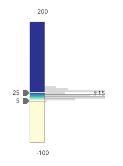
Zooms the slider track to the bounds provided in this property. When min and/or max zoom values are provided, the absolute min and max slider values are preserved and rendered at their typical positions on the slider. However, the slider track itself is zoomed so that thumbs cannot be moved above or below the provided min and max zoomed values.
When a slider is in a zoomed state, the zoomed
ends of the track will appear jagged. In the image below, notice how the
top thumb cannot be moved past the zoom max of 31 even though the slider
max is 200.
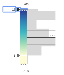
To exit a zoomed state, the user can click the
jagged line or the developer can set the zoomOptions to null. It
is up to the developer to provide a UI option for end users to
enable zooming on the slider.
Setting the zoomOptions is useful when the slider is tied to heavily skewed
datasets where the histogram renders only one or two bars because of outliers.
You can remove the influence of outliers by zooming the slider and regenerating a histogram based on the zoomed min and max. This will provide a better view of the data and make the slider more useful to the end user.
Examples
// zooms the slider to so thumbs can only be moved// to positions between the values of 10 and 25 while// maintaining the slider's absolute minimum and// maximum valuesslider.zoomOptions = { min: 10, max: 25};// disables zooming on the sliderslider.zoomOptions = null;// zooms the slider to so thumbs can only be moved// to positions above the value of 10, while maintaining// the slider's absolute minimum valueslider.zoomOptions = { min: 10};// zooms the slider to so thumbs can only be moved// to positions below the value of 25, while maintaining// the slider's absolute maximum valueslider.zoomOptions = { max: 25};// zooms the slider to the handle positions// with some paddingdocument.getElementById("zoomInButton").onclick = function() { const lowerThumb = slider.values[0]; const upperThumb = slider.values[1];
const range = upperThumb - lowerThumb; const padding = range * 0.3;
const zoomMin = (lowerThumb - padding) > slider.min ? (lowerThumb - padding) : slider.min; const zoomMax = (upperThumb + padding) < slider.max ? (upperThumb + padding) : slider.max;
slider.set({ zoomOptions: { min: zoomMin, max: zoomMax } });};Methods
| Method | Signature | Class |
|---|---|---|
classes inherited | classes(...classNames: ((string | null | undefined) | ((string[] | Record<string, boolean>) | null | undefined) | false | null | undefined)[]): string | |
destroy inherited | destroy(): void | |
emit inherited | emit<Type extends EventNames<this>>(type: Type, event?: this["@eventTypes"][Type]): boolean | |
hasEventListener inherited | hasEventListener<Type extends EventNames<this>>(type: Type): boolean | |
isFulfilled inherited | isFulfilled(): boolean | |
isRejected inherited | isRejected(): boolean | |
isResolved inherited | isResolved(): boolean | |
on inherited | on<Type extends EventNames<this>>(type: Type, listener: EventedCallback<this["@eventTypes"][Type]>): ResourceHandle | |
postInitialize inherited | postInitialize(): void | |
render inherited | render(): any | null | |
renderNow inherited | renderNow(): void | |
scheduleRender inherited | scheduleRender(): void | |
when inherited | when<TResult1 = this, TResult2 = never>(onFulfilled?: OnFulfilledCallback<this, TResult1> | null | undefined, onRejected?: OnRejectedCallback<TResult2> | null | undefined): Promise<TResult1 | TResult2> |
classes
- Signature
-
classes (...classNames: ((string | null | undefined) | ((string[] | Record<string, boolean>) | null | undefined) | false | null | undefined)[]): string
A utility method used for building the value for a widget's class property.
This aids in simplifying css class setup.
Parameters
- Returns
- string
The computed class name.
Example
// .tsx syntax showing how to set css classes while rendering the widget
render() {  const dynamicClasses = {    [css.flip]: this.flip,    [css.primary]: this.primary  };
return ( <div class={classes(css.root, css.mixin, dynamicClasses)} /> );} emit
- Signature
-
emit <Type extends EventNames<this>>(type: Type, event?: this["@eventTypes"][Type]): boolean
- Type parameters
- <Type extends EventNames<this>>
Emits an event on the instance. This method should only be used when creating subclasses of this class.
hasEventListener
- Signature
-
hasEventListener <Type extends EventNames<this>>(type: Type): boolean
- Type parameters
- <Type extends EventNames<this>>
Indicates whether there is an event listener on the instance that matches the provided event name.
Parameters
| Parameter | Type | Description | Required |
|---|---|---|---|
| type | Type | The name of the event. | |
- Returns
- boolean
Returns true if the class supports the input event.
isFulfilled
- Signature
-
isFulfilled (): boolean
isFulfilled() may be used to verify if creating an instance of the class is fulfilled (either resolved or rejected).
If it is fulfilled, true will be returned.
- Returns
- boolean
Indicates whether creating an instance of the class has been fulfilled (either resolved or rejected).
isRejected
- Signature
-
isRejected (): boolean
isRejected() may be used to verify if creating an instance of the class is rejected.
If it is rejected, true will be returned.
- Returns
- boolean
Indicates whether creating an instance of the class has been rejected.
isResolved
- Signature
-
isResolved (): boolean
isResolved() may be used to verify if creating an instance of the class is resolved.
If it is resolved, true will be returned.
- Returns
- boolean
Indicates whether creating an instance of the class has been resolved.
on
- Signature
-
on <Type extends EventNames<this>>(type: Type, listener: EventedCallback<this["@eventTypes"][Type]>): ResourceHandle
- Type parameters
- <Type extends EventNames<this>>
Registers an event handler on the instance. Call this method to hook an event with a listener.
Parameters
| Parameter | Type | Description | Required |
|---|---|---|---|
| type | Type | An event or an array of events to listen for. | |
| listener | EventedCallback<this["@eventTypes"][Type]> | The function to call when the event fires. | |
- Returns
- ResourceHandle
Returns an event handler with a
remove()method that should be called to stop listening for the event(s).Property Type Description remove Function When called, removes the listener from the event.
Example
view.on("click", function(event){ // event is the event handle returned after the event fires. console.log(event.mapPoint);}); when
- Signature
-
when <TResult1 = this, TResult2 = never>(onFulfilled?: OnFulfilledCallback<this, TResult1> | null | undefined, onRejected?: OnRejectedCallback<TResult2> | null | undefined): Promise<TResult1 | TResult2>
when() may be leveraged once an instance of the class is created. This method takes two input parameters: an onFulfilled function and an onRejected function.
The onFulfilled executes when the instance of the class loads. The
onRejected executes if the instance of the class fails to load.
Parameters
| Parameter | Type | Description | Required |
|---|---|---|---|
| onFulfilled | OnFulfilledCallback<this, TResult1> | null | undefined | The function to call when the promise resolves. | |
| onRejected | The function to execute when the promise fails. | |
- Returns
- Promise<TResult1 | TResult2>
Returns a new promise for the result of
onFulfilledthat may be used to chain additional functions.
Example
// Although this example uses MapView, any class instance that is a promise may use when() in the same waylet view = new MapView();view.when(function(){ // This function will execute once the promise is resolved}, function(error){ // This function will execute if the promise is rejected due to an error});Events
| Name | Type |
|---|---|
max-change inherited | |
min-change inherited | |
segment-drag inherited | |
thumb-change inherited | |
thumb-drag inherited |
max-change
max-change: CustomEvent<MaxChangeEvent> Fires when a user changes the max of the slider.
Example
slider.on("max-change", function() { const renderer = layer.renderer.clone(); const visualVariable = renderer.visualVariables[0].clone(); colorVariable.stops = slider.stops; renderer.visualVariables = [ visualVariable ]; layer.renderer = renderer;}); min-change
min-change: CustomEvent<MinChangeEvent> Fires when a user changes the min of the slider.
Example
slider.on("min-change", function() { const renderer = layer.renderer.clone(); const visualVariable = renderer.visualVariables[0].clone(); colorVariable.stops = slider.stops; renderer.visualVariables = [ visualVariable ]; layer.renderer = renderer;}); segment-drag
segment-drag: CustomEvent<SegmentDragEvent> - Since
- ArcGIS Maps SDK for JavaScript 4.20
Fires when a user drags a segment of the slider. A segment is the portion of the track that lies between two thumbs. Therefore, this only applies when two or more thumbs are set on the slider.
Example
slider.on("segment-drag", () => { const renderer = layer.renderer.clone(); const visualVariable = renderer.visualVariables[0].clone(); colorVariable.stops = slider.stops; renderer.visualVariables = [ visualVariable ]; layer.renderer = renderer;}); thumb-change
thumb-change: CustomEvent<ThumbChangeEvent> Fires when a user changes the value of a thumb via the arrow keys or by keyboard editing of the label on the slider.
Examples
slider.on("thumb-change", function() { const renderer = layer.renderer.clone(); const visualVariable = renderer.visualVariables[0].clone(); colorVariable.stops = slider.stops; renderer.visualVariables = [ visualVariable ]; layer.renderer = renderer;});slider.on("thumb-change", function() { const renderer = layer.renderer.clone(); renderer.colorStops = slider.stops; layer.renderer = renderer;}); thumb-drag
thumb-drag: CustomEvent<ThumbDragEvent> Fires when a user drags a thumb on the widget.
Examples
slider.on("thumb-drag", function() { const renderer = layer.renderer.clone(); const visualVariable = renderer.visualVariables[0].clone(); colorVariable.stops = slider.stops; renderer.visualVariables = [ visualVariable ]; layer.renderer = renderer;});slider.on("thumb-drag", function() { const renderer = layer.renderer.clone(); renderer.colorStops = slider.stops; layer.renderer = renderer;});